School websites are complex beasts. They contain lots of content, serve multiple functions and need to appeal to a wide audience. It can be tricky to execute on all this while remaining easy to use! Here are some tips for a great website that will yield positive results for your school.
School Website Benefits
Communicate with Students
A school website is an easy centralised place for students, parents and teachers to find information on term dates, events, exams and sports draws. To retain readers, ensure all information is up-to-date and accurate. Your school community will continue to visit if they can reliably find the information they need.
A Marketing Tool
A website is the most effective method of inbound marketing your school can use. With full creative control over content and design, it is easy to capture a holistic view of your school and its brand.
The site should act as an extension of a school prospectus, with information on fees, entry requirements and school life. All the facts that future students could want should be easy to find on your school website.
A website is also an easy way to gauge what your audience deems important and interesting. With analytic insights at your fingertips, you can see what pages get the most clicks and how long viewers stay on each page. This helps you tailor future content and better promote your school.
Creating a Great School Website
Homepage Design
A great first impression is crucial for a successful website, and most of this comes down to great design. Great web design consists of looking unique while being easy to navigate. An attractive website makes your school look credible and professional, and decreases your bounce rate.
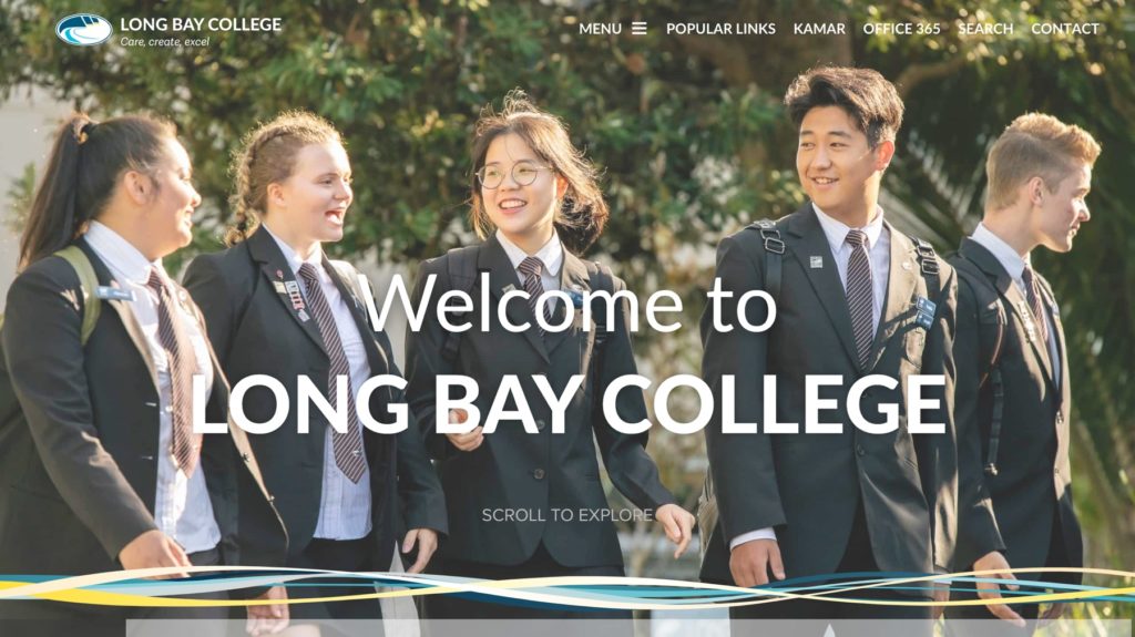
The homepage is how most viewers enter your website. This page should clearly show who the website belongs to and what it’s all about. A good way to achieve this is through school colours, photography and clear, simple messaging.
The most important and eye-catching part of each page should be above the fold. The fold is a term used to describe what is visible on the screen without scrolling. Great design and messaging will encourage viewers to scroll through the page to find out more.
Professional Photography
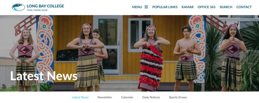
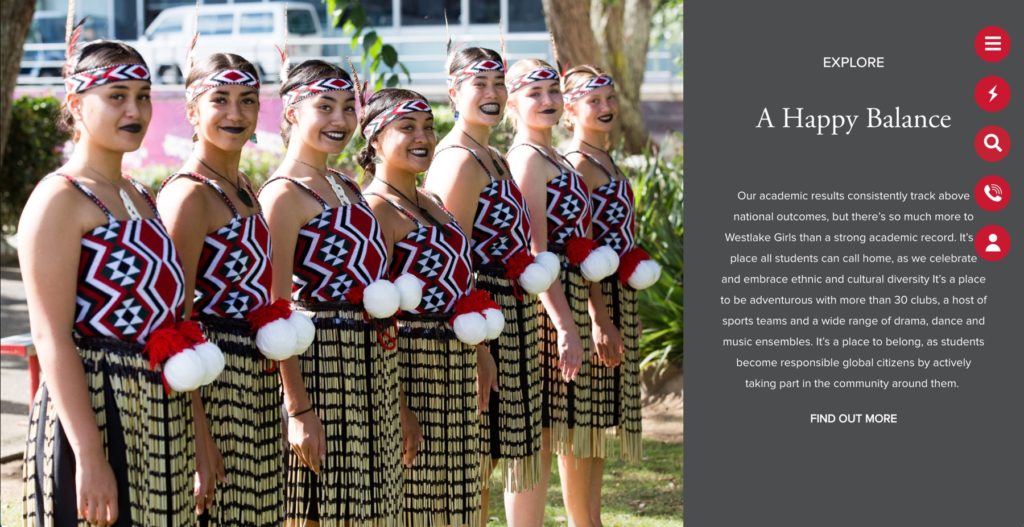
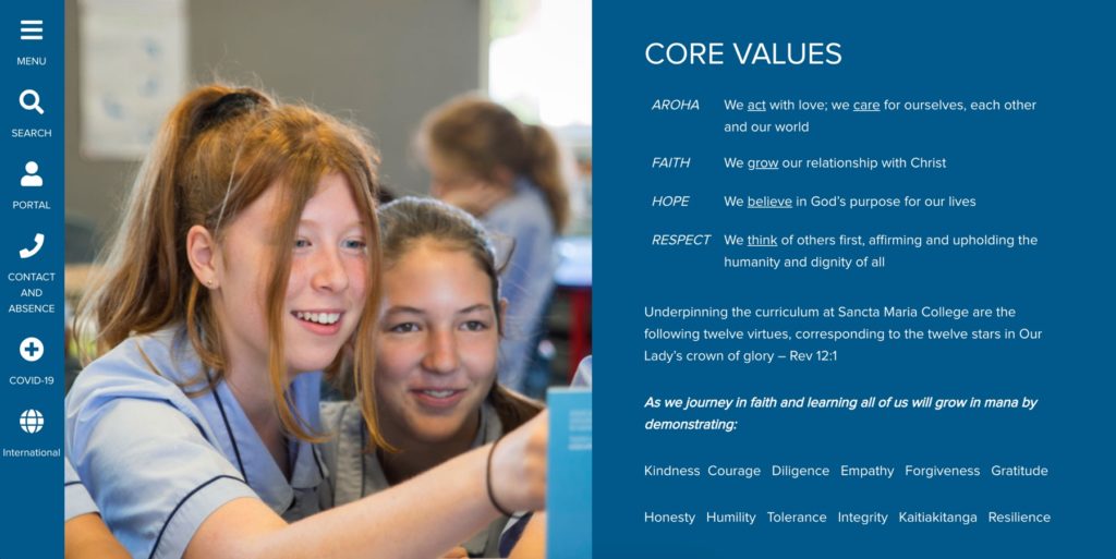
The photos you choose play a huge role in the look of the website. Much like the rest of your design, simple photos are typically best. Don’t clutter your web pages with lots of small images that dilute your message. Instead, choose a large, captivating shot that encapsulates the content on the page.
For a polished website, professional, original shots are best for feature images. Whereas more candid shots taken by teachers, staff or coaches are great alongside articles and updates.
Website Navigation
Above all else, it should be easy and quick to find information on your school website. Web users are notoriously impatient and will exit your site if it’s too challenging to use. A simple rule is that it shouldn’t take more than three clicks to find anything on your website.
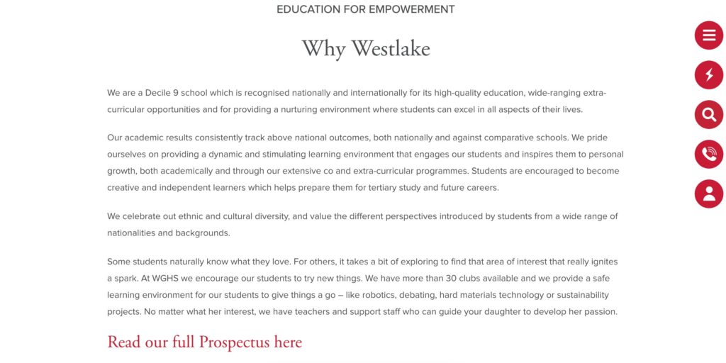
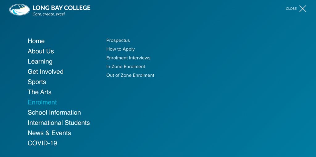
The easiest path to great navigation is to simplify your site as much as possible. The homepage text should be short and direct, with a clear menu and search bar visible. Try to use standard terms for your pages and buttons so your viewer waste time figuring out where to go. Standard terms also help viewers with limited English skills and those using a website translator.
People like having options, but not too many. In fact, having lots of options can make people give up instead of choosing. This is why it’s a good idea to simplify the buttons into broad categories on your website. If viewers want a specific update or story, the search bar can help them find it.
A good way to ensure your website is easy to navigate is to create a site map in the planning stages. A site map shows every page on the website, the hierarchy, and how to navigate between the pages. If you choose to create your school website with Spacific Creative, this is part of our process to ensure the user experience is the best it can be.
Engaging Content
School websites are large, so try to cut any content that adds little value. Ensure readers aren’t stumbling over old announcements with incorrect information. Instead, content that is no longer current or applicable.
An interesting About Us page is a key page prospective students will want to read! Facts about school values, curriculum, history and successes all help to tell your school’s story.
Term dates, a school calendar and the exam timetable are key additions for a successful site. Make sure these are easy to find to ensure visitors don’t miss important information.
Accessible & Responsive Content
A good website is easy to access on different browsers and devices. Over half of all media interactions in New Zealand are via a smartphone so ensure your website is optimised for mobile. At Spacific Creative, we test our websites on the following:
- Desktop: Apple (Safari), Google (Chrome), Microsoft (Edge) and Mozilla Firefox.
- Mobile: Apple iOS (Safari Browser) on iPad and iPhone; and Google Android (Chrome Browser). We also test to ensure that people who use Microsoft Internet Explorer 11 for Windows get an appropriate experience.
Bring Your Website to Life
Spacific Creative only works with schools, so we understand what makes school websites fundamentally different. We can help plan, build and manage your site, as well as train key staff to update and style content. Reach out if you would like further information or a quote.

