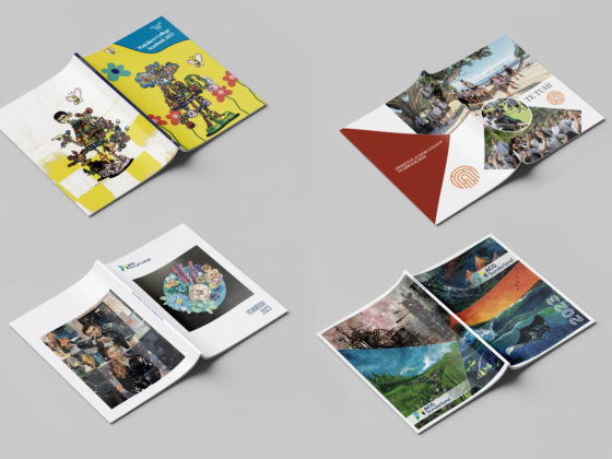
Set the mood and theme for your next school yearbook with a creative colour palette! The best colour schemes are the ones that match your school, the publication, and the message you are trying to convey. It’s also important that your colours work well together while ensuring the text and page content remain clear and legible.
To give you an idea of some successful colour palettes, here are a few examples from our clients’ yearbooks – take a look!
Howick Intermediate

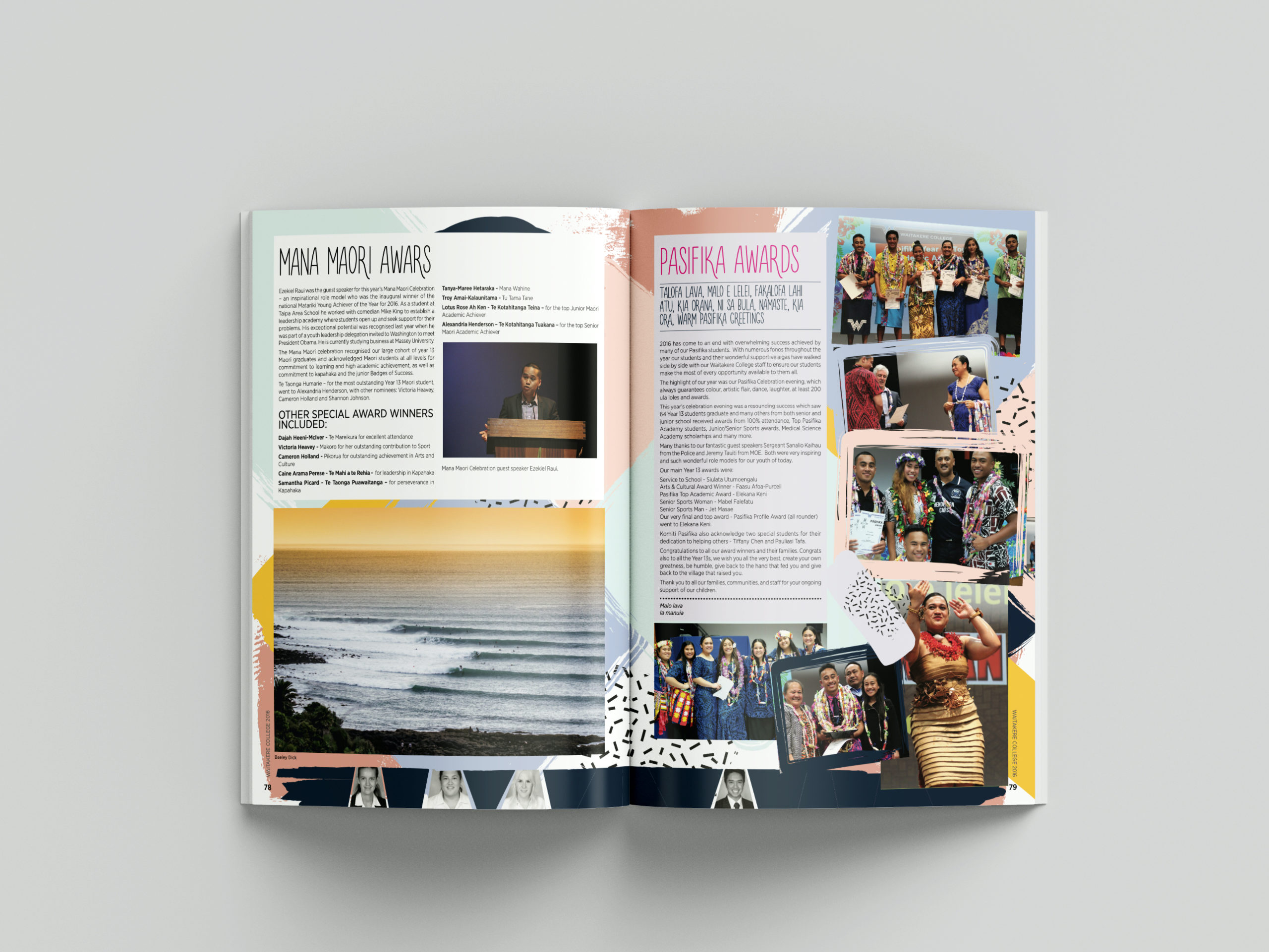
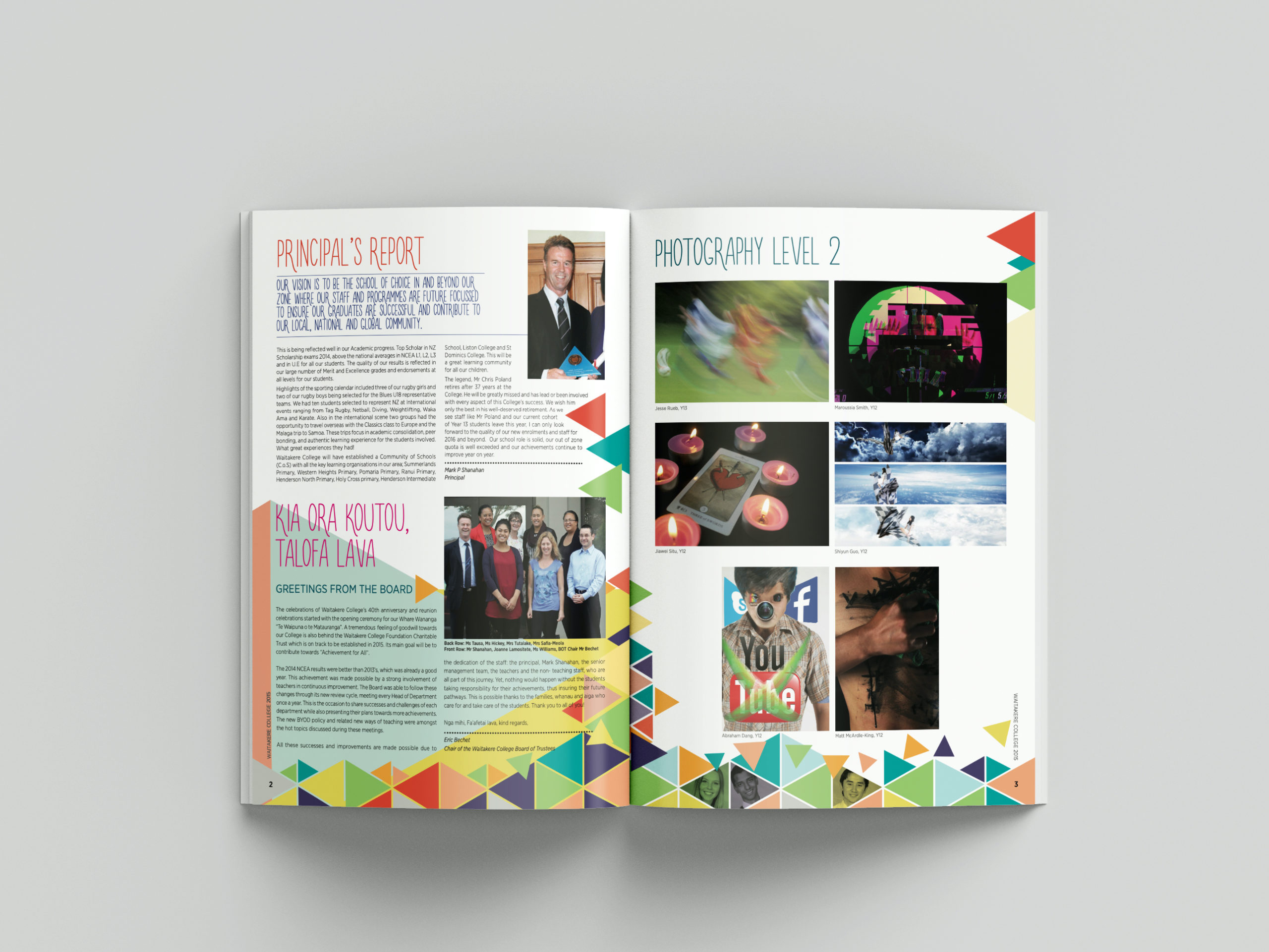
Waitakere College

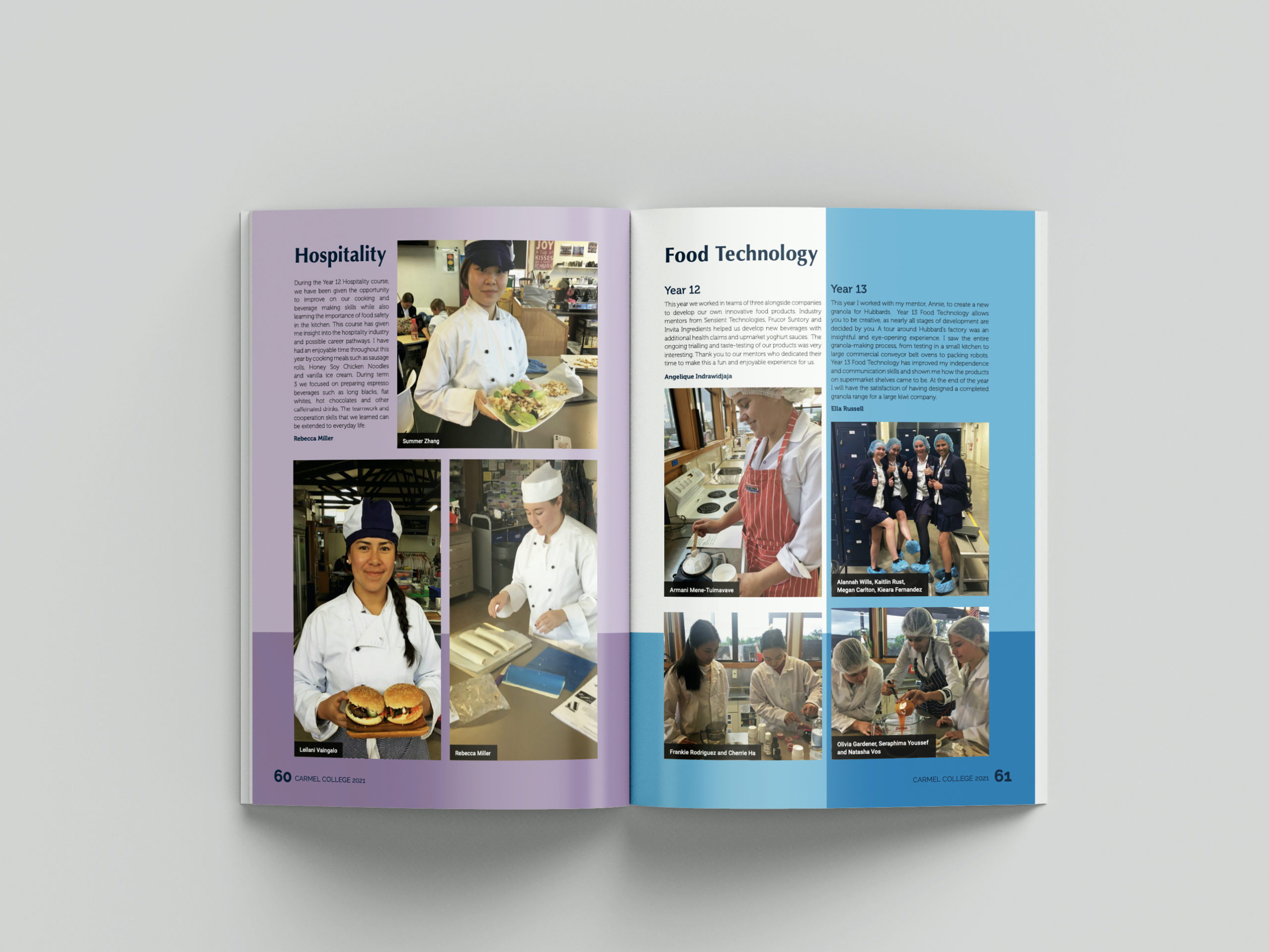
Carmel College

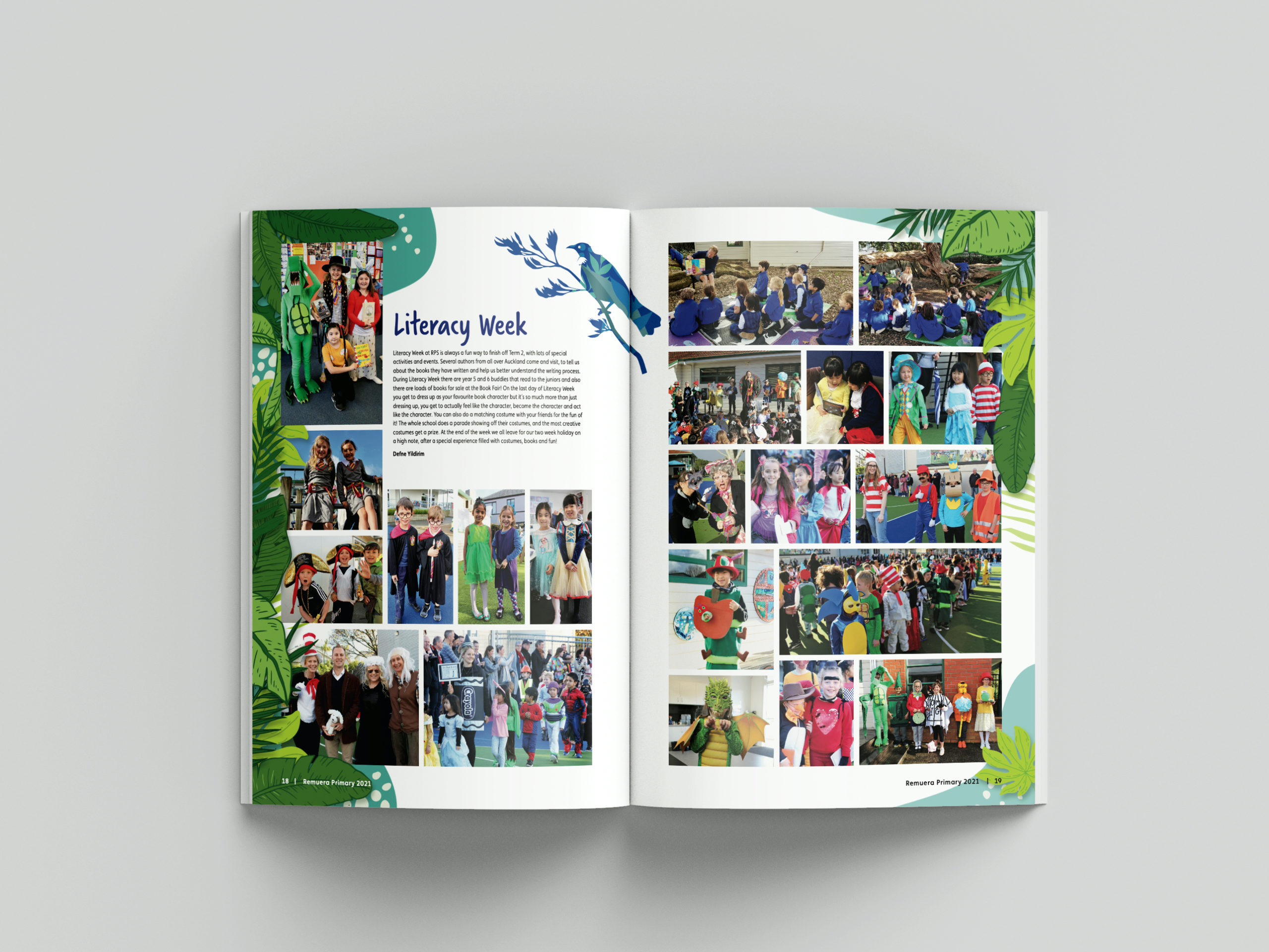
Remuera Primary School

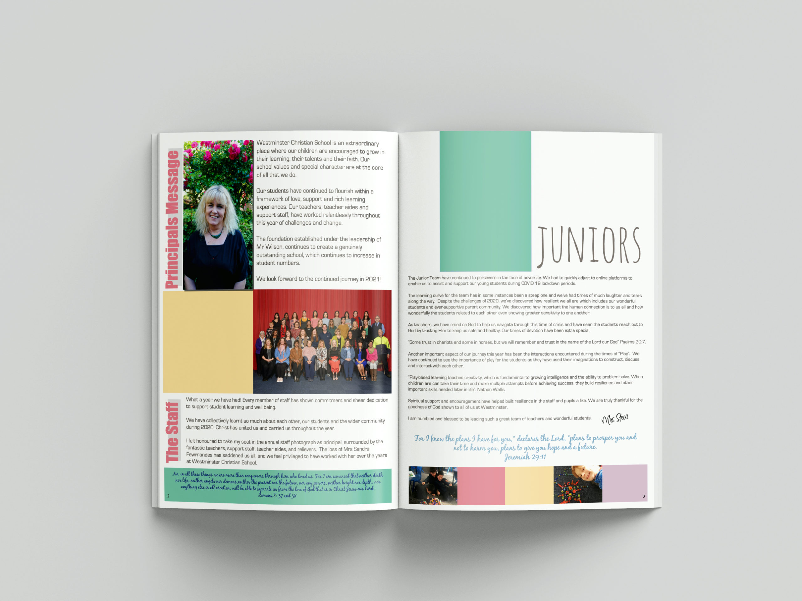
Westminster Christian School

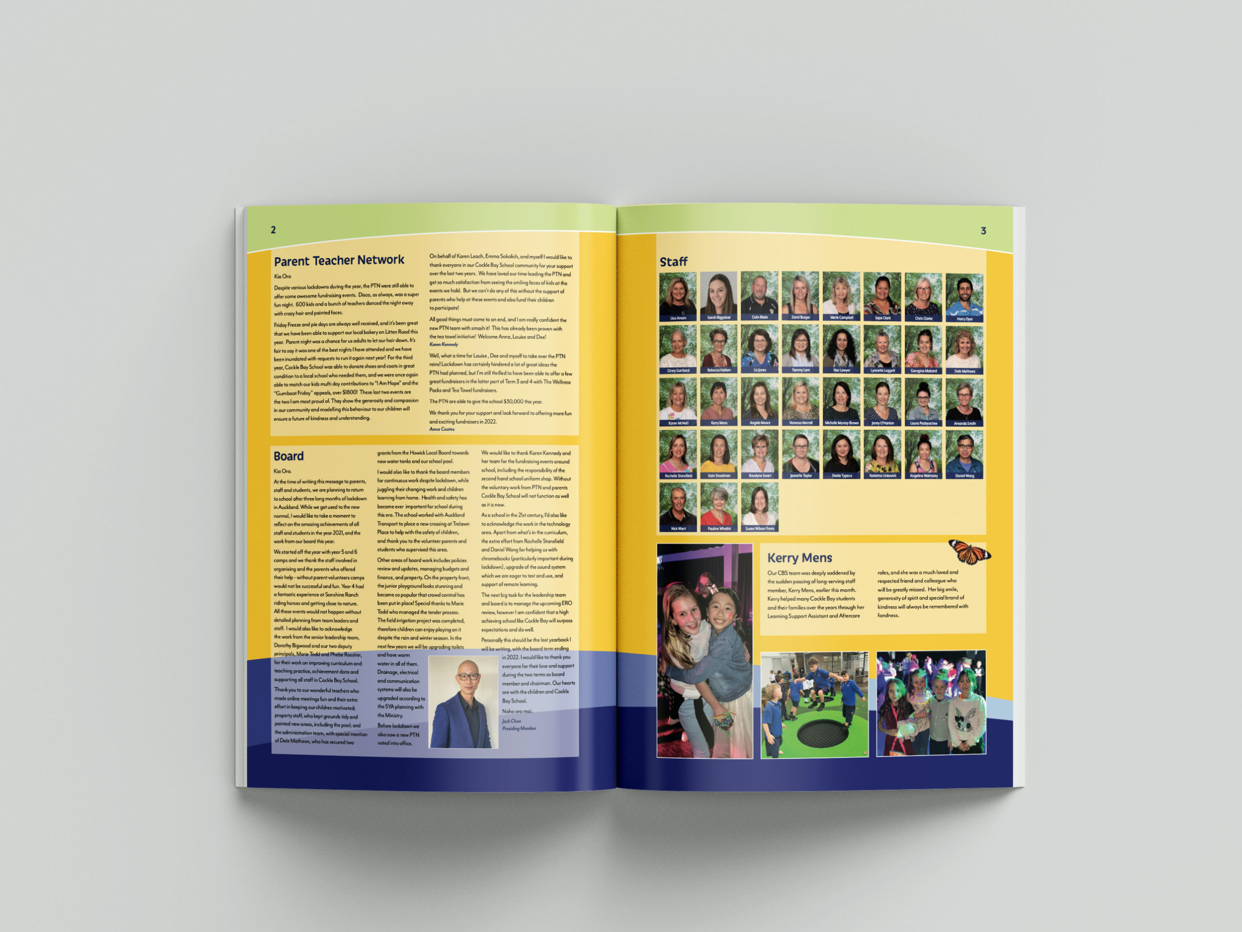
Cockle Bay School

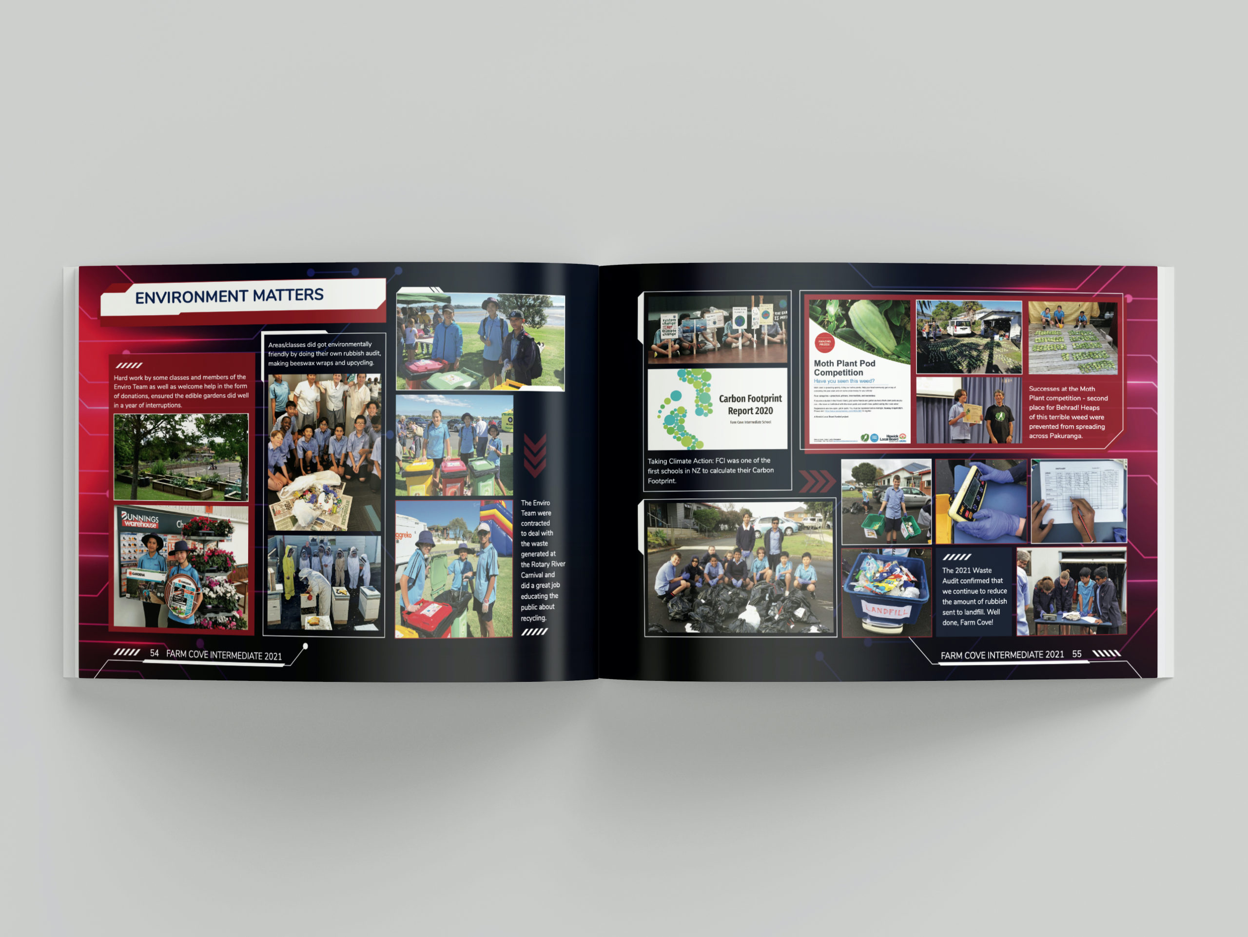
Farm Cove Intermediate

Waitakere College

Still unsure what colour palette is best for your school yearbook? Check out our article on how to find a great colour scheme!