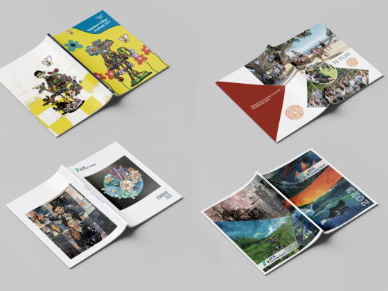
Choosing a theme for your school yearbook is a fun way to begin the design process and set the tone for your publication. So here are some tips if you’re after a trippy, fun and bold look. Keep reading for ways to create a 60s psychedelic-inspired design for your next yearbook, leavers book or event poster!
Pick Your Colour Palette

For a truly psychedelic palette, it’s time to go bright and clashing! Psychedelic design is full of loud neons, oversaturated shades and colour vibration.

Colour vibration occurs when two shades that are exactly opposite on the colour wheel with the same value and intensity are paired together. The two colours compete for attention, creating an optical illusion that the image is vibrating. This colour pairing is popular in psychedelic posters, just be aware they can be hard to look at! Instead, consider adjusting the tone of one or both shades so that you still get the desired effect but it’s a bit more subtle.
Choose Some Fun Fonts
60s psychedelic-styled fonts look fluid and hand illustrated. Due to their bold, artsy look, they are often used as the main design focus, taking on an almost illustration-like quality on the page. For yearbooks and posters, limit your use of these retro fonts to headings and decorative page elements. Here are a few options to try out!
Mix in Motifs
Continue your retro theme throughout your book by incorporating some 60s motifs and patterns!
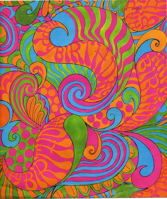
Opt for fluid lines, kaleidoscope patterns, and busy illustrations, avoiding anything that looks too sharp or rigid.
Illustrated Images
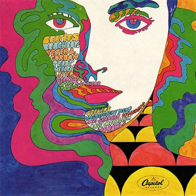
Capitol Records Sampler (1968)
Psychedelic design often incorporates faces as a prominent feature in illustrations and photos. Add some artistic doodles and effects to an image, or get students involved in designing some retro art with fluid lines and bold colours!
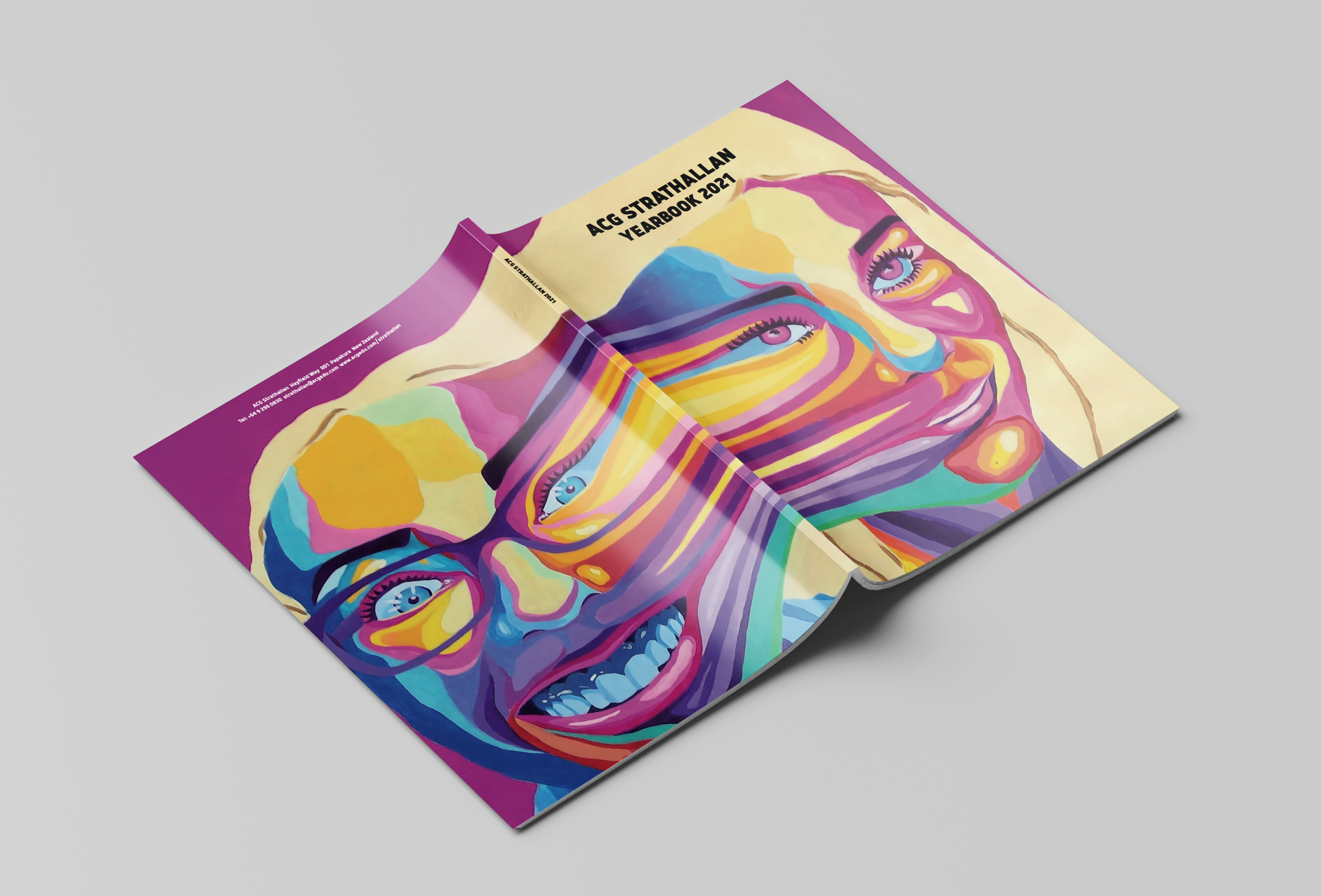
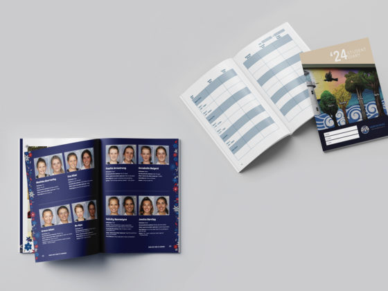
ACG Strathallan yearbook
And if a retro throwback is not your style, why not try something more futuristic!
