In need of some typography ideas for your next school yearbook? Well-thought-out headings and font choices can help your yearbook stand out, and get readers excited to flick through the pages!
There are lots of ways to choose headings that will make a statement. It’s all about choosing the style best suited to your school and yearbook design.
Benefits of Bold Headings:
- They command attention and make an impact. A bold heading grabs the reader’s eye and keeps them focused on the content.
- They help show your school’s personality, convey a feeling, or reinforce a yearbook theme.
- They create or reinforce a visual hierarchy, indicating to readers how to follow the page from large heading text to smaller paragraph text.
- Your other design elements can remain simple while still making a statement!
How to Design Bold Headings!
Here are some ways to create headings and titles for your yearbook with examples from our clients!
Pair Contrasting Colours
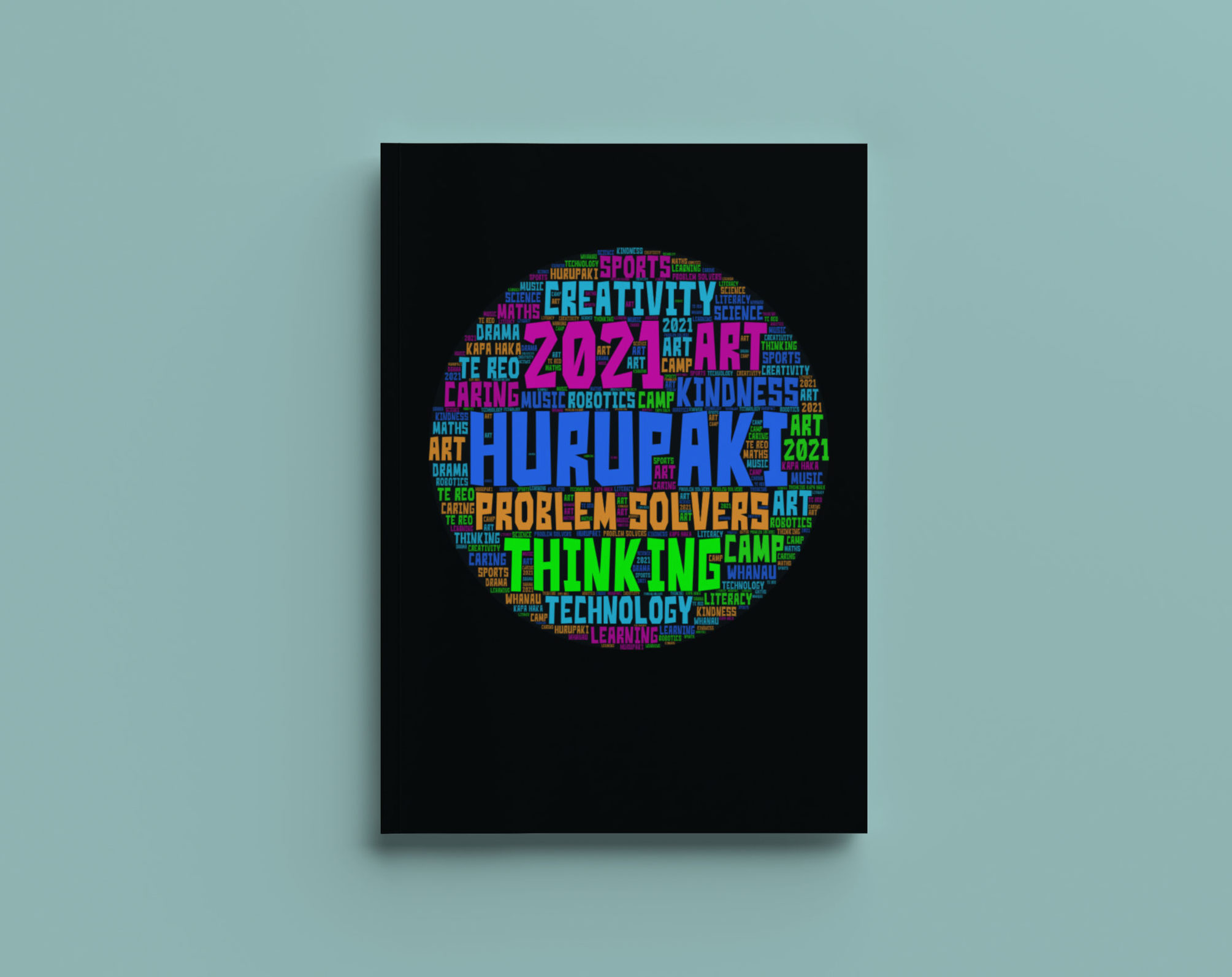
Hurupaki School
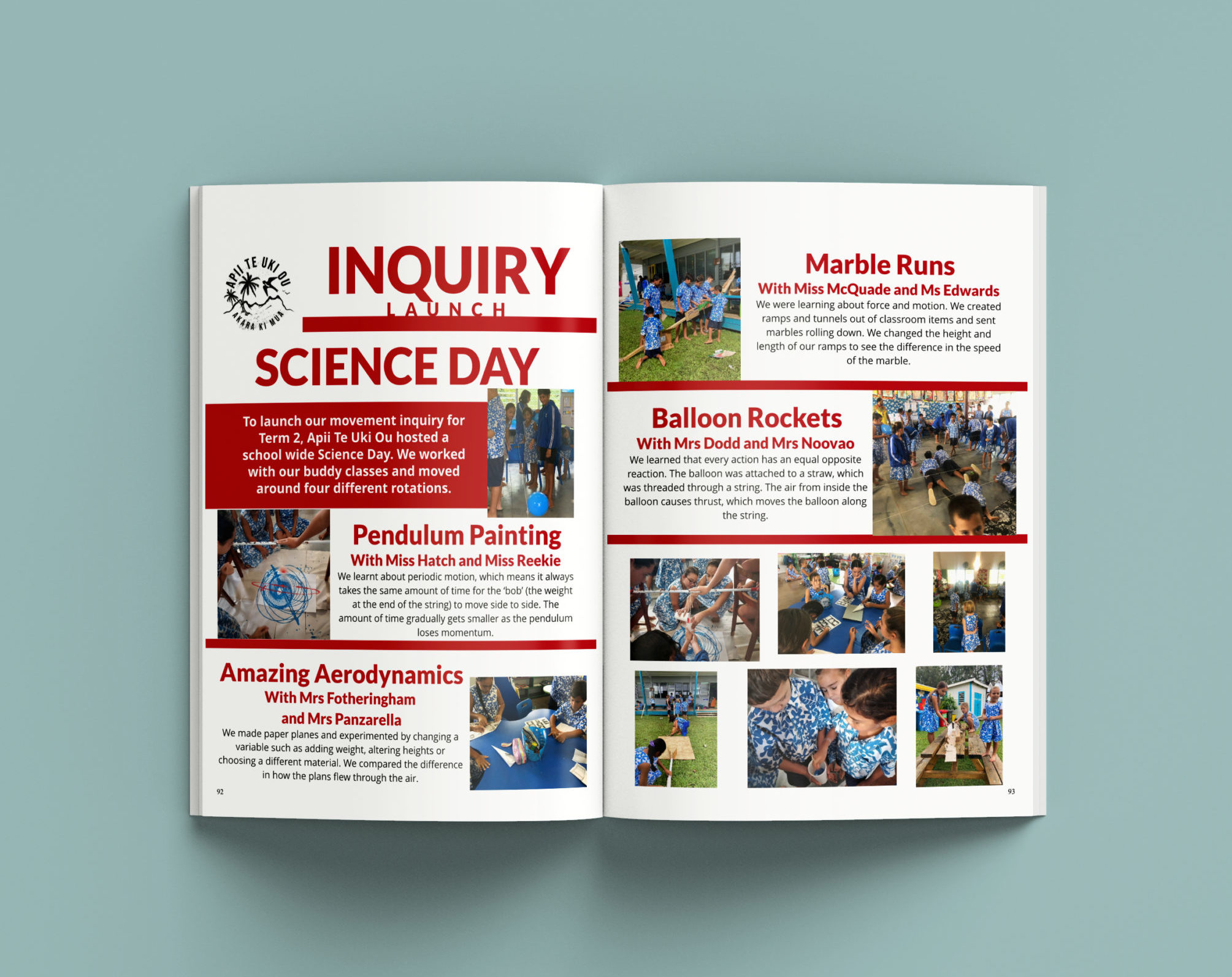
Apii Te Uki Ou
Capitalise Your Headings
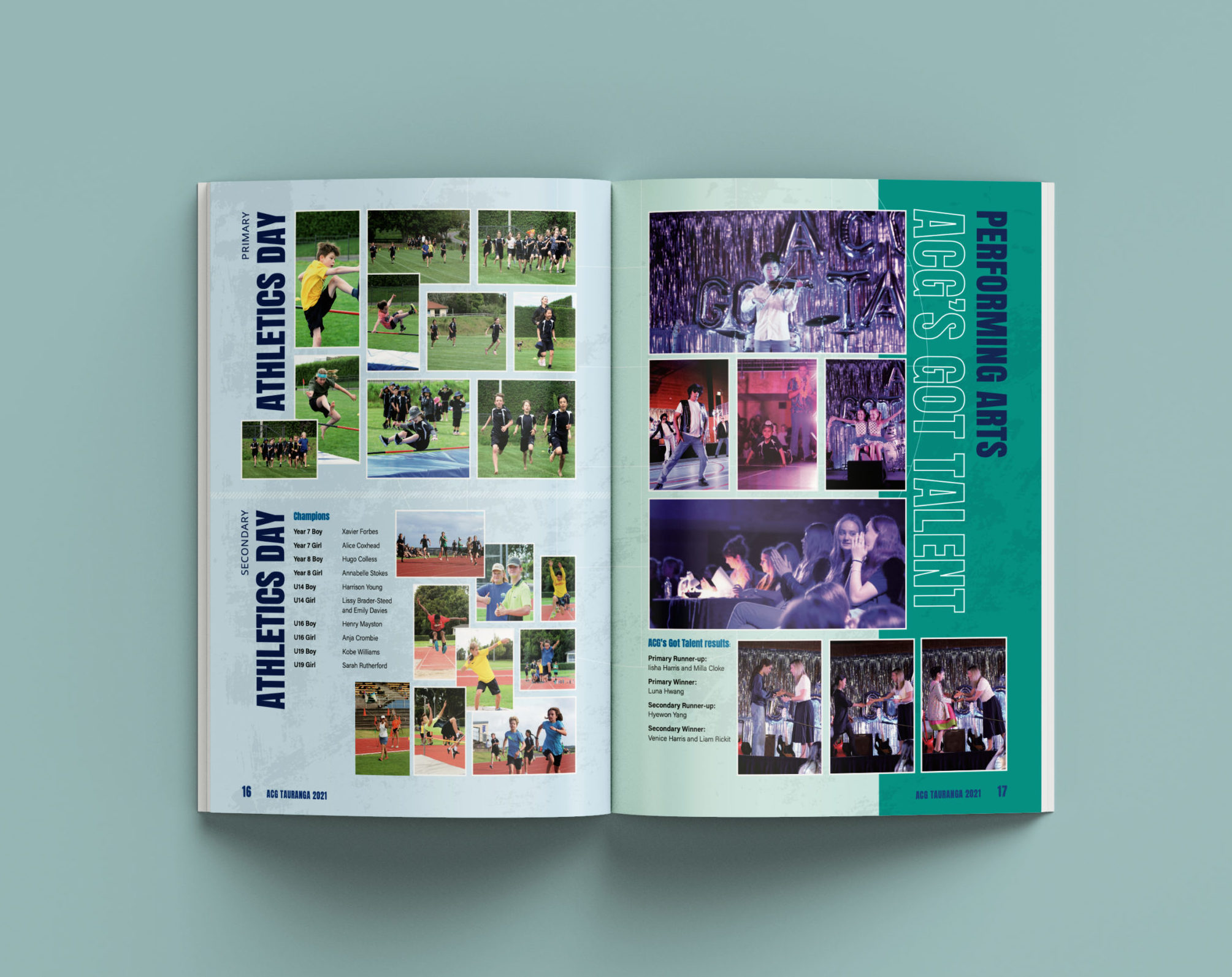
ACG Tauranga
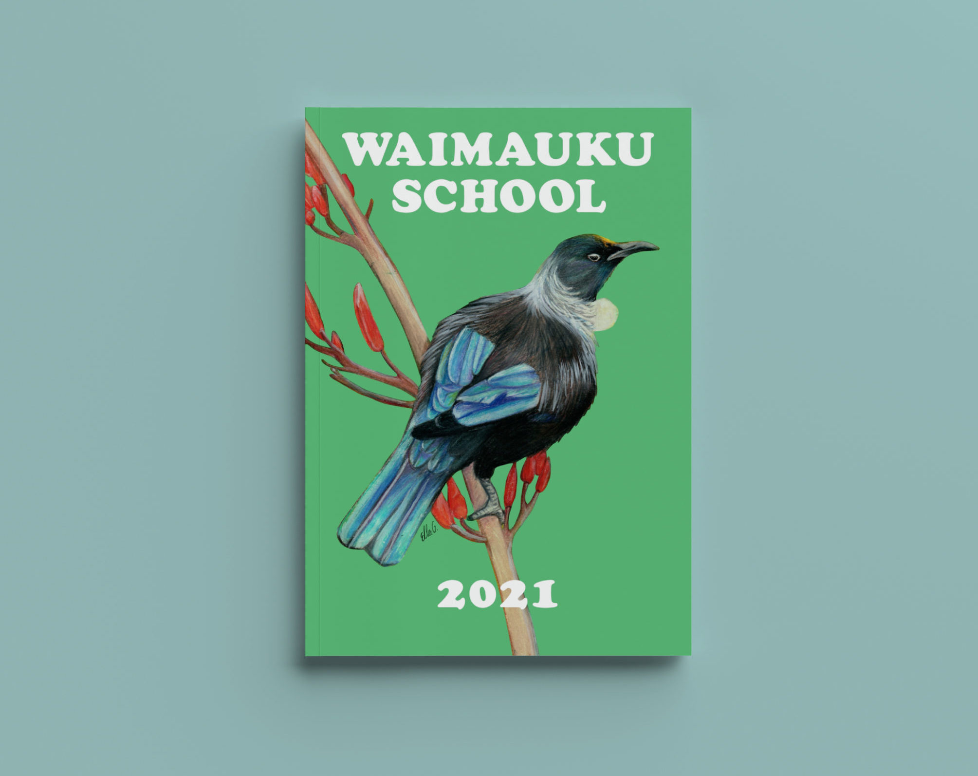
Waimauku School
Pair Contrasting Fonts
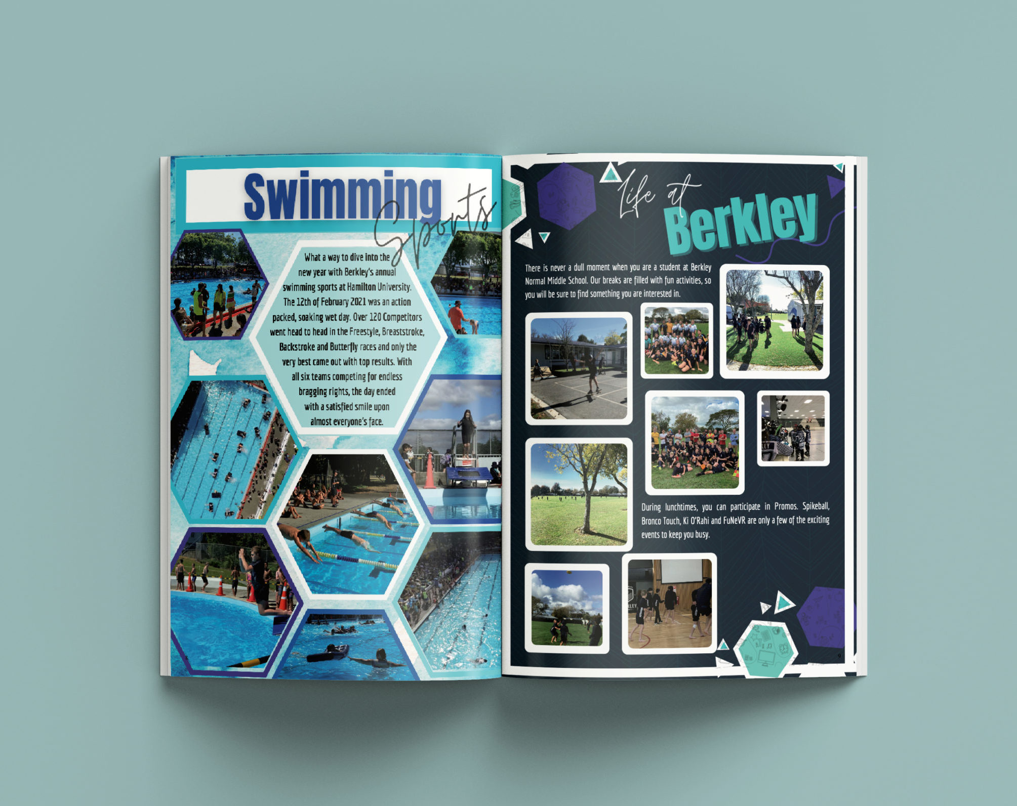
Berkley Normal Middle School
Go Large!
Motueka High School
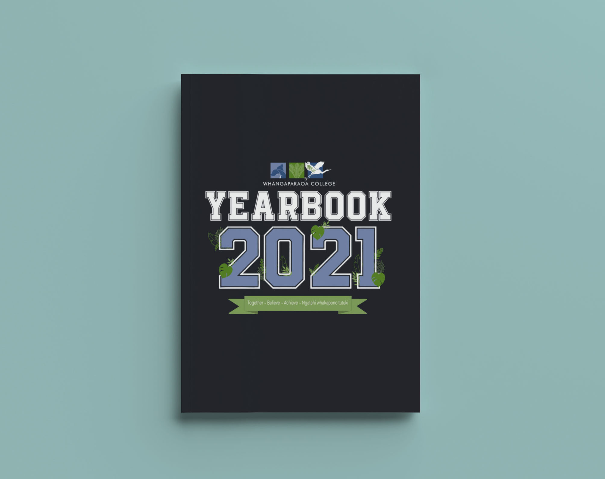
Whangaparaoa College
Match Your Theme
Mt Carmel School
Use 3D Styles
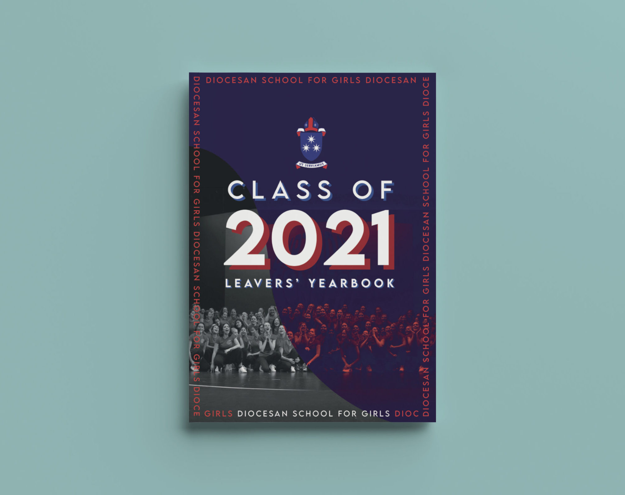
Diocesan School For Girls
Hurupaki School
Add Texture
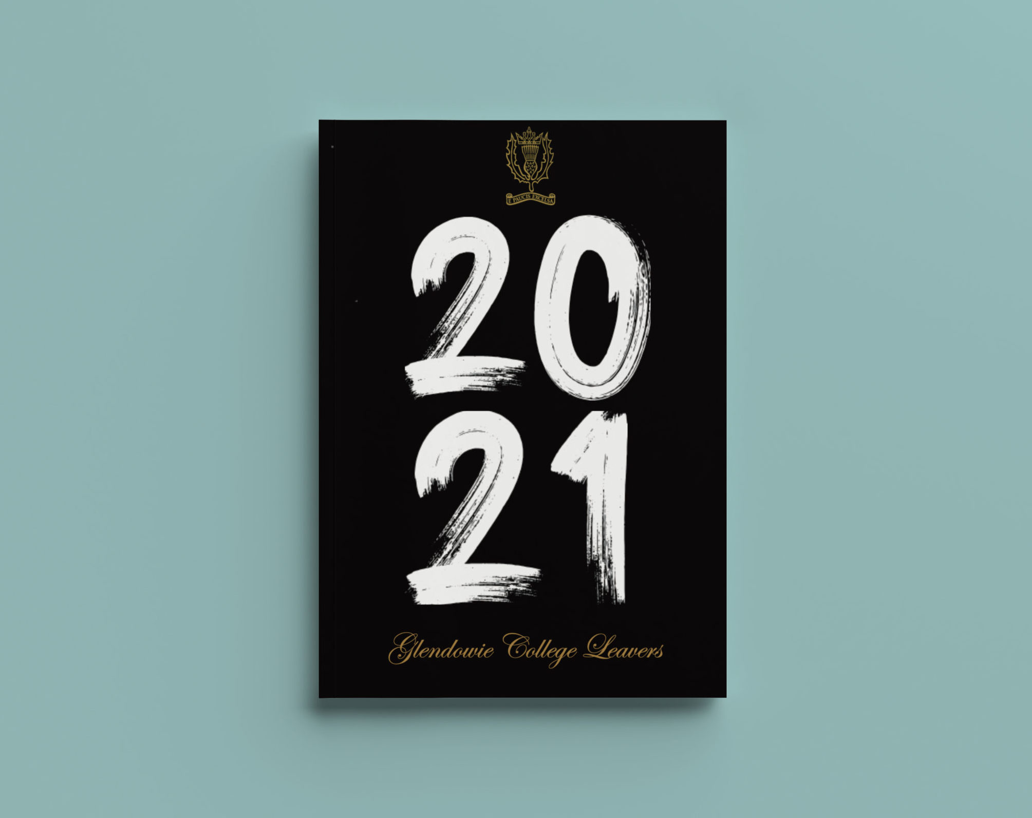
Glendowie College