There are many Dos and Don’ts in design – use contrast, limit fonts, maintain whitespace! These guidelines are useful, but generalised rules can also restrict creativity and originality. Here we explore some popular design myths and misconceptions to consider breaking.
Design Myth 1: Less Is More
Modern design and minimalism often go hand-in-hand. The once busy landing pages and logos of brands are now simplified and sleek. Minimalism has its place in design, but it doesn’t work for every medium or for every audience!
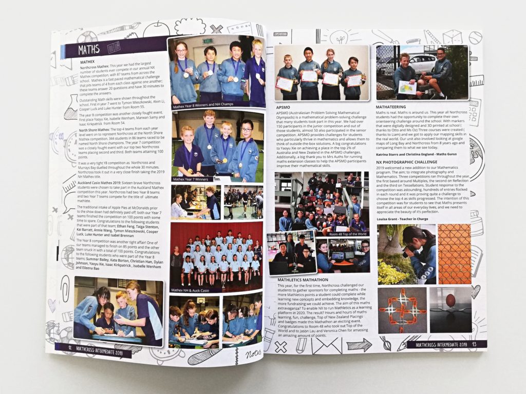
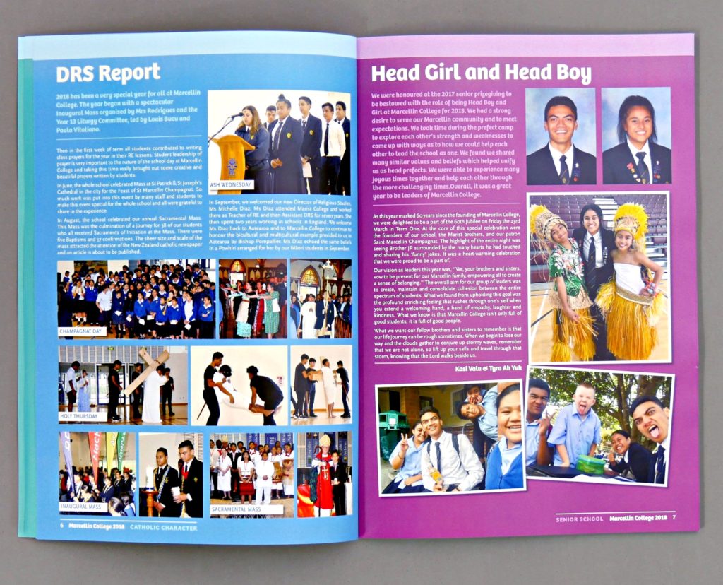
Above all else, good design should be functional. Yearbooks are information-dense by nature and need lots of content to be effective. Student photos, school updates and articles are all vital for a successful yearbook. Minimalism relies on decreasing the volume of content for visual effect. This isn’t ideal for a publication that aims to tell a huge story!
Even in a busy yearbook, it is still important to maintain whitespace and cohesion – but don’t be afraid to pack your yearbook full of special details!
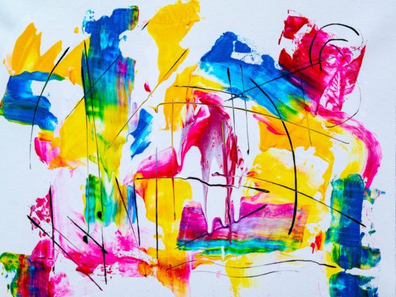
Design Myth 2: Colour Themes Should Be Harmonious
Having a set colour palette across a yearbook is great for maintaining consistency. Single hue colour palettes that range from light to dark produce a calm and professional look. Whereas contrasting, complementary colour schemes bring energy to your design.
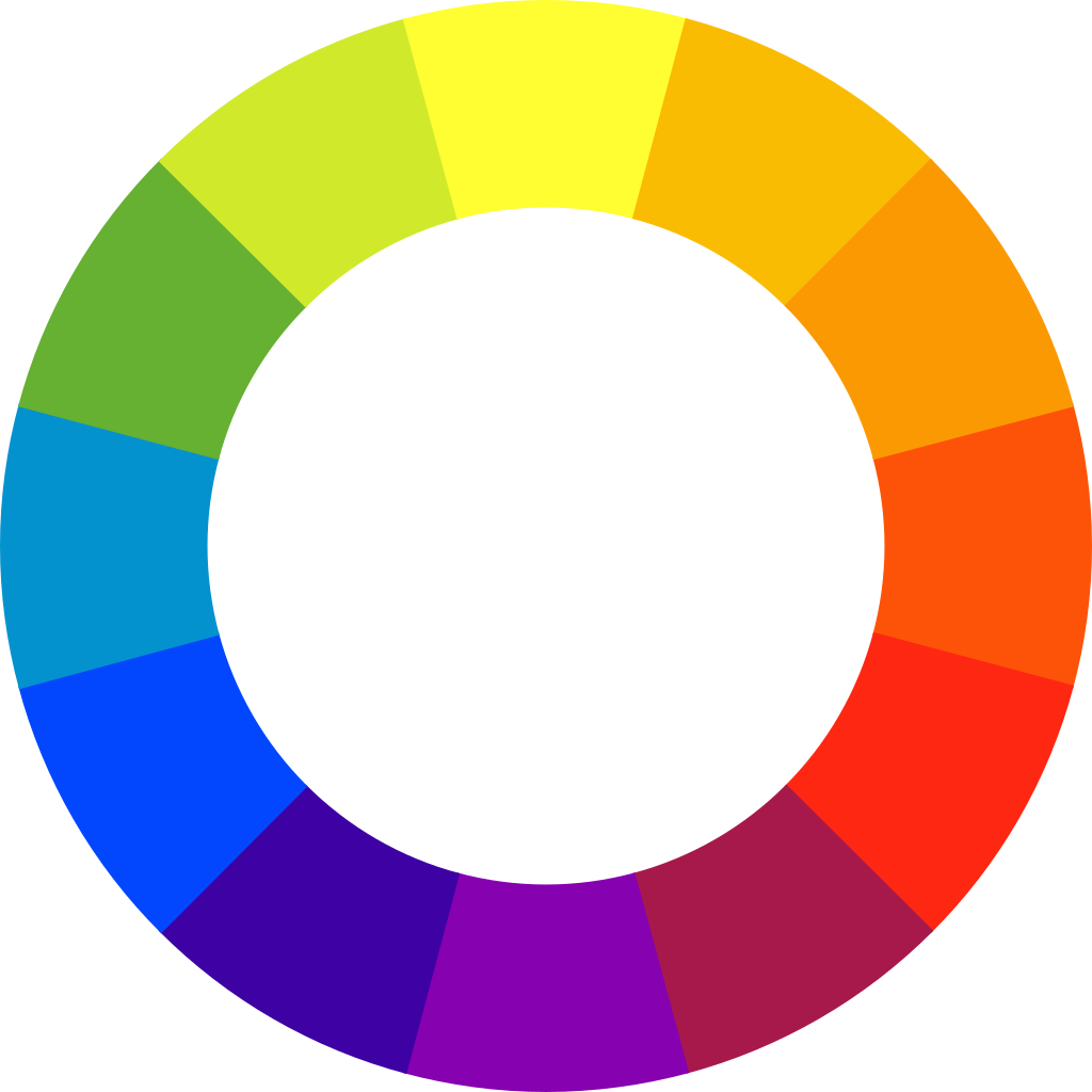
But it is a misconception that colour themes always need to follow the rules! Discordant colour combinations use shades that purposely clash and evoke a sense of rebellion. Shades that are almost opposite on the colour wheel but just slightly off are paired for an unsettling look.
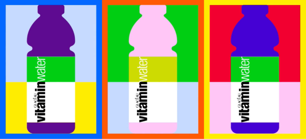
This isn’t for everyone or for every publication but is effective when used well. This off-beat style is popular in a lot of modern branding and design.
Design Myth 3: Readers Make Optimal Choices

It is easy to get wrapped up in fun, unconventional layouts. Creative design is wonderful but recognise that your reader won’t scan the page in the same way that you do.
Readers are naturally lazy and will focus on the largest and boldest page element first. So, ensure that the most eye-catching page element is also the most important! Don’t make your reader search the page for the message you are trying to convey.
If you are unsure if your design is easy to comprehend, get a second pair of eyes to look over your work.
Design Myth 4: Paired Fonts Should Contrast
Fonts are not one-size-fits-all. Some are great for headings, for commanding attention and injecting personality. Whereas others are easy to read and are better suited for long passages of text. Using 2 or 3 fonts across a yearbook makes it easier to cover all these bases.
A popular rule is to choose fonts that contrast – pair serifs with sans-serifs, or a bold display heading with a clean readable font for body text. This rule makes it easy to pair fonts that won’t compete for attention.
Contrasting combinations are great but sometimes pairing similar fonts is a better choice. This can give the page a more harmonious look, where the fonts work in concord and not in contrast.
Be aware that using similar fonts can look messy if not done correctly. This is where your visual hierarchy comes into play. Reserve one font for headings and another for body text, and don’t switch them up!
Design Myth 5: Originality Is Key
Original design sets your work apart from the crowd and helps establish an identity. The truth however, is most great design is heavily influenced by the work of others. A quick glimpse at popular design trends will show you that this is true.
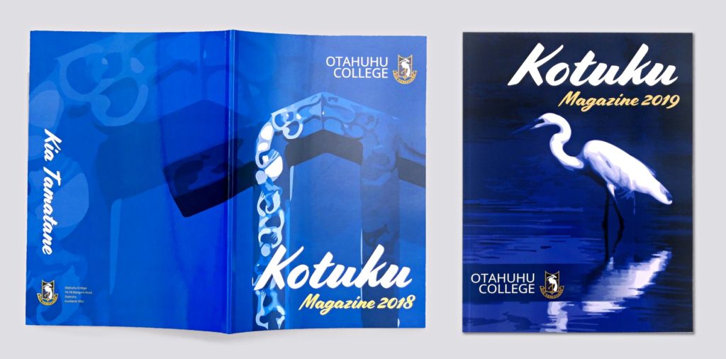
Your yearbook design doesn’t need to be an entirely new concept. It can be overwhelming or even impossible to start designing with nothing to go off! A good place to start is by looking at last year’s yearbook, or the typical colours and styles your school uses on their website.
For something more creative, there are many online and print sources of inspiration. Don’t be afraid to borrow ideas or make them your own!
For more design inspiration, check out Spacific Creative on Pinterest and Instagram.