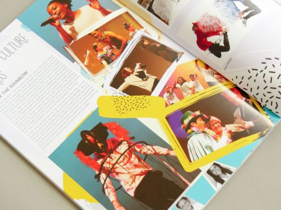
There are many Dos and Don’ts in design – use contrast, limit fonts, maintain whitespace! These guidelines are useful, but generalised rules can also restrict creativity and originality. Here we…
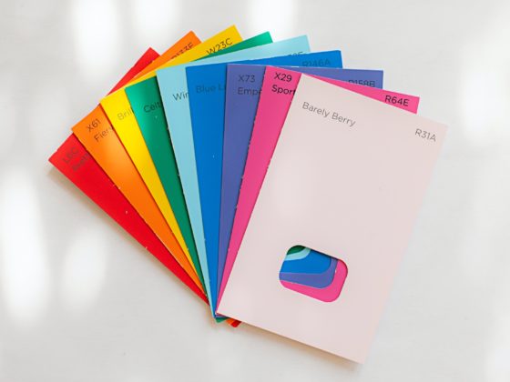
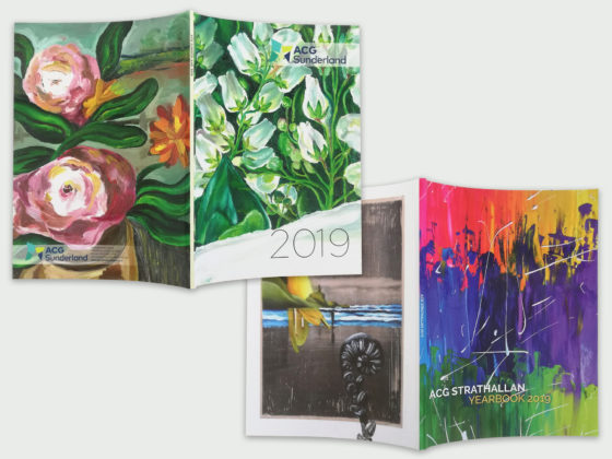
A cohesive colour palette plays a larger role than just making a page look pretty. Maintaining consistency with colour ensures that your design flows from start to end. For yearbooks,…
There are a lot of great fonts on the market, but many are expensive or hard to find. Spacific Creative has compiled a list of great free fonts that are…
The best design inspiration usually comes from seeing what others are up to! When speaking to yearbook coordinators, one of the most common requests we get is, “We would love…
In the large world of design, new styles of illustration and typography are always popping up! For 2020, we have collected the trends in branding, publishing and websites to help…
A yearbook full of content is a good thing for both your school and the reader. School events, important notices and great photography should all be highlighted – but how…
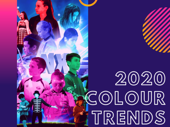
With a new year and new decade in full swing, let’s predict what will be big in colour for 2020! Colour plays an important role in a school yearbook. It…
Backgrounds are the canvas of your page and can be as detailed or as simple as you would like. While hidden behind writing and photos, your page background plays an…
Yearbook content may be static and two-dimensional but that doesn’t mean it needs to look that way! Creating the illusion of movement helps to carry the reader through the yearbook…
If a picture is worth a thousand words, just think of the story you could tell with a photo collage! Yearbooks that range from informal to formal can benefit from…

