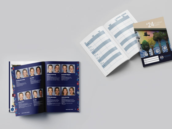
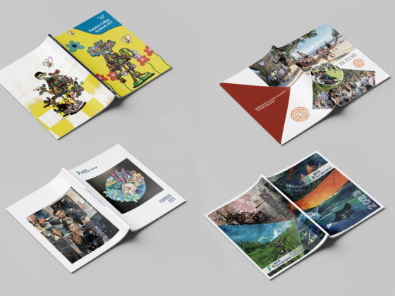
Photos are key to most school publications, but arranging them can be tricky! A photo collage or creative layout is a clever way to add extra pictures to a page and create an exciting spread.
There are many ways to create a successful layout, and it all depends on what style you want. In this article, we’ve gathered some designs from our clients to show what is possible!
Layered Collage
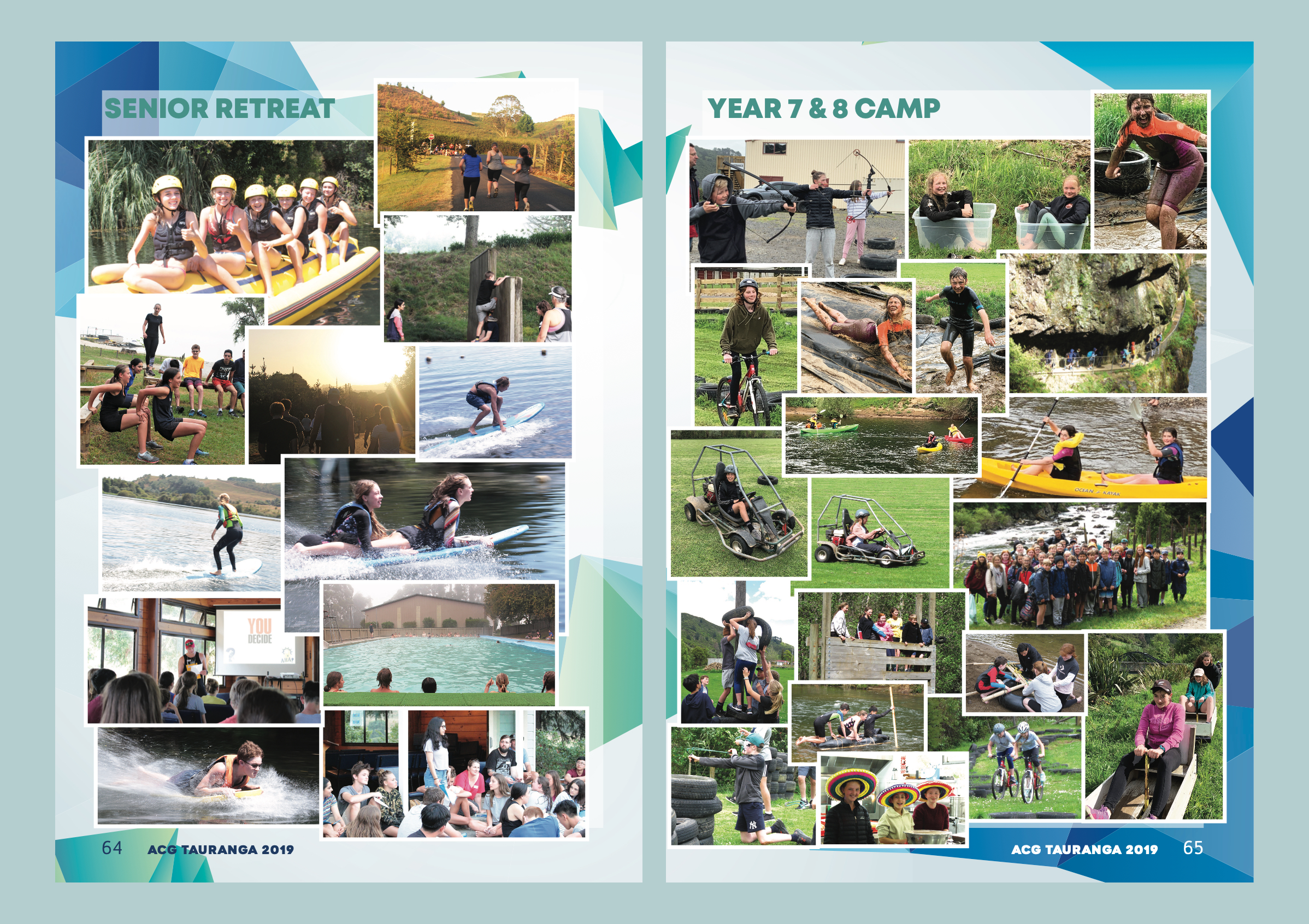
ACG Tauranga 2019 Yearbook
Share memories from camp or a school event with a simple photo collage. This yearbook spread has a thin border around each overlapping image to retain structure and definition.
Front & Centre
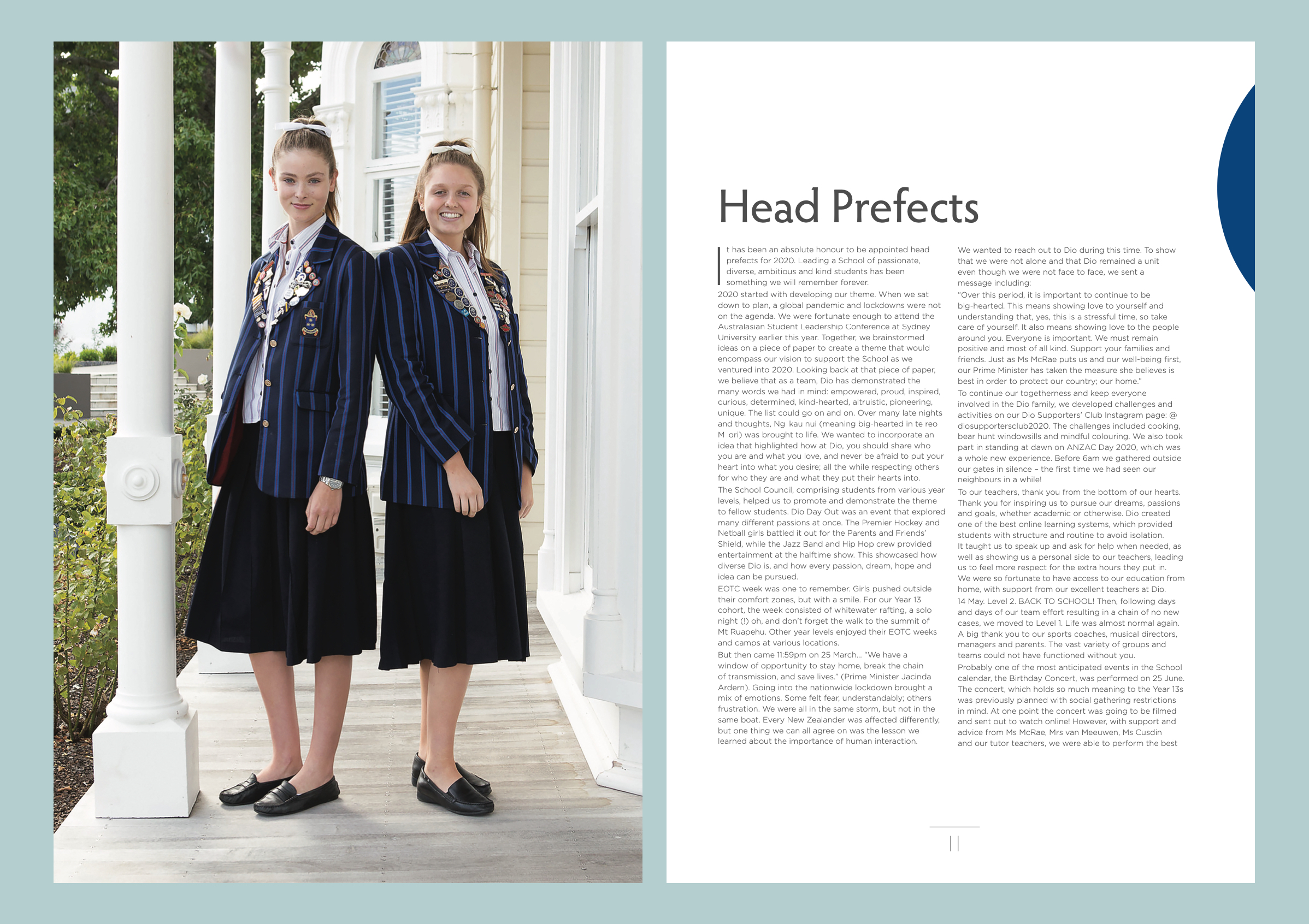
Diocesan School for Girls 2020 Yearbook
Sometimes simplifying your imagery is the best choice. For a professional and bold page spread, select one high-quality image to take centre stage.
Paint & Patterns
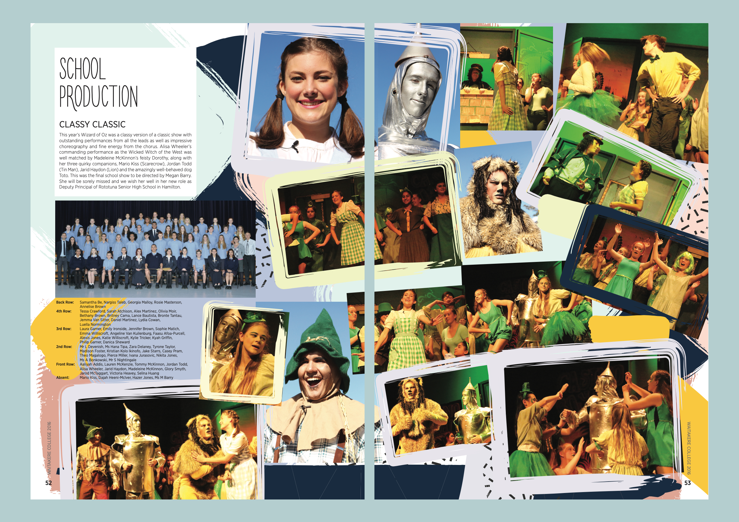
Waitakere College 2016 Yearbook
Add texture and dimension with some artistic elements. This Waitakere College yearbook includes illustrated patterns and borders that bring colour and energy to the pages.
Stories With Photos
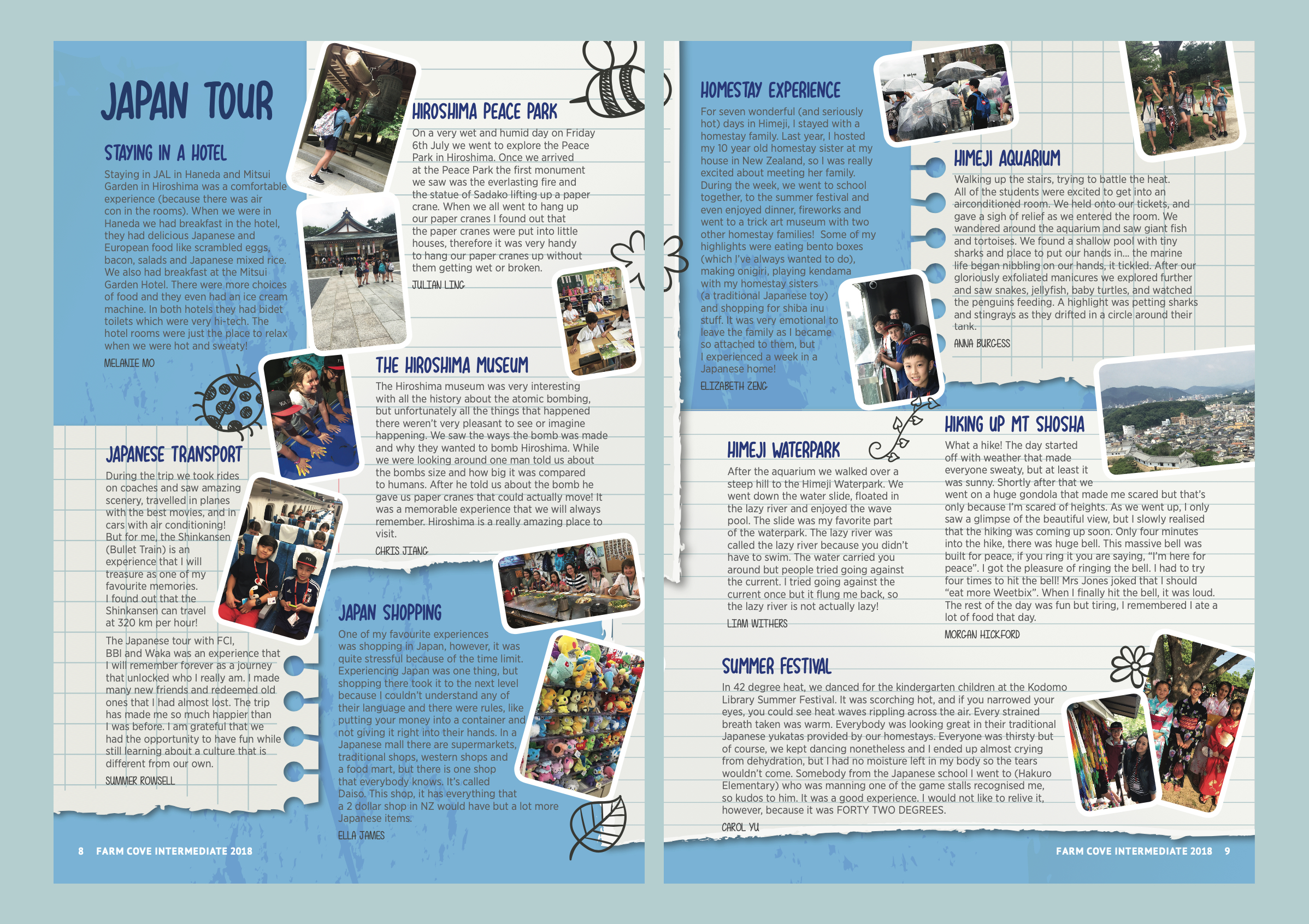
Farm Cove Intermediate School 2018 Yearbook
Display some small photos alongside your content for more of a scrapbook look. This style is perfect for an informal yearbook or leavers’ book.
Circles & Squares
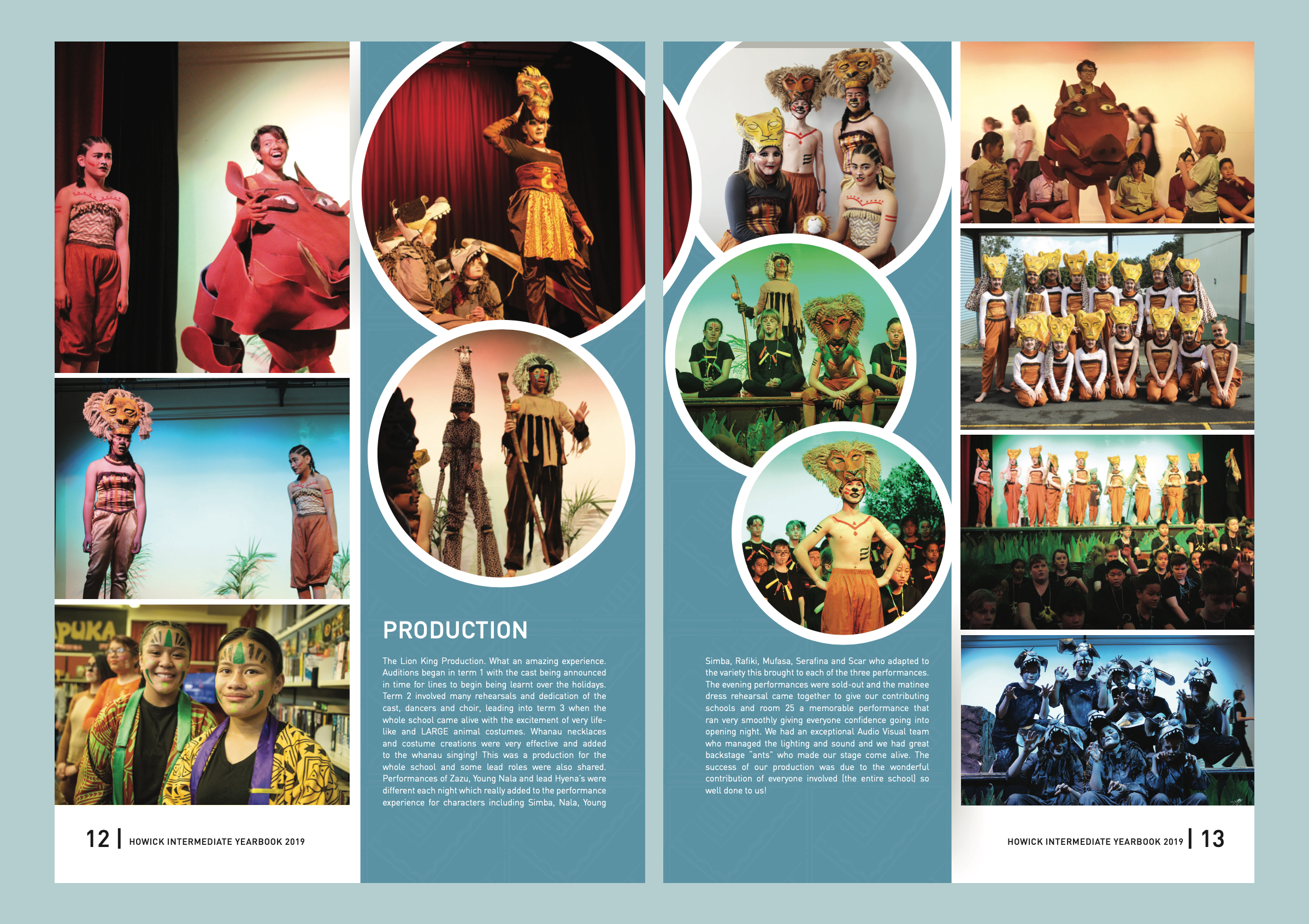
Howick Intermediate 2019 Yearbook
Photos don’t all need to be the same shape. This yearbook spread for Howick Intermediate includes both circular and square images. Each image has a thick white border to add contrast and make the photos pop!
School Motifs
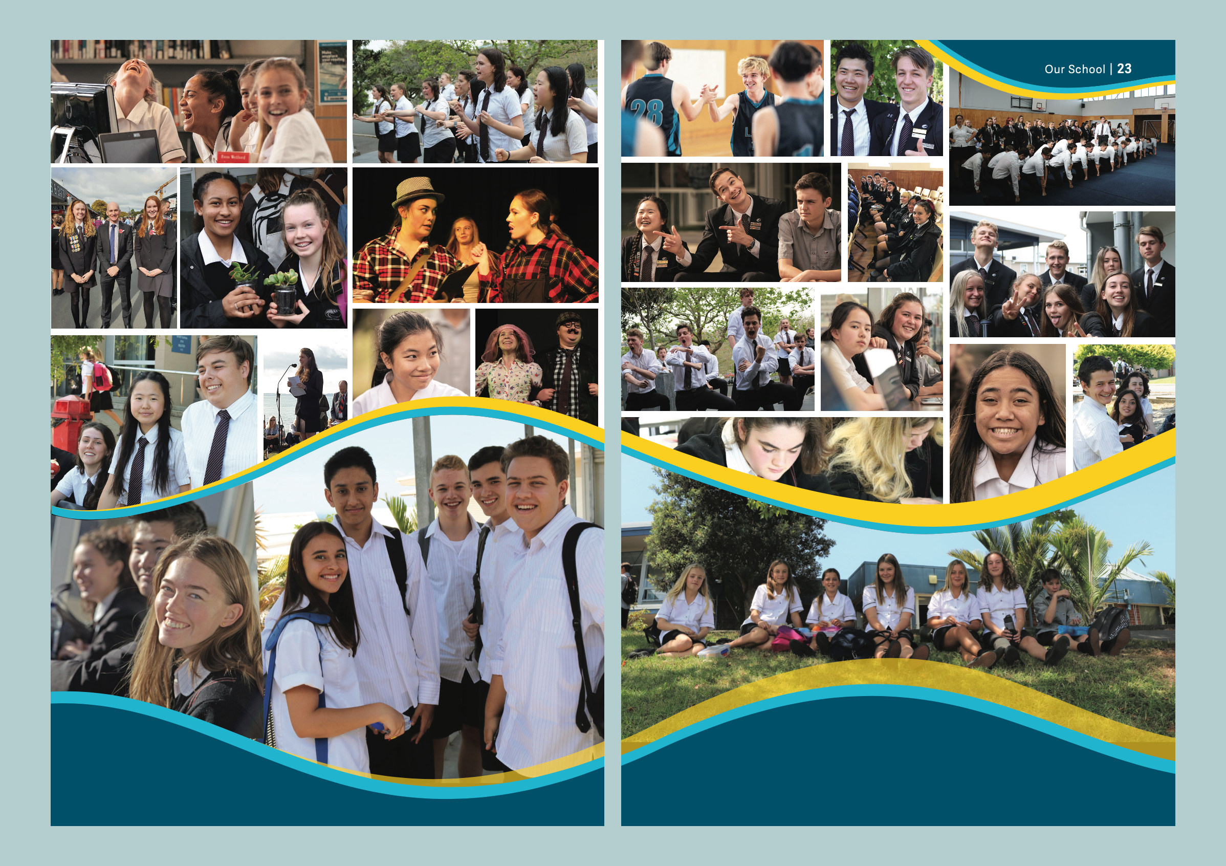
Long Bay College 2019 Yearbook
Include your school motif in your photo spread. This Long Bay College yearbook includes the school’s wave motif, bringing movement and energy to the design.
Square & Structured
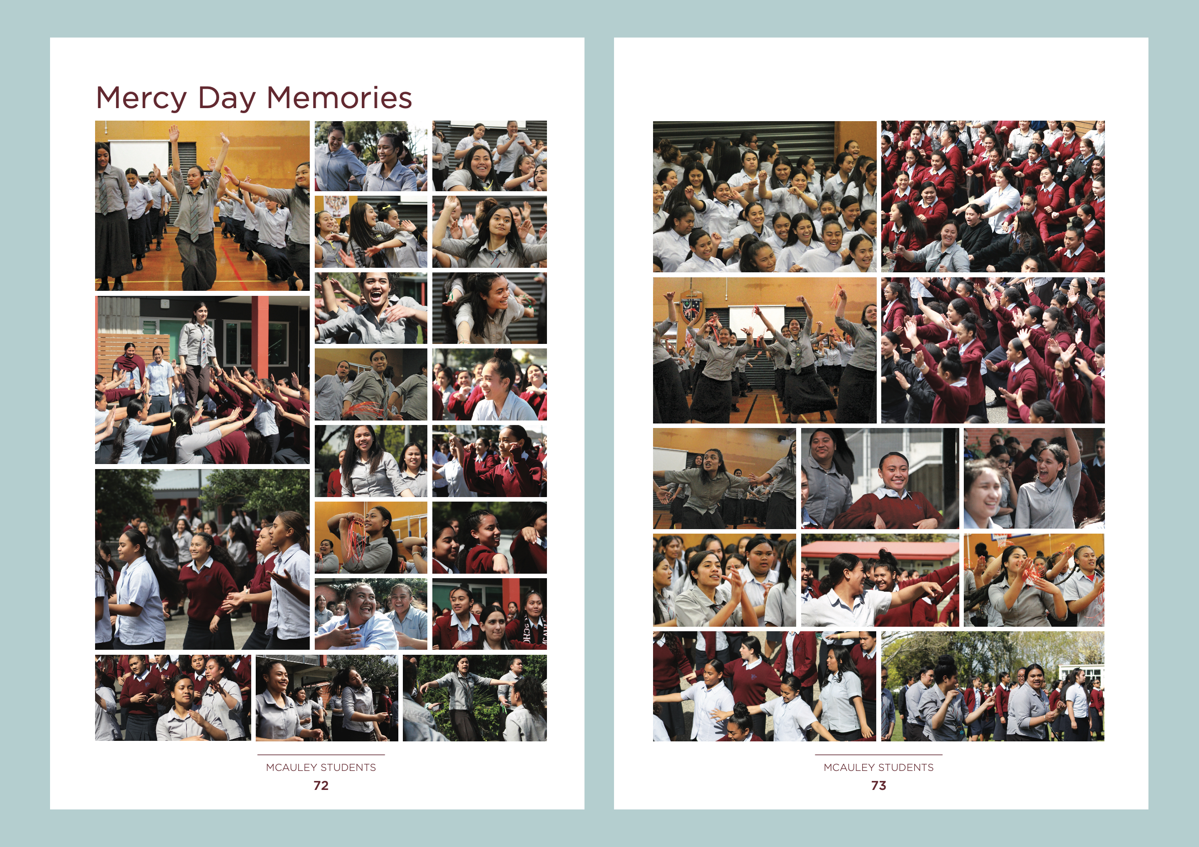
McAuley High School 2018 Yearbook
If you wish to use lots of photos but want to maintain a sophisticated design, try out a grid structure! Uniform, well-spaced images keep the page looking orderly and uncluttered.
Student-Focused
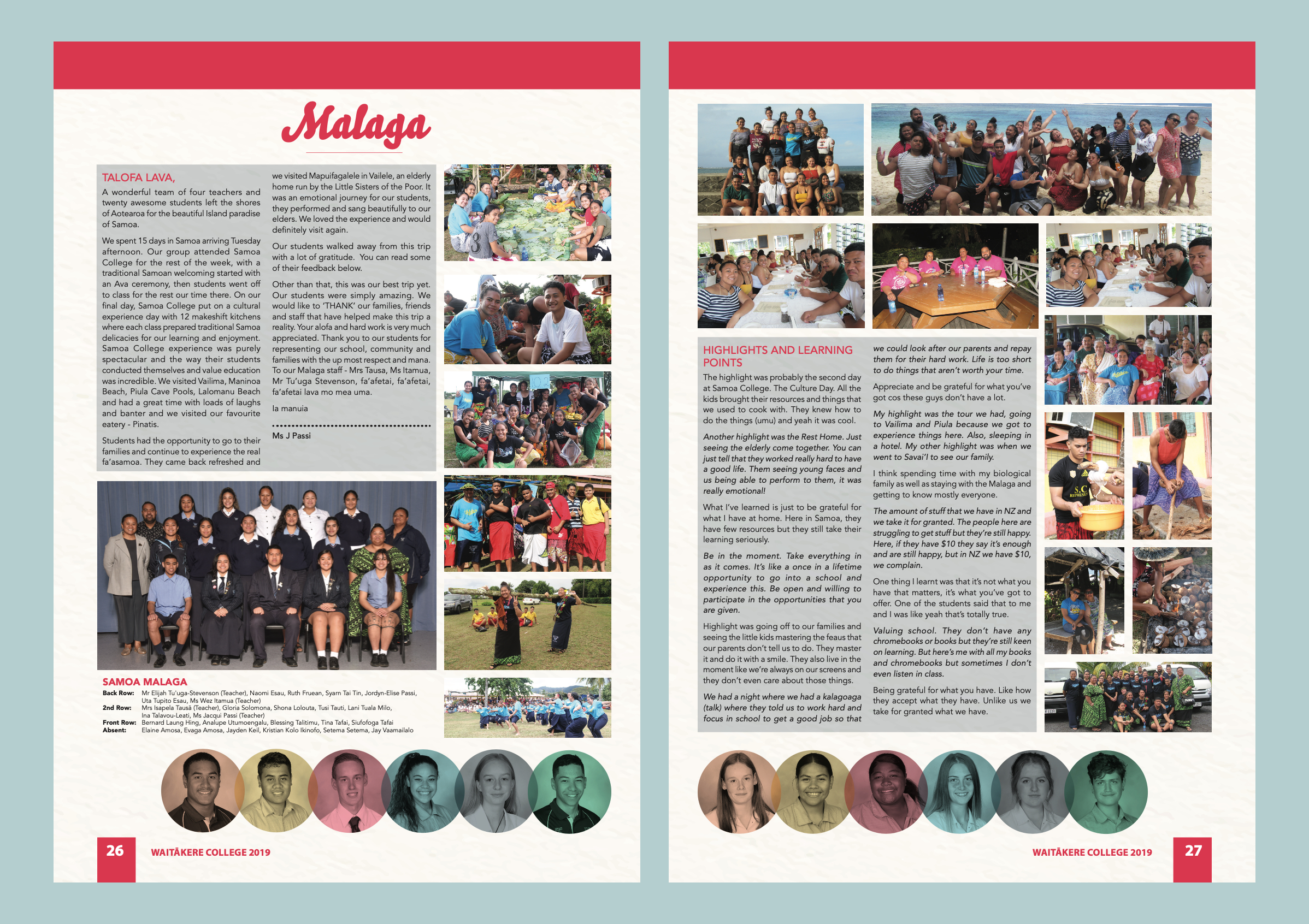
Waitakere College 2019 Yearbook
Here is a creative way to make sure you include all your students in the yearbook! This yearbook incorporates small coloured images of students along the bottom of each page.
Angled Images
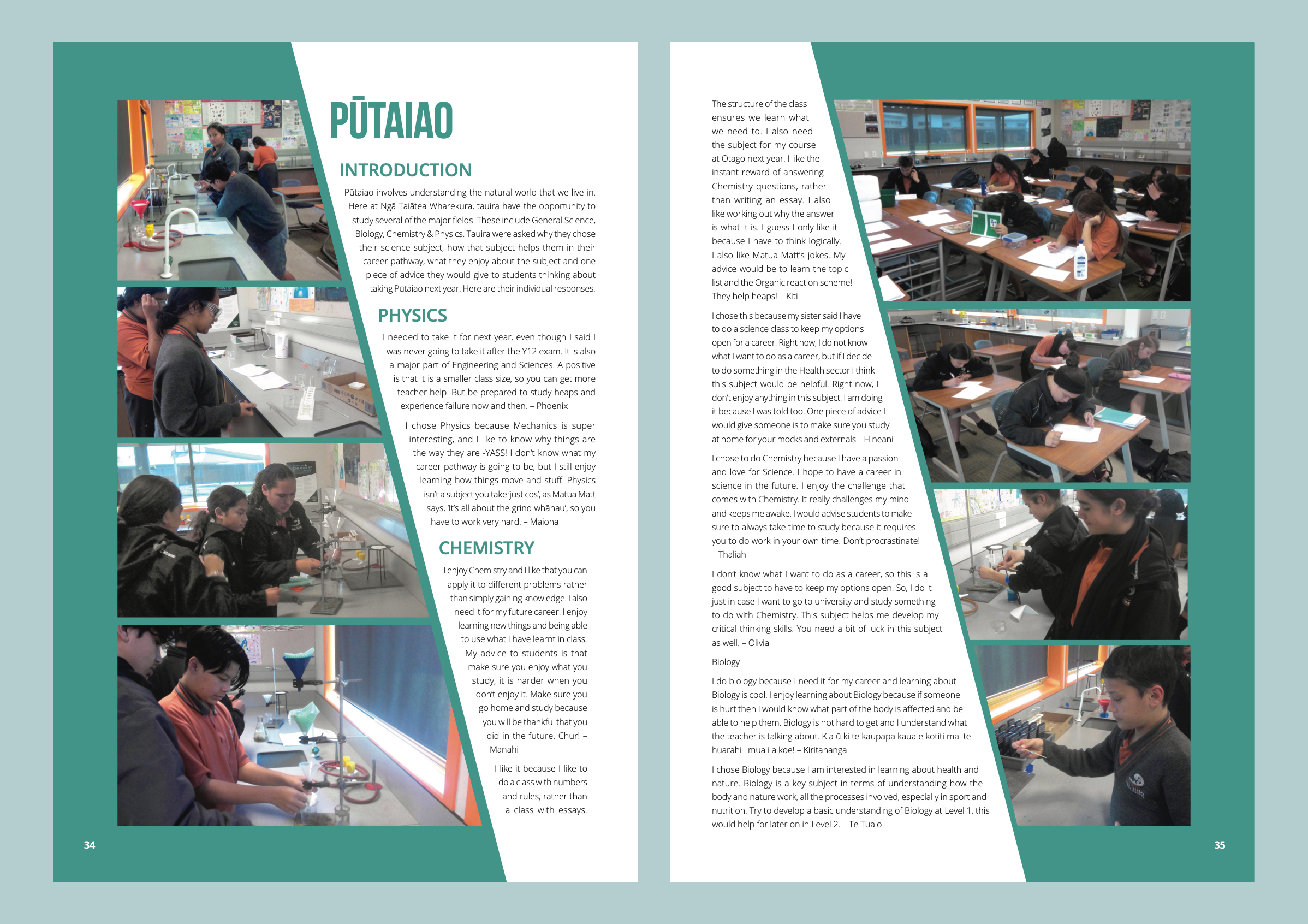
Nga Taiatea Wharekura 2018 Yearbook
Choose a unique format for your text with photos to match! Here, the images help to frame the written content and reinforce the angled structure.
Circular Photos
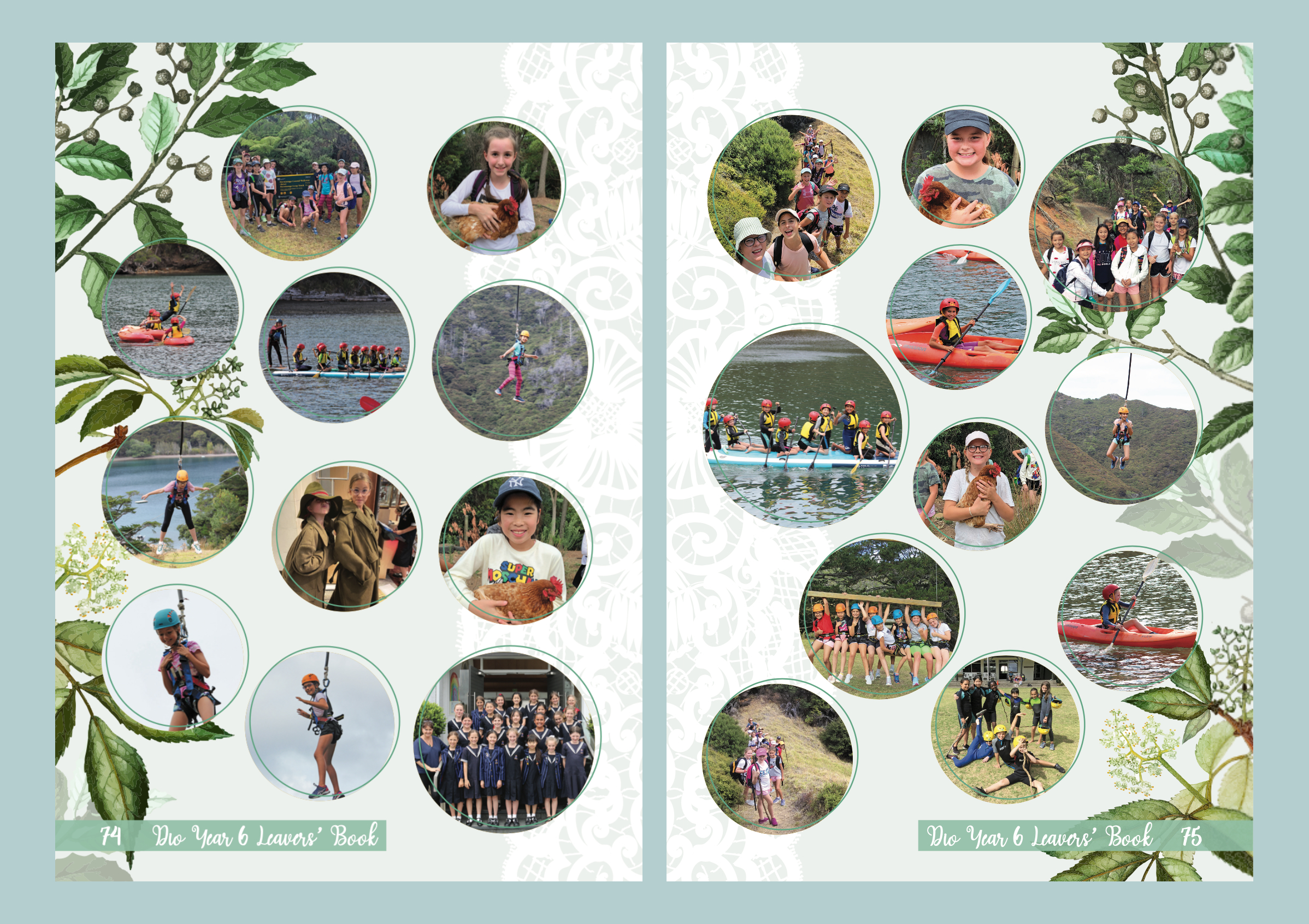
Diocesan School for Girls Year 6 Leavers’ Book
A circular photo spread brings a softer look to your design. This leavers’ book includes circular images that complement the botanic theme.
Honeycomb Theme
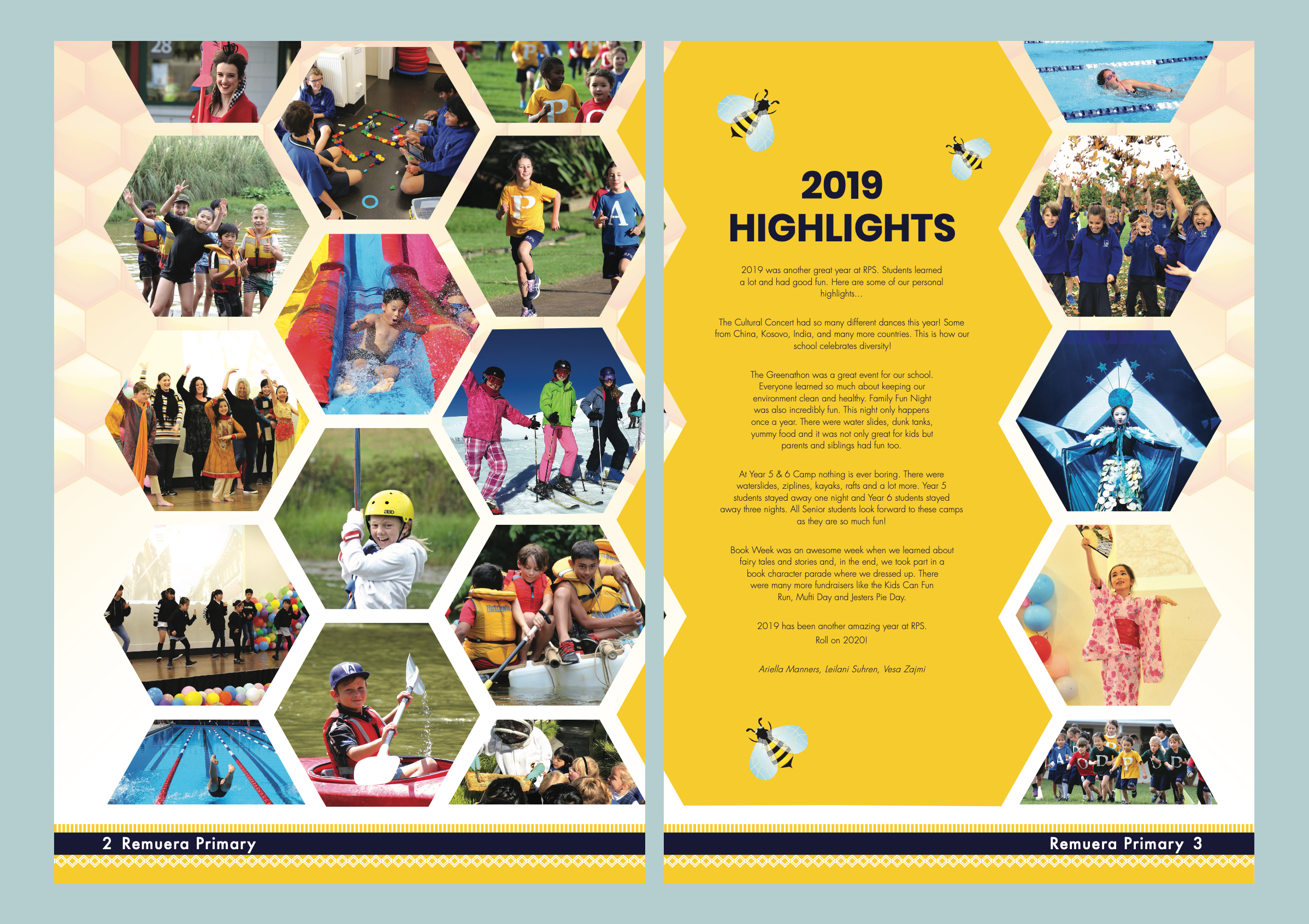
Remuera Primary School 2019 Yearbook
Photos don’t have to be square or circular, so why not shape them to suit your design theme? This yearbook includes cartoon bees and a honeycomb photo layout to match!
Bold & Geometric
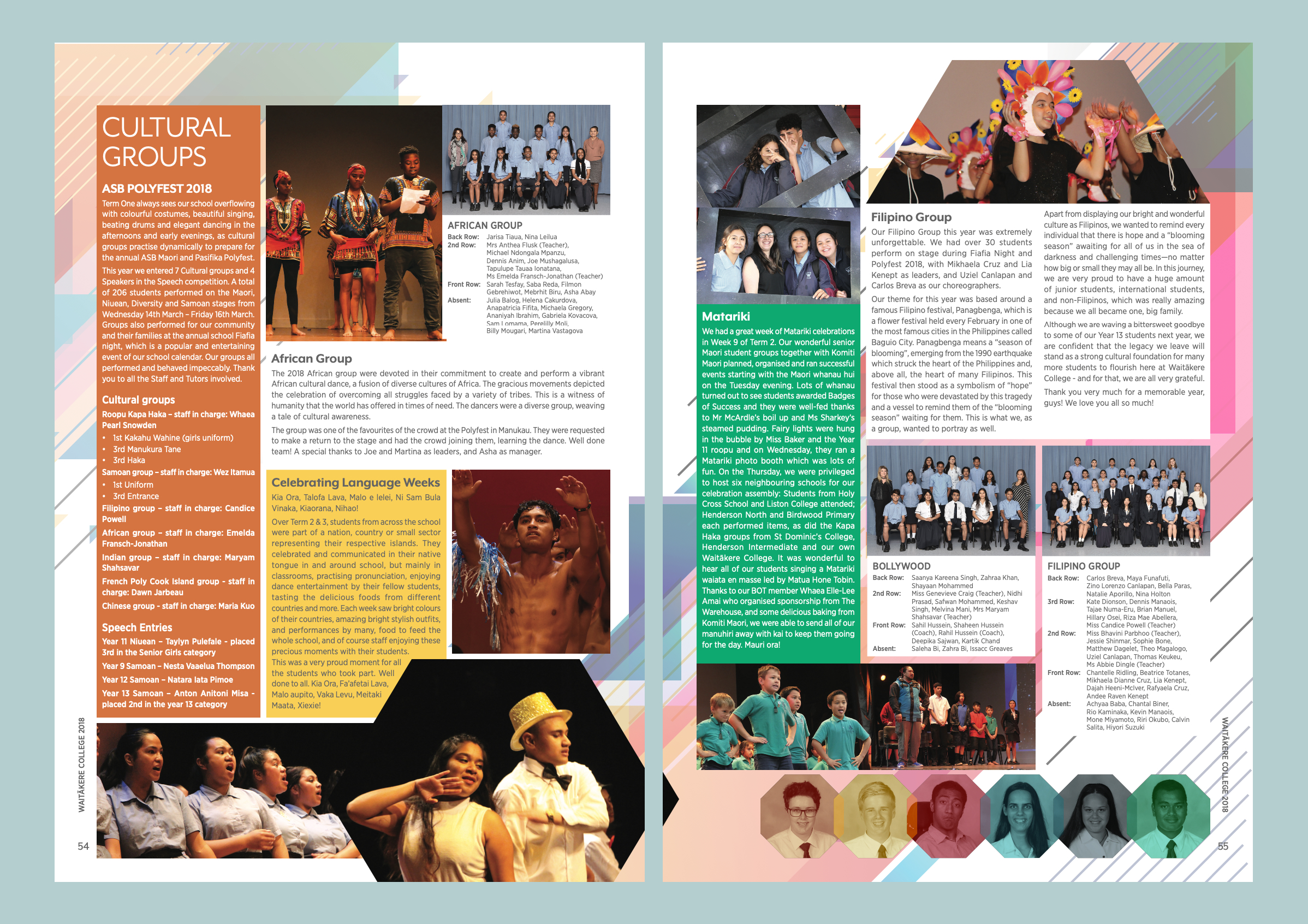
Waitakere College 2018 Yearbook
This yearbook spread includes photos in a variety of geometric shapes. There are no set rules for your images, so play around and create something truly unique to your school!
