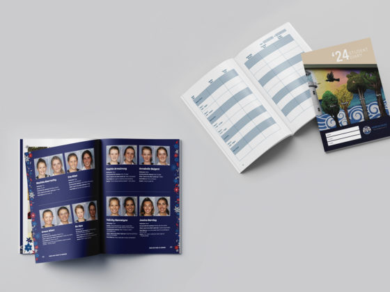
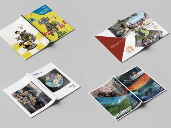
A motif is a repeated design element used to create consistency and tell a story. Lots of yearbooks and leavers’ books use motifs so that the book flows from beginning to end. But you can also use a single motif more broadly across your school communications. This helps to create a strong and recognisable school brand.
Here are some motif tips to try for your next school publication!
Create a Colour Palette
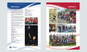
Somerville Intermediate
A good first step for creating a motif is to pick your colour palette. Use your school colours or shades that suit the theme of the publications.
Make your motif adaptable and ensure it looks great in a few different shades. This way, you can vary the colour based on the page content. For example, use different colours on pages for different school houses or year groups!
Play With Opacity
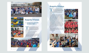
Somerville Intermediate
A motif doesn’t need to be the focal point of your page design. In fact, sometimes subtle is best, especially on a busy page with lots of content. Varying the motif opacity makes it easier to use across a range of pages or publications. Display it bold and in the foreground or faded as part of the background.
Add Depth & Movement
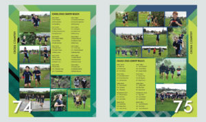
ACG Strathallan
Make your static pages come to life and use a motif filled with energy! Overlap layers, add texture and 3D effects to create depth and movement on your page.
Embrace a Theme
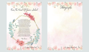
Diocesan School for Girls
A motif is a great way to tie a theme together or build excitement for an event. Create a motif for your specialised book, event invites, or school calendar.
Tell Your Story

Northcross Intermediate School
There are lots of options when choosing a great motif, so it’s best to pick one that is personal to your school or the publication type. The pattern you choose for a school prospectus may be different from your leavers’ book. Think about the message you wish to send and design around that – is this book professional, fun, or sentimental?
Mix It Up
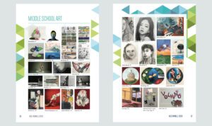
ACG Parnell College
Change up the position of your motif on each page to keep things interesting! This gives you more creative freedom when it comes to busy pages.
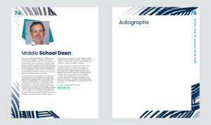
Kristin School
Why not try a motif that doubles as a page border or background? This is a practical and useful way to incorporate your pattern.
Consider Negative Space

Kristin School
Designing requires you to think just as much about what isn’t on the page as what is on the page. A design that is too busy won’t have the desired effect and can confuse your message. Instead, opt for negative space on the page and around your motif. This will help your pattern pop!
Does It Work Across Multiple Mediums?
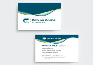
Long Bay College
If you plan to use your motif as part of your school branding, make sure it works across different platforms. Is it versatile enough to work across a school prospectus, a business card and a website?
You could even create variations of your motif depending on the medium. For example, it could be a moving feature on your school website, like Long Bay College’s use of their wave motif. This is a great way to make your design come to life!
Create Motif Variations
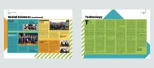
St Mary’s College
Not every page and publication is the same, so try out a few variations of your motif that can be used interchangeably. Vary the size, colours and pattern – just ensure it all still looks connected.
Make It Unique
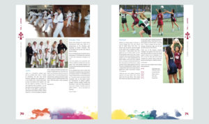
Carmel College
A motif is an opportunity to set your school apart and create something that looks unique. So make sure to use an original design for a one of a kind look!


