Gladstone Primary School
Are you unsure what colours to use in your next school yearbook? Instead of narrowing your choices down, why not use them all?!
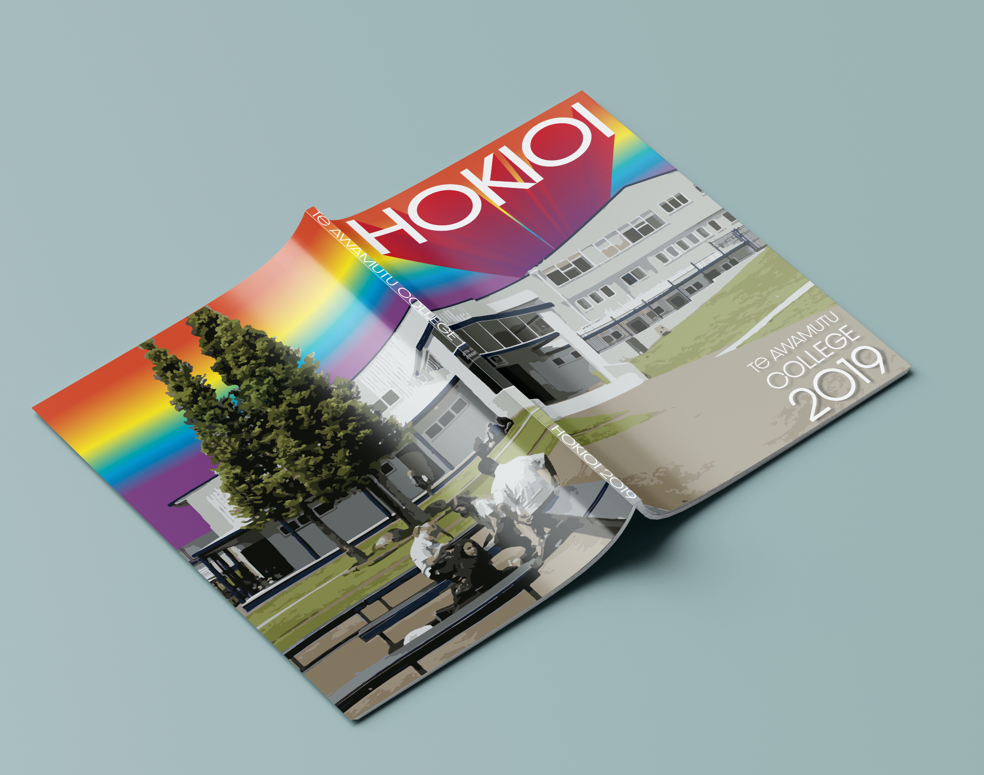
Te Awamutu College
A rainbow colour palette evokes optimism, energy and new beginnings, which makes it perfect for an end-of-year yearbook!
Waimauku School
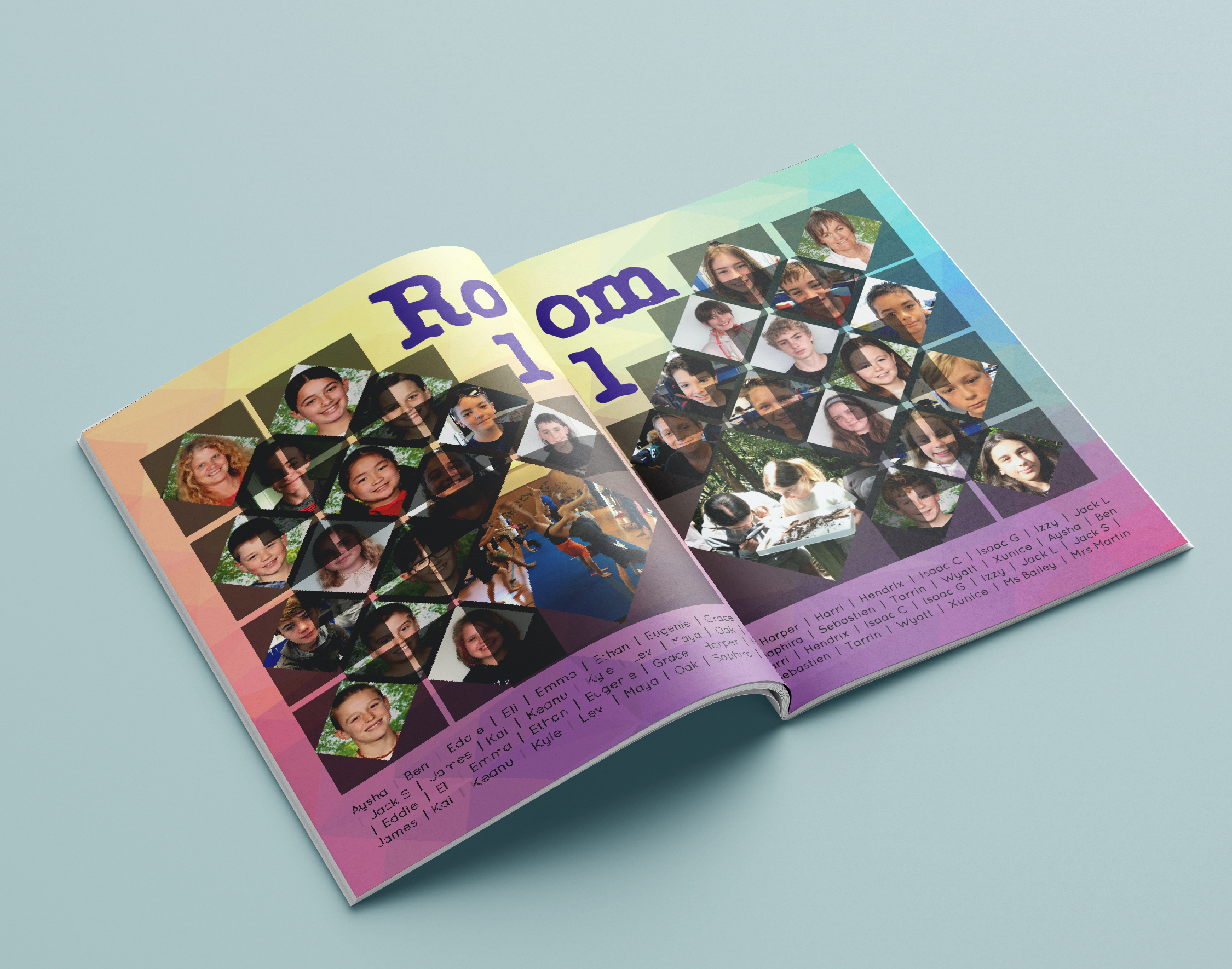
People are attracted to colourful shades and may be more likely to pick up your rainbow-coloured design! The bright colour palette lets readers know they are in for a fun read, making it perfect for a primary school yearbook.
Saint Kentigern College
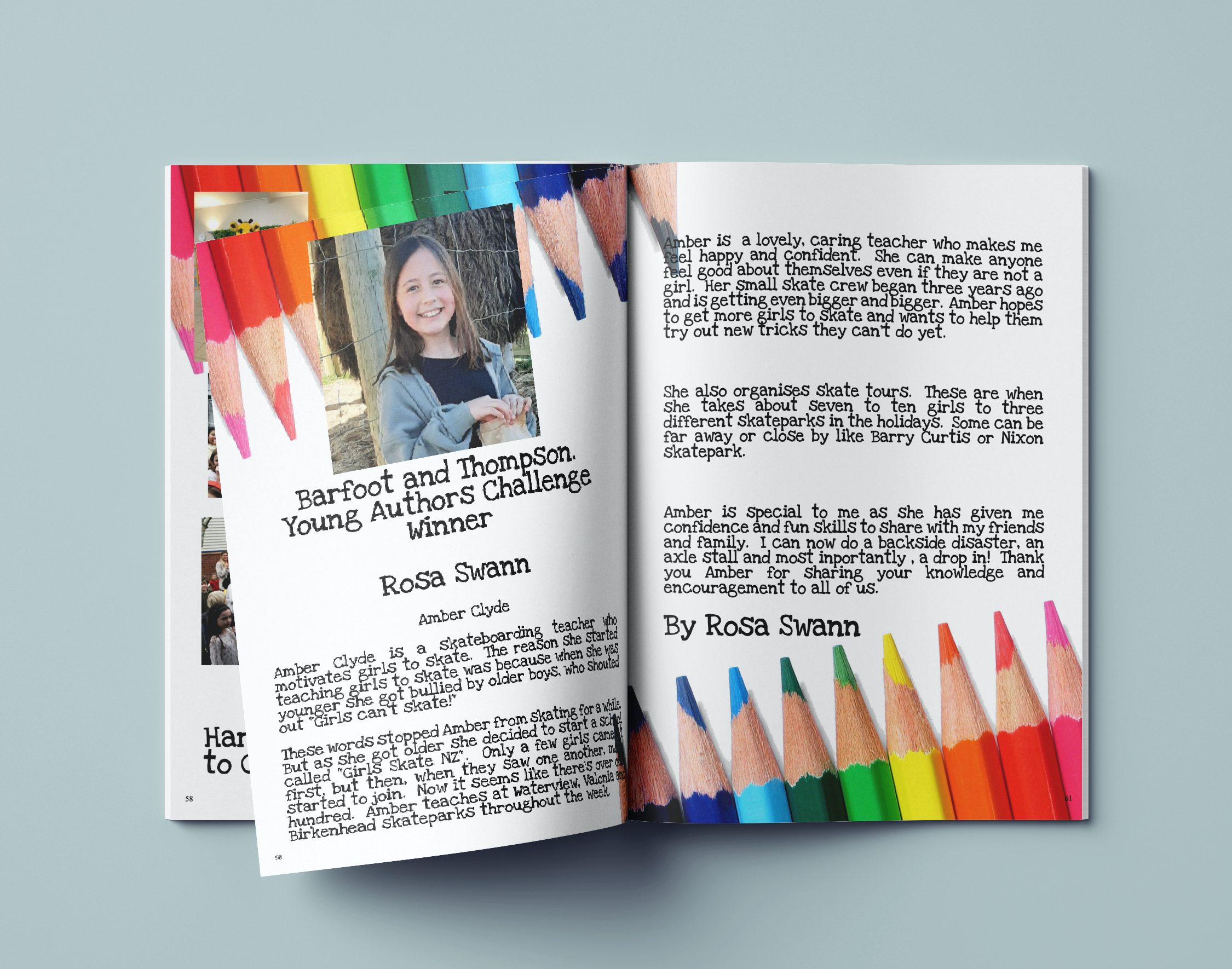
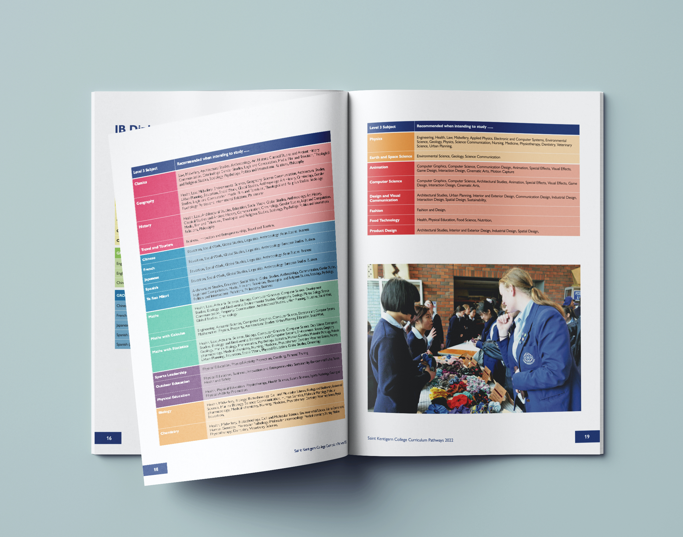
Using a wide range of contrasting colours is an excellent idea for infographics and flowcharts. The colours help to separate sections and to jazz up less exciting content.
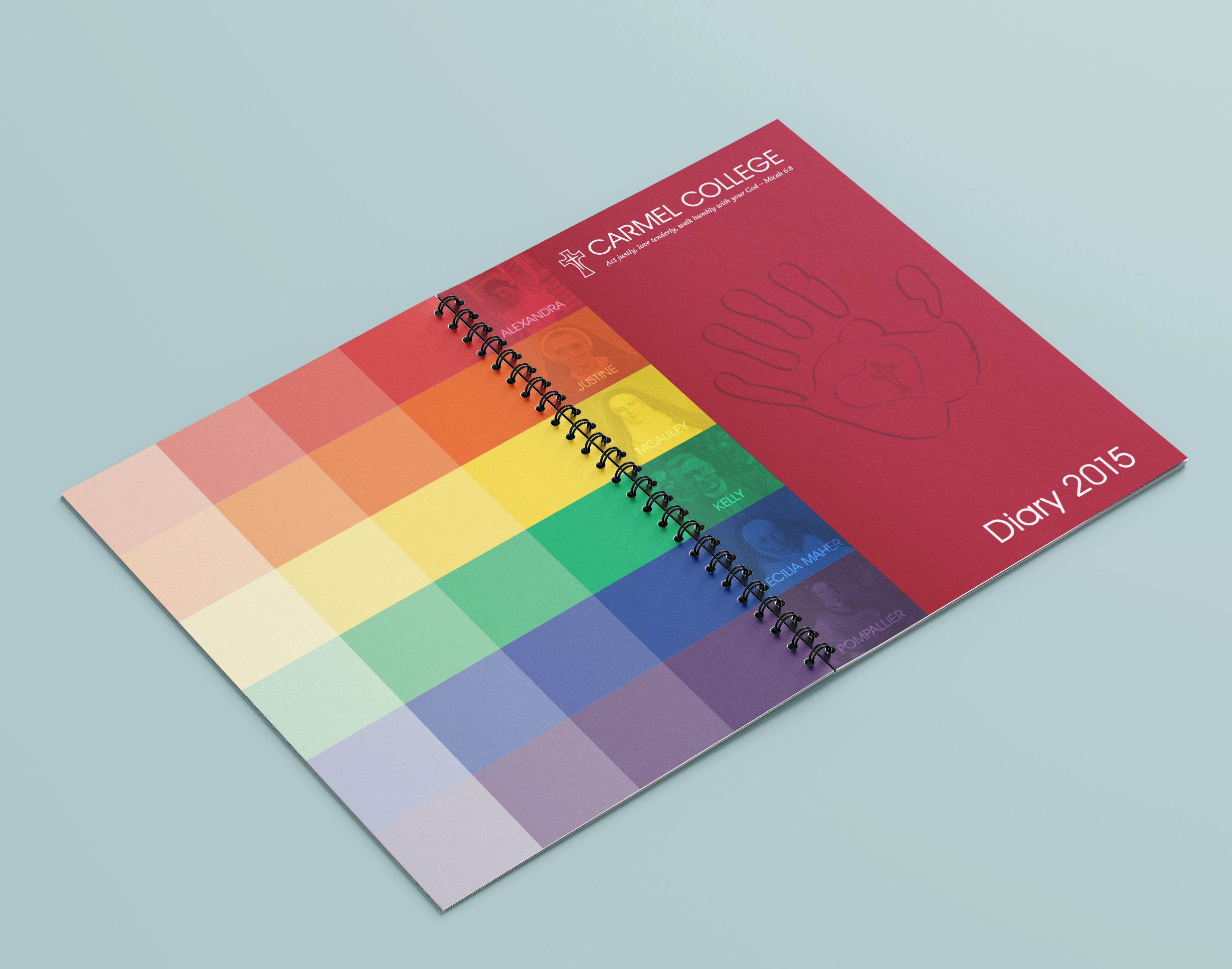
Carmel College
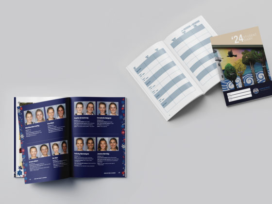
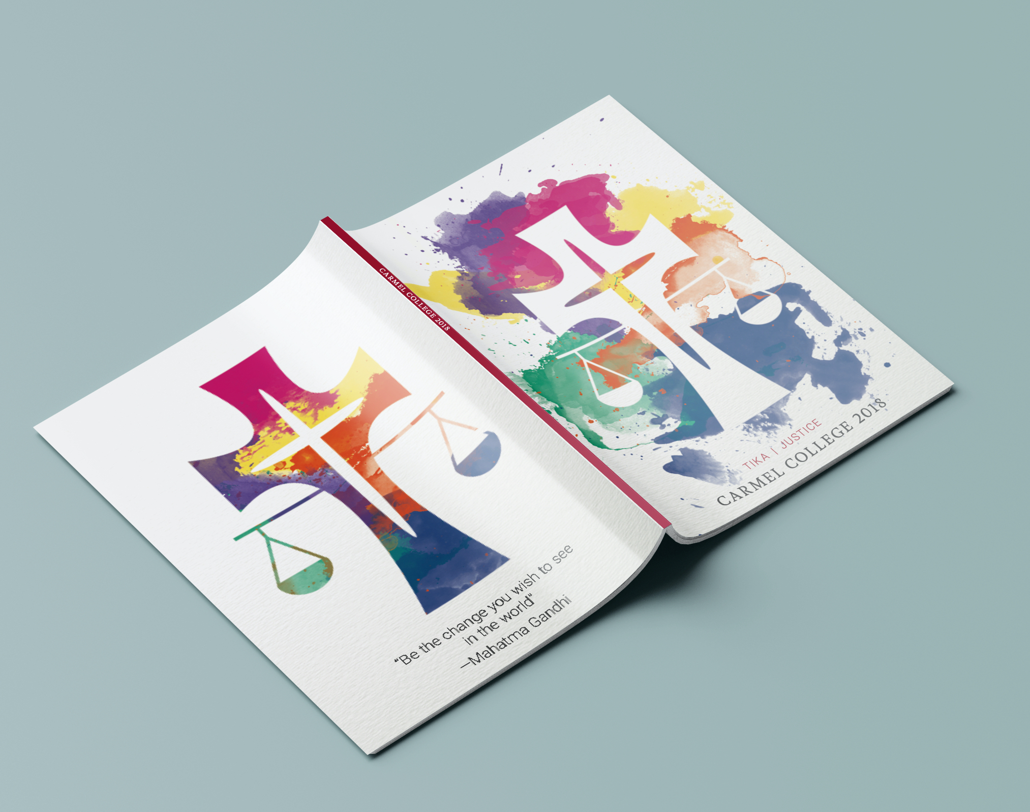
Pair your bold colour palette with lots of white space. Not only does this give your reader’s eyes a break, but it can also make the bright shades stand out more.
Farm Cove Intermediate
A rainbow colour palette is a bold choice, but you can always tone it down to better suit your theme.
Waimauku School
Try only incorporating a rainbow border, or pick more muted shades for a softer look.
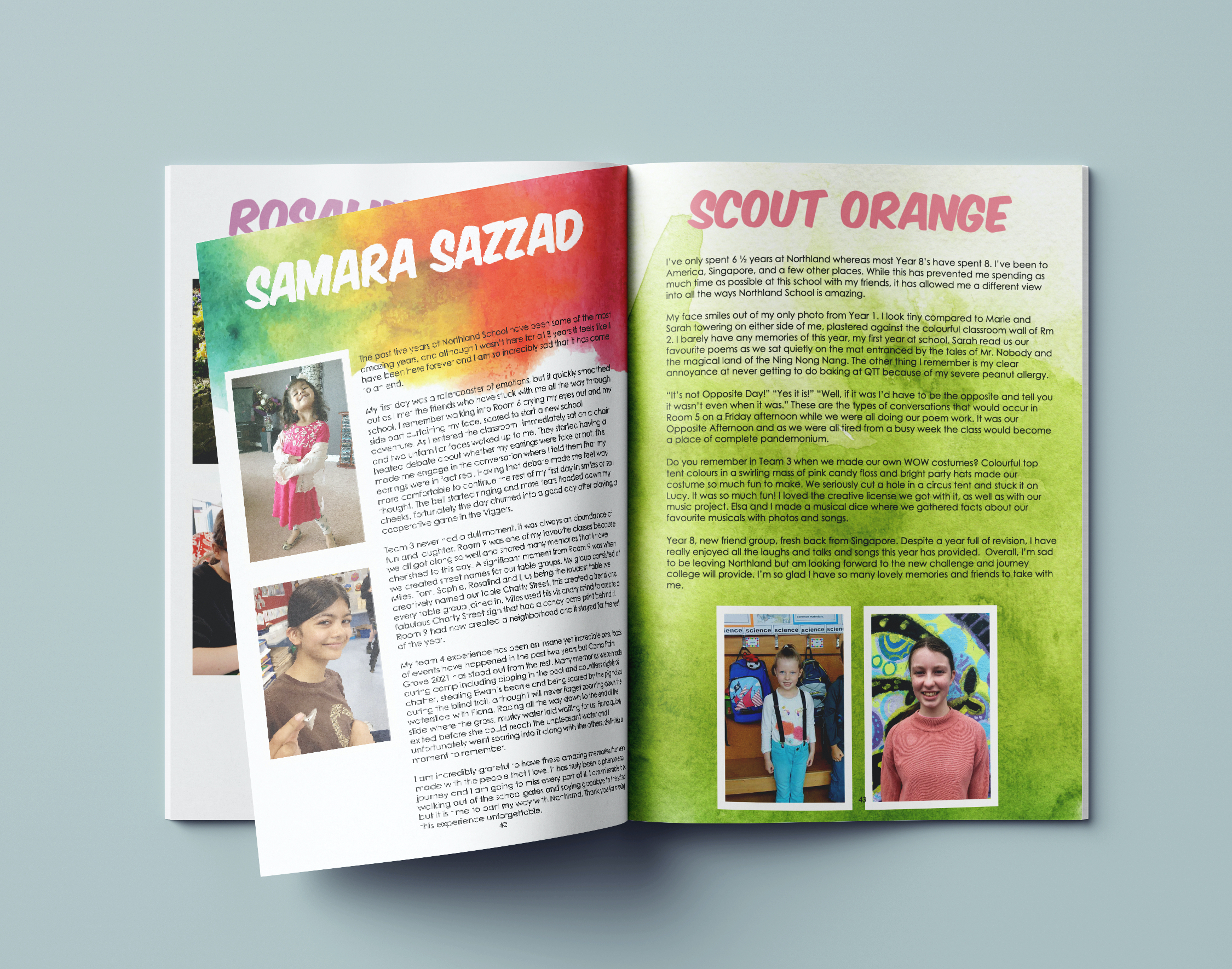
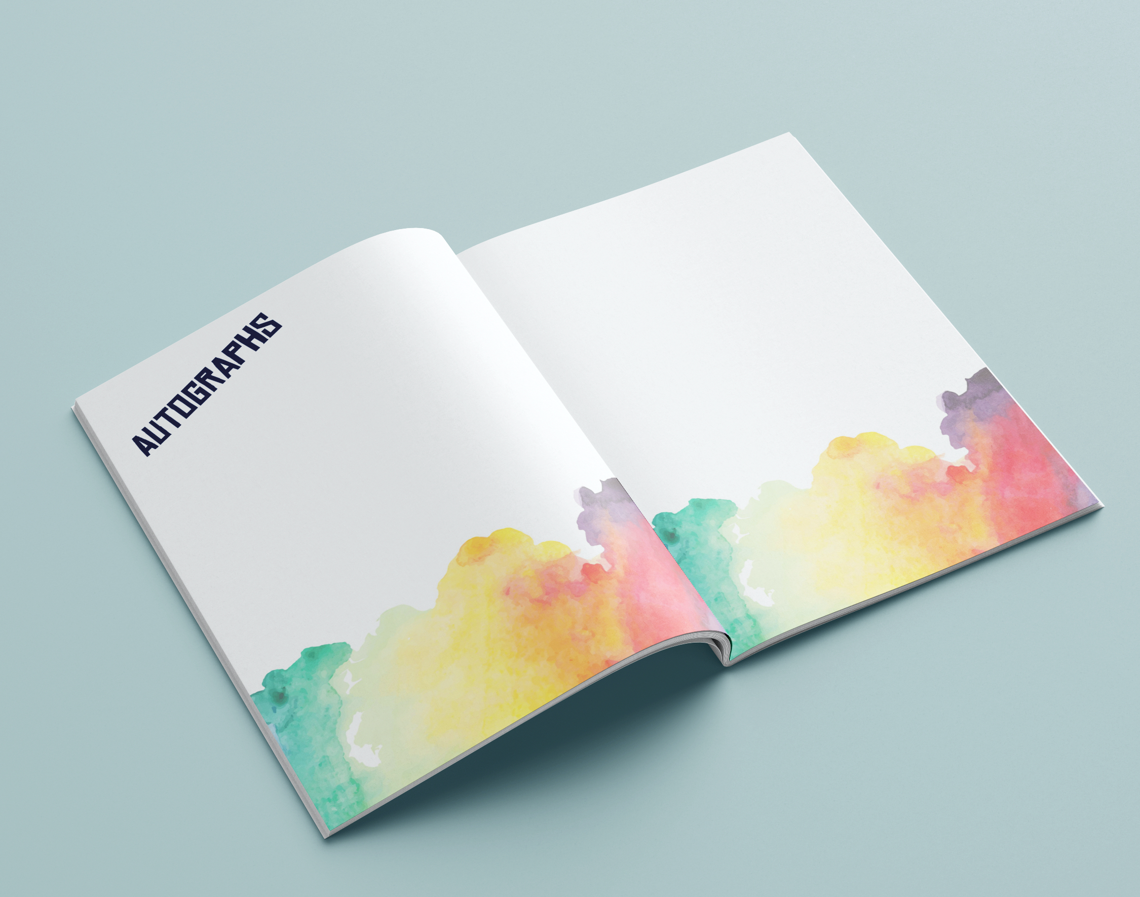
Northland School
Using rainbow shades gives you lots of options when designing. Some sections or pages may require a light background, whereas others might need to stand out. With many colours at your disposal, you can mix and match as you see fit.
Carmel College
While a rainbow colour palette gives your pages a bright and contrasting look, it’s important that the shades you pick still look cohesive. The easiest way to do this is by choosing colours of equal brightness and saturation.
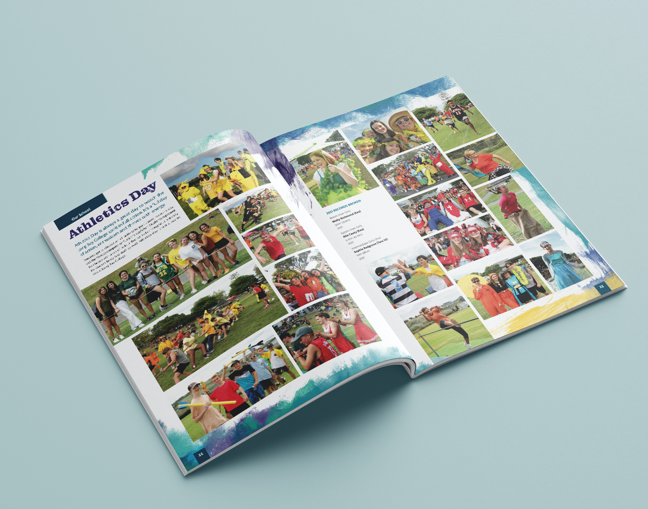
Long Bay College
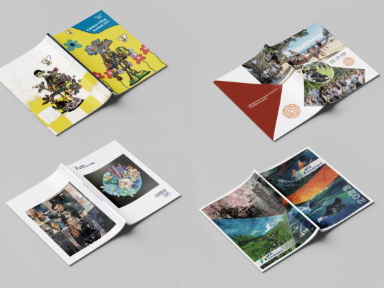
Not sure if a rainbow yearbook theme is for you? Check out some other colour palette ideas from our clients!