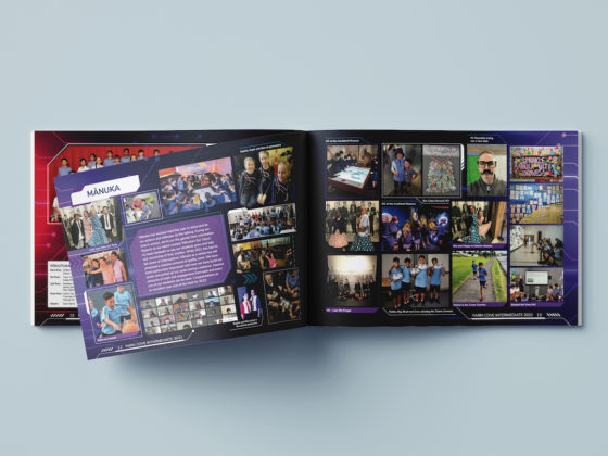
The creative options in yearbook design are endless — colour choice, fonts and the style you select will all influence the final product. It can be a little overwhelming! To help you move forward, it pays to begin with an established ‘visual style guide’ and set some rules around how your yearbook should look.
Don’t Have a Visual Style Guide?
No problem, this is a perfect opportunity to create one by bringing together your yearbook team for a ‘mind-mapping’ exercise. Your team could comprise of teachers, students, management and even parents. The goal is to bring together all the visual elements that help paint a picture of your school, including:
- Location – are you close to a distinctive landmark?
- Your school logo – perhaps it has elements that you can use in a new way?
- Colours and fonts – what does the school use in its publications?
- Historical images – of the school and the community
- Distinctive school architecture
Using a whiteboard or post-it notes, start to build a picture of your school’s ‘characteristics’—its goals, achievements and role in the community.
To help get things started, ask participants to choose three words that define what the school means to them. If the school was a person – how would you describe them? It might sound silly but it helps with generating ideas. You could get the group to rank these attributes to give you an idea of where the school’s priorities lie.
Collate this information and use it to formulate your visual style guide. Are achievement and formality important? Does your school value diversity? Is history an important connection? These values will help inform your design choices and establish guidelines for how your yearbook should look.
For some schools, the outcome might be a clean and minimal look; for others it could be bold colours and a more impromptu style. Don’t treat these as hard and fast rules though—good design often means bending the rules a little.
Yearbooks play an essential role in not only celebrating achievements and milestones; they also reinforce your school’s brand and identity.
You should have some fun with the look and content, after all, yearbooks should be interesting to read! But it’s worth ensuring that the style retains some consistency with your school’s other publications and creating a Visual Style Guide will make this process a lot easier.


