At Spacific Creative, our years of experience have taught us that sometimes people do judge a book by its cover. That’s why we recommend spending a little extra time to create something special for the outside of your yearbook. First impressions count – it’s important to have a cover that gets people’s attention and makes them want to keep reading. After all, you’ve worked hard putting together the content on the inside, so you want to make sure people see it!
Be Decisive
Yearbooks typically have a front and back cover, and yearbooks with more than 64 pages can also have a spine. Sometimes it’s best to start by making a list of all the elements you are required to include on the cover. Do you have to follow the same naming conventions as previous yearbooks you’ve made, or are you free to come up with your own title? Do you have to include the school logo, colours or motto? Maybe you want to use an inspiring quote from a famous role model? These elements can influence the cover design – for example, it’s not a good idea to use colours that clash with your school logo or make it hard to read.
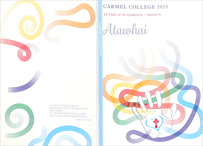
The design below shows the front, back and spine with an artistic design. The example at the top of the page from Westlake Girl’s uses a more traditional design.
Don’t be afraid to limit the number of elements that will go on the cover. Sometimes it can be tempting to cram in as much as possible, but a crowded cover design can put people off. At the other end of the spectrum, a minimalist design can be quite eye-catching.
Once you’ve decided on all the elements of the cover, try to stick with your decision. It can be tempting to keep adding pieces to keep everyone happy, but a clear decisive vision usually makes for a better cover than one designed by committee.
Be Creative
A yearbook cover is like a blank canvas – you have the freedom to do whatever you like. It’s a great chance to let your creativity run wild. Typically, the inside pages have structure, with lots of text and pictures, that restricts how creative you can be, but on the cover almost anything is possible. This can be a bit daunting though.
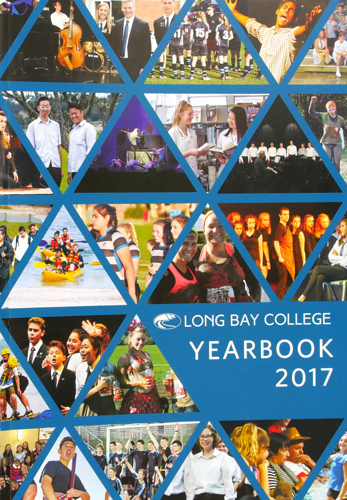
A yearbook cover can tell a story, so what kind of story do you want to tell? Start by trying to understand your audience – the students – and what kind of ‘feel’ or ‘atmosphere’ they would prefer to see: traditional and clean, or fun and artistic? Traditional designs typically use the school colours as the background, with the logo, year, school name, and motto. Artistic designs can use painted artworks, photo collages, hand drawn illustrations or funky fonts to give a totally different vibe.
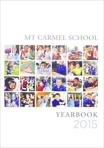
Below are some yearbooks that use photo collages to make effective cover designs.

Be Consistent
Your cover design should set the tone and expectations for the content that’s on the inside, so you want to make sure that you have a consistent theme. If your inside pages use lots of hand script text and pastel colours, it’s probably not a good idea to use bright colours and bold headings on the cover.
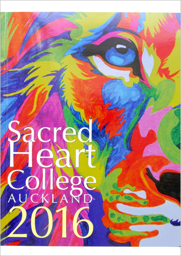
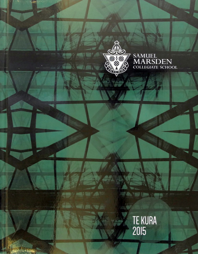
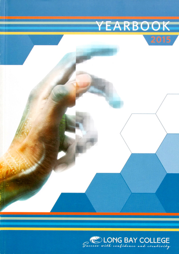
Since the majority of the content on the inside of your yearbook is about the students, why not get their help with the cover? Student artworks are the most common theme for yearbook covers because it sums up exactly what a yearbook is all about – a showcase of the talent and achievements throughout the year. You could even hold a design competition and let everyone from the school vote on the winner, which is a great way to get the whole school involved and make people excited to see the finished product.
Below are some examples of student cover designs that use student artworks.
Be Inspired
Luckily, you’re not the first person to create a yearbook – there are plenty of cover designs out there that you can get inspiration from. Over the past 16 years, we’ve helped more than 100 schools design stunning publications, so If you’re struggling to come up with the perfect look for your cover, why not take inspiration from one of them?
If you need inspiration to get you started, check out the Spacific Creative Pinterest boards or our article on Yearbook Design Trends for 2018.
Be Yourself
Making a yearbook cover is a chance to get creative, so don’t hold back. It’s the perfect opportunity for you and your students to say something unique. And most important of all: to have fun!
But if you get stuck, Spacific Creative is here to help. We have a variety of packages to choose from – you can either do it all yourself with our easy-to-use tools, or let us take care of the basics so you can collaborate with us on the fun creative parts.


