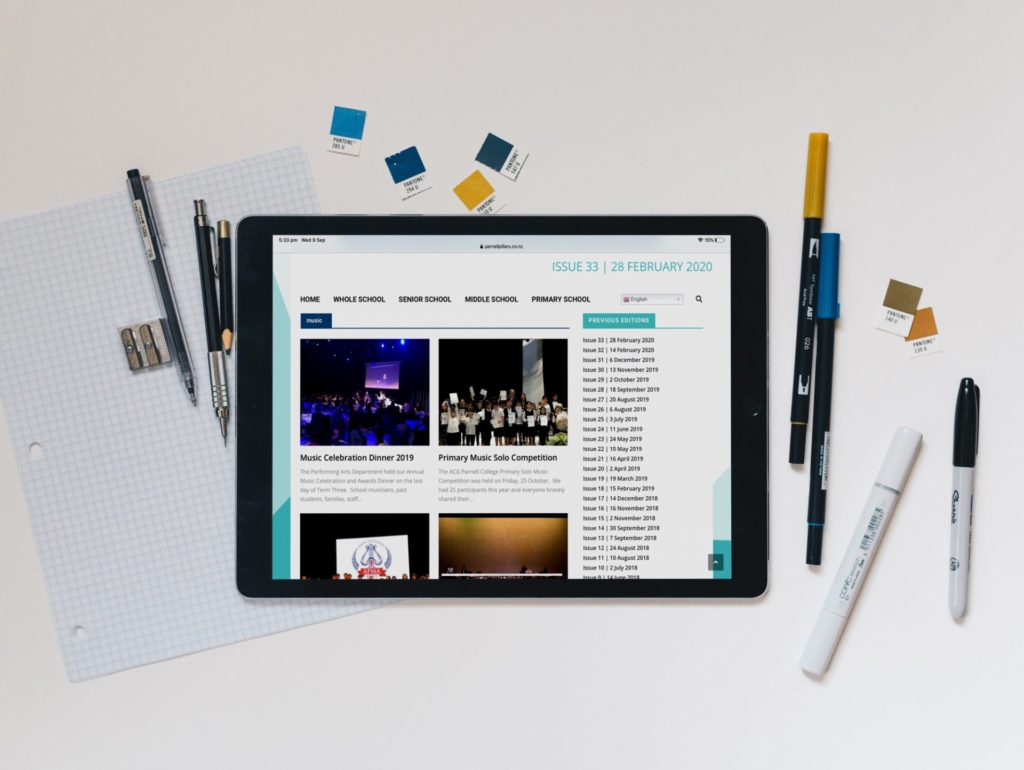
Whether you are designing an online newsletter, yearbook or updating the school website, there is lots to consider when creating digital content. The colours you use, content you add, and even the fonts need to be appropriate for web. The world is becoming increasingly digital, so even if there are no projects in the pipeline, it is still a good idea to brush up on your onscreen skills!
Colour

Colours that look great in print don’t always translate well on a computer screen. This is largely due to the difference between how RGB and CMYK colours are created, and the varying quality of digital displays. That is why there are some special rules to follow when designing for digital.
Colour Contrast
Colour contrast is important for design across all mediums. Text should be readable and stand out from the background. When designing for digital, you need to be aware that different screens can produce very different looks. What appears readable on one screen may be harder to discern on another. Adequate colour contrast will ensure your audience can decipher text and important elements. Test your design across devices or reduce your display brightness and see if the colours hold up.
Avoid Black
Pure black may look punchy and bold in print, but many advise against using it for digital design. Things that we perceive as black, e.g. roads or the night sky, really aren’t pure black. In fact, pure black can appear unnatural and can overpower your design. When printed, factors like lighting and the printing method can soften the look, but with web there is nowhere to hide! Instead of clicking #000000, opt for a very deep grey. This will appear as black to the viewer but will blend seamlessly with your design.
Muted Shades
Saturated colours are great for grabbing attention but use them sparingly. Staring at bold shades for too long can tire the eyes, so try and pick more muted tones for passages of text. Dark text on a white background is the easiest for people to read and to find important buttons or pages. Think of an art gallery: the white rooms helps to draw attention to the artwork without distracting from it. A simple and bright background will have the same effect and will let your content shine.
Different devices can display content very differently. View your work across different digital mediums, including some older devices to get a good idea of what your audience will see.
Images

We are typically told to ensure images are not small or pixelated. It is easy to forget that large images can also be a problem!
Designing for web means that you need to think about how your content will function. Large, high resolution images take longer to download and, in some cases, may not download at all. A slow load time due to large images can also impact your SEO score. This means you may appear lower in search engine results. If your images are very large, use a photo compression tool to reduce the file size.
Fonts
Different typefaces were developed with different mediums in mind. Early fonts intended for print media had to look great at a small size and be easy to read for large passages of text. These were typically serif fonts, with small dashes on the ends of each letter.
However, fonts that were easy to read in print were more challenging to decipher on screen. This was largely due to the low resolution of early digital devices. Sans-serif fonts became the go-to for web, and they remain popular today.
With print media, you have complete control over what the finished design will look like. Whereas with digital design, you rely on web browsers and different devices to display things well. Use very thin fonts with caution. Not only are they hard to read on some screens, certain browsers will render them differently. This means you have less control over your design.
Choose fonts that look clean and readable, and opt for generous line spacing. If you are still confused, websites like Google Fonts have free, web friendly options!
Content
Content that people enjoy consuming online is very different to what is enjoyed in print. Reading on a digital device is slower, and visual fatigue kicks in quicker. Online readers are also more likely to skim read content. To ensure your audience stays engaged and understands the topic at hand, keep text short and to the point. Shorter paragraphs paired with simple fonts are a recipe for success!
Images should enhance the written content but not be crucial for understanding the story. Not all devices will reliably load images, so keep all important information in the text.
The Upsides of Digital Content
Although there are many things to consider when designing for digital, there are also many upsides! While a book is more tactile, online content is more dynamic. Digital content can be updated easily, and can also include links and moving parts. Call-to-actions are easier to achieve in a digital format, whereas in print they require the reader to make more manual steps. Use this to your advantage!
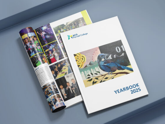
Want more content on all things digital? Read about the benefits of a digital newsletter or learn more about digital yearbooks!