Have you heard of the glitch effect?
It’s a modern design trend that makes photographs looked like they’ve glitched; perhaps a distortion or a cluster of visible pixels. Then there’s the ‘colour channels effect’ where designers take an image and distort it, creating a sort of holograph reality.
These are just a couple of the graphic design trends finding popularity out there in the big wide world, but there are some tried-and-tested principles of graphic design that never change.
While some people have a natural affinity toward good design, these tried-and-true, well-established design principles ensure that anyone can achieve great results.
In this post, we’ll look at three universal design principles:
- White Space
- Contrast
- Scale
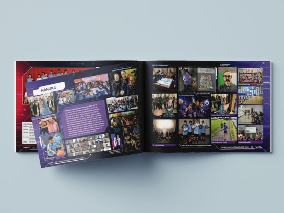
Before we look at these design principles, it’s beneficial to set up some gridlines in your software application. These gridlines not only serve as guides to help with alignment of your images and text, but they also bring structure and consistency to your layouts. For yearbooks, you need to think in terms of a two-page layout, with elements that span across both pages.
WHITE SPACE
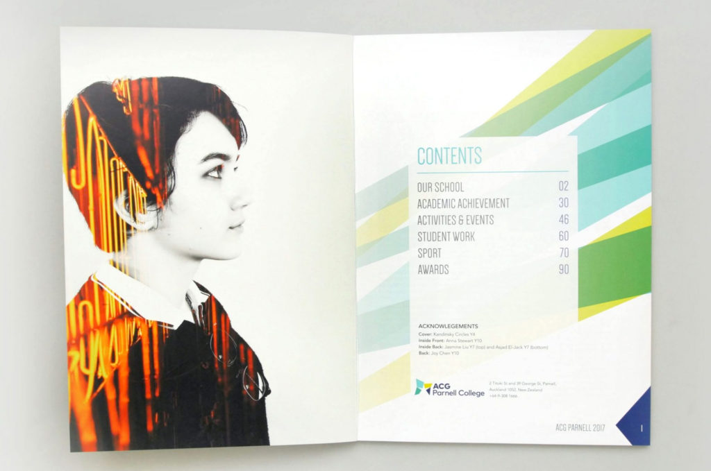
A layout with too many components can look crowded and confuse the viewer. White space (or negative space) refers to the blank areas in and around your page content. Preserving white space around your images and text makes your layout easier to ‘read’ and helps direct your audience to the important content.
CONTRAST
A classic case of poor contrast is where the background and font colour are too similar, making the text hard to read and causing eye strain. Generally, body text should be almost black or dark grey against a light background. Try to avoid light greys, greens and yellows for text. You can also improve contrast by using different typefaces. Make sure your headings are sufficiently different to your main text, in size, colour and font. This difference creates a sense of hierarchy that helps to direct the viewer’s gaze and tells them what is most important.
SCALE

Scale refers to the size and proportions of your design elements. Having one dominant image on the page is an effective use of scale. Upsizing an image and removing its background helps make an image stand out and easier to use in a design layout. The scale can also refer to patterns (e.g. a musical scale). Using repeating patterns in your design brings a sense of cohesion to your yearbook and reduces some of the
Who needs the glitch effect when you have white space, contrast and scale.


