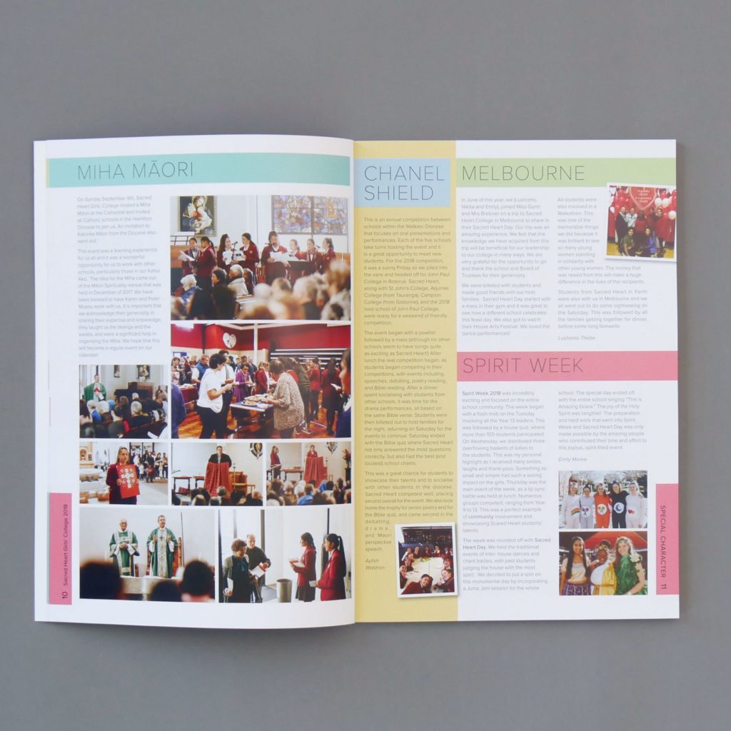
With a new year and new decade in full swing, let’s predict what will be big in colour for 2020! Colour plays an important role in a school yearbook. It reinforces your design theme, helps the reader to navigate the book and brings energy to the pages.
A lot of this year’s colour trends are ones we have seen before, only reinvented and used in different ways. A broad range of styles is evident in 2020 design, as people explore their creativity and step away from simplicity – anything goes!
Read on for some 2020 colour trends to incorporate in this year’s yearbook.
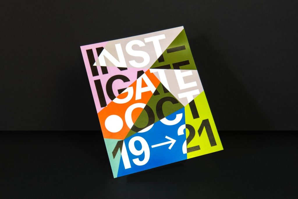
Neons & Futuristic Colours
Acidic neons and futuristic design have been on the rise, almost as a nod to the beginning of a new decade. Electric shades of green, pink and purple, often paired with black, give a striking and modern look.
In 2020, this trend will only develop, with the growth of AI technology and the release of cyberpunk video games. Expect to see more red and blue neon shades throughout the year.
Neon colour schemes are a great idea for fun primary school publications. Try incorporating neons in text, backgrounds and illustrations.
Muted Brights
While lots of 2020 design is forward-thinking and futuristic, an opposing trend has emerged. To evoke a sense of nostalgia, companies like Bose and Naturalizer are using retro-style colour palettes.
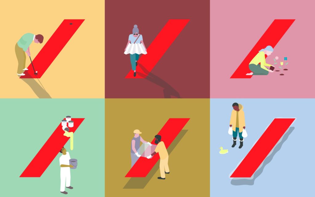
Try swapping bright colour palettes for muted shades, pastels or earthy tones. These colours are bright enough to attract attention but don’t detract from your content. Expect to see a lot of muted shades in colour blocking designs this year.
If you opt for a yearbook with muted brights, carry the trend through to your images for a cohesive book. Try toning down the saturation of photos so that they blend in with the colour theme.
Classic Blue
Blue is a popular colour choice for schools, with many using it as an official school colour. Spacific Creative also uses a range of blue shades in yearbooks as it gives books a professional and calm appearance.
While blue is always used generously, we may see it pop up even more in 2020. Pantone has chosen Classic Blue as the colour of the year, and state that it is:
“Instilling calm, confidence, and connection, this enduring blue hue highlights our desire for a dependable and stable foundation on which to build as we cross the threshold into a new era.”[i]
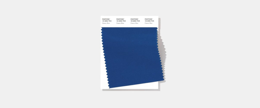
This shade of blue is versatile and would make a great addition to a primary or high school yearbook.
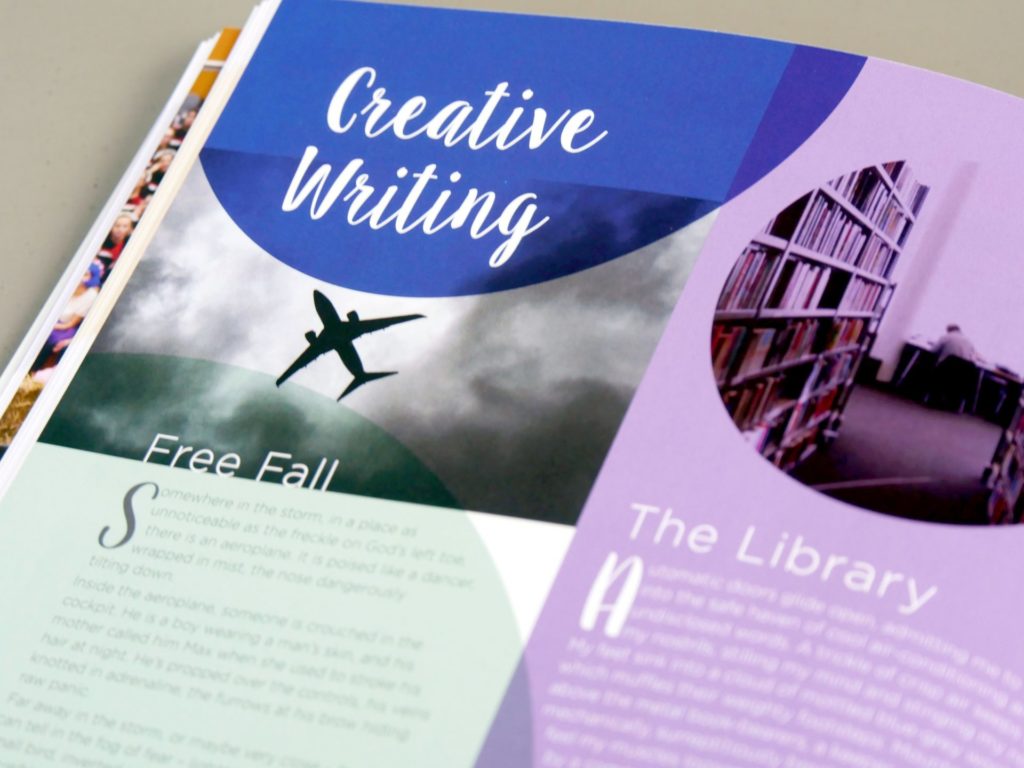
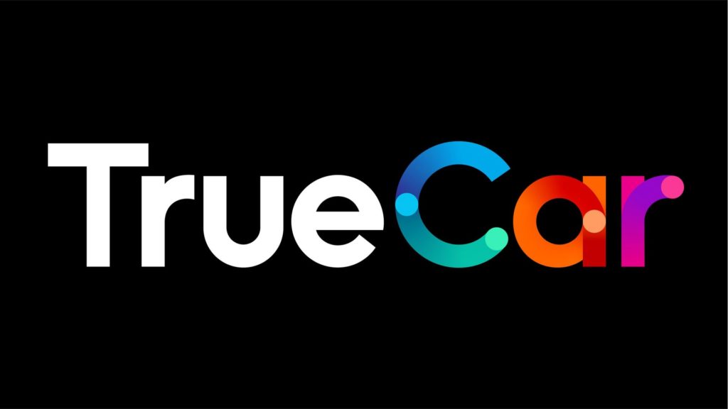
Subtle Gradients
The popular gradient trend is here to stay but it is now used in different and more subtle ways. No longer restricted to page backgrounds, gradients can enforce depth and bring texture to type and illustration.

Instead of bright gradients that are a focal point, opt for low contrast colour gradients that mimic shadows and light.

Transparency & Colour Overlays
The recent popularity of gradients and pastel shades has converged into a new colour trend. In 2020, expect to see transparency and colour overlays used to bring depth to design.
Partially transparent elements can give your page a harmonious and relaxing look. Adjust the transparency level to suit your design theme or use it between text and busy backgrounds to improve readability. This trend works well with pastel themed yearbooks.
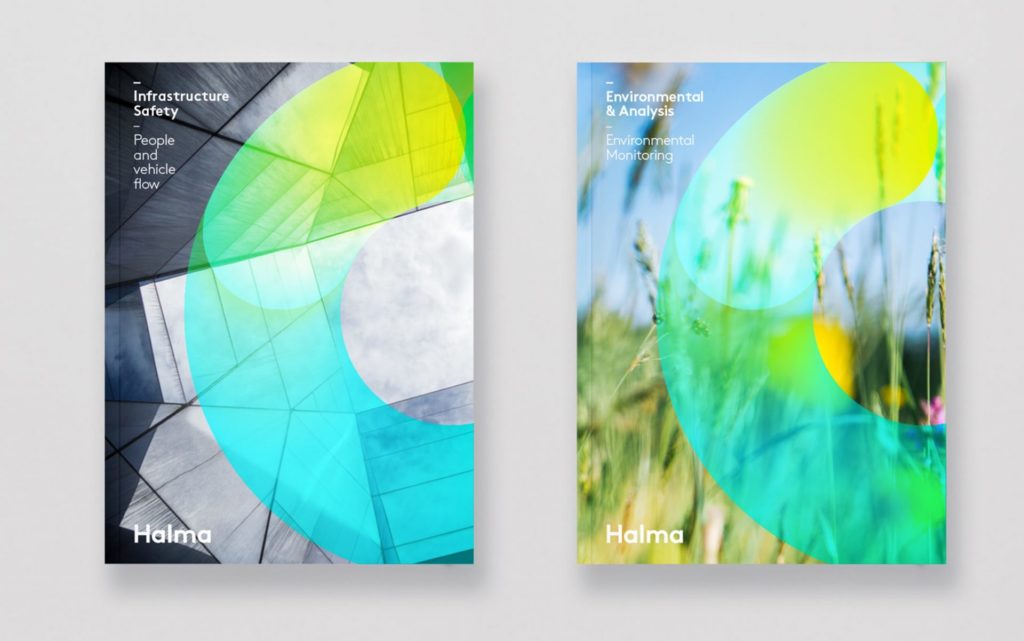
Colour overlays also have a purpose in bright design themes. Layer bright textures for a gradient effect with added dimension.
Monochromes
Last year, we wrote about the popularity of duotone images, with brands like Spotify adopting the trend. Photos were reduced to two colours for a simple, stylised look.
In 2020, this trend is set to simplify even more! Monochrome is often used to describe greyscale design, but in reality, it can be any colour. Images, type and design that use only one colour will be more prevalent this year.
Different shades or textures create depth and definition in monochrome design. This style can give your yearbook a sophisticated and modern look.
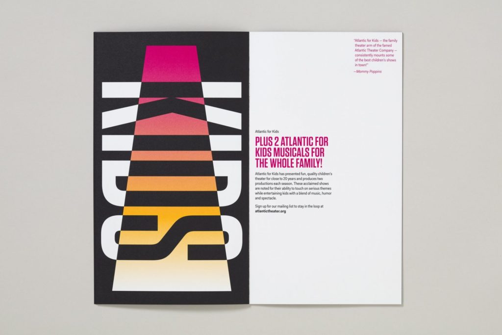
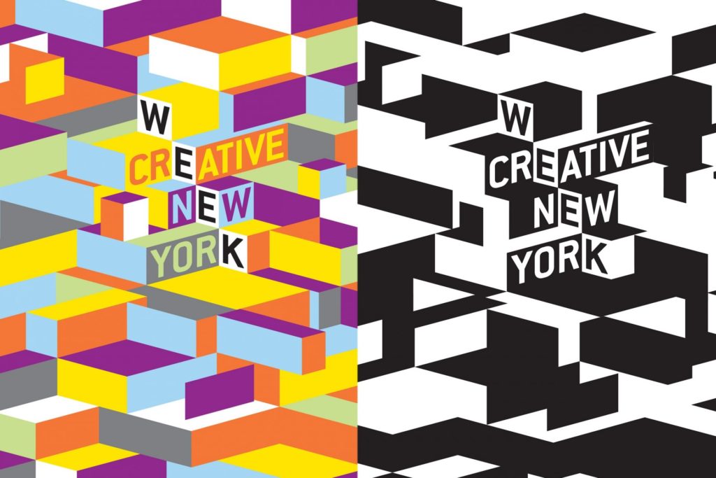
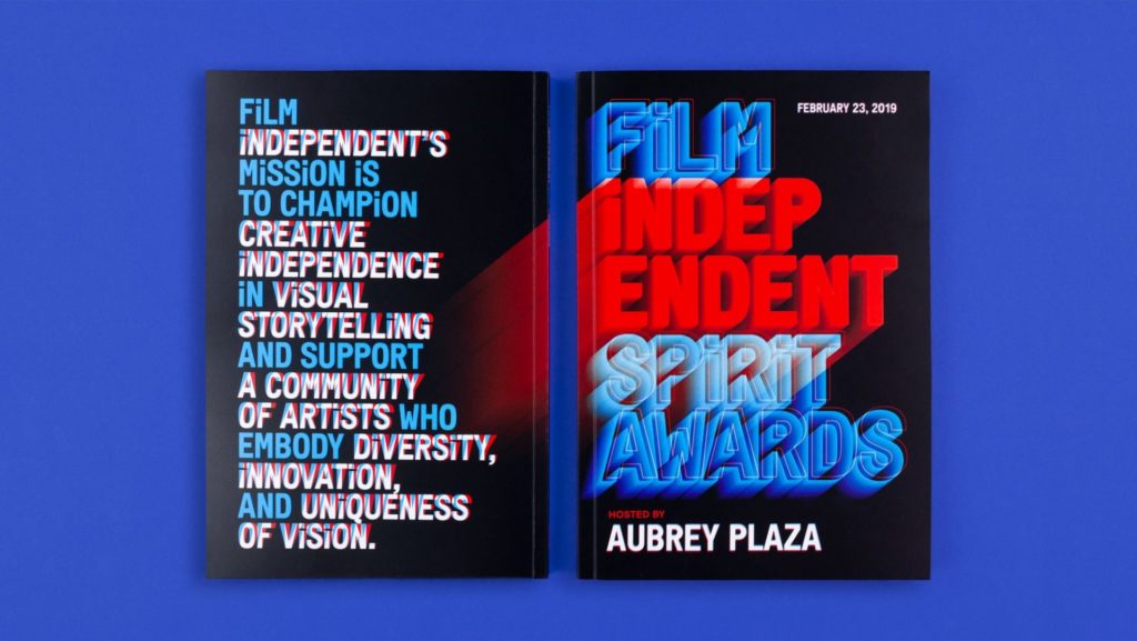
Playing With Type
Block, sans-serif fonts are popular this year, with delicate italic fonts taking a backseat. Heavy fonts are great when it comes to incorporating colour trends. As they are clear and readable, colour can be used to provide the flair!
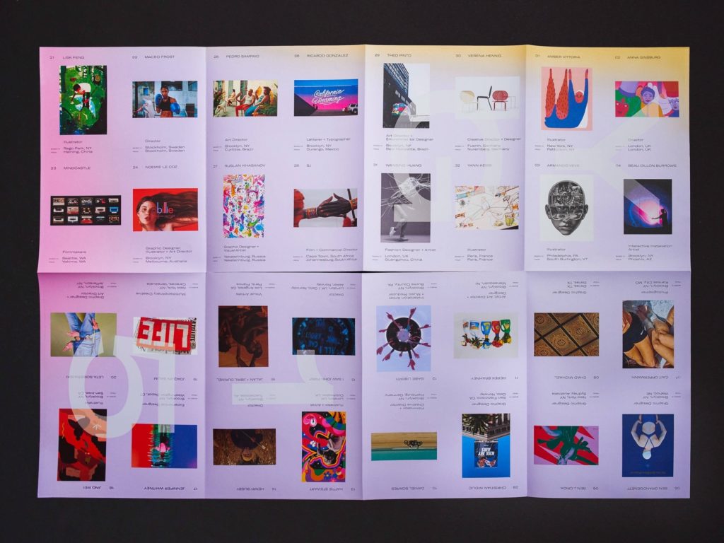
Here are some examples of type that use colour in interesting ways:
[i] https://www.pantone.com/color-intelligence/color-of-the-year/color-of-the-year-2020