An excellent colour palette can make good design great, so it’s important to get it right! From monochrome to metallic, colour can pique curiosity and convey emotion. In this article, Spacific Creative has rounded up the top 2021 colour trends to help you find your perfect palette!
Black, White & Colour
A striking colour trend for 2021 is a monochrome palette with a single pop of colour. Black and white with one extra colour creates a bold but simple palette.
Red is a popular addition to monochrome design but this theme can include any colour you would like. As almost every colour goes with black and white, there are endless options to try!
Grainy Colour Gradients
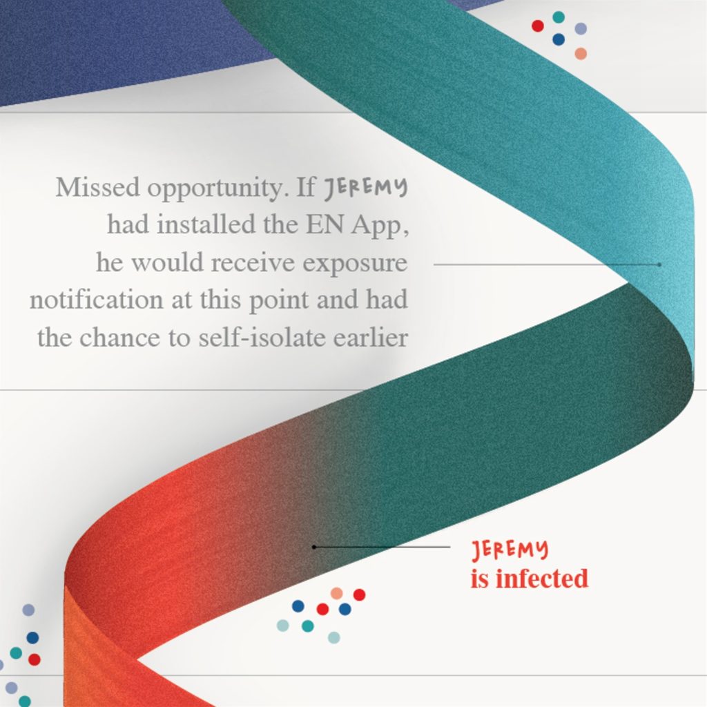
Last year, we wrote about the popularity of gradient colours in design. Prepare to see an elevated version of this trend continue into 2021! Textured, gritty gradients are everywhere and bring a raw, unpolished look to design.
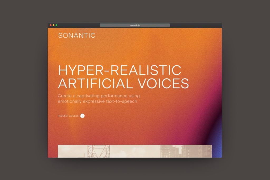
Textured gradients are sometimes paired with futuristic, neon design to advertise tech. However, this trend also works well with an earthy colour palette and it suits most design themes. Just make sure that the texture looks intentional!
Earthy Shades
Trade-in bright shades for more soothing tones. Muted brights were popular last year, but will continue to trend in 2021. Try a darker or lighter alternative to typical bold shades for a less intense look. These tones are more soothing to look at while remaining rich and full of energy.
2021 Pantone Colour of the Year
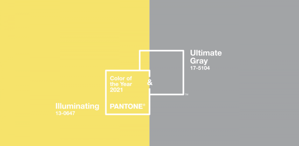
Each year, Pantone releases their Colour of the Year. The chosen colour is one we can expect to see used in design, architecture, fashion and tech. For 2021, Pantone selected two colours: a grey and a neon yellow. Pantone describes the two shades as a symbol of strength and positivity for the future.
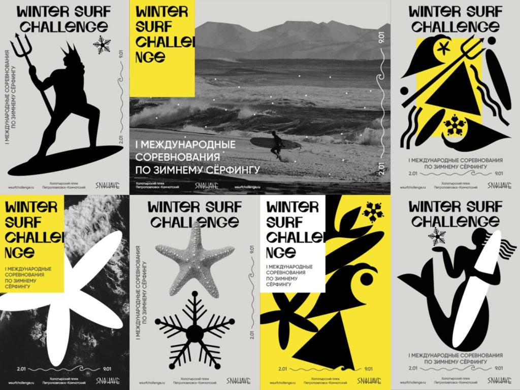
These two colours look great when paired with just black and white. This simple palette looks electric but refined.
Bright Basics
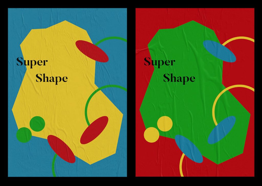
If you’re after a colour palette that will always be in style, then stick to the basics! Primary colours or other simple tones are an easy way to achieve contrast and draw the eye in.
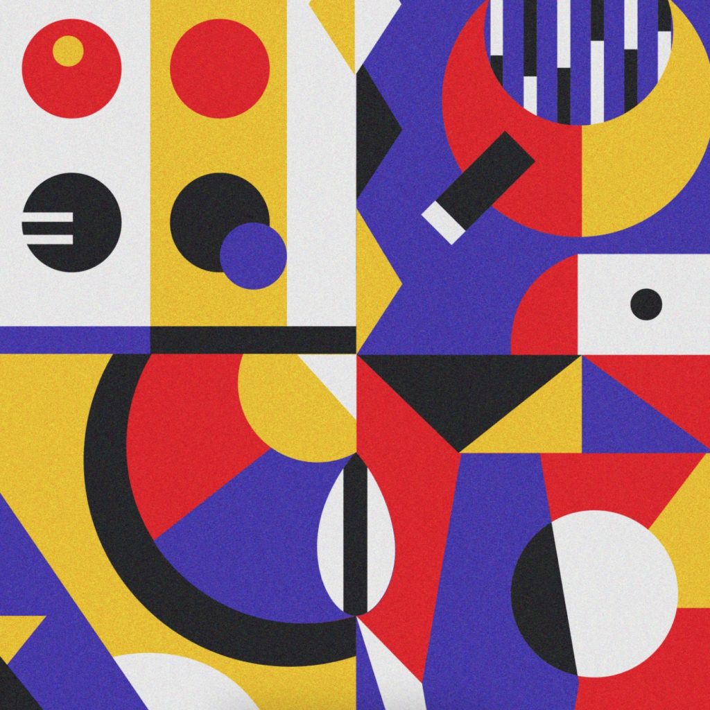
Google has embraced this simple colour palette across its product range. It is also often paired with geometric, flat design. This colour combo is optimistic and youthful – perfect for a primary school yearbook!
For more 2021 design trends, check out what is popular in typography this year!