Fonts play a huge role in design by setting the tone and providing personality! Designers are always adopting new trends and revisiting old ones. The New Year is a perfect time to see what people are currently loving and what trends we may want to try out this year. Here are some innovative typography trends and some golden oldies to check out in 2021!
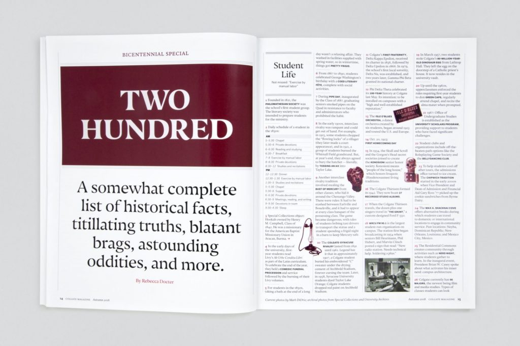
Oversized Text
Oversized letters and words are a big trend for 2021. This style is best used for visual effect, not function – so don’t use it to convey vital information!
Large type is being used in all sorts of creative ways. It can be off-centred, sit outside the usual content margins, or may even extend off the page. This style is sometimes used in magazine layouts for a unique and contemporary look.
Creative Characters
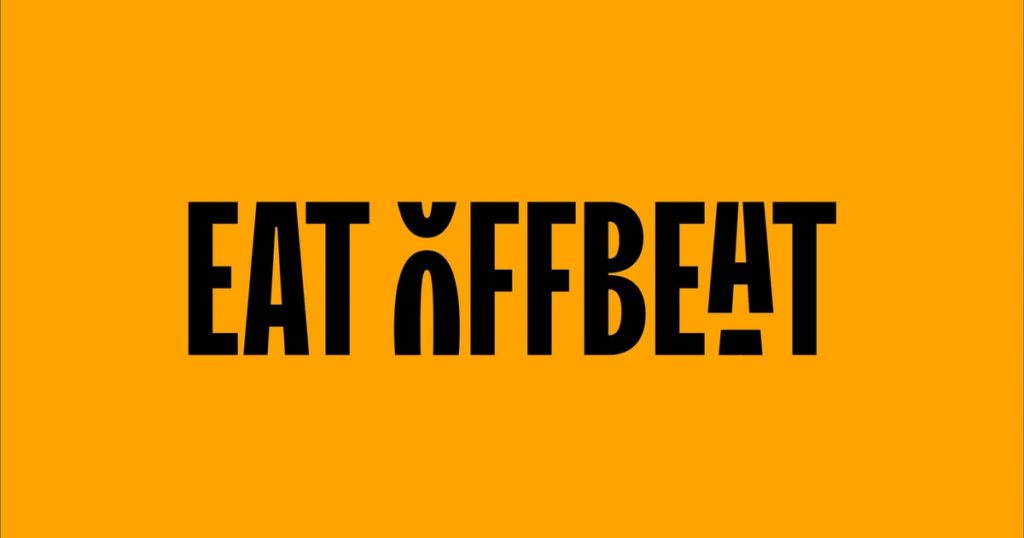
Clean, sophisticated design is often the clearest way to convey a message. Yet this popular style can sometimes feel flat or boring. Prepare to see lots of standout letters included in logos and titles in 2021. One letter could be a different colour, or serve a dual purpose by doubling as an illustration.
If you are looking to elevate a simple yearbook cover, this could be the trend to try! Maybe there is a clever play on words or messaging to use, or an artistic way to write your school name.
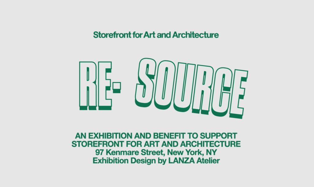
Outlined Typography
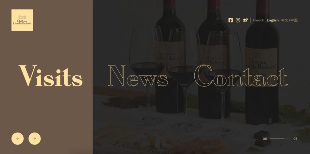
Outlined, thin fonts are a popular trend for titles, or as an oversized design element, this year. They are often paired with a solid font version for variance or to highlight words. If you are searching for text that looks great over imagery, an outlined font is a great choice. It won’t overpower the image and you can get creative with contrasting colours to make it stand out!
Shaky Text

Spruce up your simple design with text that breaks all the rules of proper alignment. The baseline is the bottom line where letters usually sit, to keep them in line and uniform.

A 2021 trend is varied baselines, resulting in words that curve or sit in an unusual fashion. This style is playful and energetic – perfect for a fun yearbook cover!
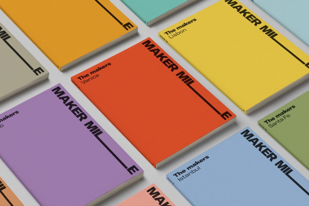
Retro Serifs
Thick, friendly serifs remain popular for headings and branding in 2021. These retro fonts are lively and ideal for primary schools or to advertise fun events! This font style is great for low-contrast colour palettes. The thickness of the characters means they are always easy to read.
Timeless Serifs
We all know chunky serifs are having their moment, but they are best reserved for headings. A more versatile and still on-trend look is thinner, classic serifs. This style is sophisticated and timeless, so they are great for a range of projects. They evoke a sense of nostalgia and appear trustworthy.
Swiss International Style
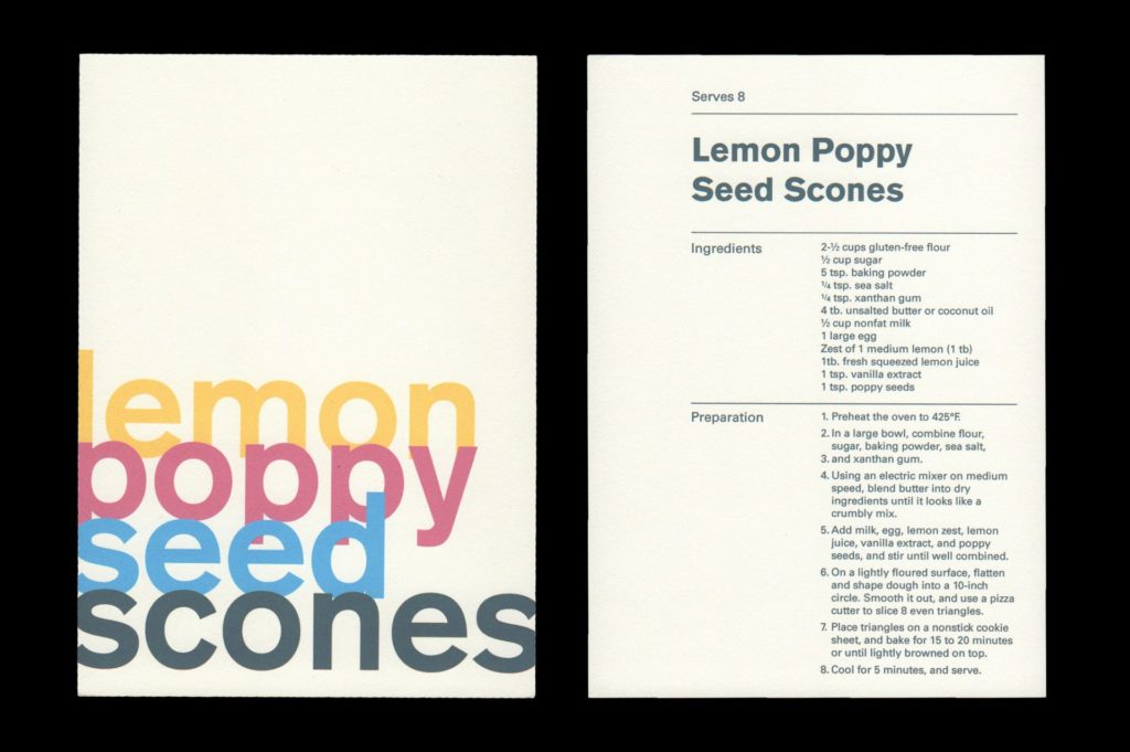
If serifs aren’t for you, you are still in luck! 1950’s Swiss Design, also known as International Typographic Style, is right on-trend. This style includes lots of readable sans-serifs with clean, confident lines.
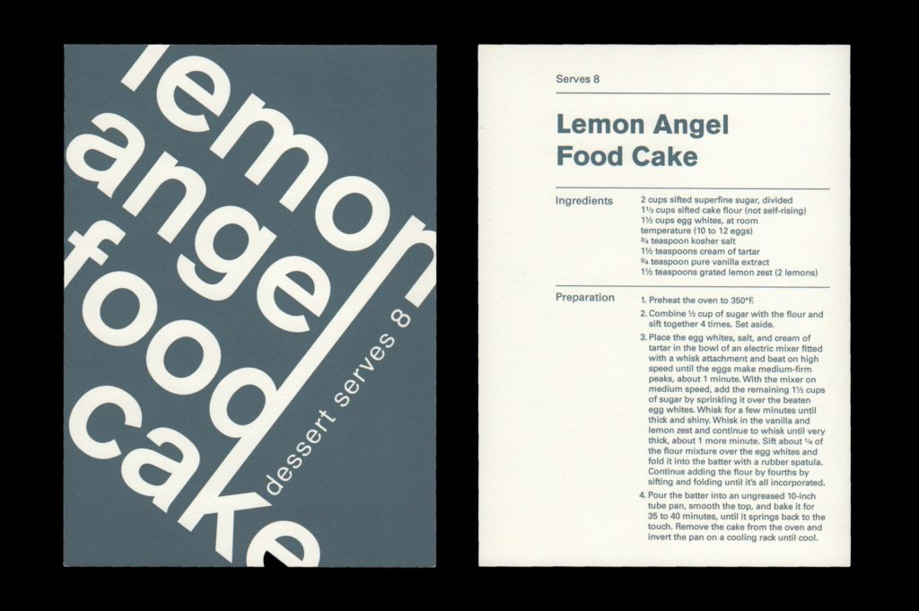
Although traditionally intended for print media, it is also perfect for digital design. This style evokes simplicity but is often displayed in angled or asymmetrical ways. Get creative and try it in a school cookbook!
Typewriter Style
Typewriters are notorious for spelling mistakes and ink splotches. This makes it the perfect font to pair with earthy or imperfect design. Try a typewriter font if you want text that will blend into your design while remaining unique. Although perfect for body text, this style has become popular for headings as well.
3D Shadows
If you miss the joy of Microsoft WordArt headings then this trend is for you! 3D shadows that look solid are big for 2021. Bold, uplifting and playful, this style can elevate your titles and look modern or retro depending on your application.