Are your yearbook pages looking a bit lacklustre? Here are a few easy additions for your school yearbook to ensure readers give your design a double take!
Add a Colour Gradient
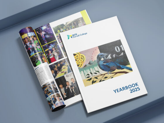
ACG Parnell College
If a solid background colour is doing nothing for your page, why not try a colour gradient?
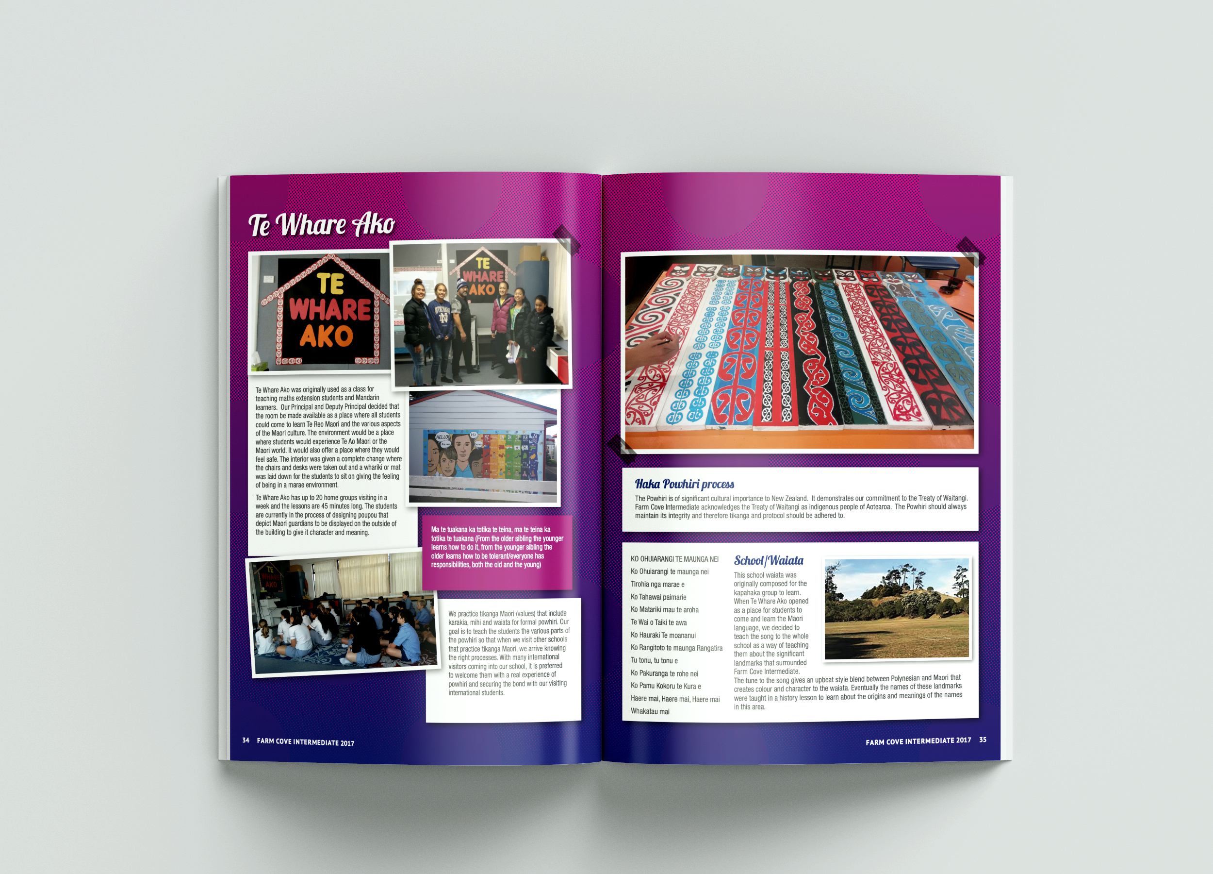
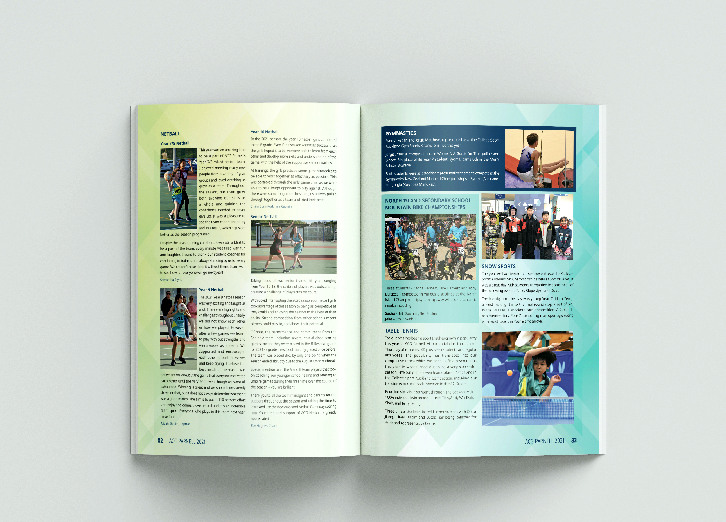
Farm Cove Intermediate
A gradient works well across a range of designs and is right on trend in 2022!
Use Translucent Elements
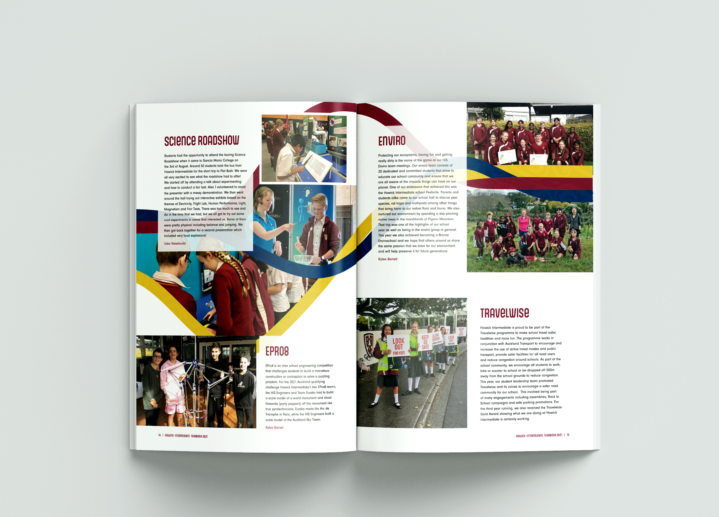
Howick Intermediate
Adding translucent elements provides depth to your design and gives the pages a softer look.
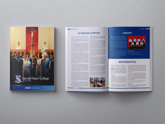
Diocesan School for Girls
Decrease the opacity of images, shapes and boxes behind the text to highlight the different layers and elements on the page.
Try a Unique Photo Composition
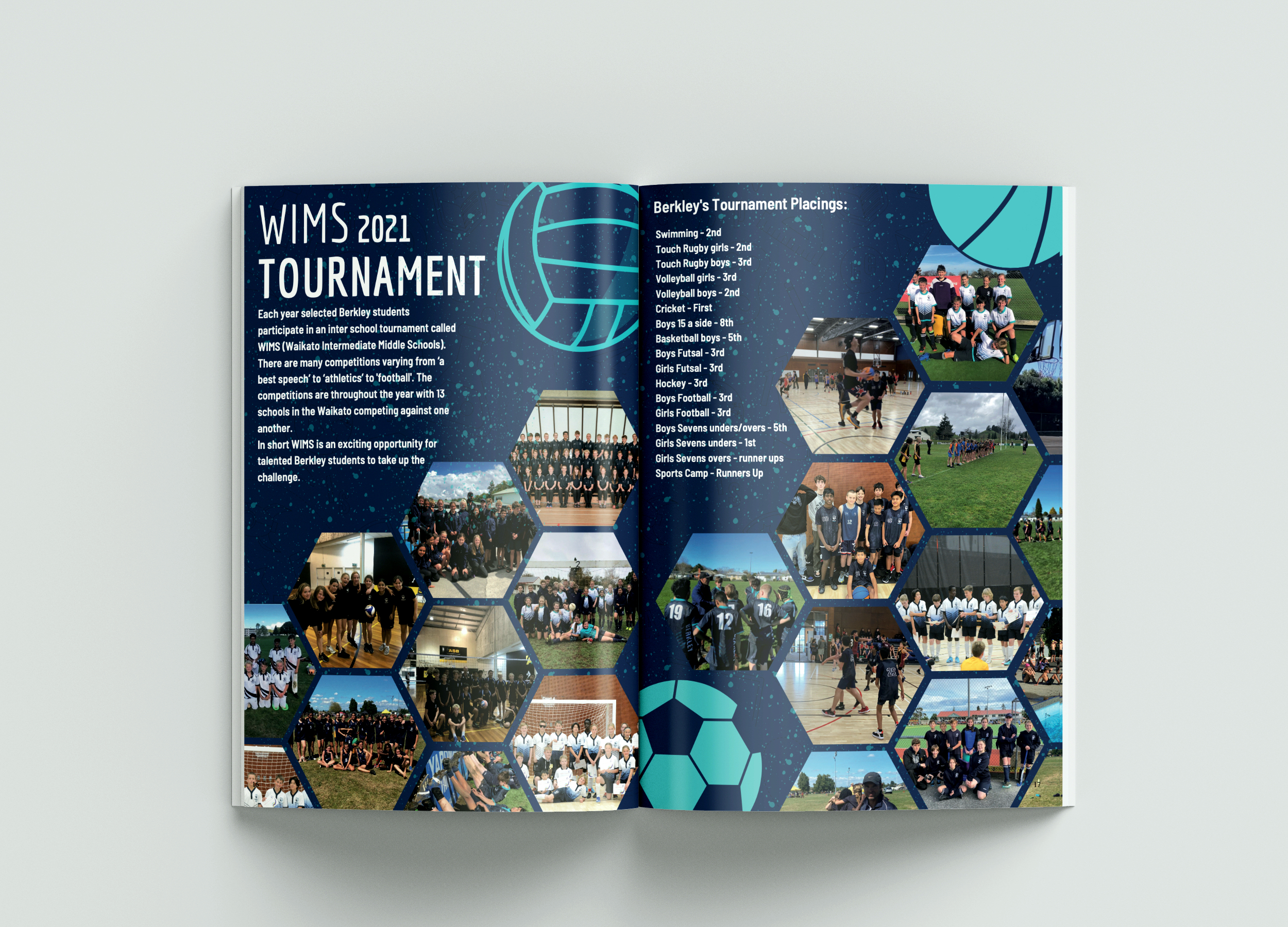
Berkley Normal Middle School
Photos are a great place to incorporate some fun into your design layout.
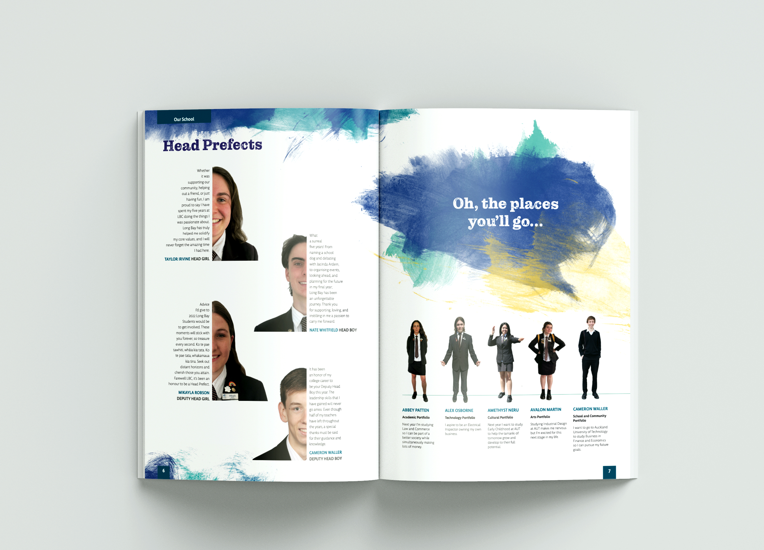
Long Bay College
Design a creative collage, pair images with shaped text or use your photos as a page background!
Include Hand-Drawn Doodles
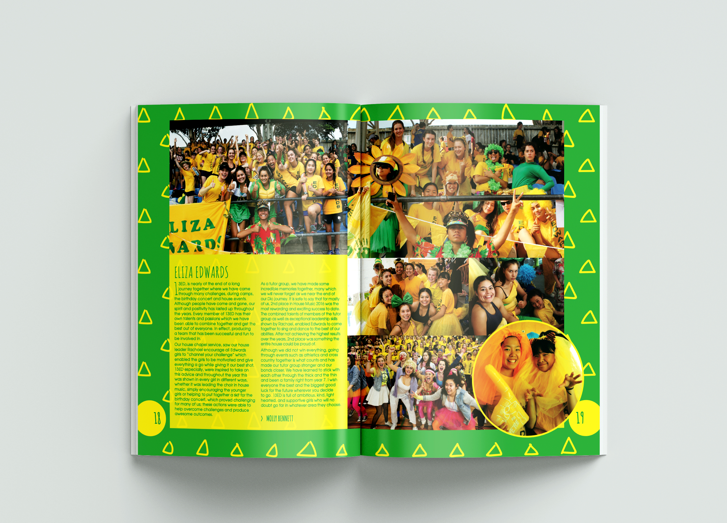
Diocesan School for Girls
Include some hand-drawn illustrations or patterns in your yearbook!
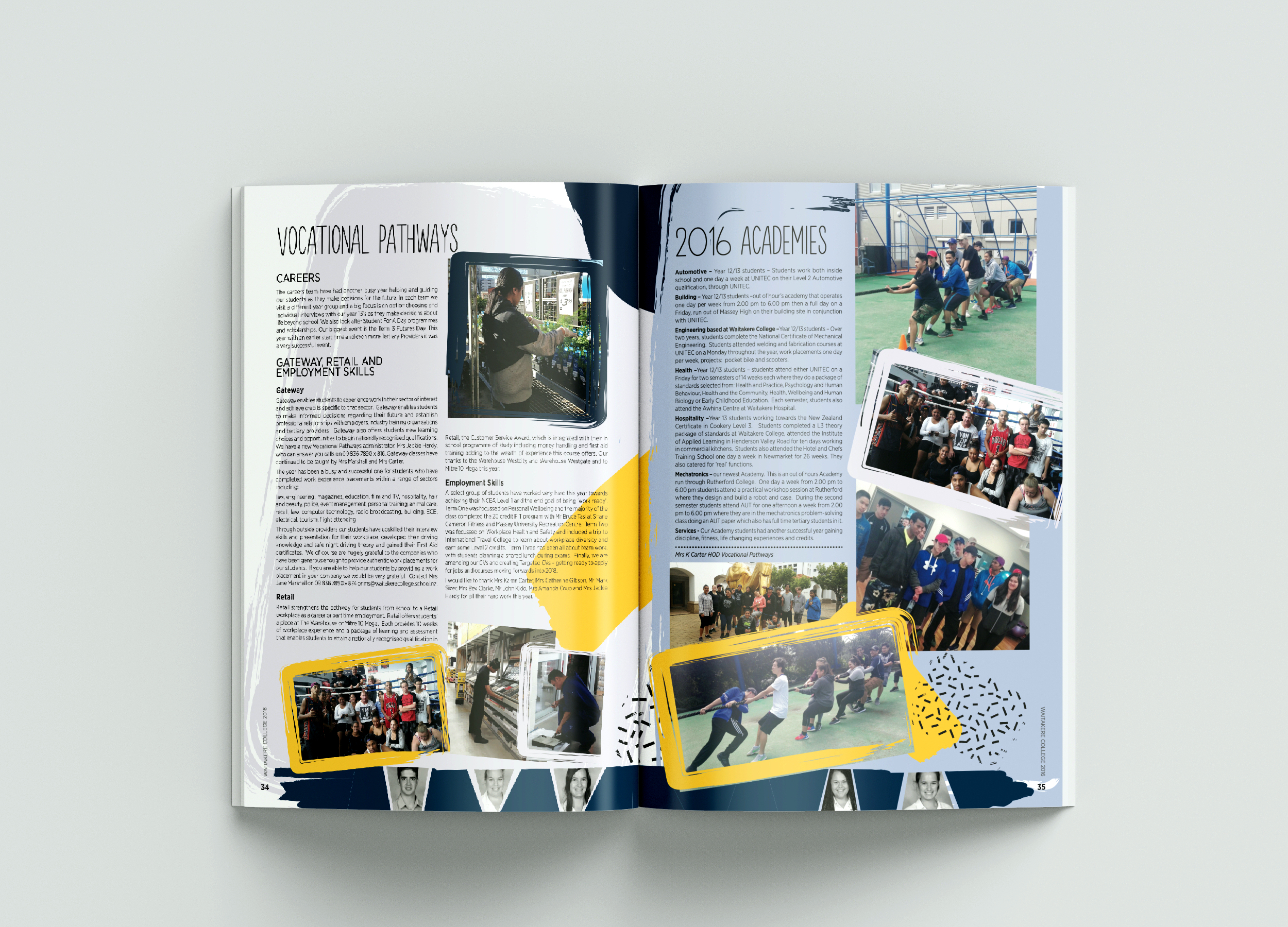
Waitakere College
These can add texture, depth and a personal touch to your designs.