Want to add a punch of excitement to your school yearbook? Then red might be the colour you’re after. Red is energetic and sophisticated, and can make your yearbook pages pop! Here we have compiled a few great red yearbook pages from some of our clients – take a look!
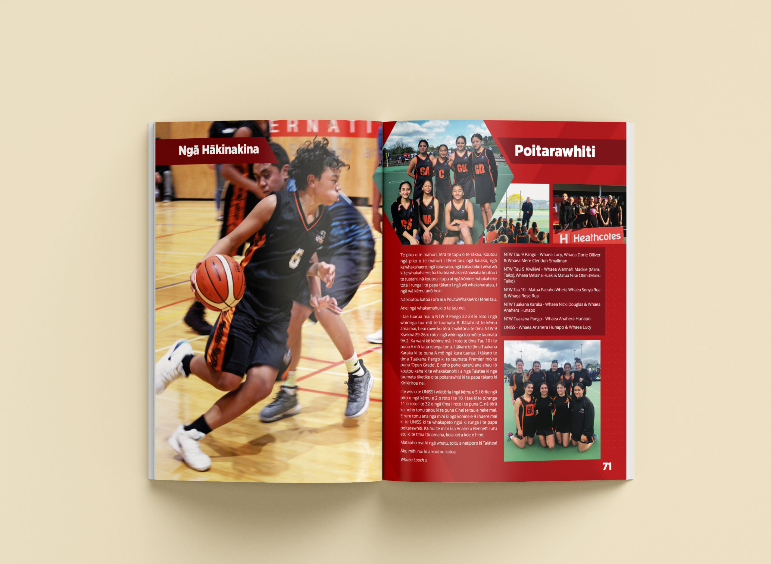
Nga Taiatea Wharekura
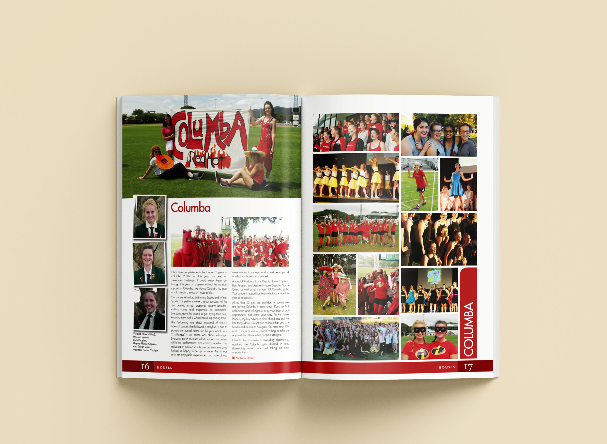
St Orans College
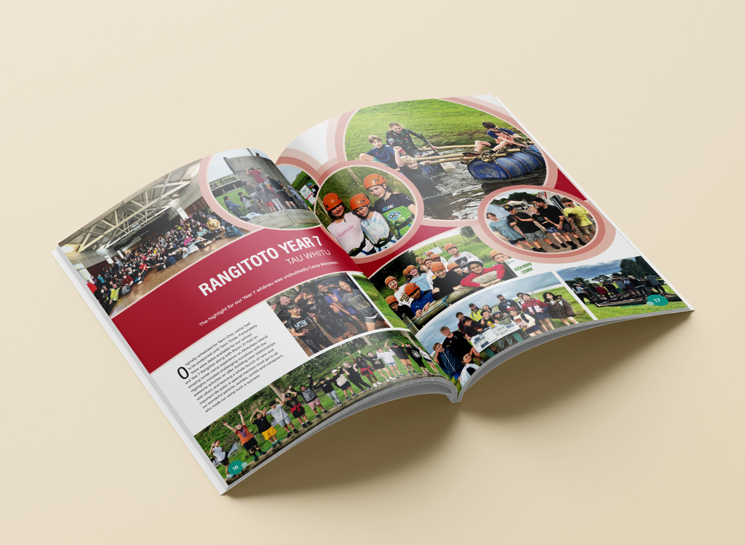
Somerville College
Bright reds are a perfect choice if you’re after a high-contrast page that demands attention. They are also a great way to inject colour into otherwise monochrome designs!
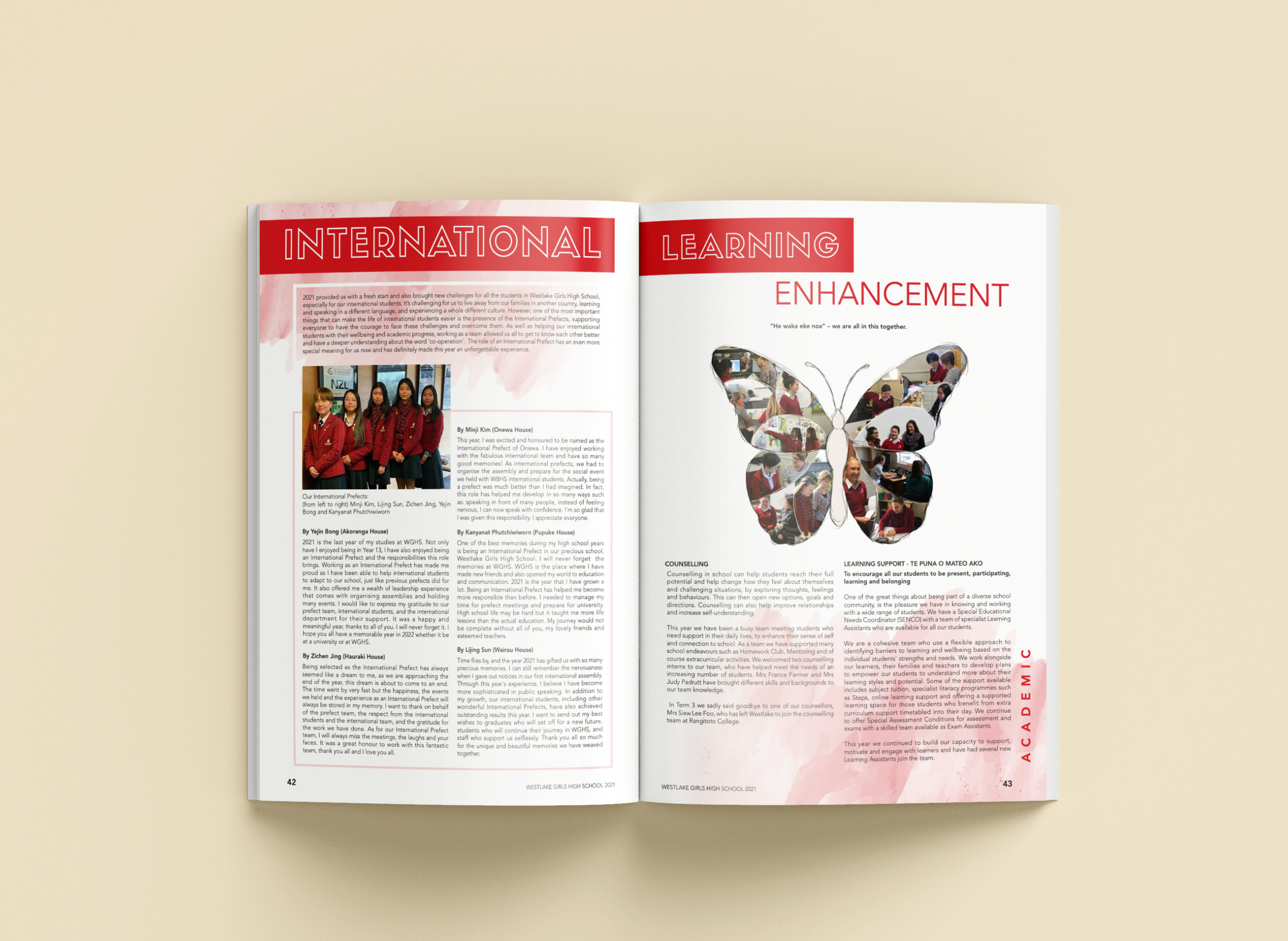
Westlake Girls’ High School
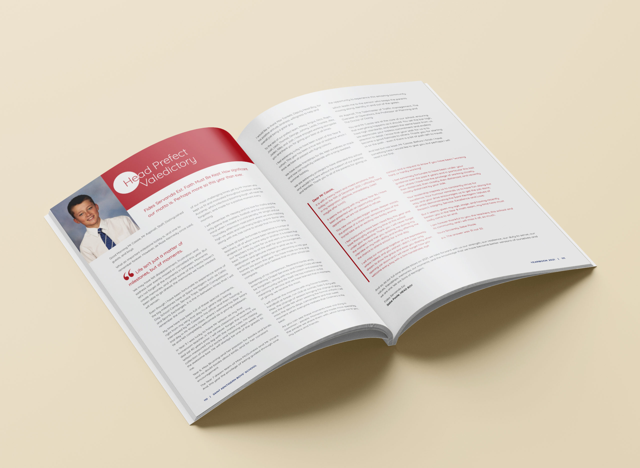
Saint Kentigern Boys’ School
Red is an eye-catching colour, which makes it a great addition to your visual hierarchy! Consider opting for a bold shade of red when crafting headings, as it naturally draws your readers’ attention and guides their navigation through the page. For this reason, red is also a good choice for pull quotes or highlighted passages within articles!
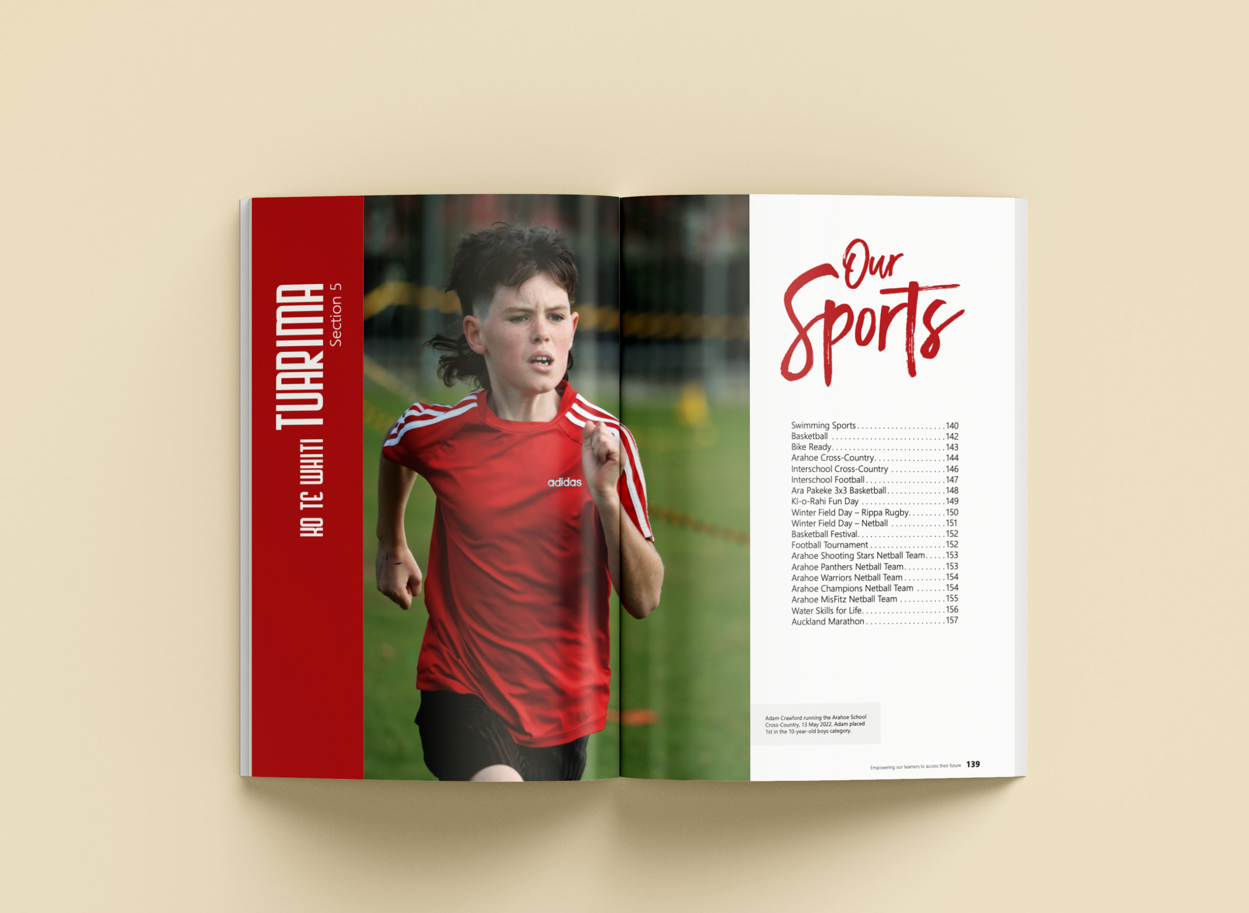
Arahoe School
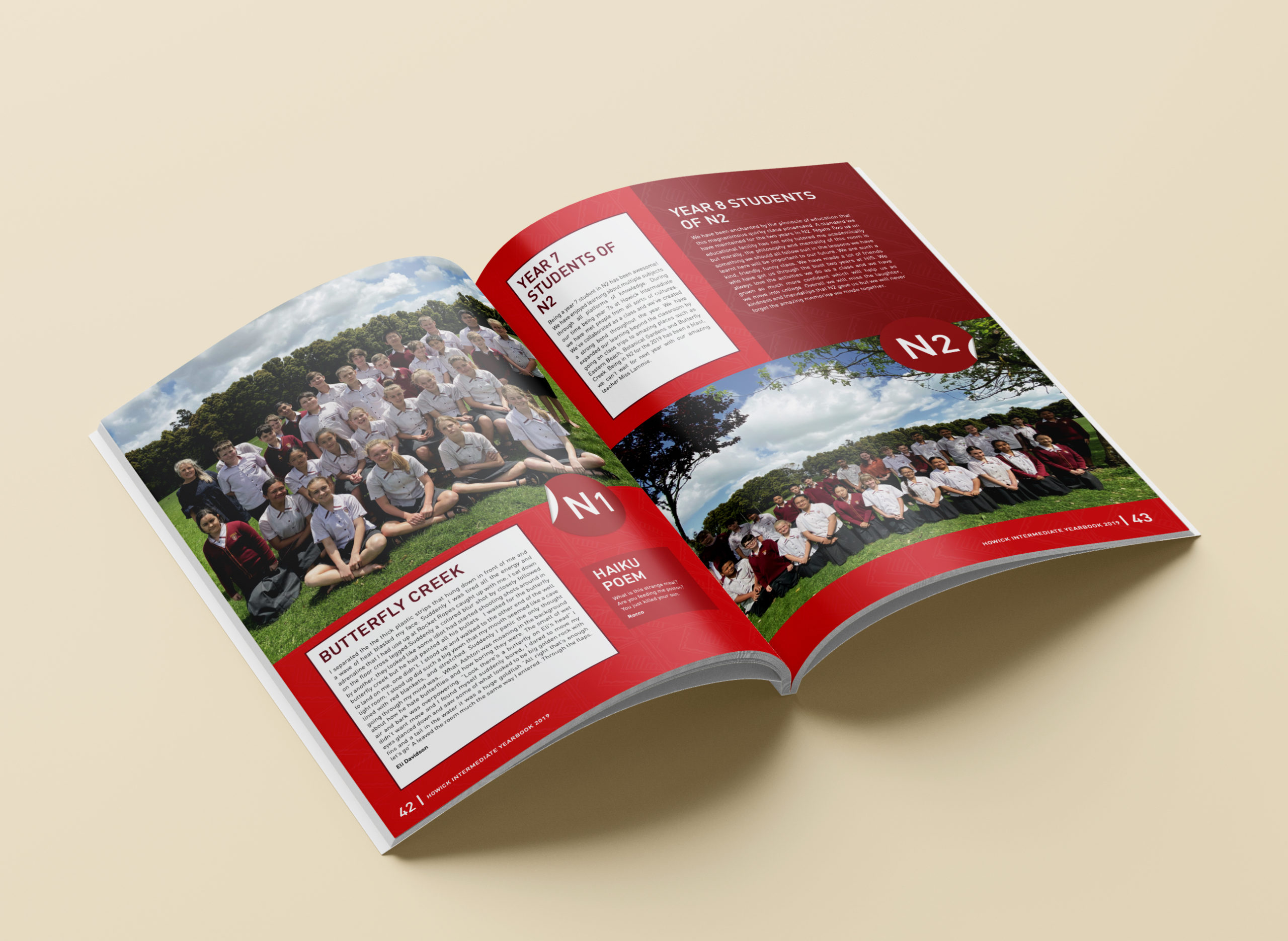
Howick Intermediate
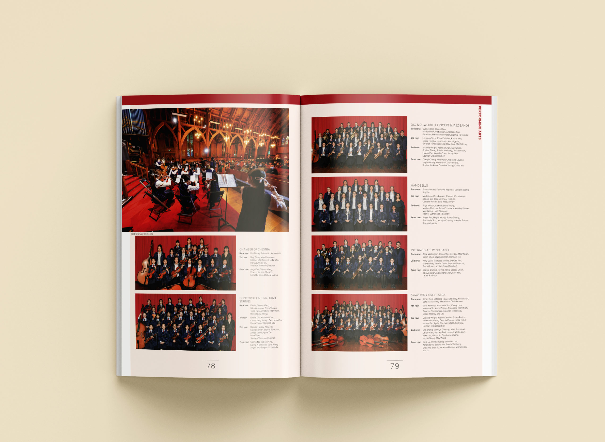
Diocesan School for Girls
While red is undeniably bold, you can create a calmer palette by pairing it with similar or softer shades of red. Consider combining pale reds with rich maroon tones to strike a harmonious balance.
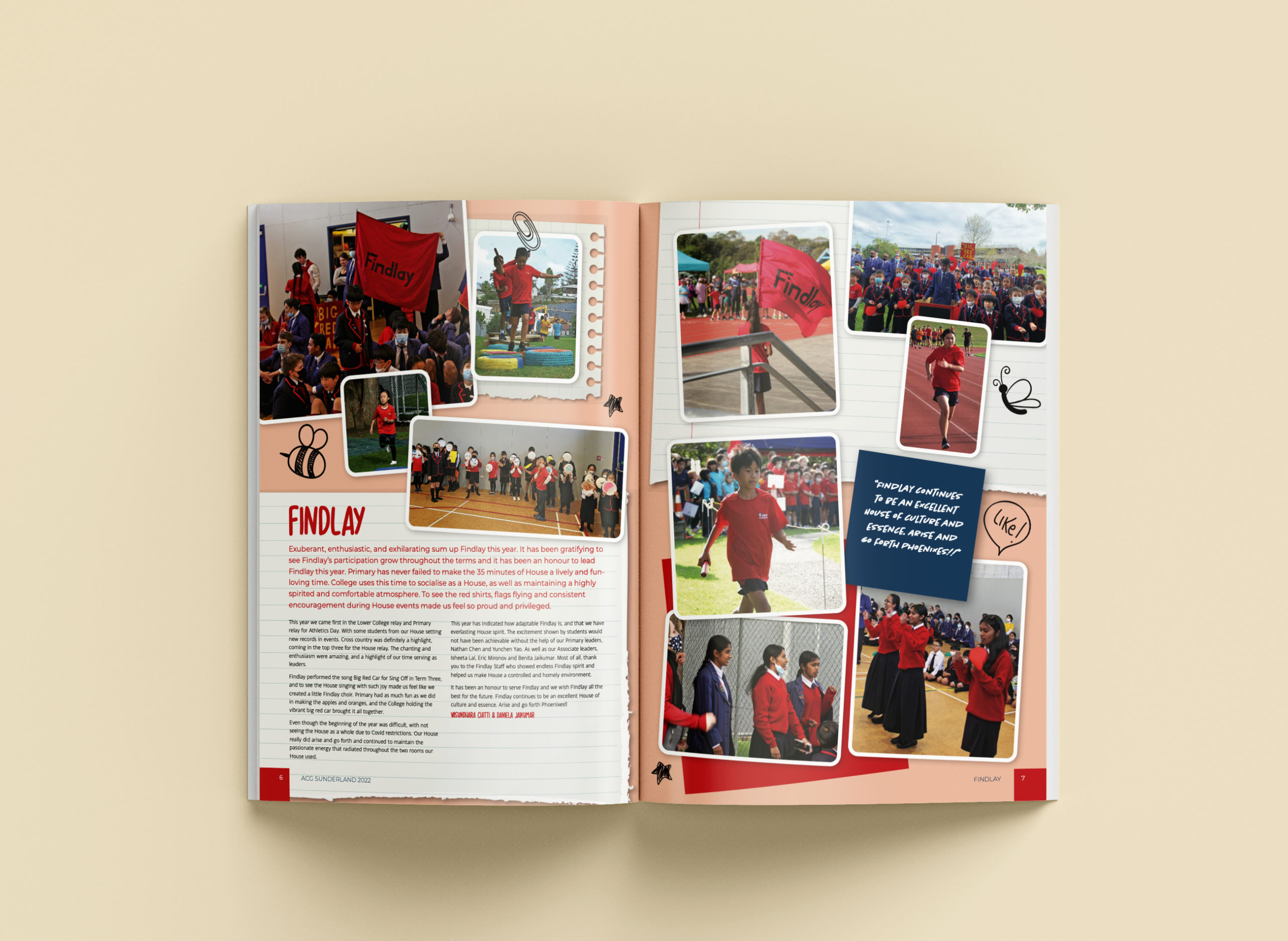
ACG Sunderland
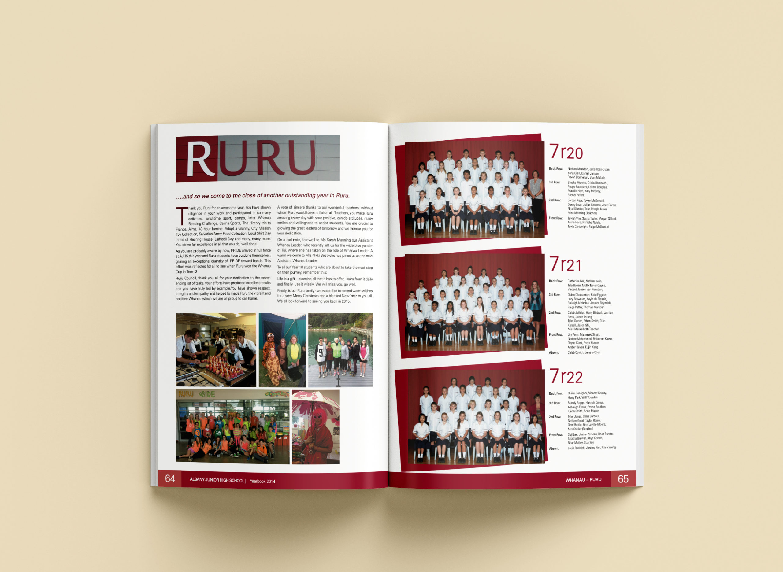
Albany Junior High School
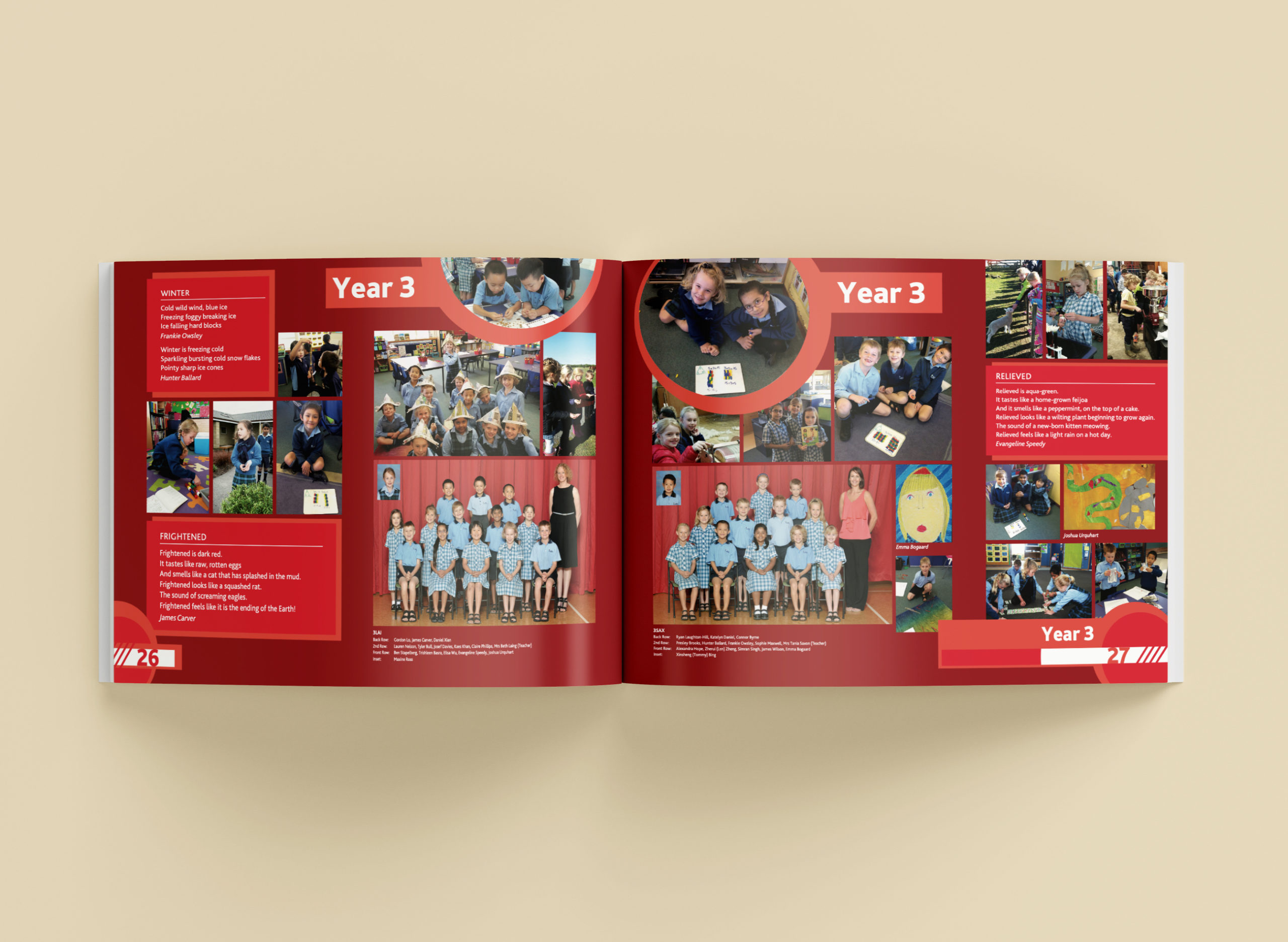
ACG Strathallan
If you aren’t sure what colour to pair with red, why not try a shade of blue? Red and blue are complementary colours, sitting on the opposite side of the colour wheel.
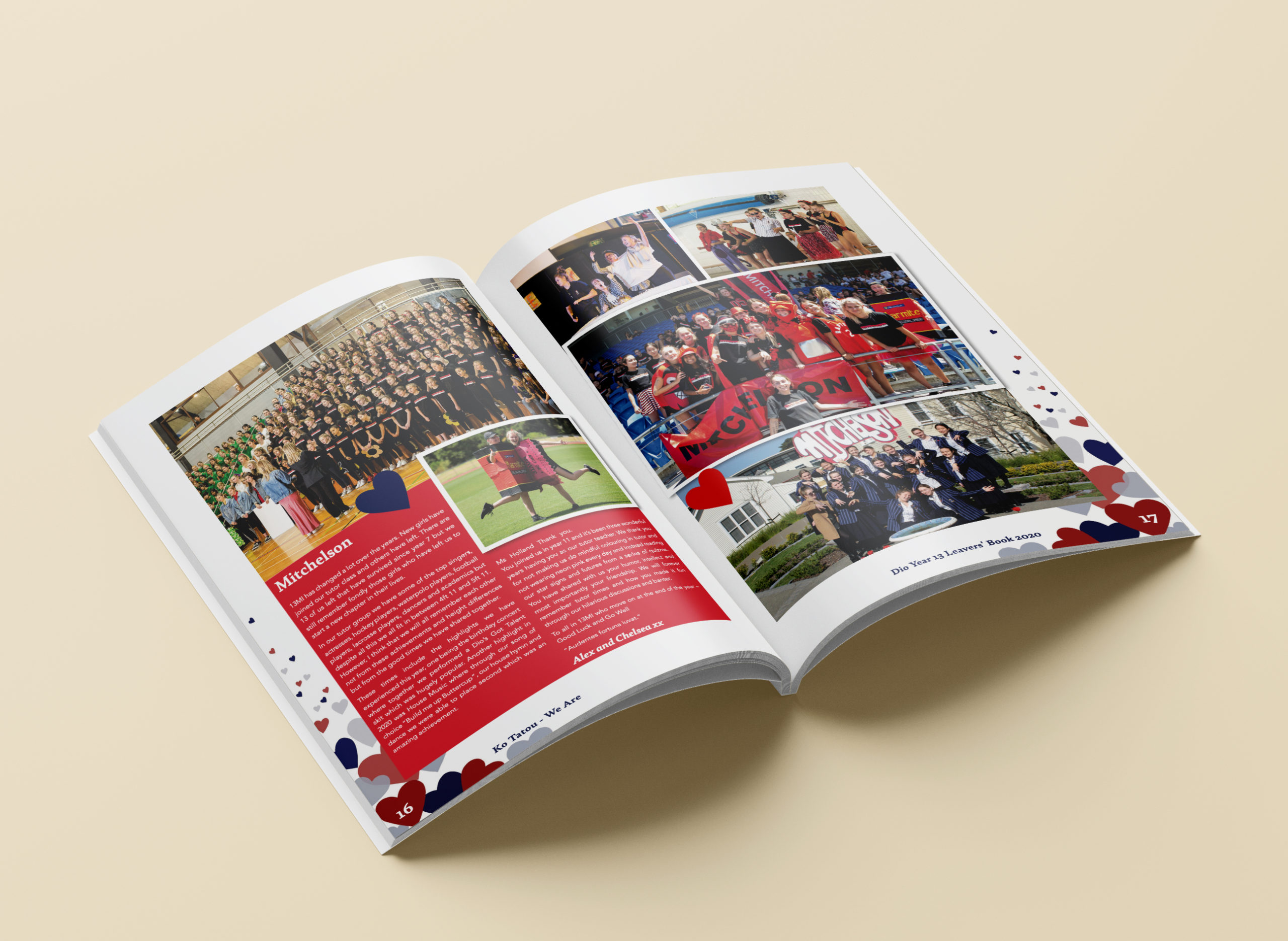
Diocesan School for Girls
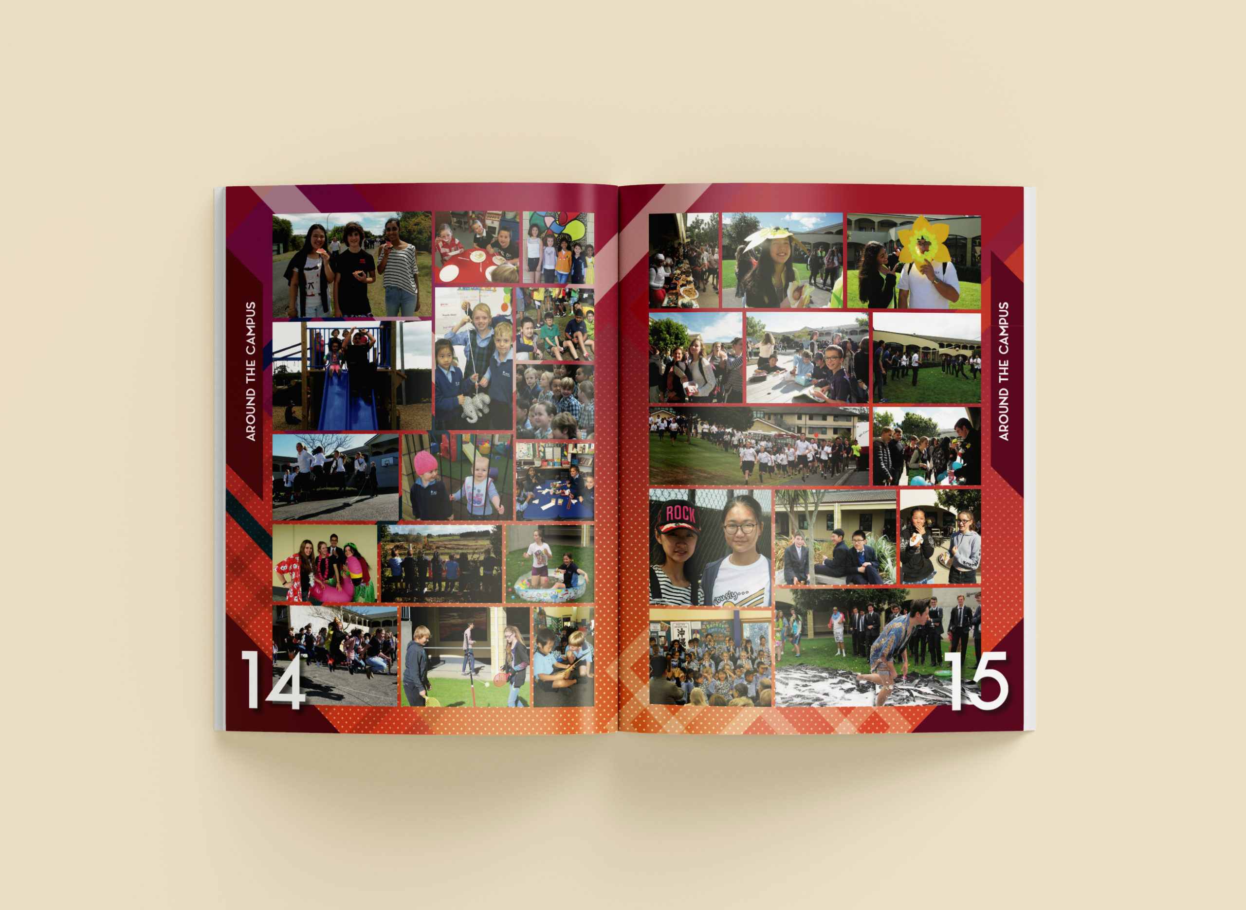
ACG Strathallan
Do you enjoy the boldness of red but want something a bit more off-beat? Then check out some orange yearbook designs!
