A yearbook full of content is a good thing for both your school and the reader. School events, important notices and great photography should all be highlighted – but how do you retain a sense of calmness and cohesion?
Simplicity improves communication and comprehension, which ensures the reader understands the intended message. Here are some techniques to try to improve the look and readability of your yearbook.
The Yearbook Text
Simple Headings
Shortening your headings is an easy way to free up space on a page. Most yearbook headings don’t need to be lengthy as the reader already knows what to expect. Use short, or even one-word, titles to introduce topics – this will also make page formatting easier!
Make sure these headings are at least double the size of the body text. This helps to reinforce hierarchy and improves readability.
Be Smart About Fonts

Balance your busy yearbook with a simple typeface. Consider a versatile sans-serif font for a clean and uncomplicated look. Either stick to one font family or limit your yearbook to three fonts total to minimise the chaos.
Cut the Unnecessary Words
Years of school assignments with word count targets has left us all too comfortable using filler words to meet a goal! Filler words have no place in a busy yearbook and should be the first thing you edit out.
Words like really and very provide little value except for taking up space. Either eliminate them from the text or change your phrasing for more impact. This results in a shorter, more direct sentence:
Weak: It was a really cold day.
Good: It was a freezing day.
Strong: The day was freezing.
Make sure that every new sentence serves a purpose and is necessary for the story.
The Yearbook Images
Be Picky with Pictures
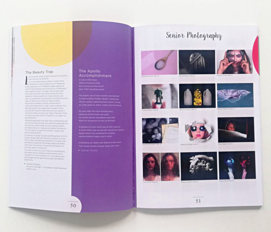
Less is sometimes more when it comes to photography. A single image may tell a better story than a collection of photos, and will also decrease the clutter on the page. If your page spread is already full of content, try simplifying the imagery.
Stay Cohesive

For pages that are calling out for a photo collage, try to keep it uniform. Choose images that are cohesive in size, colour and composition – the fewer variables the better!
The Yearbook Layout
Pages of Relief

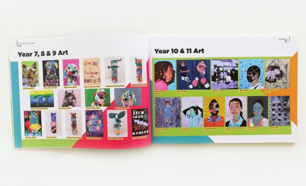
Text-heavy pages are common in yearbooks but they need to be balanced out so the reader doesn’t feel overwhelmed. Short-form content, or a page of student art, allows for some ‘breathing time’. If you’re using busy backgrounds, reserve them for less content-dense pages.
White Space
White space or ‘negative space’ helps to break up the chaos of a busy yearbook. Space out your design elements and don’t be scared of an undecorated area!

White space also pertains to writing and imagery. Increase the spacing between lines of text for a less cluttered look that is also easier to read. Make your images stand out by increasing the margins around them.
Page Structure
Dividing each page into a 3 or 6 column grid to give the design better structure and cohesion. This results in a sophisticated, and easier to consume, yearbook.
For more tips for a cohesive yearbook, check out our 10 Design Rules article!


