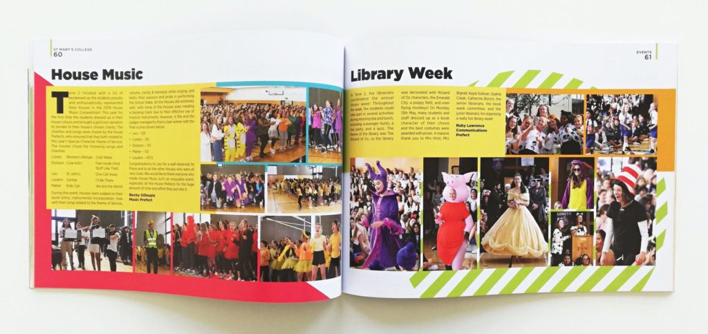
Yearbooks are content dense and rely on good formatting and structure to make sense of the madness! Page headings help to organise content and inform the reader of the subject matter quickly.
Many yearbook readers won’t examine each page in-depth, only searching for content that is relevant to them. This is where the importance of headings comes into play! Eye-catching titles make all the difference and increase the likelihood that your articles will be read. Keep reading to learn how to perfect your yearbook page headings.
Short & Sweet
If you read a well-written news article, you will notice that all the important information is in the top paragraph with background facts and tidbits left until the end. This ensures that the reader absorbs the most important information. Headings are an extension of this rule. They should immediately inform the reader of the subject matter at hand so that they can assess whether they are interested in reading on.
Aim to keep headings as short as possible while still clearly conveying the subject. Higher-level headings, like those at the top of the page, are usually very general and short – often 1 or 2 words. Smaller, lower-level headings that introduce a section or story can be a bit longer.
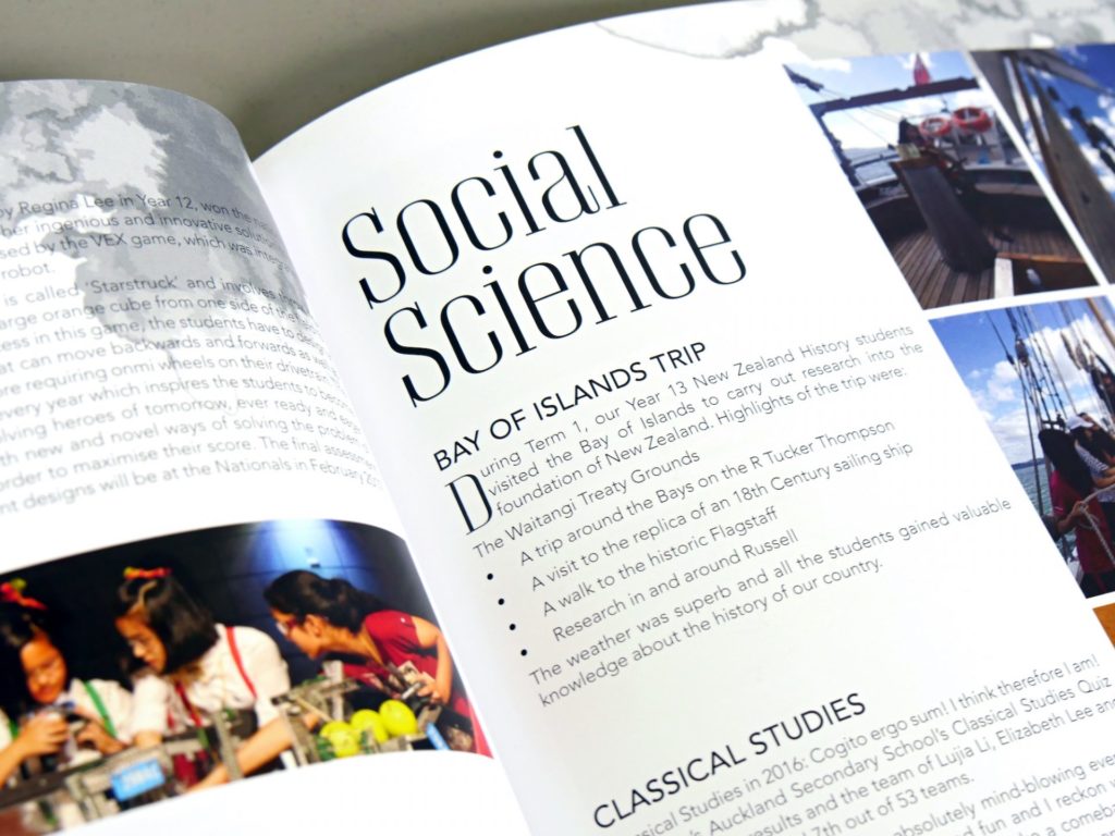
Try to limit your headings to 1 line. This will make formatting easier and will also help with legibility – especially if you are using a display font that is hard to read.
Visual Hierarchy
A successful visual hierarchy helps the reader navigate the page. The most significant information should be the largest, boldest and brightest! Page headings inform the reader of the topic or story and should stand out from the written paragraphs that follow.
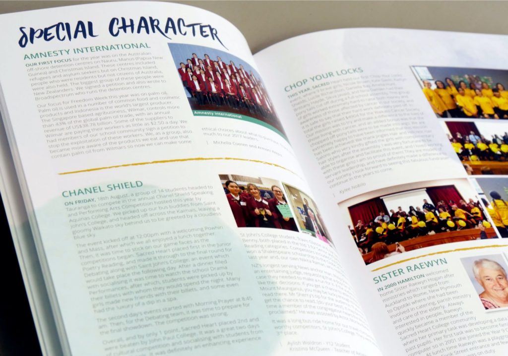
Good headings don’t need to overpower the article but should be clear and pronounced. Subheadings that follow should be smaller but still distinguishable from body text.
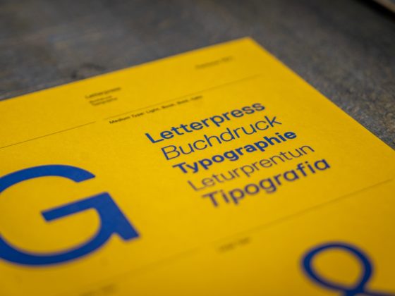
Letter Case
The case style of your headings will affect the tone and appearance of your design so it should be properly considered. All-caps, lowercase or a mixed case will evoke different emotions from the reader.
All-caps headings are bold and create a sense of urgency. This makes them perfect for headings that need to command attention! All-caps text is usually more difficult to read and can look like yelling, so it is best to keep these headings short.
Mixed case or lowercase titles appear calm and are often easier to read. To get the benefits of both all-caps and lowercase text, use one style for higher-level headings and the other for lower-level headings. This will help establish your visual hierarchy and provide contrast to the page.
The Yearbook Design Theme
Consistency and uniformity are vital for great design. Page headings should stay consistent throughout the yearbook but should also pair well with other design elements and smaller body text. Handwritten fonts look great with fun primary school yearbooks whereas formal publications look great with structured serifs.
For page heading font inspiration, check out our article, 20 Great Free Fonts for Your 2020 School Yearbook!