We all know first impressions are important, and these judgements can be quick to form! Within seconds, people are able to decide whether they like and trust a person, a business and even your yearbook.[i]
In a study by Cover Matters, 79% of participants mentioned that a book’s cover plays a role in their decision to purchase, with 48% saying it plays a dominant role in their choice.[ii] The way we purchase and enjoy yearbooks may differ slightly to novels, but it is clear how persuasive attractive design can be.
Creating a ‘WOW’ cover allows the reader to start and finish your yearbook on a positive note. Here are some tips and things to consider if you are in charge of the job.
Be Consistent
Be clear before you are clever. A good cover will quickly let the reader know what the publication is, the school it is for, and the overall tone of your yearbook. For example, if the yearbook content is serious and formal, create a cover that reflects this. For a more personal or fun book, try incorporating bright colours or even student artwork into the design. The pages within the yearbook should include design and personality that matches the cover, to tell a consistent and clear story.
Colour
Colour evokes a stronger emotional reaction in humans than any other design element.[iii] Choosing shades that evoke the right tone for your publication is an important consideration. Although colour meanings differ across different demographics, below are some popular associations:
- Blue: Trustworthy, Professional and Calm
- Green: Well-Intentioned, Natural and Inviting
- Yellow: Happy, Energetic and Honest
- Red: Powerful, Commands Attention and Aggressive
- Orange: Ambitious, Optimistic and Adventurous
- Pink: Feminine, Youthful and Loving
- Purple: Royal, Imaginative and Creative
- Black: Elegant, Powerful and Commanding
- White: Light, Fresh and Refined
Binding
Yearbook binding depends on the number of pages in your book, your style and your budget. Saddle stitch binding uses staples to join the pages and is a popular choice for books with fewer pages and smaller budgets. This will result in a relatively flat book. For larger yearbooks and publications, perfect binding or even spiral bound may be used. With perfect binding, your yearbook will have a flat squared-off spine. This can be a useful design feature as it gives you the option to print the school name and year down the side of the book. This may increase the likelihood of your yearbook being selected from a shelf, and will also command more attention on a coffee table due to its size and shape.
Composition
Balance
Disperse the design weight across the cover by balancing out your elements. Simplifying your design and ensuring white space is present will keep your book looking modern and sleek.
Fonts
Your font choice will depend on the overall style you want for your book – just make sure it is easy to read. Don’t make it hard for your reader to identify the purpose of your book, and instead, make your writing large and legible.
Imagery
Make sure to use large, high-quality photographs and artwork for your yearbook cover. A single image is more effective and attention-grabbing than a collection of images and will elicit a greater emotional response. Imagery also serves as a source of colour palette inspiration. Use colours found in your photos for text elements for a complementary look.
For more information to perfect your cover, check out our 10 Design Rules for yearbooks.
Great Yearbook Covers
Orewa College
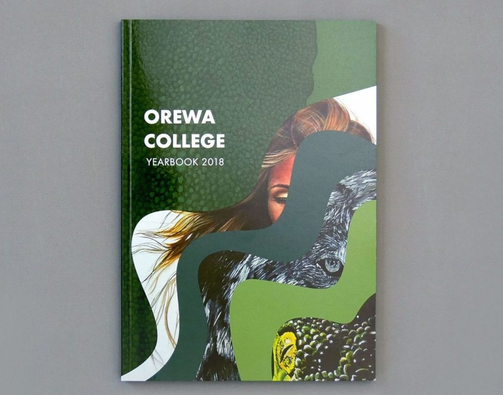
This yearbook cover uses a popular design trend, combining illustration and photography. The cover has energy and movement due to the depth and lines of the image. Bold and clear writing clearly communicates the school and publication type. The cover uses confident green hues that are natural and inviting to the reader.
ACG Strathallan
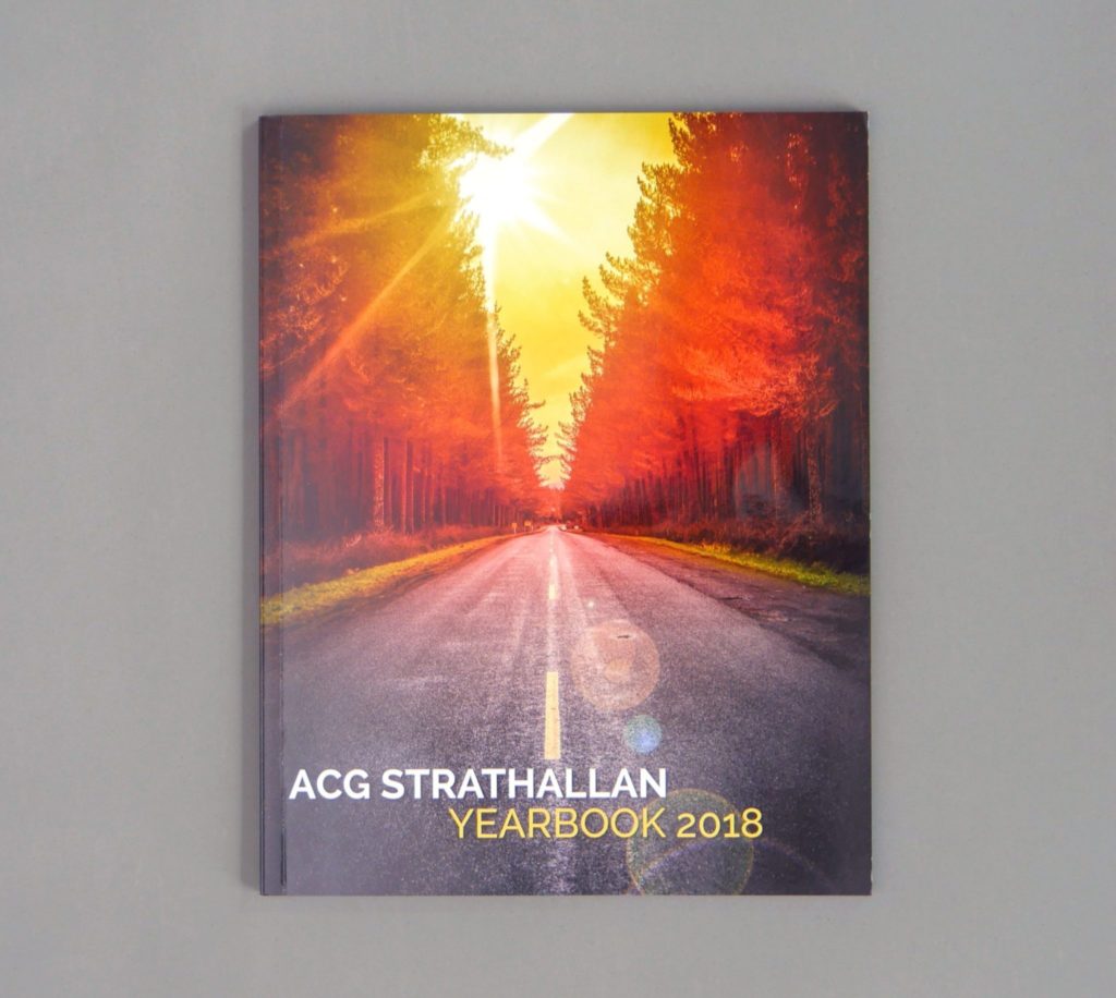
This cover is attractive due to its simplicity and balance. The background image is almost symmetrical from left to right and contains depth and a 3D feel. The text is clear and pulls a yellow from the sunset image, which keeps the look cohesive.
Birkenhead College

Text is interwoven with the artwork, which adds dimension and gives the cover a modern look. Contrasting, eye-catching colours attract the reader and make for a lovely and artistic cover.
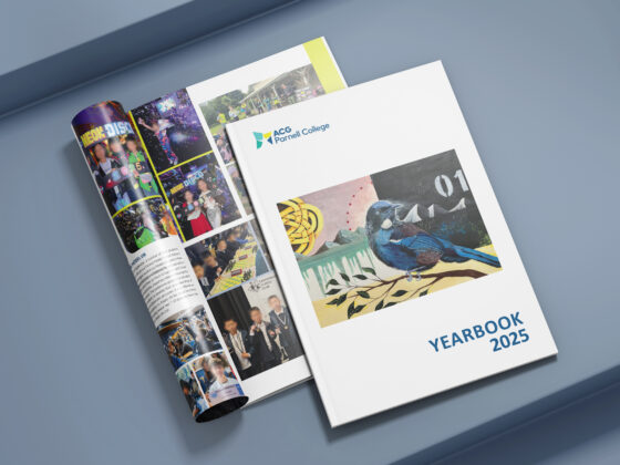
ACG Parnell College
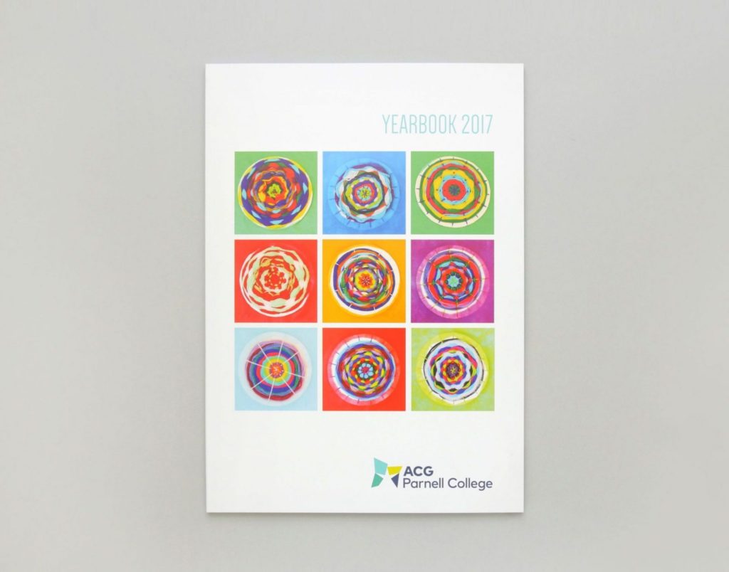
This yearbook cover uses student art for a more personal touch. The fun, bright art is paired with a good display of white space. This keeps the book professional and symmetrical. This cover shows how your design doesn’t need to be complicated to be a big hit!
Sources:
[i] https://www.psychologicalscience.org/observer/how-many-seconds-to-a-first-impression
[ii] http://www.thebooksmugglers.com/2010/04/cover-matters-the-survey-results.html
[iii]Arnheim, Rudolf, Art and Visual Perception, University of California Press, Berkely, 1974