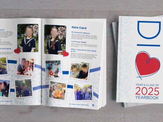
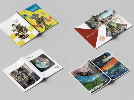
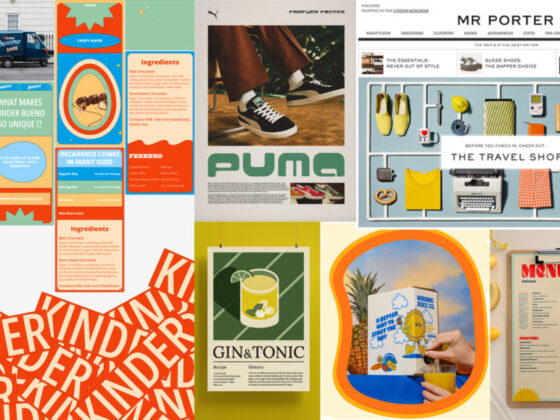
Backgrounds are the canvas of your page and can be as detailed or as simple as you would like. While hidden behind writing and photos, your page background plays an important role in making the yearbook content stand out!
Backgrounds can add texture and depth, set a scene, provide continuity or reinforce a theme. Just make sure to retain consistency throughout your yearbook and that all overlaid text is readable.
Let’s explore some different styles to try for your next school yearbook!
Yearbook Background Styles
1. Colour Blocking Styles
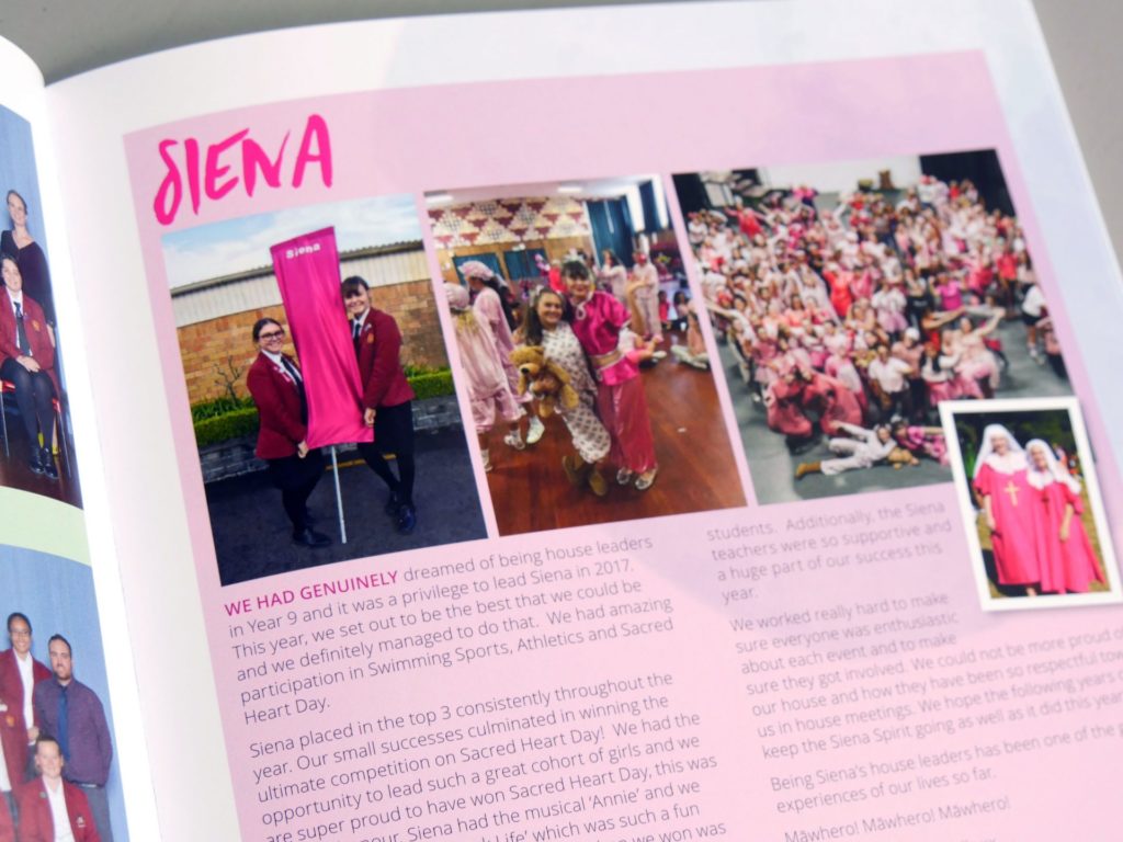
Block coloured backgrounds are a simple but very effective option. This style gives you the freedom to place text directly on the background and still be readable.
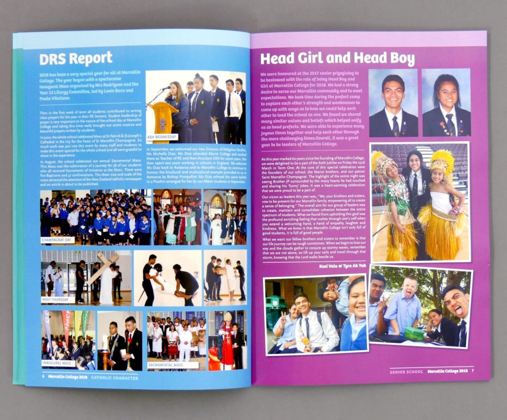
A plain background lets your content speak for itself without distracting the reader. Try different colours for different pages, sections or themes in your yearbook.
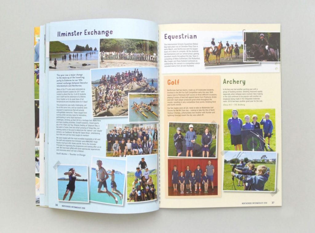
Consider changing the background colour for different stories on the same page. This style makes it clear to the reader where one article stops and the next one starts.
2. Gradient Page Backgrounds
If the benefits of colour blocking are appealing, but you want something a bit different, try a gradient! Colour gradients are popular in design, offering versatility and a modern look.
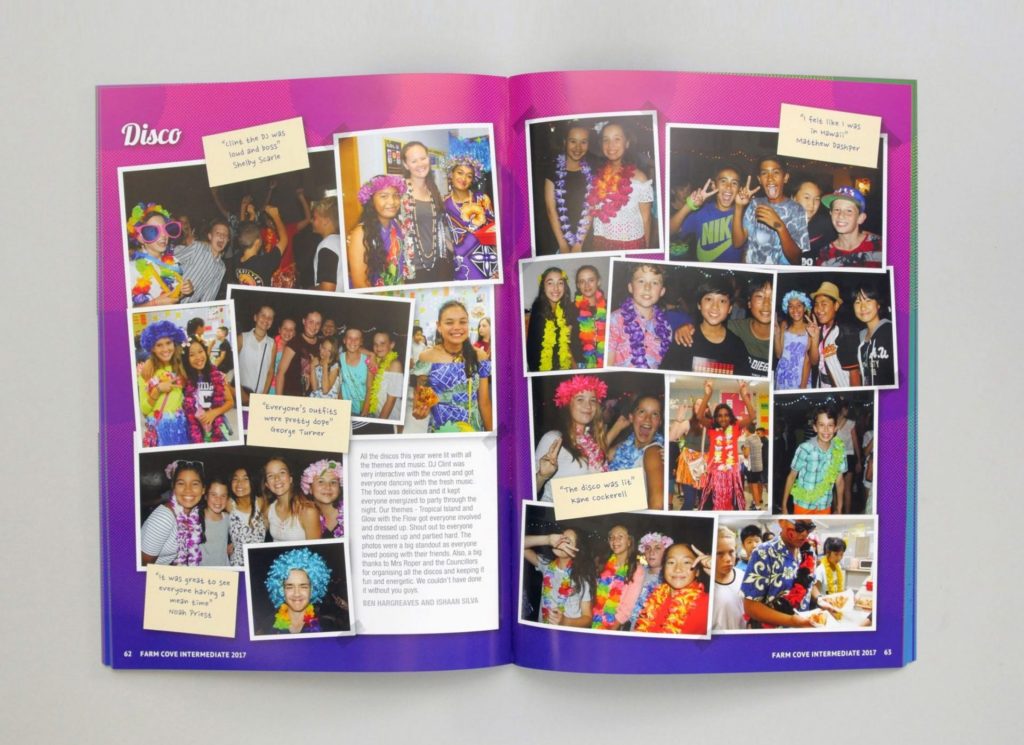
For peaceful and harmonious pages, fade between two similar shades. For something with more impact, pick contrasting colours to add life to your yearbook.
3. Photography Backgrounds
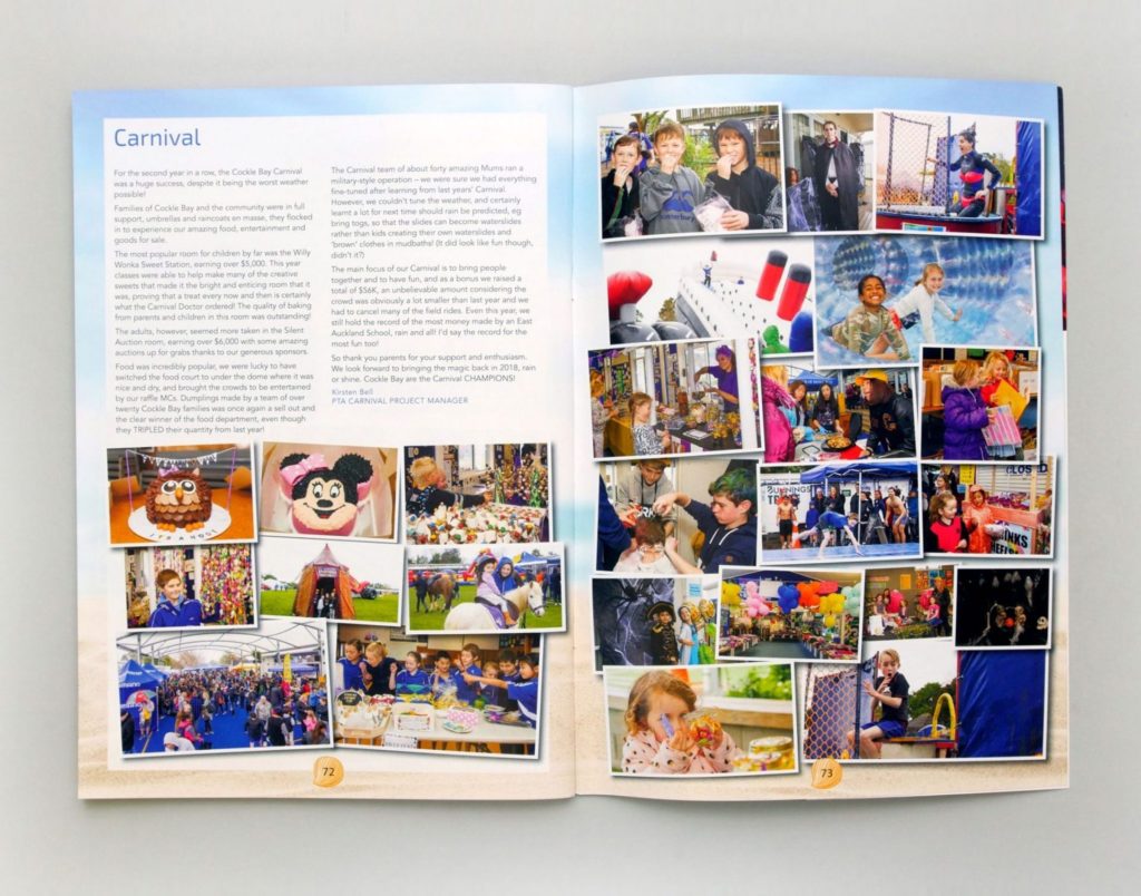
Photos as backgrounds can help set the scene, but they require some smart decision-making. As photography can be distracting, scenic shots or images of flora and fauna are the easiest to incorporate. With photos of people, choose images taken at distance to avoid cutting off faces with overlaid content.
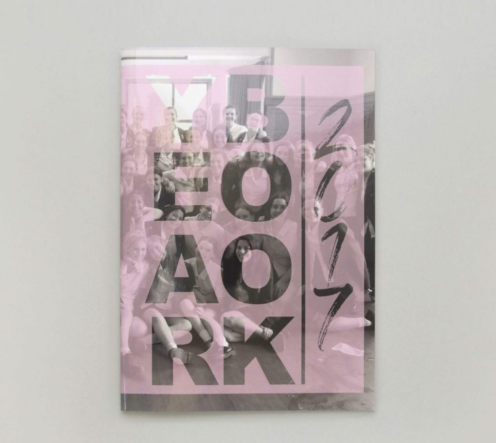
Photos that are slightly transparent or muted in colour won’t distract from the other page elements. Use original images for a high-quality look, and ensure the photo size is large enough to fill the space.
4. Ornamental & Floral Pages
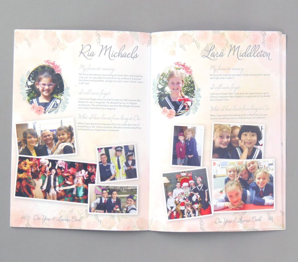
Detailed, ornamental backgrounds can enrich your yearbook when used effectively. From fleur-de-lis motifs to stylised florals, these patterns create a lovely look but try to use them sparingly.
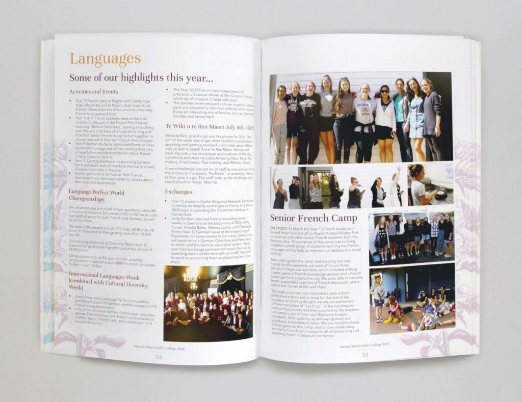
Keep dense patterns close to the page edges, with low contrast for a subtle but pretty page!
5. Brush Strokes & Watercolour Effects
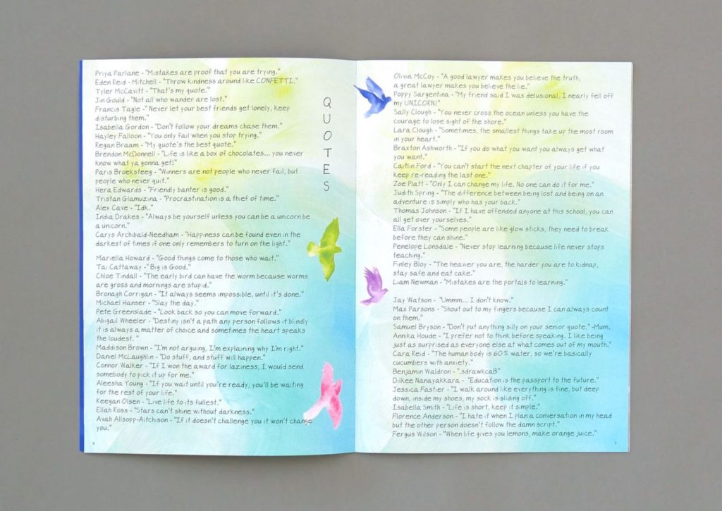
Painted backgrounds are a great option for retaining white space on your page, as they can be as detailed or as sparse as you wish. This also helps maintain the text readability without the need of additional plain backgrounds.
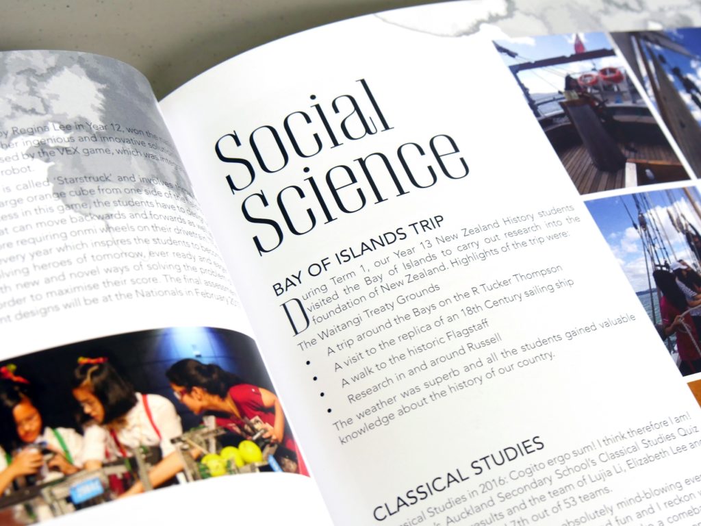
Try an artistic approach for a soft and subtle look. Brushstrokes or watercolour droplets pair nicely with many different yearbook themes.
6. Geometric Pages
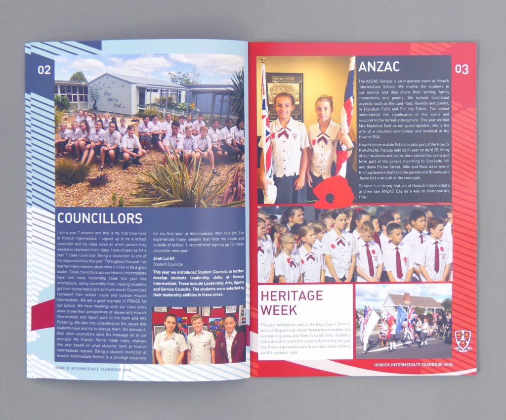
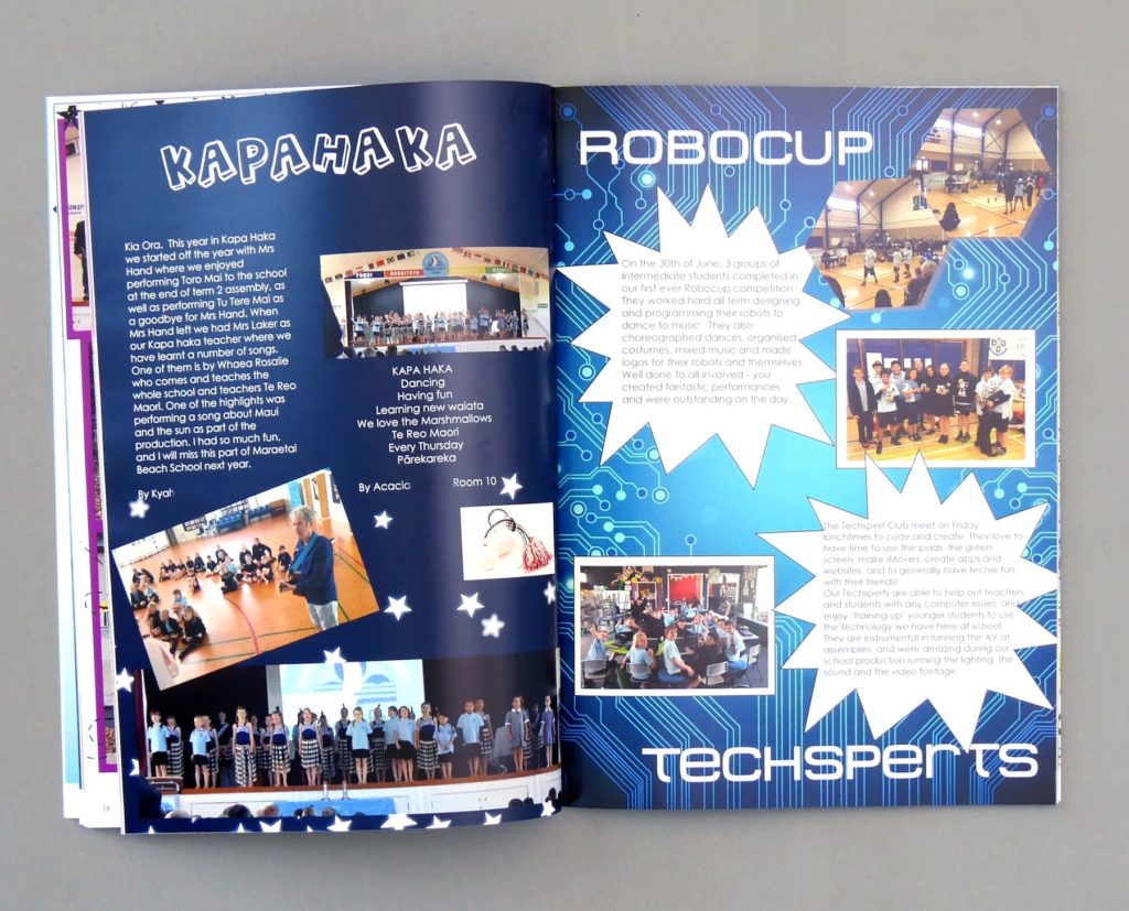
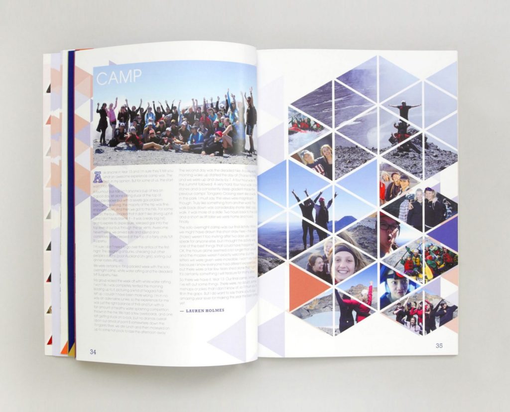
Give your yearbook a confident look with bold lines, shapes and angles.
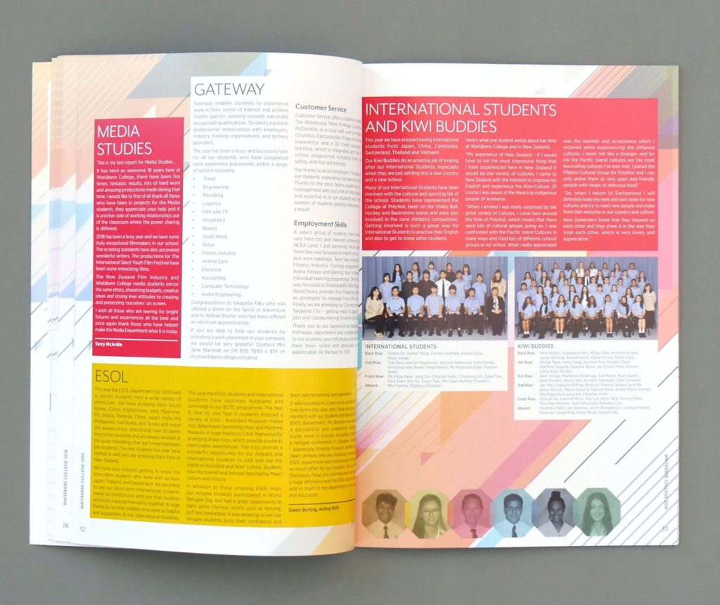
Not for the faint-hearted, this look is energetic, busy and filled with movement. Because of this, it’s a good idea to place additional plain backgrounds behind articles.
7. Classroom Scenes
Make your yearbook come to life by incorporating textures found in the classroom!
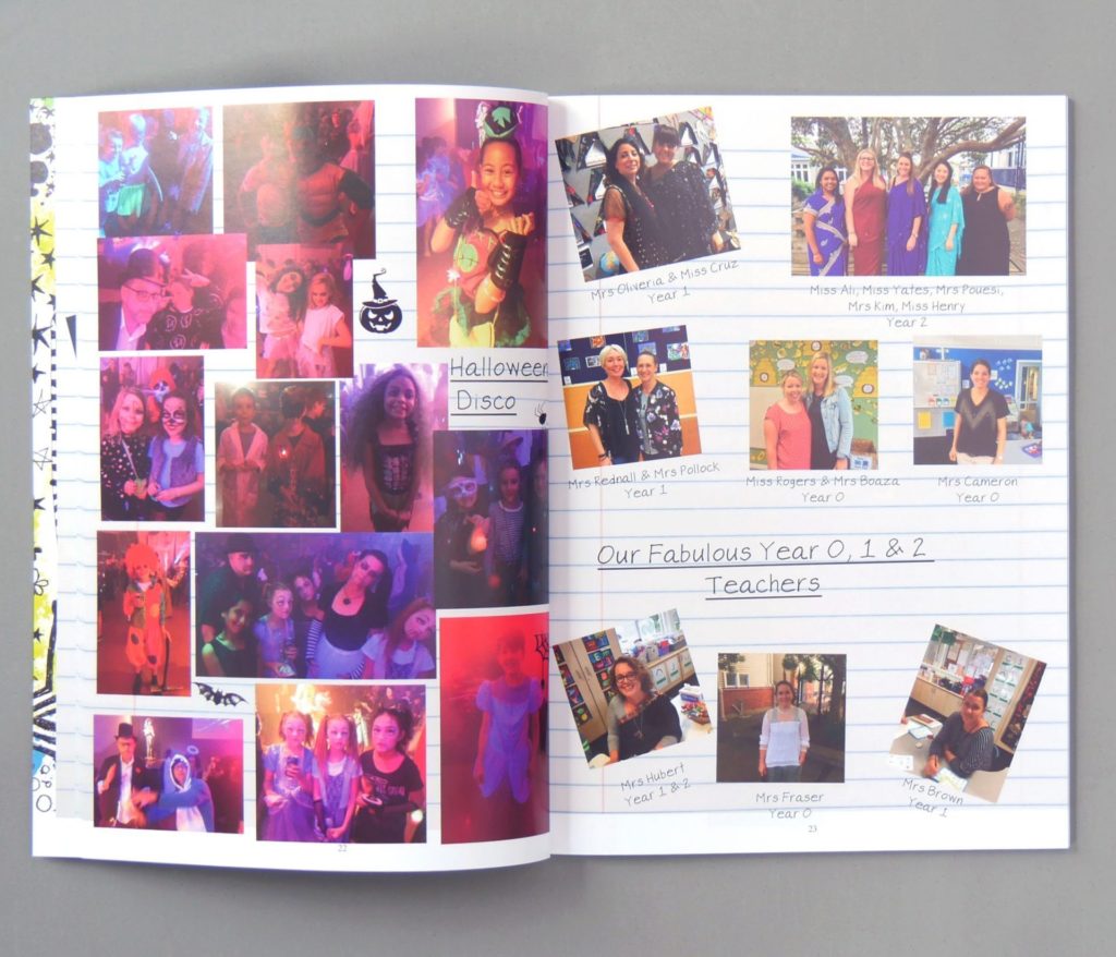
Try a lined paper background, reminiscent of a workbook, for a fun primary school yearbook. Pair with handwritten fonts, and unstructured photos to further set the scene.
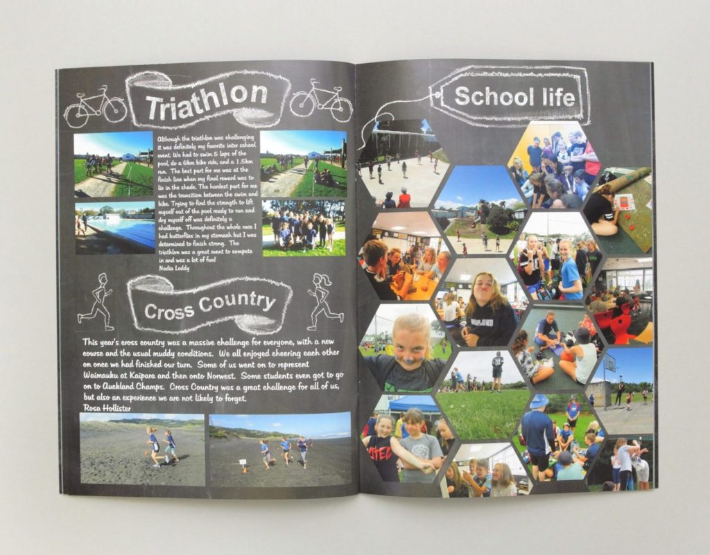
Another classroom theme is the chalkboard style. Pair a dark, textured background with a chalkboard font for your classroom theme.
8. Textured Page Backgrounds
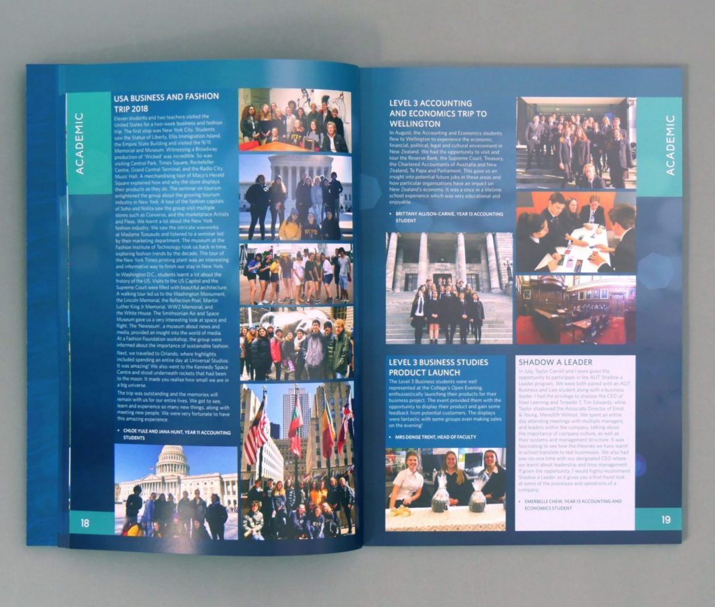
Textured backgrounds are similar to solid colour page backgrounds but with some additional benefits. Subtle strokes, grainy patterns or simple imagery provides depth to the page.
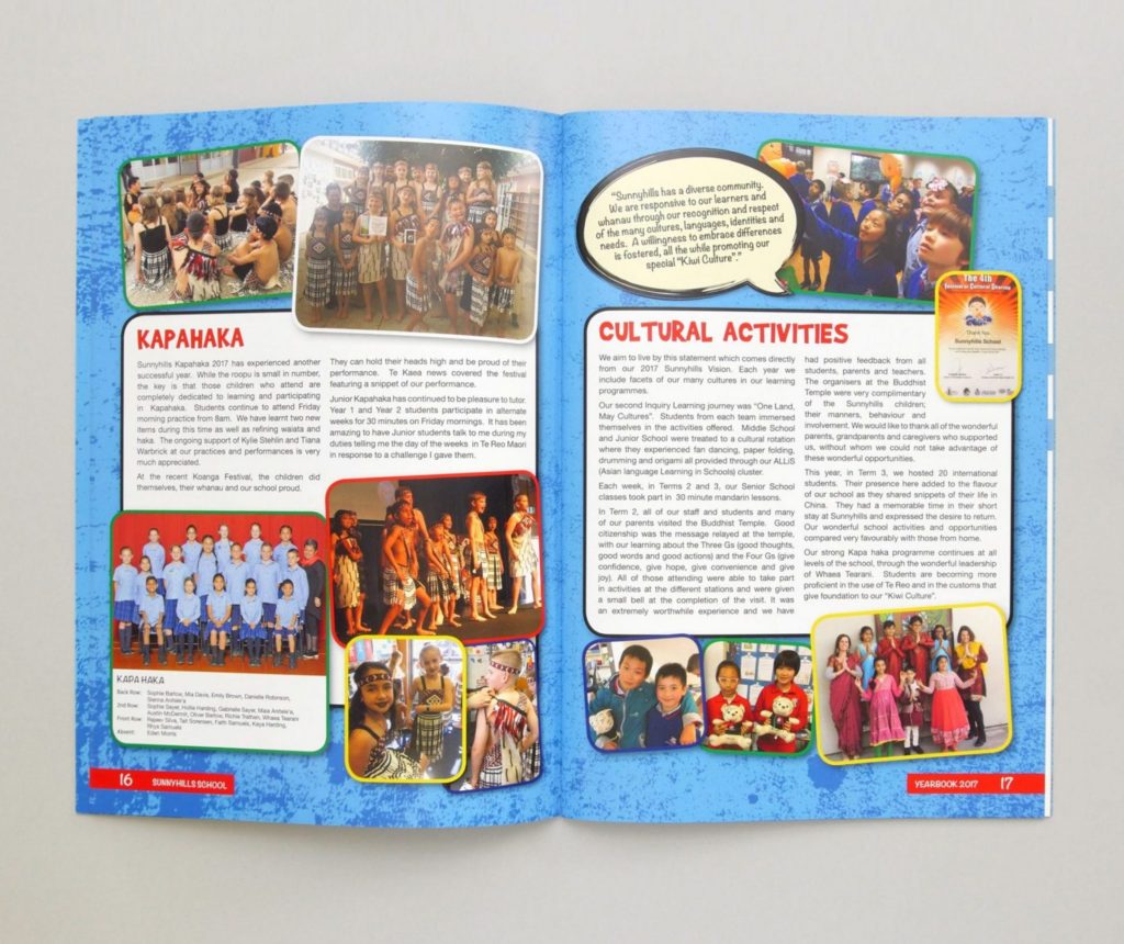
Add rough textures for a confident look, or soft blurs for a dreamy page.
9. Cultural Motifs
If your school has a rich cultural history or if you would like to celebrate student diversity, use a theme that reflects this.
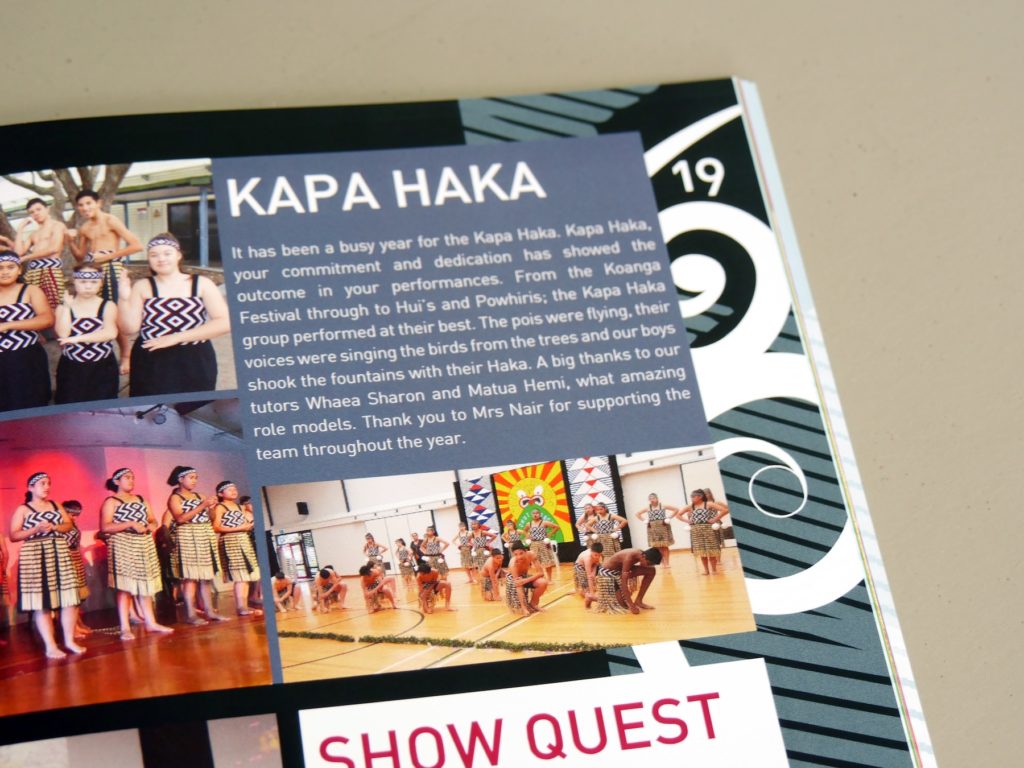
For New Zealand schools, Maori symbols like the koru can be used to symbolise new beginnings, strength or peace. These shapes lead the eye in a spiral motion, providing movement to the page.
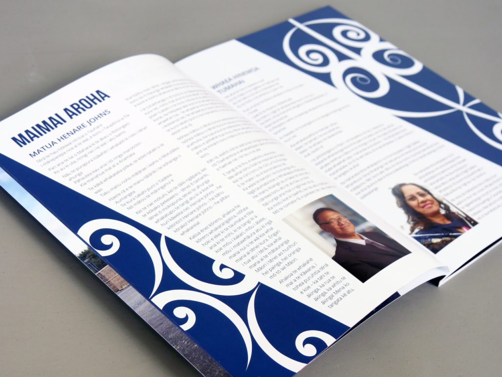
To recognise the array of cultural backgrounds in your school community, mix up your backgrounds throughout the yearbook. Dedicate different sections to different cultures, with corresponding backgrounds to match!
10. Fun & Bright Pages
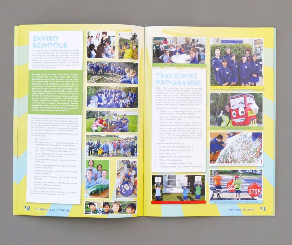
Bring life to the yearbook pages and make your content stand out! Use a page background with a bright pattern that best reflects your happy school.
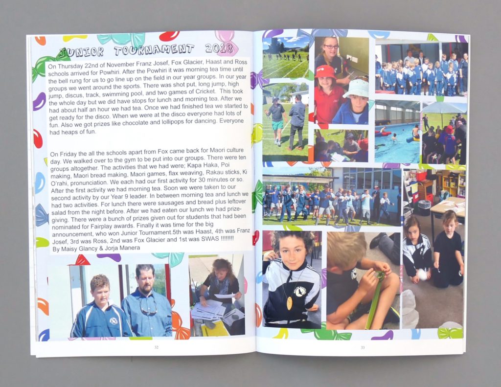
Be bold with your colours and opt for patterns of stars, sunrays or objects that are relevant to your students and school.

