Script fonts resemble cursive handwriting and can be expressive, playful, or formal, depending on which one you choose! But what they all share is the ability to bring a unique identity to your design.
Script fonts can be hard to read, which is why they are best for an ornamental addition, used sparingly and at a large size.
Here are some school yearbooks and leavers books that use script fonts to bring some flare!
Designs With Script Fonts
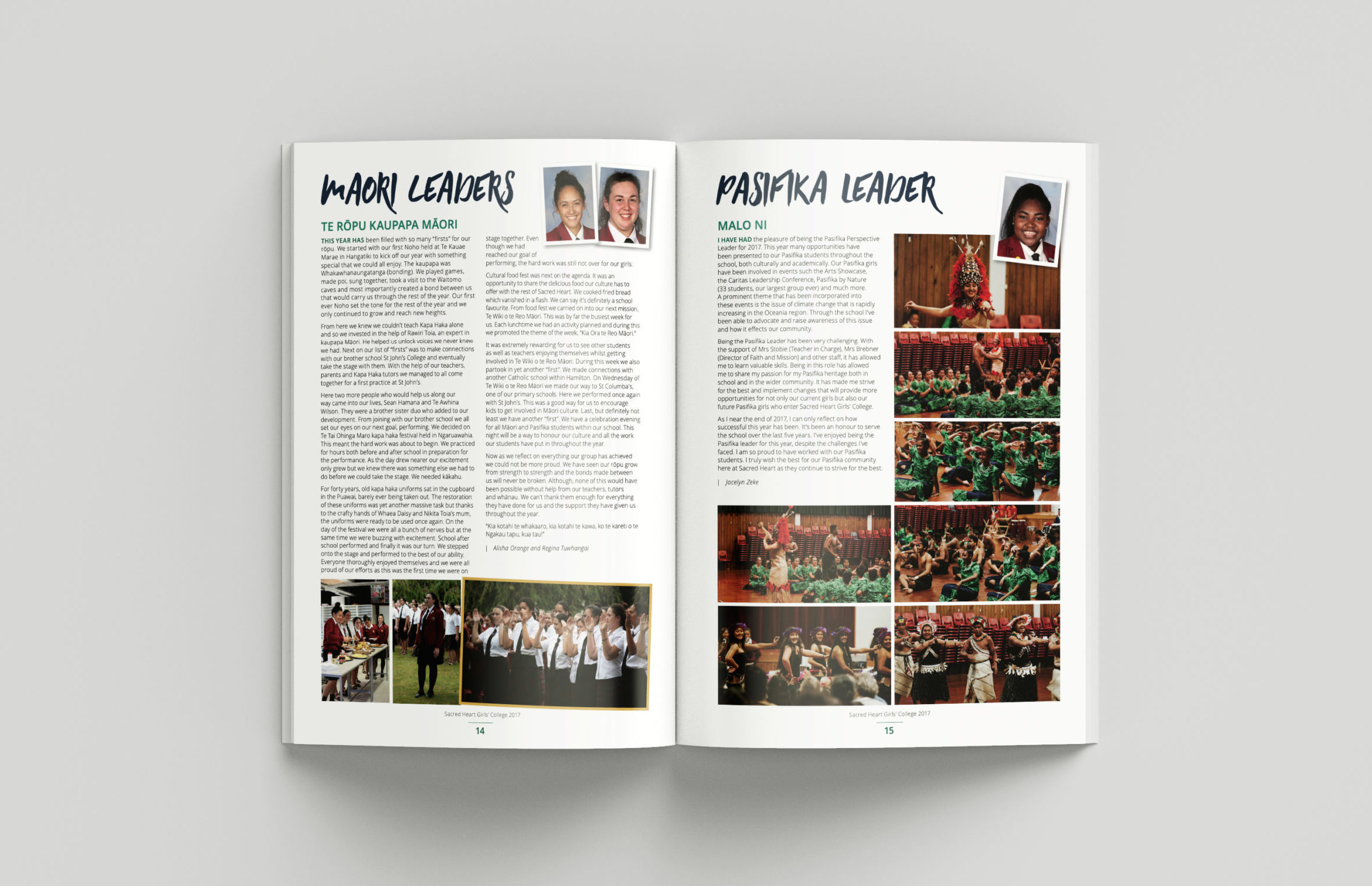
Sacred Heart Girls’ College 2017 Yearbook
These bold headings for Sacred Heart are in Summer Hearts font. This brush typeface is all-caps and brings some attitude and energy to the pages!
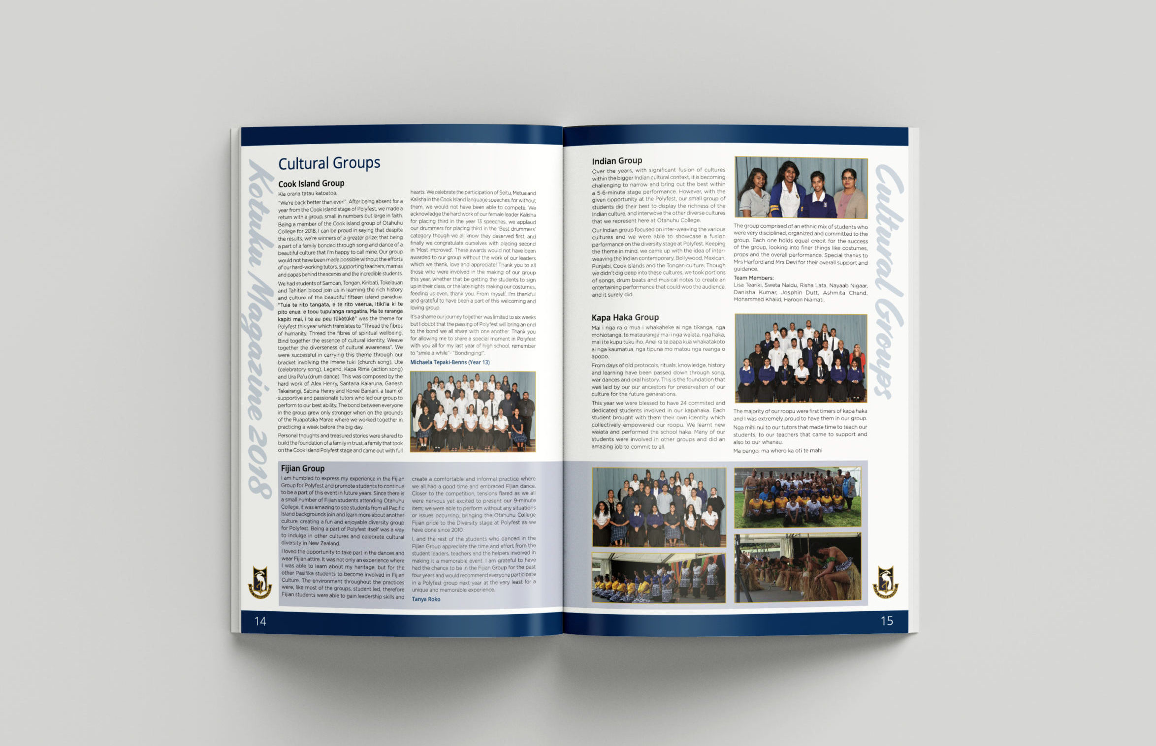
Otahuhu College 2018 Yearbook
Often, the best use for a script font is as a decorative page element. This Otahuhu College yearbook uses easy-to-read fonts for its headings and paragraphs, but a script font down the sides of the pages. In doing so, the structured page design comes alive!
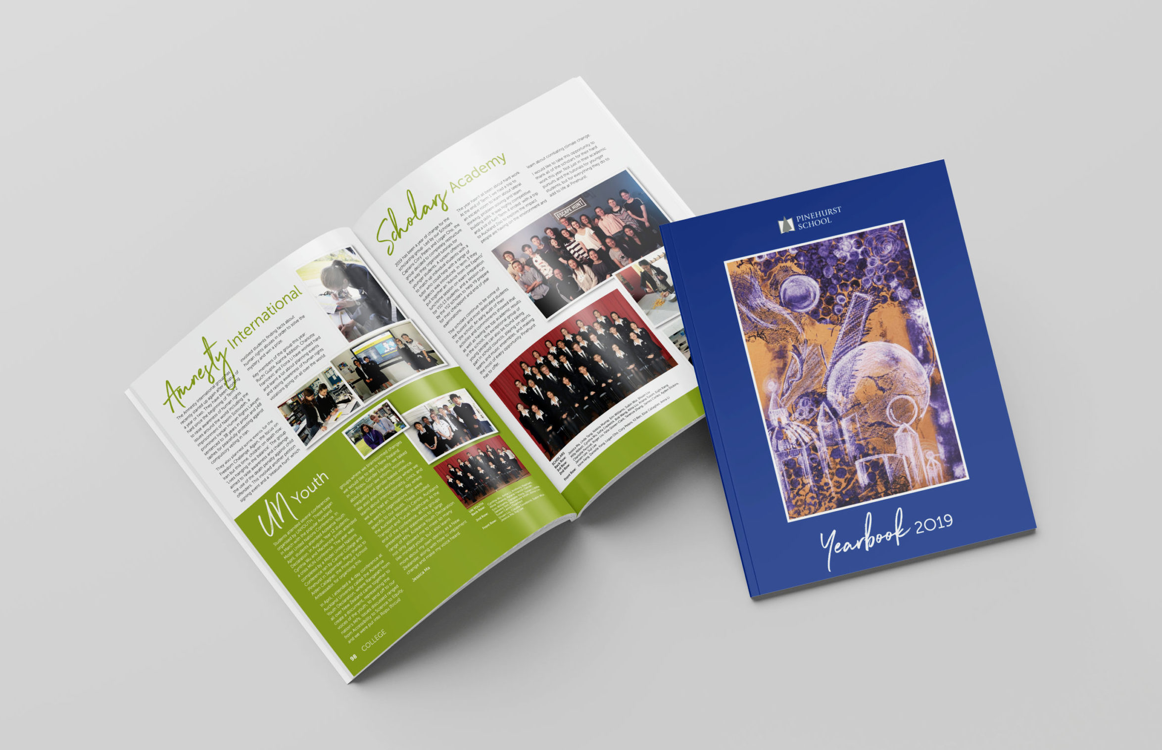
Pinehurst School 2019 Yearbook
For Pinehurst School, Northwell font is present on both the yearbook cover and pages. This font looks like cursive handwriting, with short dry strokes and an organic feel. This font is used alongside simpler fonts for clarity and contrast.
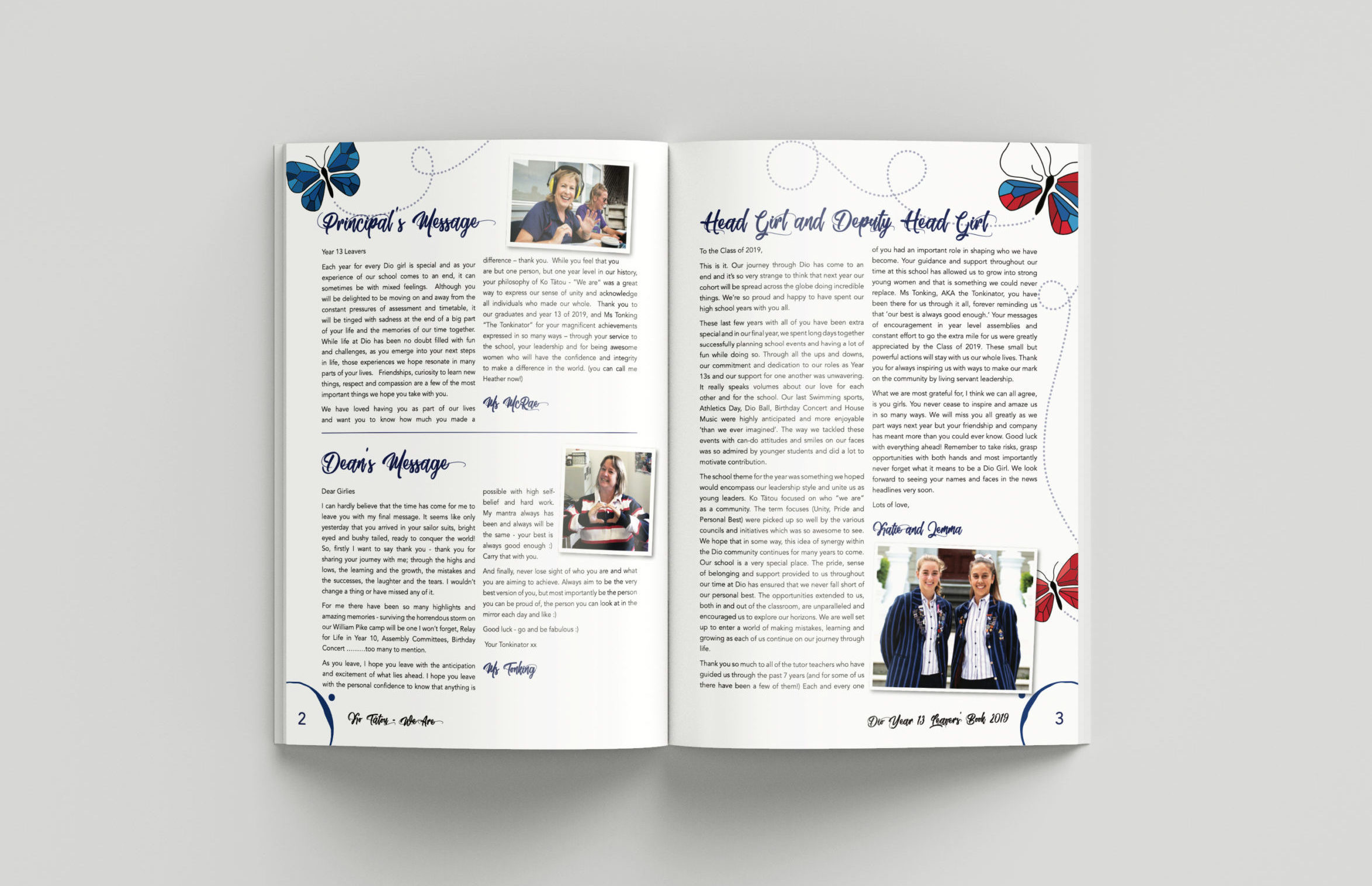
Diocesan School for Girls 2019 Leavers Book
For this Dio leavers book, Moving Skate font brings a whimsical flair to the page. This font pairs perfectly with the butterfly motif and page design.
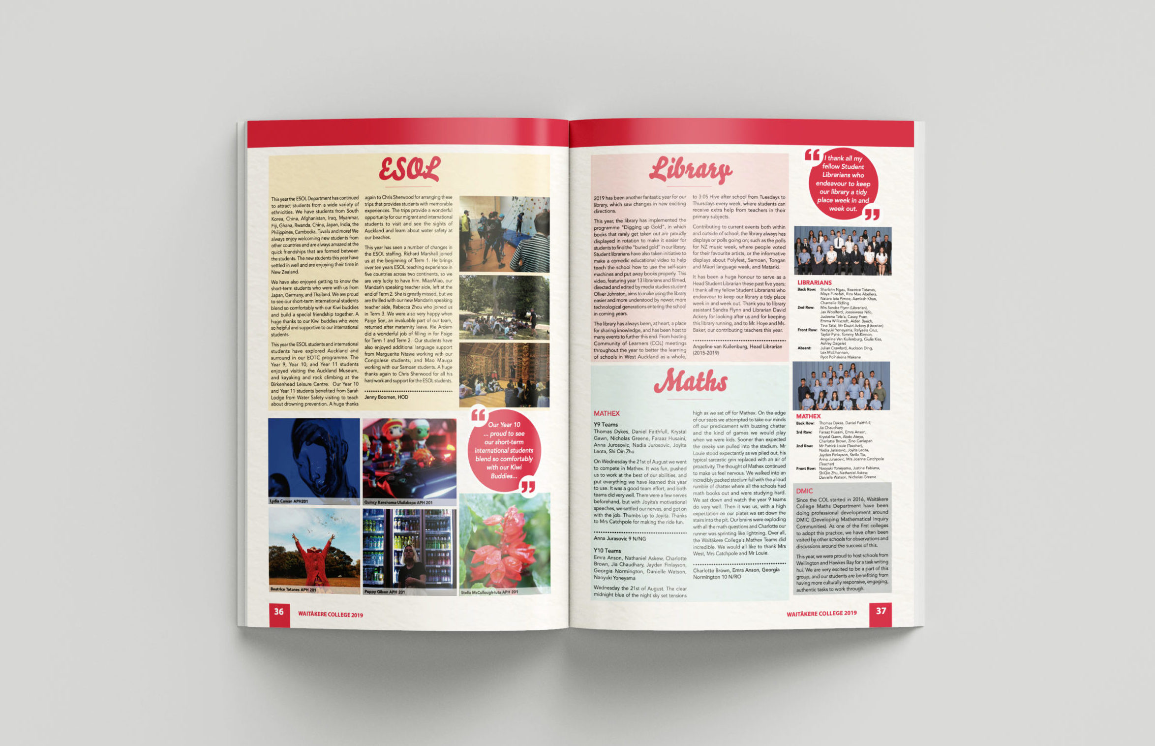
Waitākere College 2019 Yearbook
This Waitākere College yearbook uses Bello font for its headings. This font is a chunky brush typeface, which looks friendly and casual.
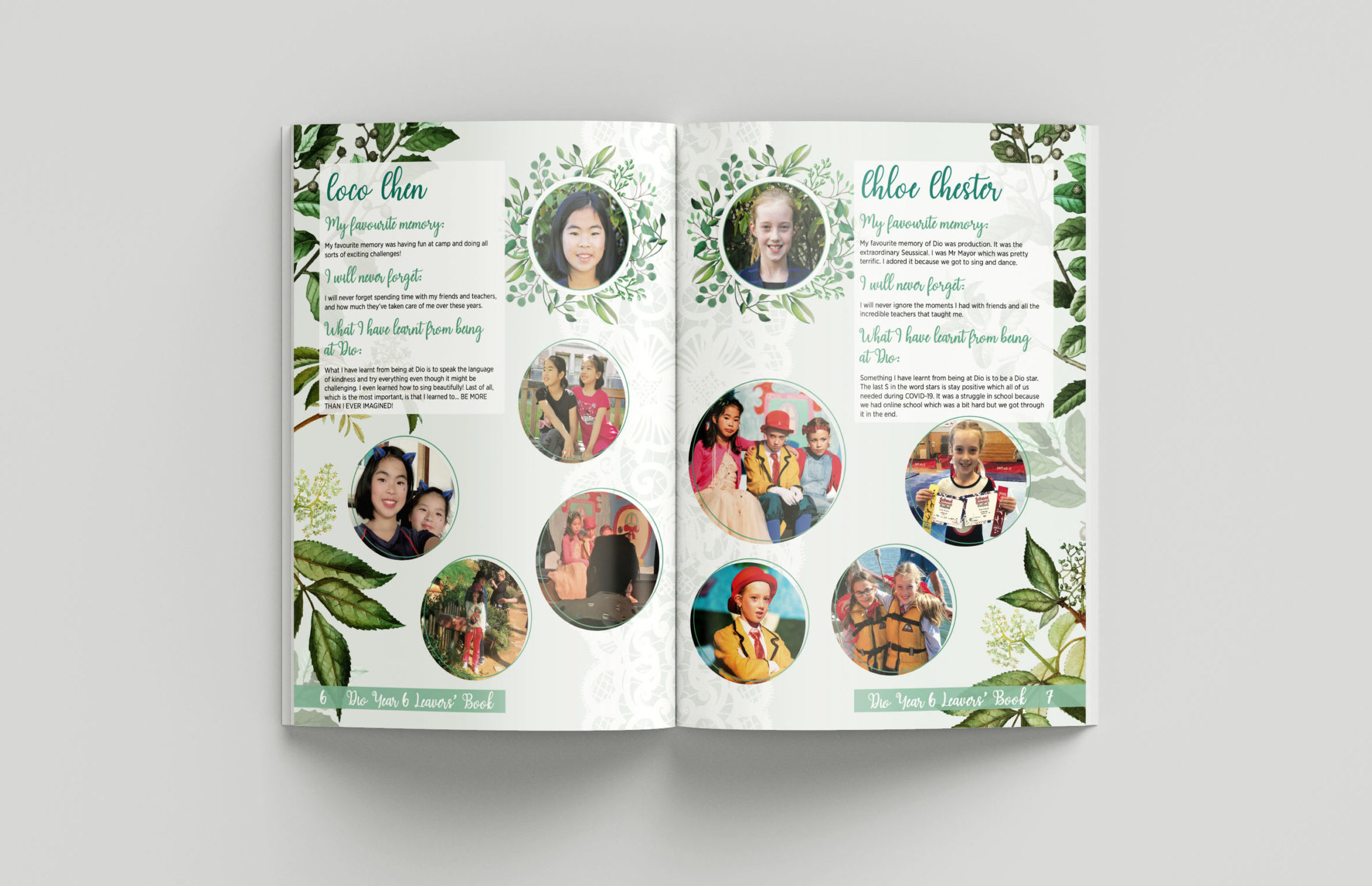
Diocesan School for Girls 2020 Leavers Book
The headings and subheadings for this Dio leavers book are reminiscent of cursive handwriting. This style matches the earthy, organic page design, while the paragraph text is simple and easy to read.
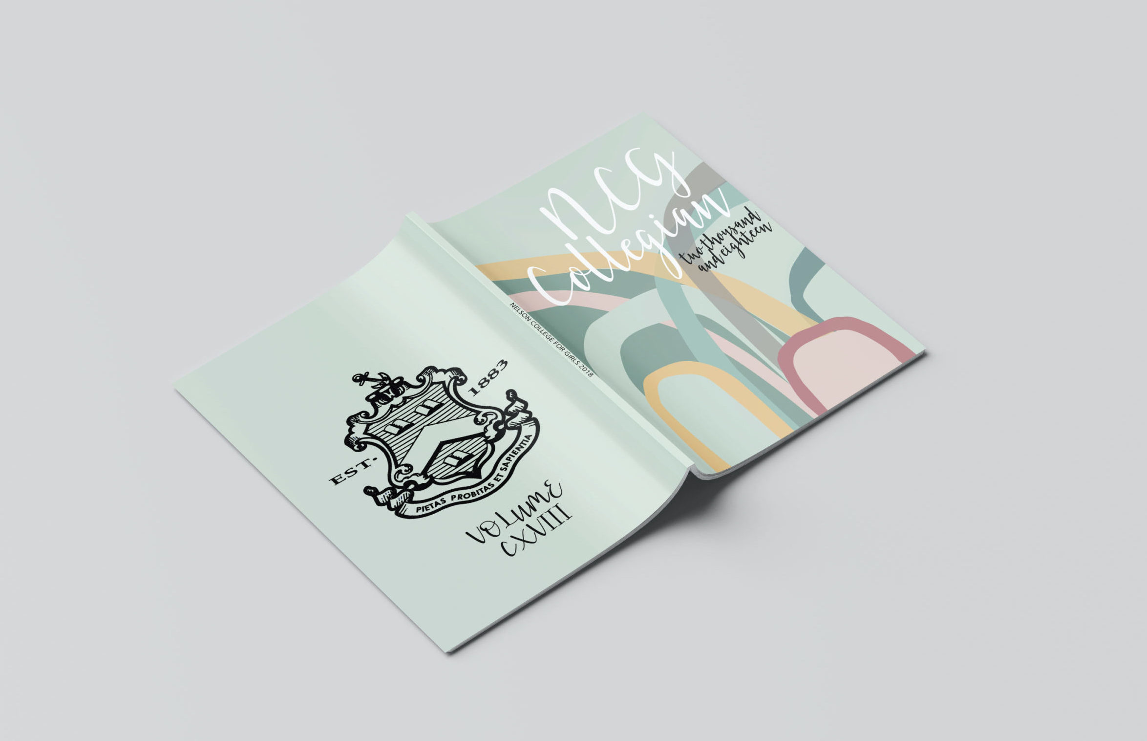
Nelson College for Girls 2018 Yearbook
If you’d like your yearbook pages to remain easy to read and structured, you can always have some fun with your cover! This yearbook cover uses a contemporary, cursive font paired with abstract shapes for a one-of-a-kind look!
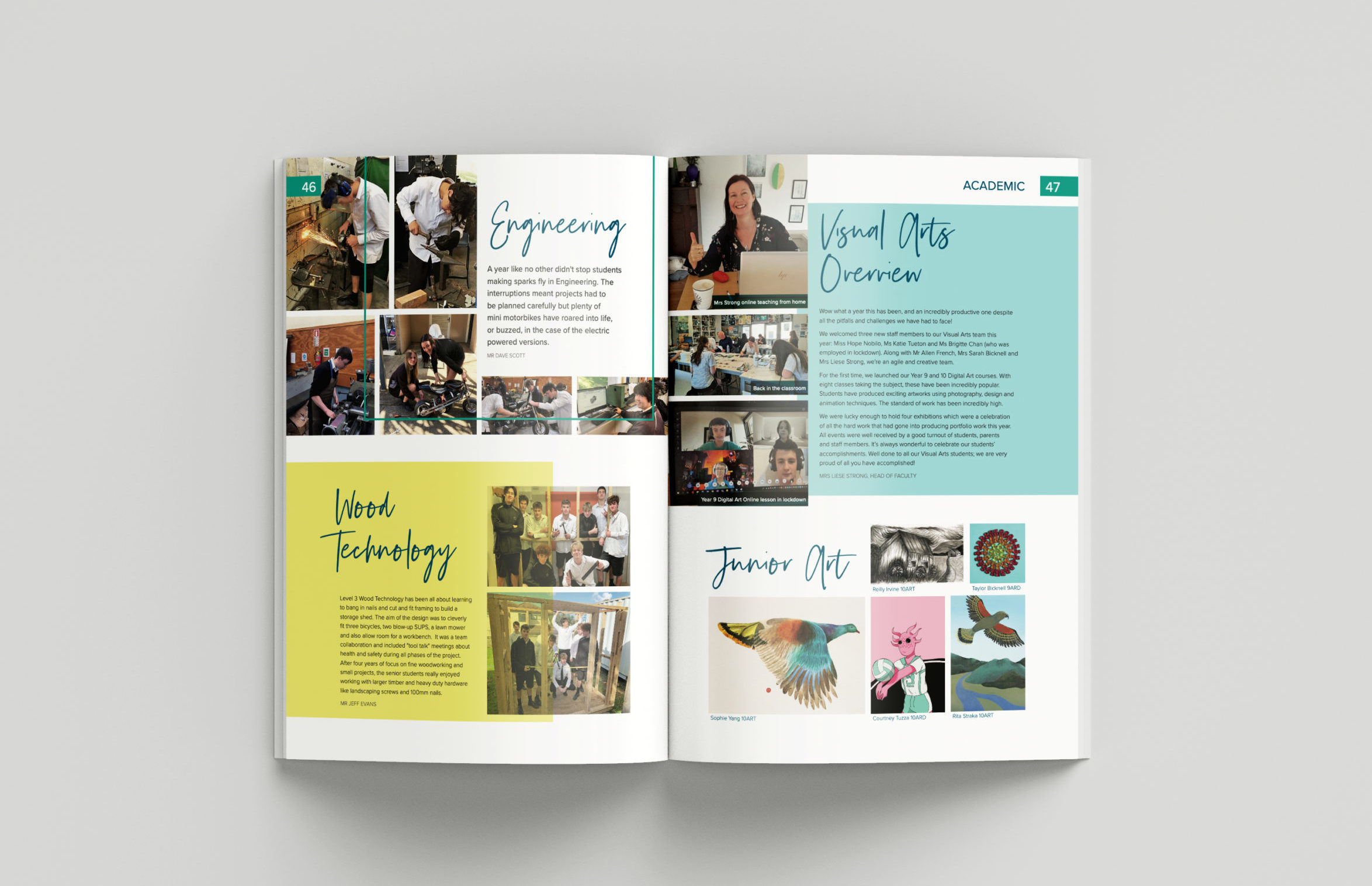
Long Bay College 2020 Yearbook
Silver South Script brings the WOW factor to this Long Bay College yearbook! This font is both elegant and expressive, and a great choice for both formal and informal publications!

