If you are creating a yearbook, school diary or any other design project in 2022, you’re going to need some fresh ideas and inspiration! Here are a few top graphic design trends for 2022 to spark your creativity. Remember, sometimes mixing and matching these trends and styles is the best way to create something truly unique!
Modular Geometric
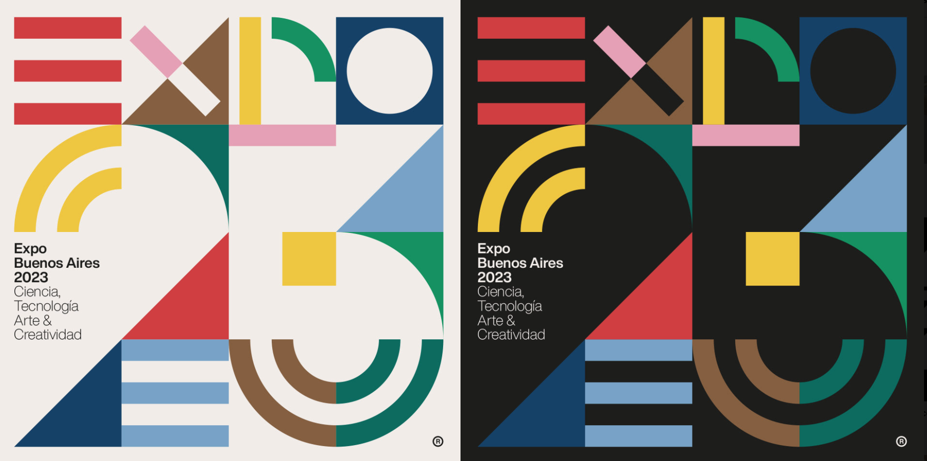
Our first 2022 graphic design trend is Modular Geo. This style consists of bold, flat geometric shapes like squares, circles, parallelograms and triangles.
For a contrasting look, use a palette of primary colours, black and white. Try out this trend for a poster, yearbook cover or as a page background pattern.
Grit & Grunge
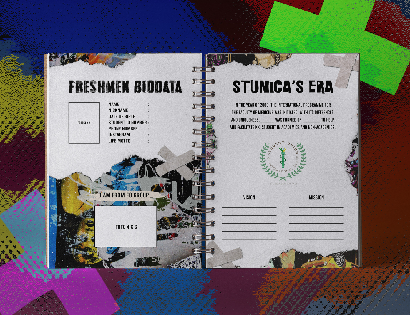
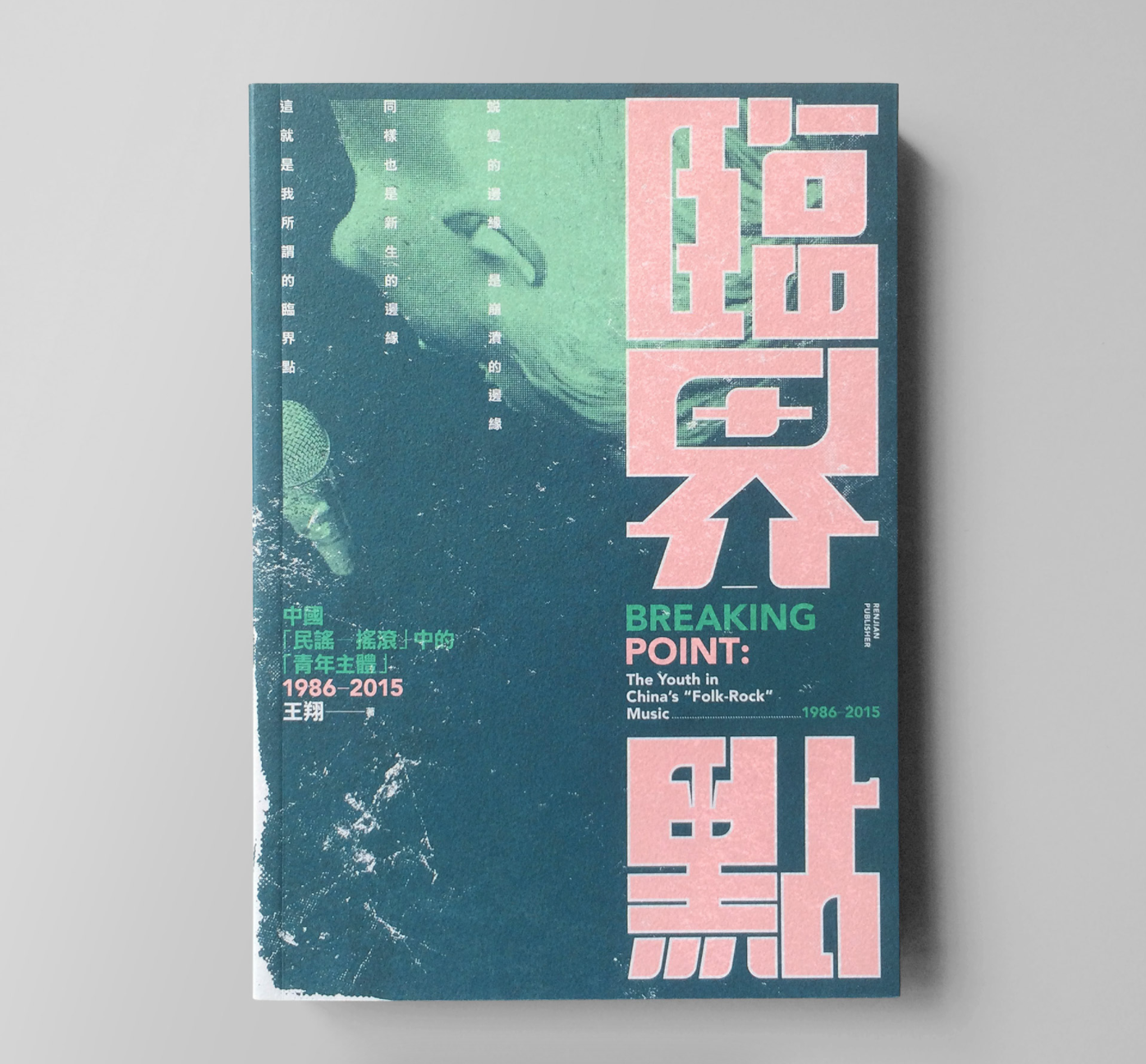
Our next trend embraces a grungy look, with grainy overlays and weathered effects. This style adds visual interest, character and age to your designs.
Try out this design trend for your school diary or student magazine!
Mixed Dimension
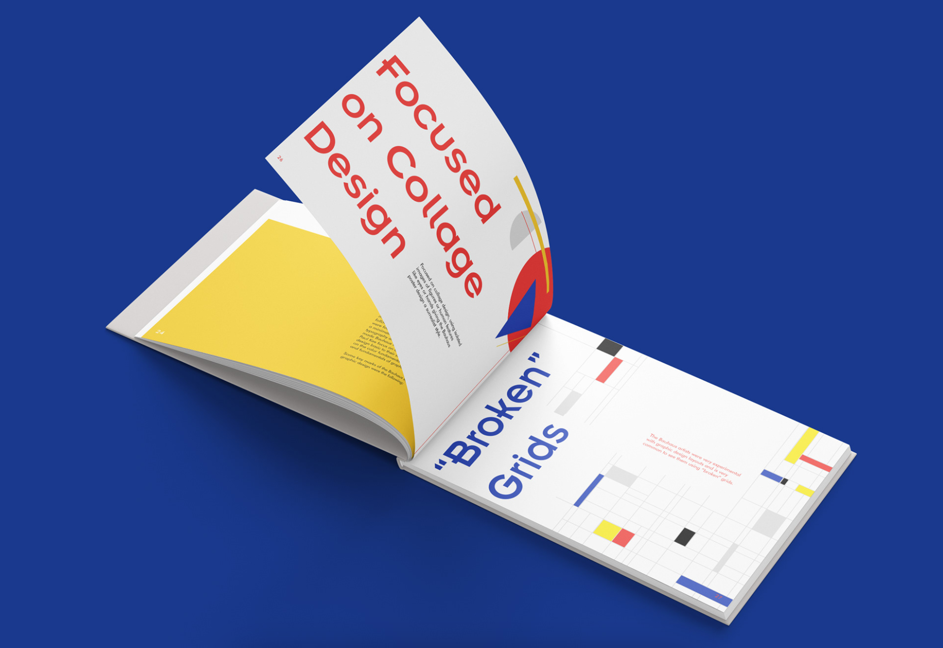
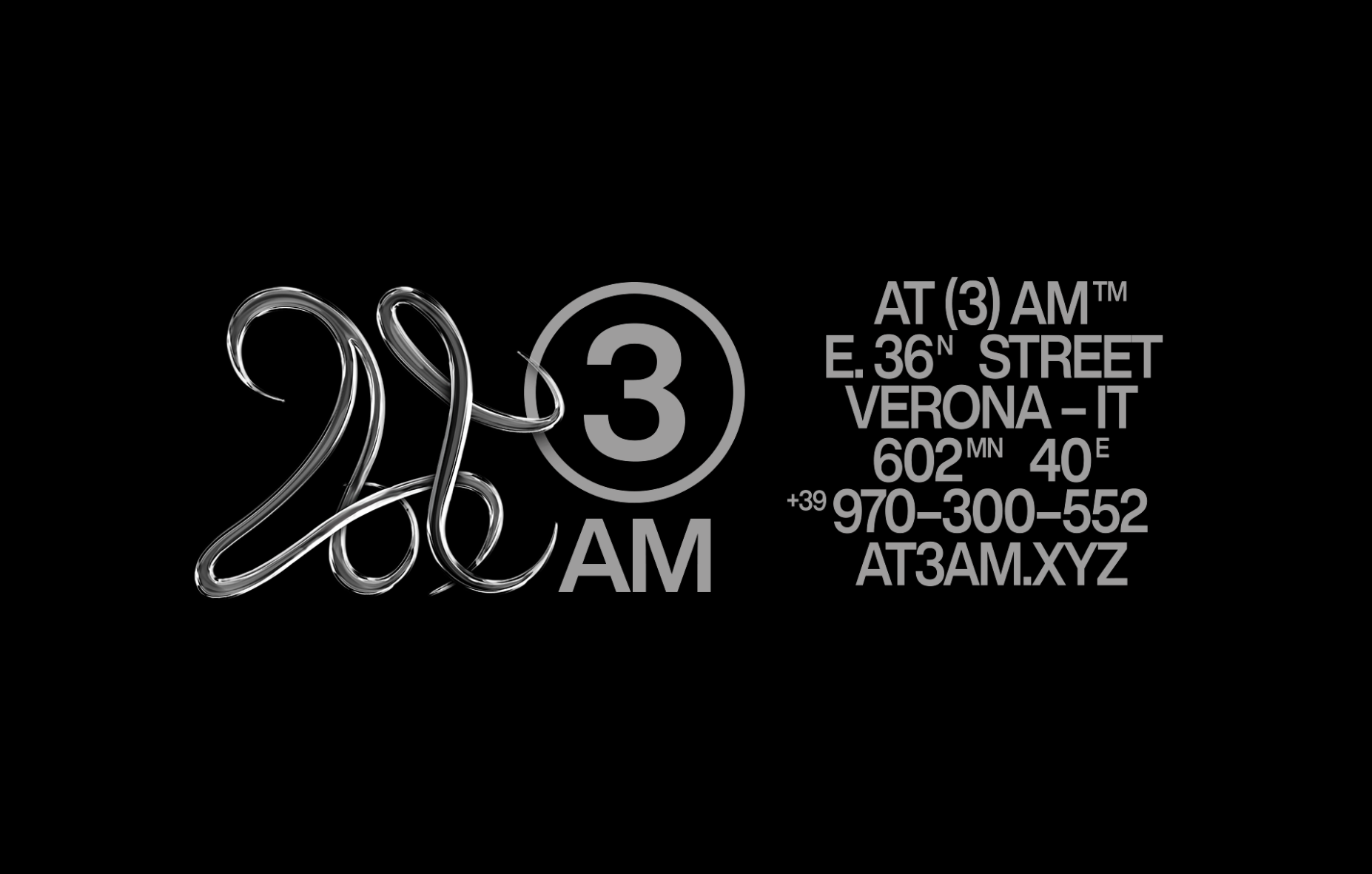
This next design trend plays with our perception of dimension. Designers are mixing and matching 2D and 3D elements that trick the eye.
By combining 2D and 3D, our eyes have to take a second look to understand what we are seeing. That’s why this style is perfect for any design that you want to grab attention!
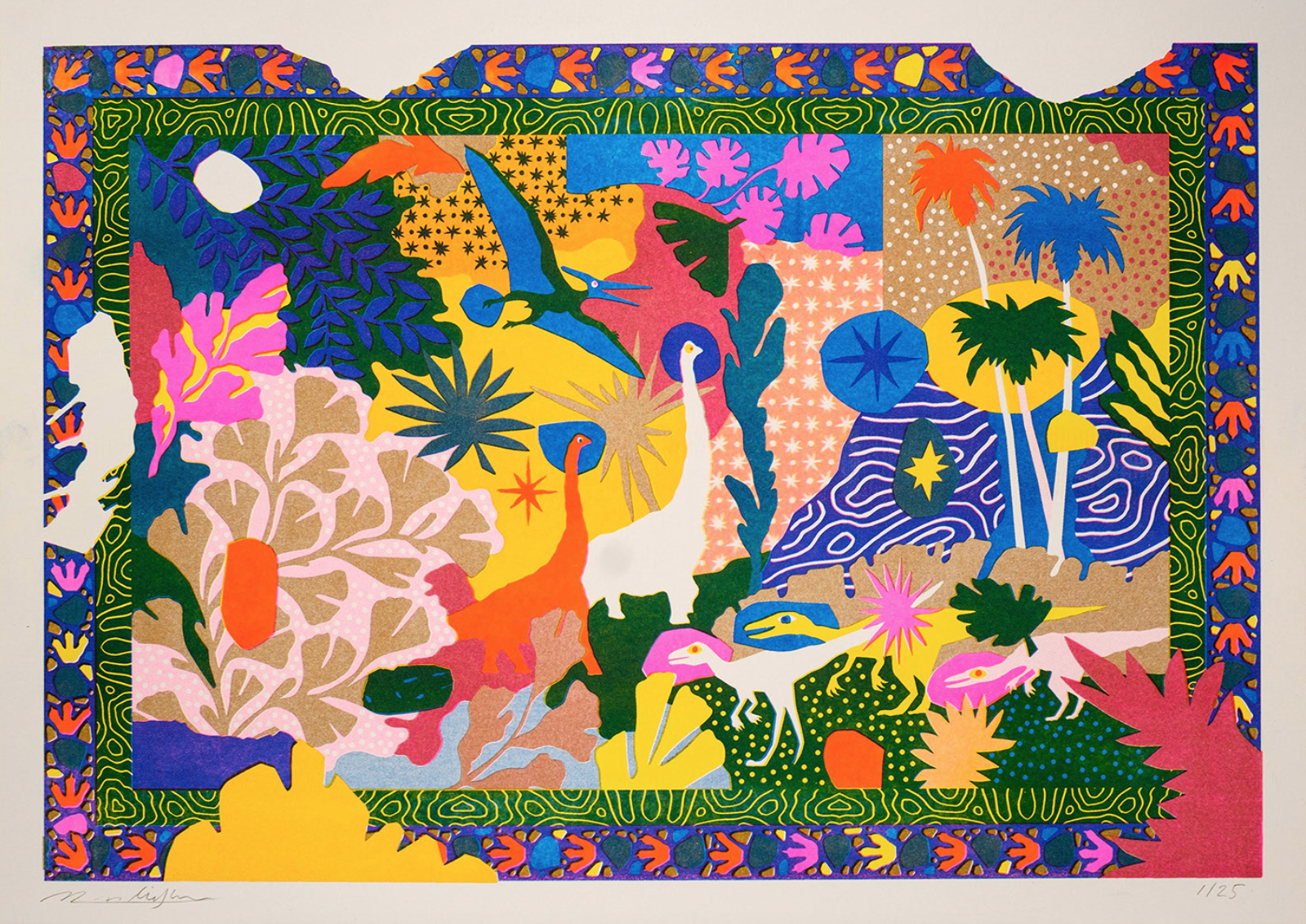
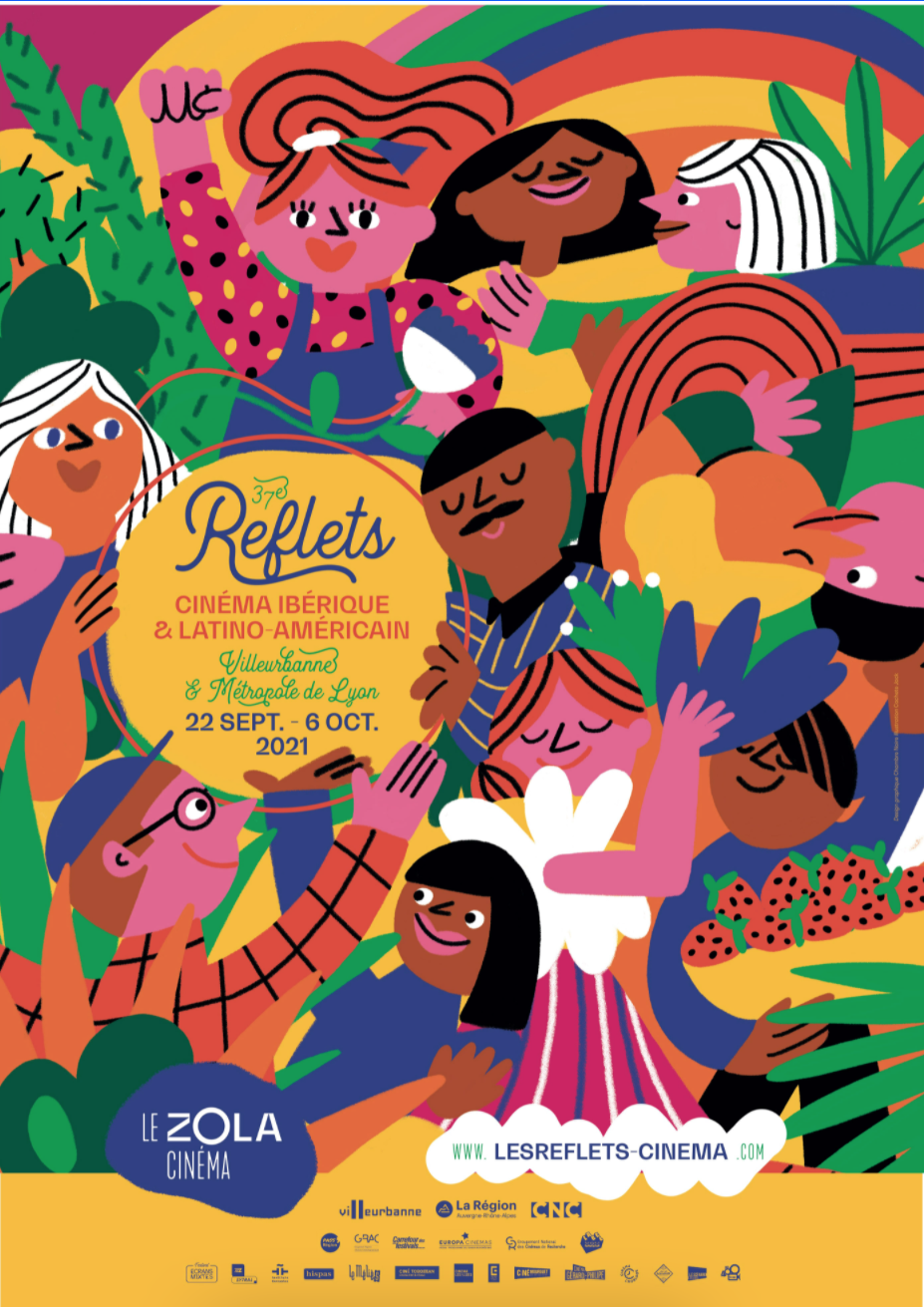
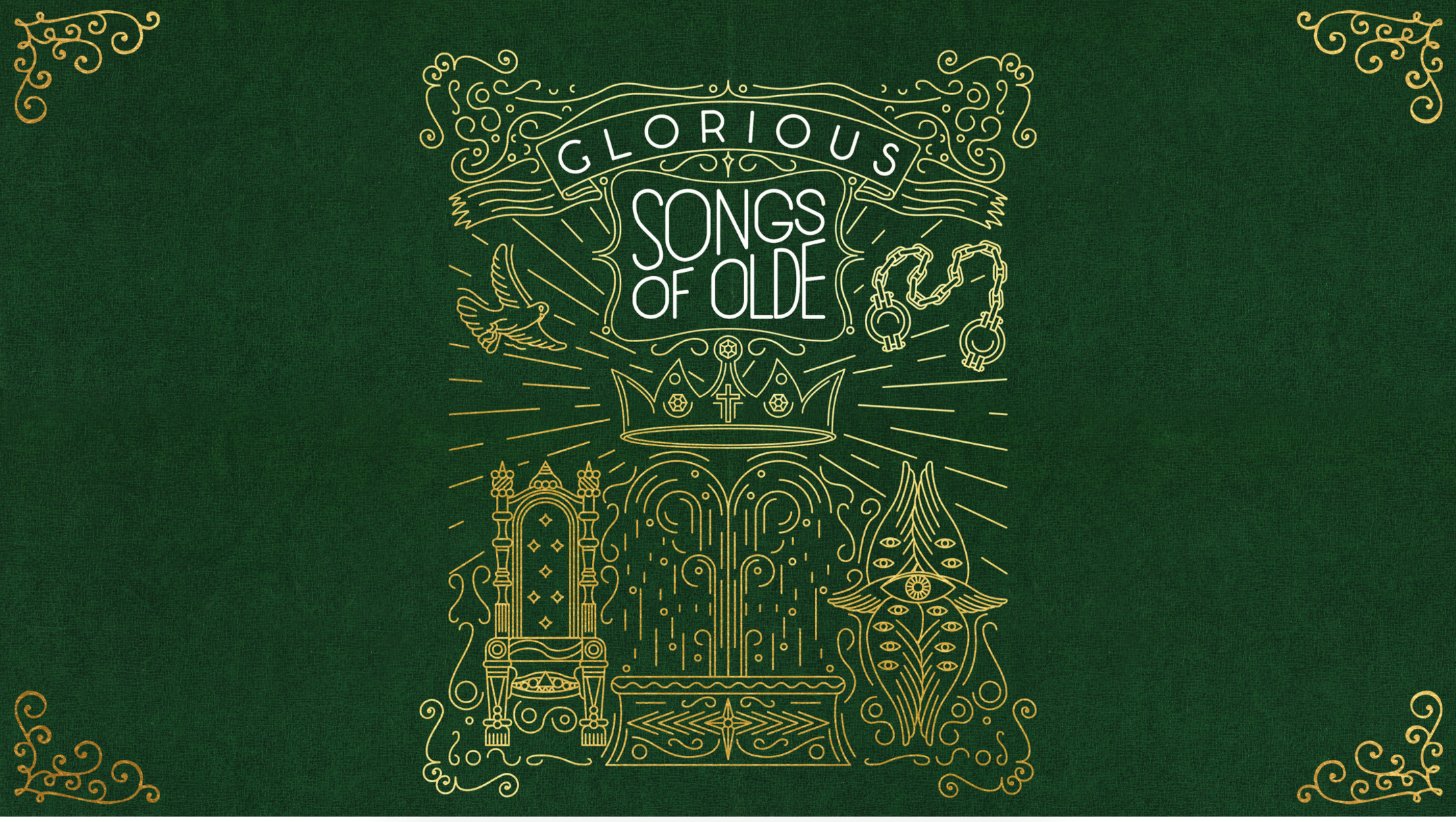
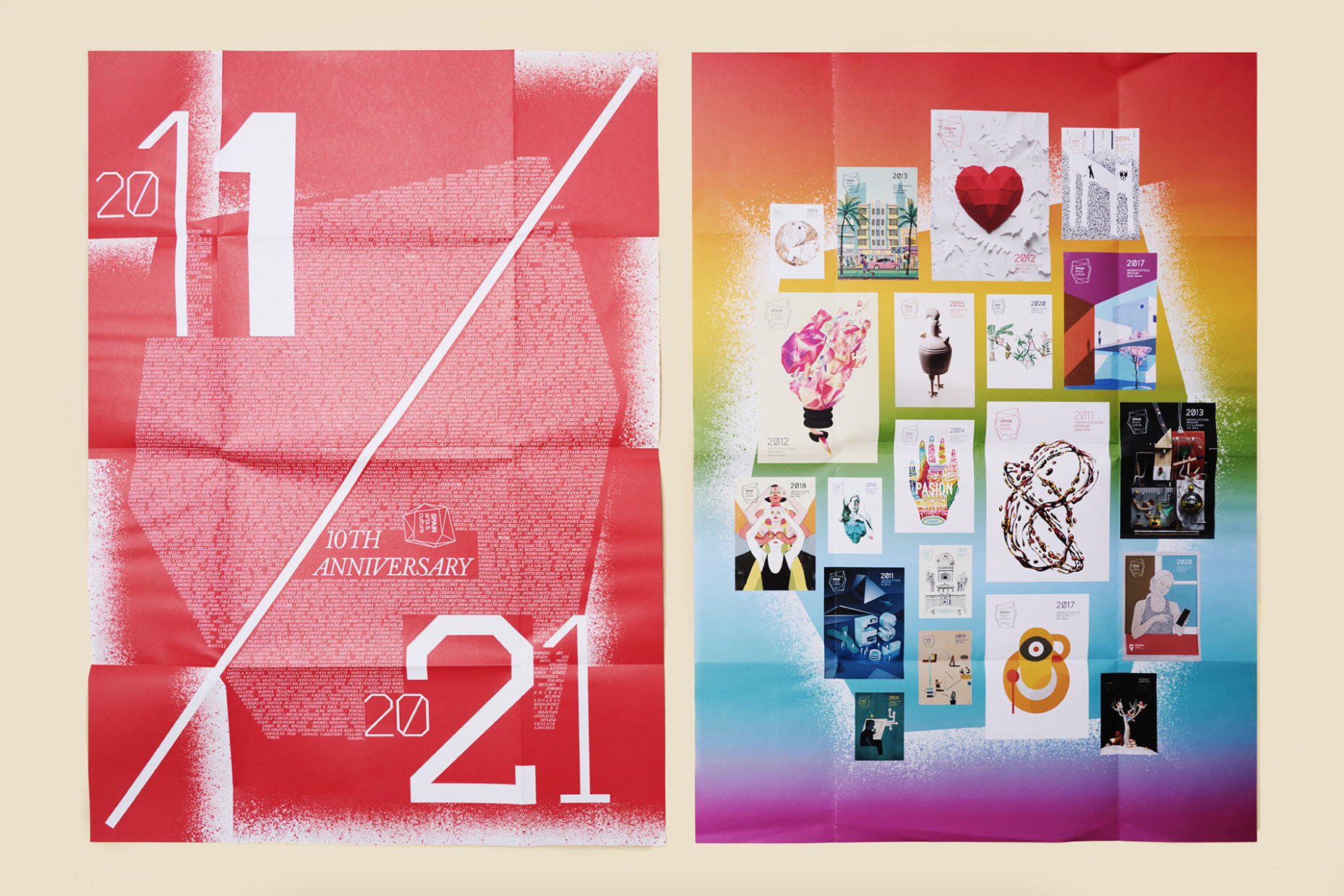
Visual Overload
Sometimes less is more, but not in this case! Maximalism brings busyness, energy and chaos to design, so everywhere you look is full of exciting elements. While this style celebrates visual overload, the design should still look cohesive. So stick to a defined colour palette and illustrative style.
Try out Maximalism for a classroom spread by creating a collage of student art. Otherwise, have a talented student create a busy yearbook cover filled with colourful illustrations!
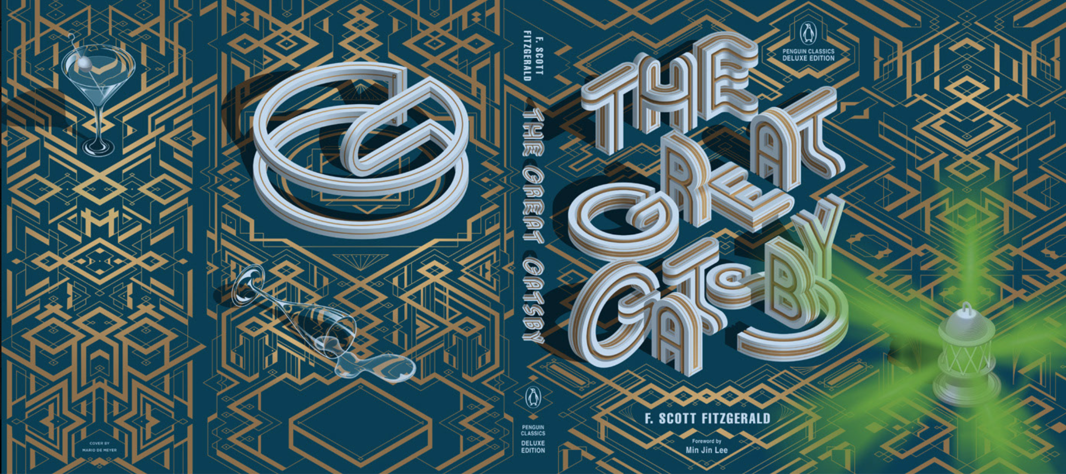
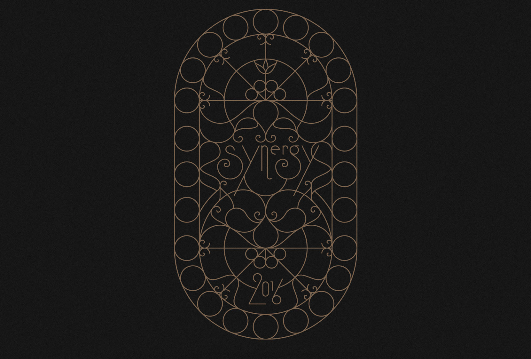
Nouveau Deco
This trend combines elements of both Art Deco and Art Nouveau. Art Deco is known for its intricate line art detailing. This style is usually very symmetrical, angular and geometric. But in 2022, these lines are now more fluid and curved.
Expect to see wavy lines, cursive font pairings, florals and foliage. Try out this trend for logos, branding and stationery.
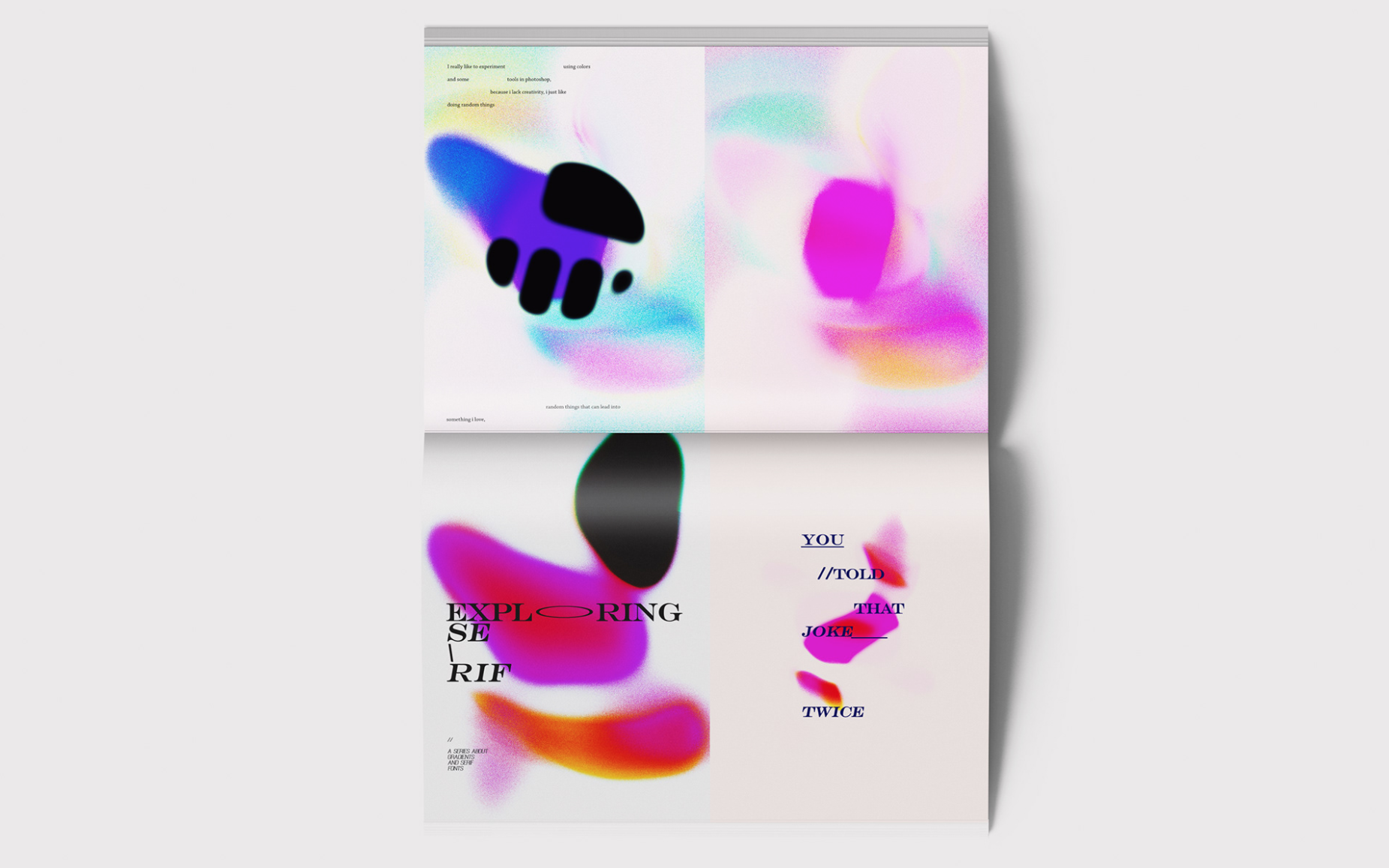
Anti-Design
Our final 2022 graphic design trend throws all the design rules out of the window! Anti-Design goes against everything we are typically taught about how things should look. Clashing colour palettes, odd alignment and illegible text.
This trend isn’t for everyone or for every publication! But this playful look would work well for a student magazine or diary cover!

