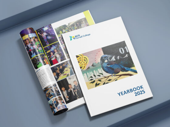
If you’re going to spend the time putting together a whole heap of great content for your yearbook, then you’ll want a great design to match.
A stylish design will really lift your content and make your yearbook something to treasure, so it’s worth taking your time to consider the latest trends, especially if you plan to use it as a fundraiser. Ideally, you also want a timeless look, so that when you pick up your yearbook in a few years you don’t cringe.
It’s a big decision, and there are so many options to choose from. But don’t stress – as designers, we always keep an eye what’s trending, and we’ve pulled together some of the hottest design trends for 2018 to help you out.
BE BOLD
This year, it’s all about being BOLD. We’re talking bold colours, bold typography and bold ideas. Bright pops of fluoro colour, attention-grabbing fonts in large sizes, intersecting elements and double-exposure imagery. You will certainly grab people’s attention, but it needs to be used with a light touch – too much of a bold design can be hard to read and end up turning people away.
Minimalism is back in a big way, and works perfectly in conjunction with a bold aesthetic. It catches the eye, letting the colours and content speak for itself. Using limited colour palettes, gradient overlays and lots of space, this style is a real knockout. You just need to be careful to find the balance between minimalism and empty space.
OLD SCHOOL
As a contrast, we’ve seen that hand drawn illustrations and script types are also becoming popular this year. It’s a hipster aesthetic that can feel a lot more personal compared to bold designs that use big blocks of vibrant colour. This style could be a great choice if you wanted to stand out from the crowd.
Also on the horizon are retro-modern illustrations, that reference mid-century styles, with simplified imagery and colours reminiscent of the ‘50s. The next generation are adopting this stunning look as their own, using it for everything from album covers to movie posters. It’s a breath of fresh air and makes for a unique statement.
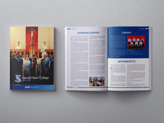
YEARBOOK TRENDS
If you’re struggling to come up with a design for your yearbook, it can be useful to take inspiration from what other schools around the country have done, and then add your own twist.
Geometric shapes and stunning patterns have been popular recently. Asymmetrical triangles, intersecting circles of bold colours, gradient backgrounds, watercolour effects and atypical photo frames – if used sparingly – can bring a lot of energy to a publication.
Sometimes it can be a good idea to look further afield for design inspiration. Each different country and culture has its own unique perspective and it can be really make your yearbook stand out. And you never know – a yearbook from Singapore might have exactly what you were looking for!
COLOUR TRENDS

The right colours, used in the right way, can add a lot of personality to your yearbook. But nothing makes people stop reading faster than using too much of the wrong colours, or using colours that clash.
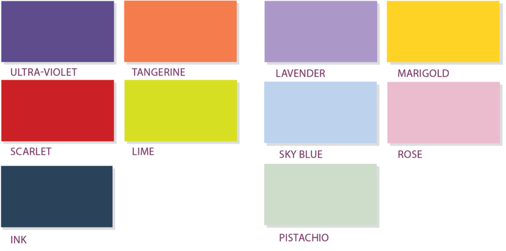
Again, bold is beautiful in 2018. Colour gurus Pantone have chosen Ultra Violet as their colour of the year. Also hot this year are Tangerine, Scarlet, Lime and Ink. They are strong, vibrant tones that recall fauvist painters such as André Derain. These will add a lot of energy to your yearbook, which is a nice compliment to the lively students that will grace its pages. But because they are so bold, these colours need to be used sparingly.
At the other end of the spectrum, we have soft pastel hues: Lavender, Marigold, Sky Blue, Rose and Pistachio. They are calming and mature, and will give your yearbook a professional look. Plus, they are a bit easier on the eye than the vibrant tones, so they can be used more often, for example as page background colours.
TYPE TRENDS
In 2018, sans serif fonts dominate. Styles like Proxima Nova are modern and minimalist, yet elegant. Sans serif fonts are ideal for smaller text, which is often the case with yearbooks. They are also a bit easier to read for younger children, as the letter shapes are more recognisable. With such a great selection to choose from, you should be able to find a font with the perfect weight, shape and spacing to match the style you want to present.
A couple of serif fonts have also caught our eye: Harriet Display and Domaine Display. Harriet is a more traditional serif style, with a lot of personality in its playful curves. But Domaine is definitely bold, with a high-impact punch that’s perfect for headings. Serif fonts are great for guiding the horizontal flow of the eye as it reads a page, with increased contrast and spacing between letters.
For a more natural look, we like Selima, a hand script font that will add a more personal touch to your yearbook. Hand script style fonts should be used sparingly, but they are great for headings and the perfect complement to the straight-lined efficiency of sans serif fonts.
BE INSPIRED
This year is an exciting one for design. Choosing the right combination of these trends will help you create something truly memorable – something to treasure. We’ve been doing this for more than 16 years now, and we’ve worked with over 100 schools across the country, so we know what we’re talking about!
We understand that creating a yearbook can be a daunting task, but we are here to help. You can find more tips and tricks here in our blog, or in our comprehensive Knowledge Base, which you’ll get access to if you use one of our yearbook design packages. So get in touch and let’s get going!