Crisp, clear photos are crucial for any yearbook, but sometimes you need to mix it up! Photos serve many purposes, largely due to the different ways we can both capture and edit them.
Read on for some different photo styles to try in your yearbook!
Long Exposure Photography
Long exposure, or slow-shutter, photography captures a shot over a long period of time. This could range between 30 seconds and many hours, depending on the shot and the desired outcome. This photo style captures the contrast between still and moving objects in the frame. The result is a crisp photo of the still object, and a blurred, light filled moving image.
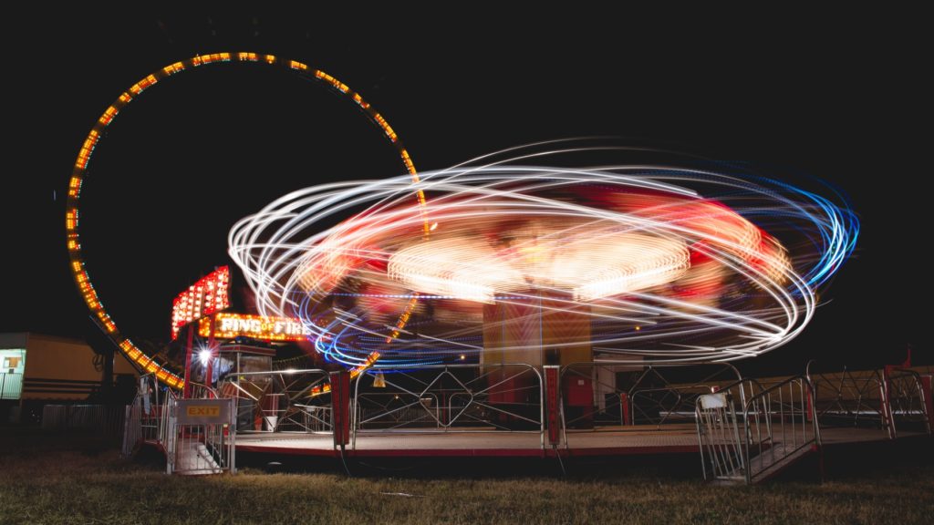
Long exposure photos have a ‘wow’ factor, which makes them great for captivating yearbook covers. As this photo style is often shot at night, it also works well with a dark themed yearbook.
Mixed Media Images
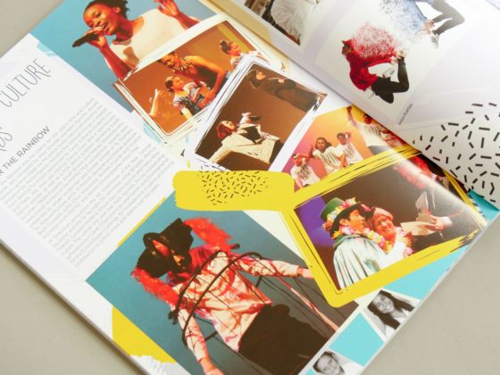
Bring life and energy to your photos by incorporating illustrations and graphics!
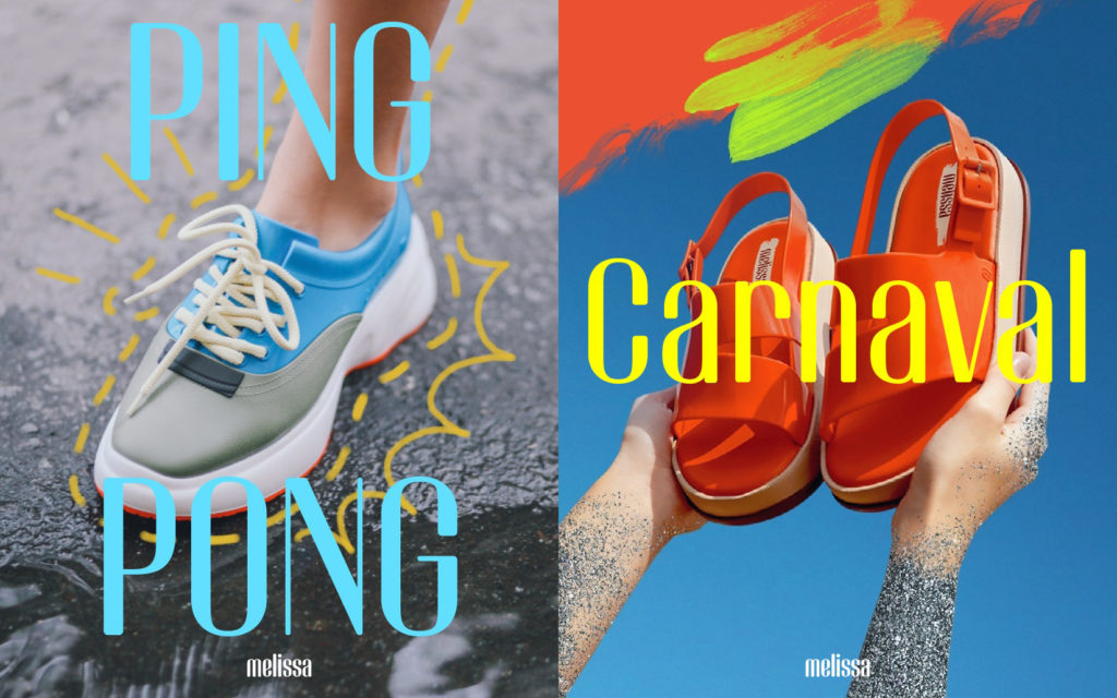
There are many takes on this photo style, which makes it a versatile option. Paint strokes, sparkles or motion lines can help to carry the yearbook theme through to the images for a cohesive design.
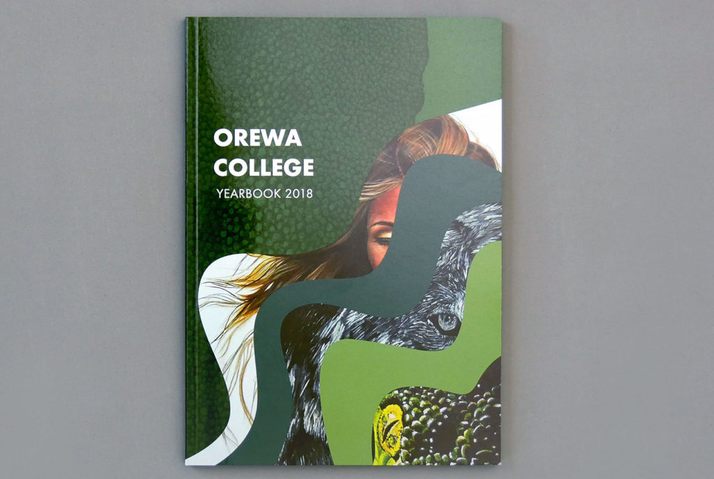
Give this look a try for yearbook covers and photo collage pages.
The Halftone Dot Effect
The halftone effect uses dots that vary in size and spacing to simulate the look of a photo. The size and density of the dots creates an optical illusion, which mimics light and shadows.
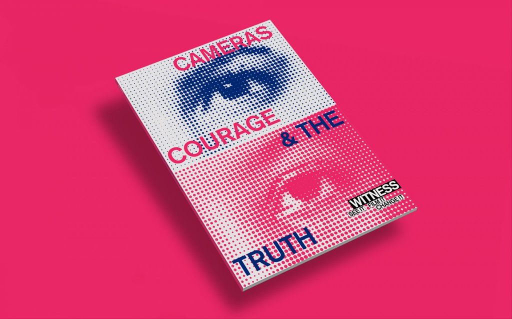
The halftone effect is a great way to elevate a photo into a design feature. The effect is versatile in shape and size, so its a smart way to fill a blank section on a page or yearbook cover. Halftone images can also be easily layered with other design elements to add depth.
The Glitch Effect
The glitch effect is a popular technique that is added during the photo editing process. The glitch effect aims to mimic a computer error, which has caused a photo to load or be printed incorrectly. Although this may sound undesirable, it can result in a unique and modern look when done correctly.
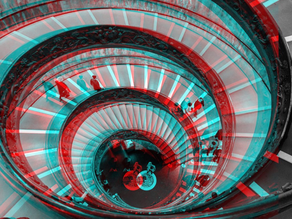
Some glitch effect images layer vivid blues and reds to mimic a printing error. This is a strong look, which works best with a bold or futuristic design theme.
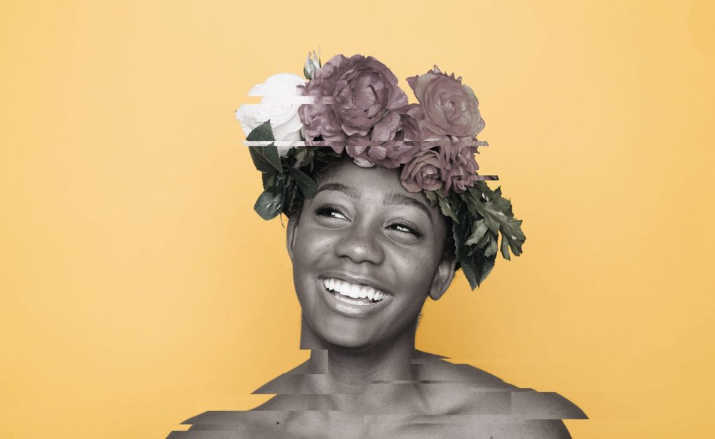
If you like the look but are unsure of how it would work in your publication, opt for a more subtle effect. Styles that look like a page loading error can be effective as long as the glitch looks intentional!
