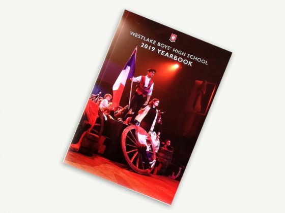
If a picture is worth a thousand words, just think of the story you could tell with a photo collage!
Yearbooks that range from informal to formal can benefit from photo collage pages. Shake up your content with a collage that sets the scene and tells the story of a school event or trip.
Benefits of Photo Collage
Engaging
Monotony contributes to reader fatigue, which is why it’s a good idea to mix up your content. Visual differences help with recall, and a photo collage offers an array of textures and a level of depth.
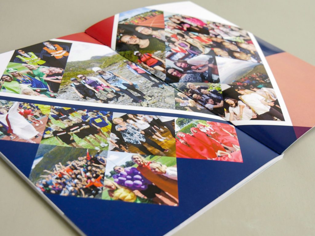
A page full of photos requires a closer look, and students will try to spot their own face amongst the group!
Story Telling
A photo collage lets you incorporate a large volume of images into a single or double-page spread. This is a good way to showcase your photos if you cannot decide which one should be used to highlight an event. A collage may tell a more well-rounded story than a single image, better capturing the essence of an activity-packed day.
A photo collage can also be used if you’re in a pinch and don’t have one large high-quality image. Filling the space with smaller photos will rid you of your pixelation issues.
Versatility
Collage pages can take any form you would like, but they tend to provide a friendly and more casual look. This makes them great for primary school yearbooks or other lighthearted reads.
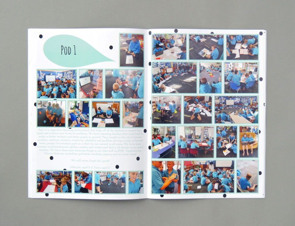
If your school allocates pages for each classroom, this is a great way to celebrate your students. Layer the collage with photos of students, class activities and even artwork!
For more formal publications, photo collage is still a useful tool. Consider structured alignments and be more conservative with the number of images used. This will help retain clarity and uniformity in your yearbook.
Photo Collage Design Tips
Choosing Photos
A photo collage may feel like a good place to throw leftover images, but there is an art to selecting the right ones.
As photo collages are non-uniform in essence, sticking to a photo theme will help retain some structure. Group photos from a single event, or select images with similar colour tones.
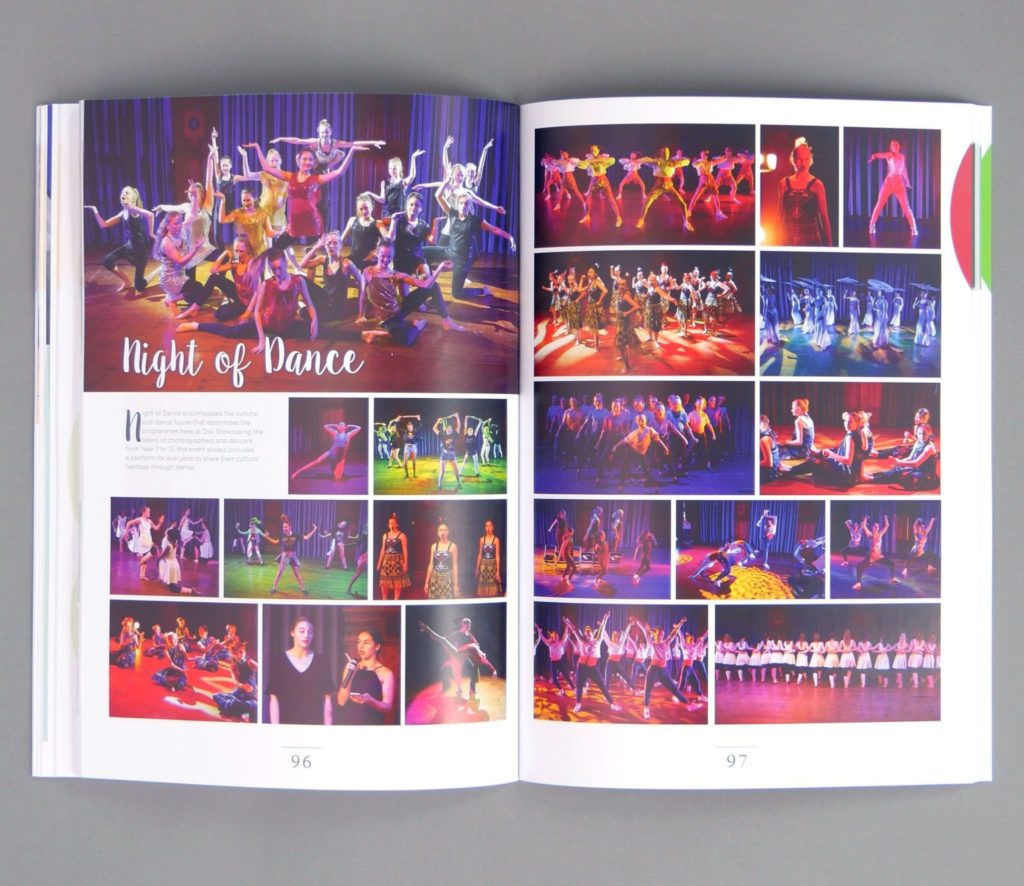
It is important to choose images that are clear at a small size. Close-up portraits provide more value than large group shots or photos taken at distance. Select images with high contrast that are clear enough to not require a caption.
Proportion & Uniformity
Photos in a collage can be different sizes but they should work in synergy and look harmonious. If you are using a variety of image sizes, ensure that the size difference is noticeable and looks intentional.
Enlarged photos can serve as focal points on the page. These larger photos should be your best ones – ones that tell a story and are well shot.
Adding Elements
Bring some pizzazz and depth to your collage and incorporate different design elements. For an artsy look, illustrated patterns and textures add something extra to the page. Giving borders to each photo avoids them blending into one giant image, and this will give each photo more recognition on the page. You can also try displaying images in less conventional shapes. From triangles to hexagons, a unique photo grid could be just what your yearbook needs!
Photo Collage Styles
Artsy
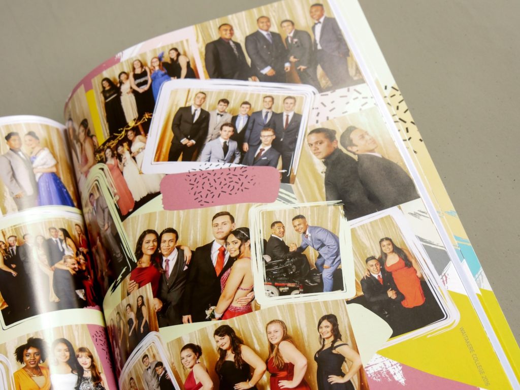
This photo collage for Waitakere College combines photography with illustrated frames and patterned lines. This artistic approach makes for a creative page with visual depth.
Geometric
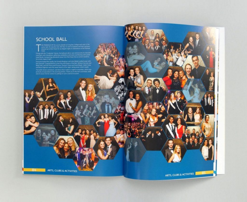
This Long Bay College yearbook uses hexagon shaped photos for its School Ball spread, which grows larger on the righthand page. This unique design draws the reader’s eye from the lower left to the top right page, giving movement to the collage.
Structured
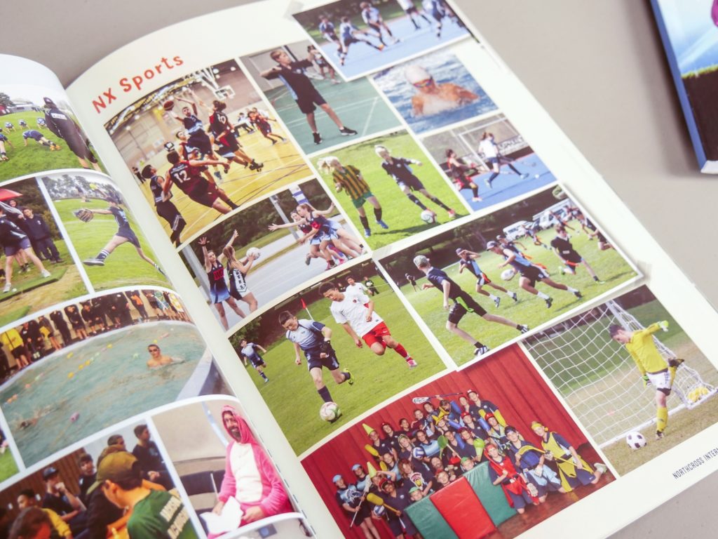
This photo page for Northcross Intermediate is structured in an almost gridline fashion, with subtle overlaps and angles to keep it fun! Colours across the photos remain consistent, with grassy greens and earthy hues for a uniform collage.
Class Pages
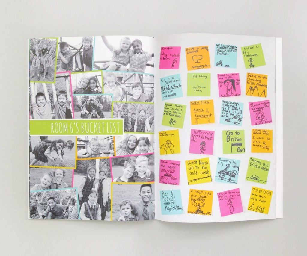
Room 6 at Mt Carmel School uses a photo collage to display pictures of the students. The fluorescent borders help the overlapping greyscale portraits stand out from one another. Bucket List post-it notes balance out the photo collage on the mirroring page, and give the spread a personal touch!

