Did you know that the back cover of a magazine is the most expensive and desired space for brands to advertise? This is a coveted spot for a reason – it takes up 50% of the outside design and has a 50% chance of being displayed face-up!
With so much focus on your yearbook cover, the back cover may be a bit of an afterthought. But a great yearbook is one that flows from beginning to end and feels connected.
There are lots of ways to create a great yearbook cover and back. Here are some fabulous examples from our clients to demonstrate.
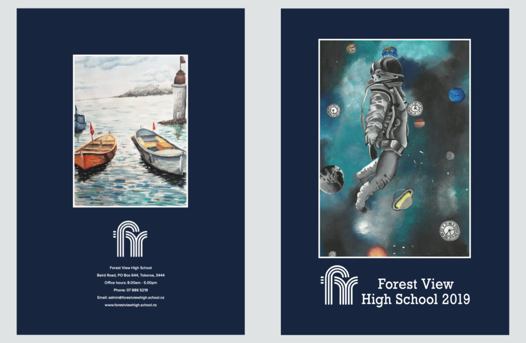
Mirror Your Front Cover
Great page design relies on some simple rules and one of those is page balance. Balancing visual content across your internal yearbook pages create a harmonious look.
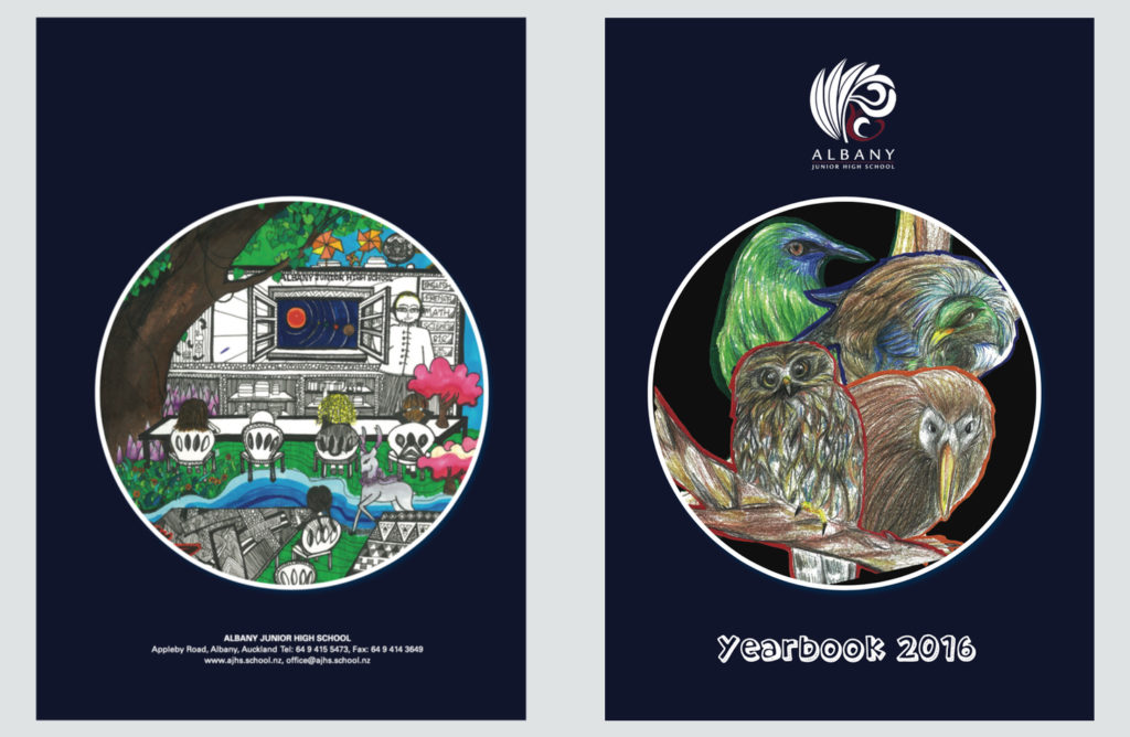
This rule can also be applied to the front and back cover of your yearbook by mirroring the design. This way both sides are interesting to look at and feel connected.
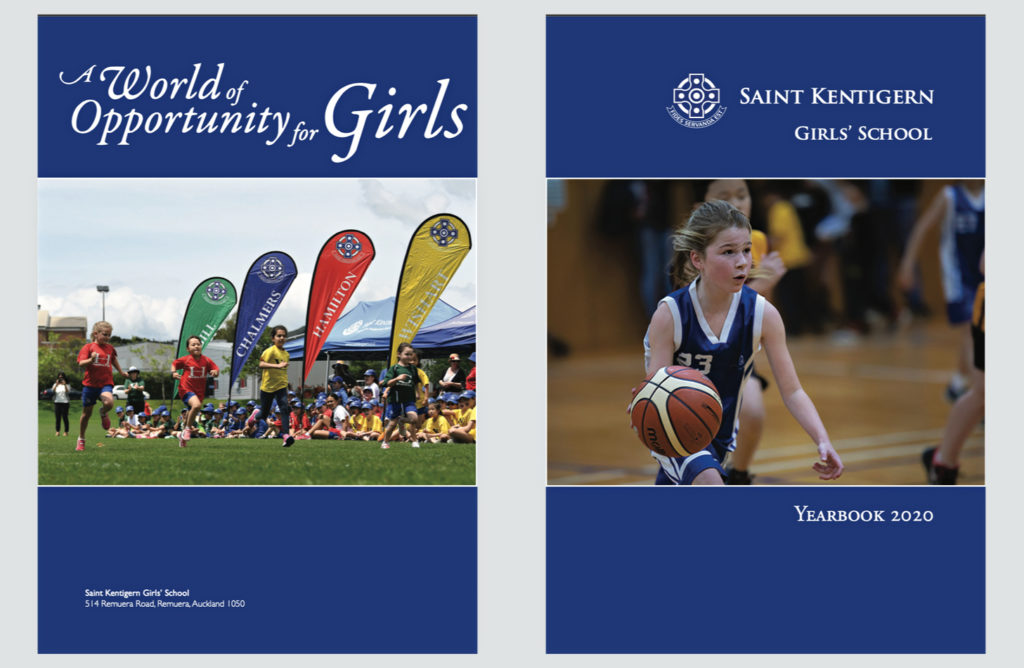
The front and back cover don’t need to be the exact same style to look coordinated. Similar colours or a matching border may be all you need for a cohesive look.
Use One Image
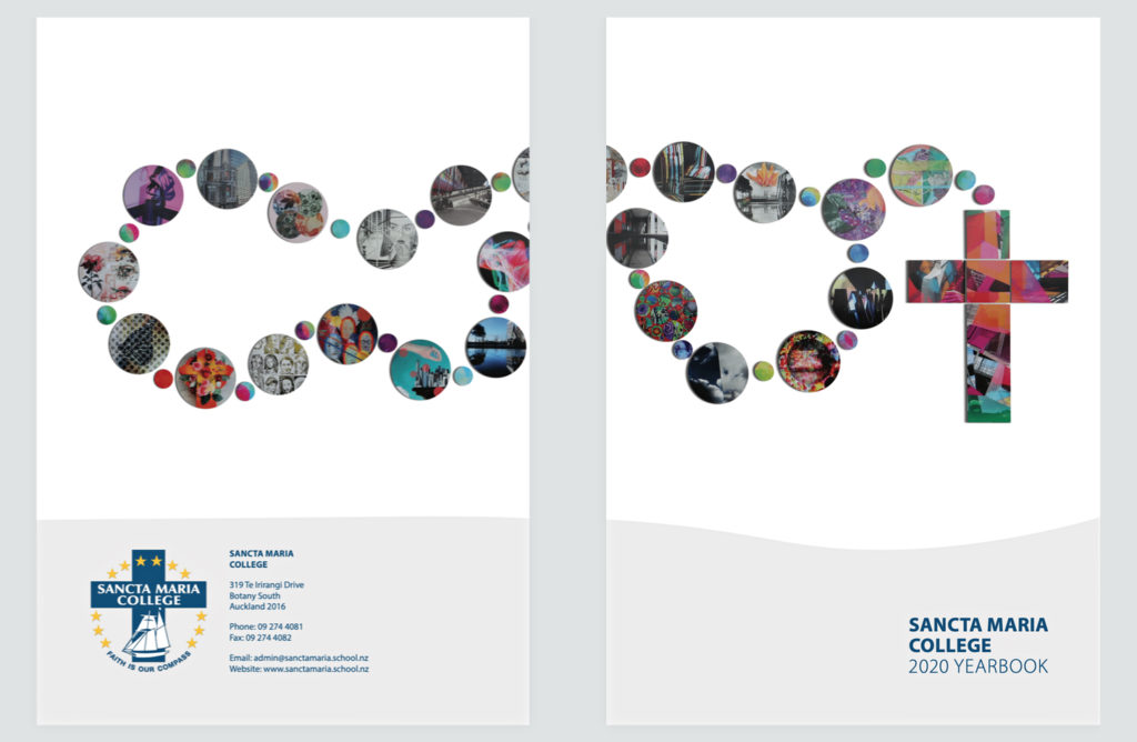
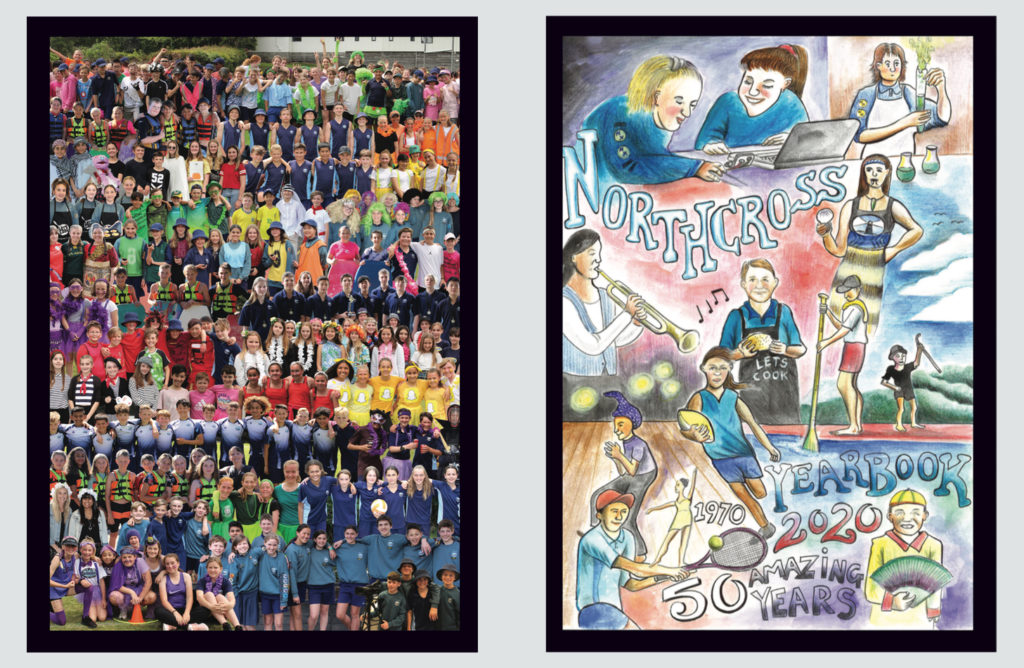
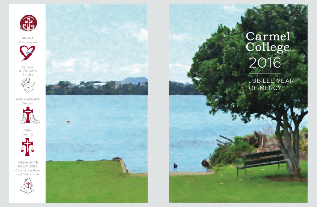
Who said the front and back cover need to be separate designs? Try a single image or pattern that wraps around the outside of the book.
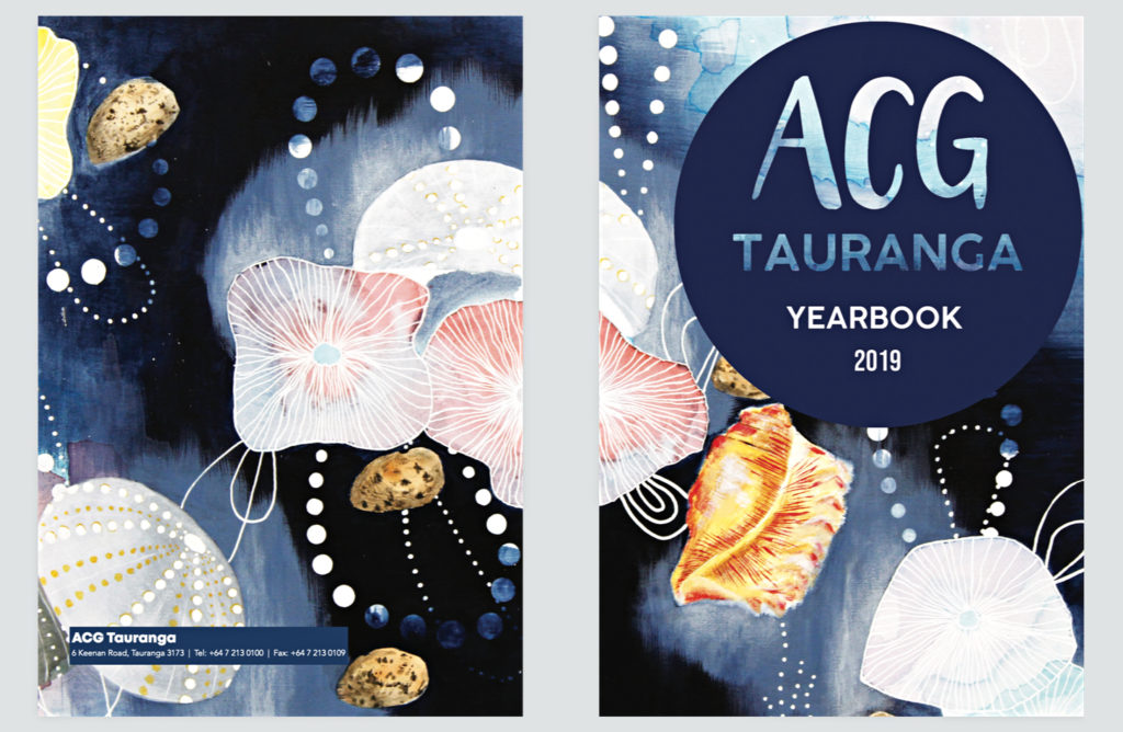
This is a great way to include some student art or photography in your yearbook. Plus, the book will look like a piece of art from the back when someone is reading it!
Keep It Simple & Recognisable
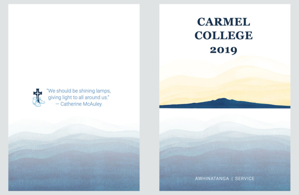
If you want the front cover to take centre stage, try a simple back cover design.
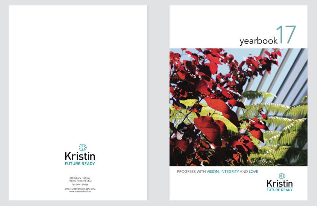
With simple back covers, make sure your school logo is visible and consider pulling through a motif from the front. This way, your design remains consistent from beginning to end.
