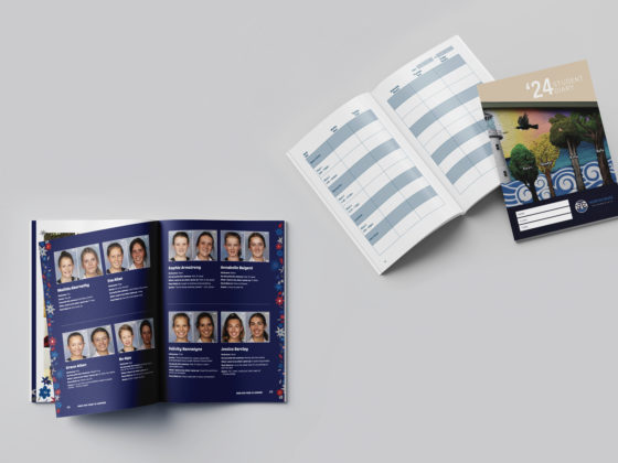
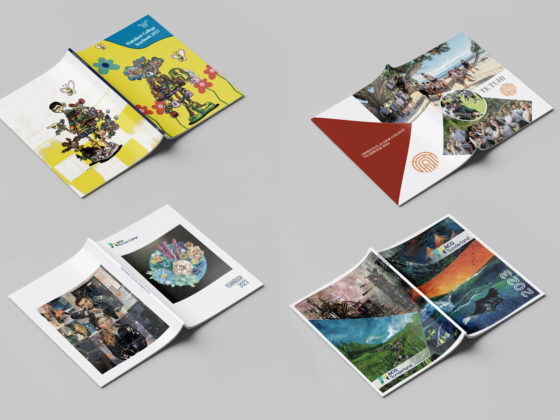
There is more to great design than just looking nice – it must also be functional and easy to navigate. Finding the balance between creativity and function isn’t always easy, and relies on following some design principles.
Below are some key design styles as well as some inspiration to spark your creativity! This includes some of our own yearbooks as well as inspiration from the web.
Bold & Simple Design
Some of the most eye-catching and enjoyable designs look relatively simple. Bold coloured, high contrast design with no unnecessary elements makes for a modern, confident look.
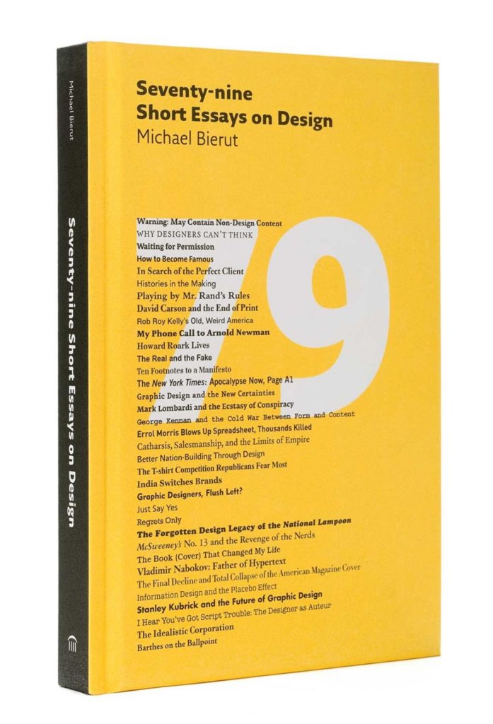
Seventy-nine Short Essays on Design
This cover is eye-catching, using a limited colour palette and good use of large colour blocking. Bright, simple sections of colour grab attention without looking ‘busy’ or hindering text legibility. The simplicity of the design and fonts mean that the 79 behind the text doesn’t distract and instead adds depth.
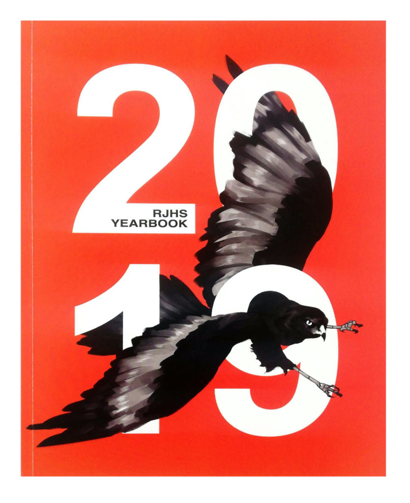
RJHS Yearbook
This yearbook is another example of simplicity done boldly! This cover uses very few design elements – just contrasting colours and heavy text with an interwoven bird that adds dimension. The design is also centred, with strong symmetry and good use of whitespace, which helps to balance the bold design.
Unique & Creative Design
For design to be memorable it needs to be unique! It also has to be appropriate for the publication, and your school or brand. A good way to test this is to cover the text and see if it is still easy to identify what the work is for.
On Site
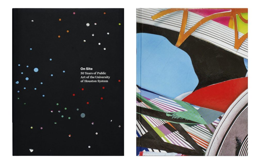
This book cover for the University of Houston is distinct, with an original use of colour and design. The book itself is bright and artistic, yet covered with a monochrome black book jacket. The jacket has cut out circles which display the colours underneath. These coloured dots represent different locations across their campus, bringing greater meaning to the book cover.
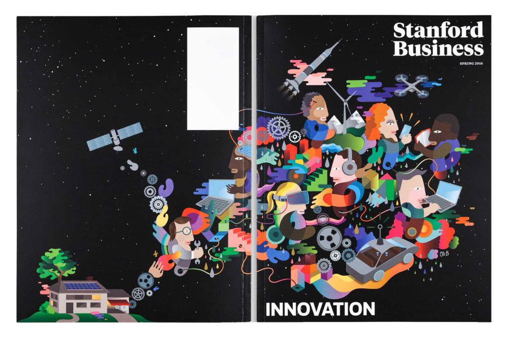
Stanford Business Magazine
This creative cover is for the Innovation issue of Stanford Business Magazine. Unique, tech-focused illustrations that match the publication theme flow from the back to the front of the book. This creates movement and visual interest to keep the viewer’s attention.
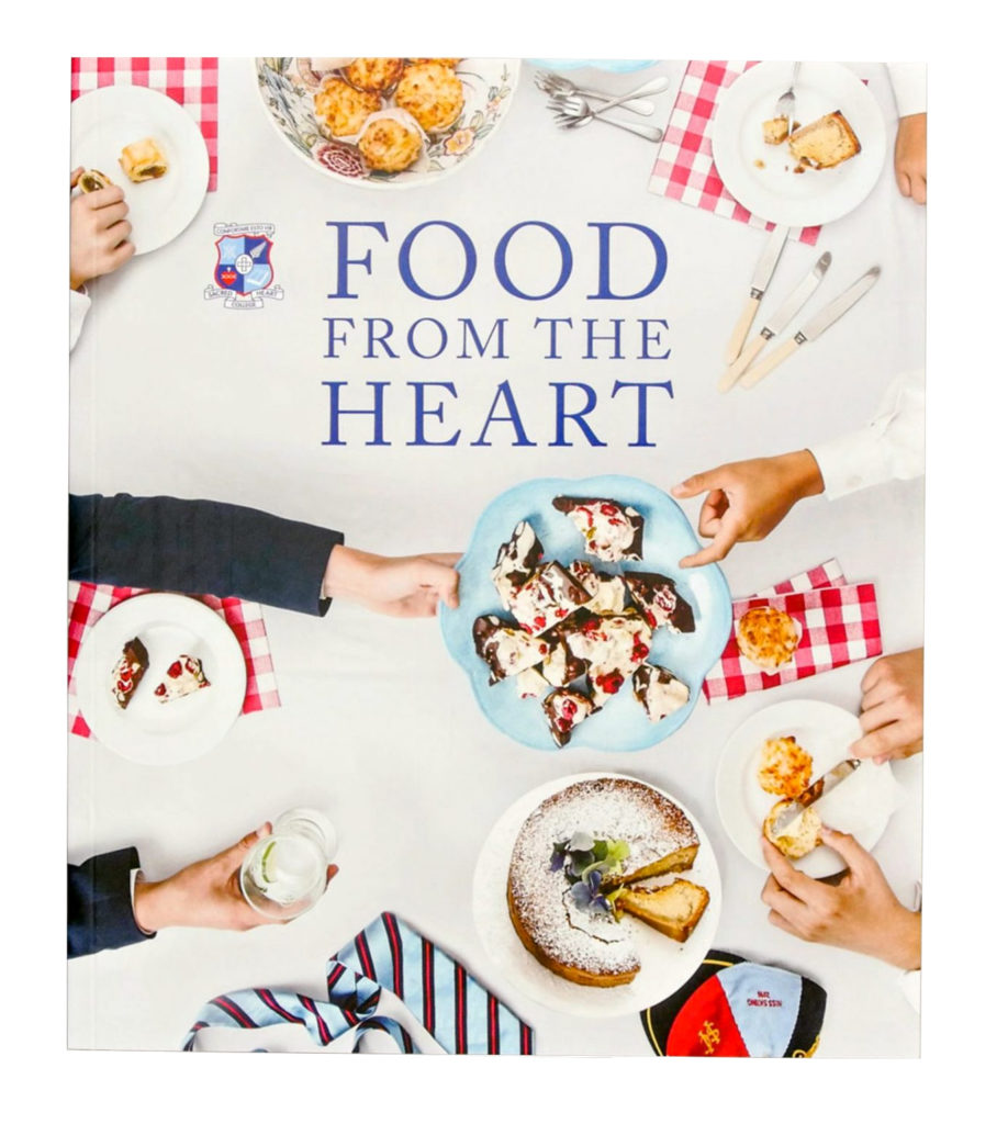
Food From the Heart
Here is a cookbook cover for Sacred Heart College. The photography clearly shows that the book is filled with recipes without needing to read the title! This cover includes lots of imagery but remains sophisticated and well balanced with adequate negative space.
Sophisticated Design
A less is more approach is a good idea when designing a professional publication. A limited colour palette, few fonts, and clear page alignment are crucial.
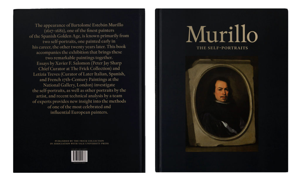
Murillo: The Self-Portraits
This publication looks both traditional and well-executed. The serif text coupled with rich, classic colours ensure that the booklet appears important and historic.
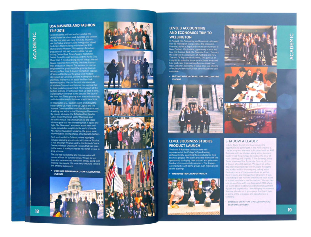
Long Bay College Yearbook
Here is a more contemporary take on sophisticated design! This yearbook contains fun stories and colourful images but maintains a professional look. The colour palette is limited to a few shades of blue, with simplistic type and obvious vertical alignment.
Fun Design
Bright colours, interesting illustrations and quirky fonts all bring fun and positivity to your pages!
Toronto Tomorrow
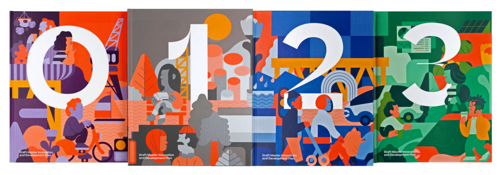
Here are some good examples of fun and busy publications that remain balanced and enjoyable to look at. Although full of illustrations, these books don’t use a large number of colours. This is a good tip when working with busy designs, as it won’t overwhelm the viewer. The same is true in reverse – with simple designs, play around with more colour!
Don’t underestimate how much energy a good font can bring to your page. The numbers on these covers are packed full of personality! For more great fonts, learn about some popular free fonts to try.

