They might say that ‘screen design is the new design,’ but not when you are producing a yearbook for print.
School yearbook design has come a long way, even in the past five years. Expectations are high, and a good-looking publication helps ‘sell’ your school as an institution that is bursting with creativity, culture and excellence.
But nothing is completely original, and it’s a good idea to harvest design ideas from wherever you find them: your favourite websites, magazines – even shows on Netflix (although it’s said that Netflix is personalising design to you these days).
Here are some design ideas that have inspired us over the past year:
Lens Flare
This post-production technique is frequently used in movies and TV shows to add some visual interest to a scene. The effect can be applied to still photos as well, to give them that early morning or late afternoon feel.
Retro Styles
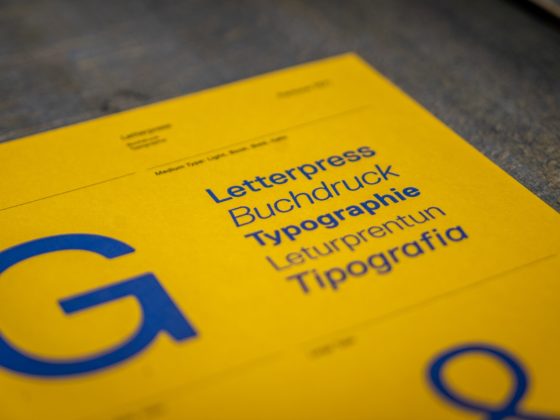
Themes, patterns and fonts that hark back to the ’80s and ’90s are back in fashion. With bold colours and geometric designs, these design references appeal to both parents and students. If your school has a long history, you can reach even further back in time with ornate, old-fashioned fonts and striking, sepia tone photography.
Images Woven Through Text
This effect is visually stunning but can be technically challenging to achieve. It helps to have a clearcut image with no background. Having text and image interwoven gives your page a sense of depth and motion, and it works wonderfully as a front cover image.
Abstract Shapes
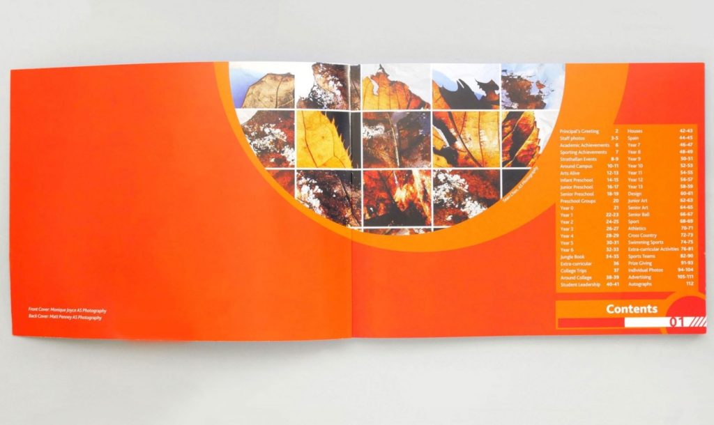
The popularity of smartphone gaming apps has created a real trend in abstract, geometric designs in everything from TV ads, online content and print material. Simple icons and stylised backgrounds provide quick and easy layout options for your pages.
Textures
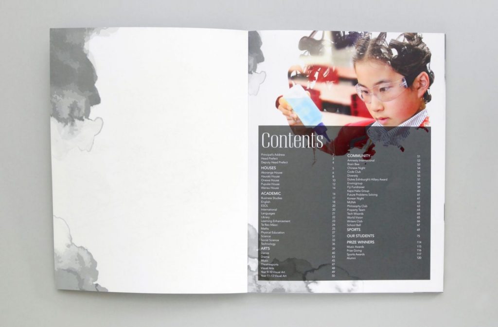
Subtle background textures look great on the page, but they must be used sparingly, with plenty of white space to avoid a heavy looking page. Another option to consider is adding a texture you can feel – with an embossed outer cover for your yearbook.
Design trends come and go, but the fundamentals of good design remain. Whatever design style you adopt, make sure the message is clear, with good contrast between foreground text and background colours. Leave plenty of white space around layout elements and use proper alignment to help direct the reader’s eye.

