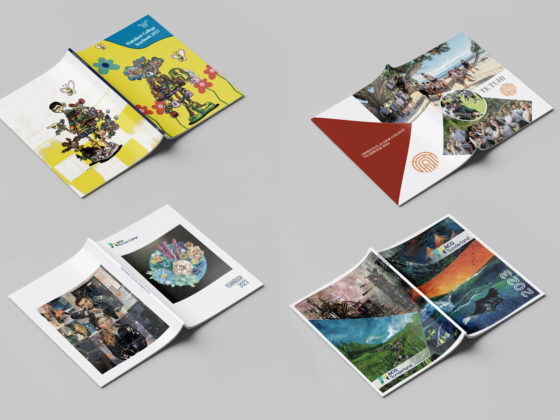
Complement your yearbook content with some eye-catching, on-trend design! Last year, we wrote about the emergence of retro design, bold colours and geometric shapes for 2018. These are still popular, but new design trends and nostalgic throwbacks have joined the mix! As we enter the second half of 2019, let’s look back on what has been trending in design and how to incorporate these styles in your yearbook.
Design Trends
Bold, Bright & Brutalist
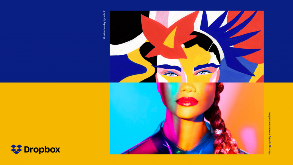
Colour blocking, simple text and brutalist elements have been growing in popularity over the past few years. Collins has been at the forefront of these trends, producing the redesigns for both Dropbox and vitaminwater.
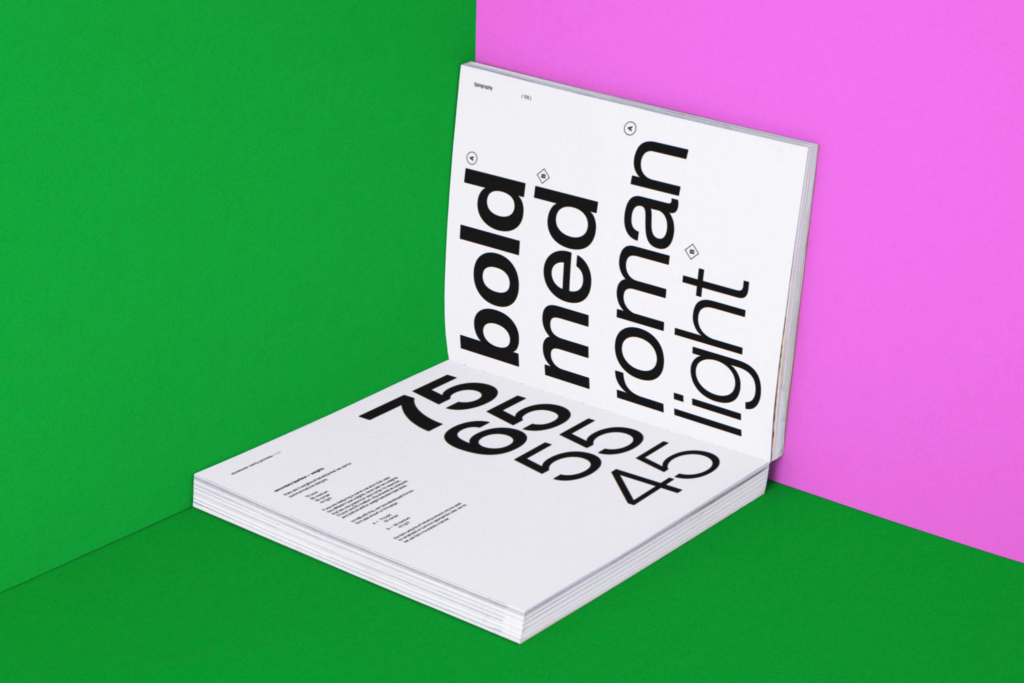
Both rebrands include large fields of uninterrupted colour, paired with clear, readable type. San-serif fonts like Helvetica and Atlas Grotesk provide a functional yet simple look. These are coupled with chaotic colour combinations that bring energy to the minimalist design. The colour pairings are often uncomfortable or jarring, leaning into the growing brutalism trend we are seeing in web design.
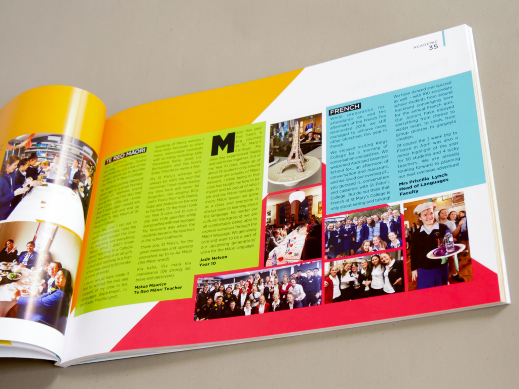
Instead of hiding behind polished design, some companies are revelling in the unrefined. See Chrissie Abbot, Le Café La Petite Reine and even Bloomberg for different takes on this style.
Dreamy Gradients
Colour gradients have been trending for the past few years and are popular in both web design and for phone apps. Instagram’s 2016 rebrand included an updated gradient icon, modernising the company’s look. Both Spotify and Apple Music use gradients for their music streaming sites. These dreamy hues offer more depth and movement than their flat colour counterparts. Appearing almost futuristic, it is understandable why these tech companies have opted for this effect.
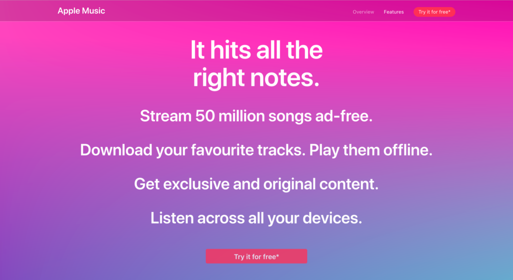
Gradients can be both bold and subtle, used for backgrounds, logos and even photos. Try similar shades for a calming effect or choose contrasting neons to grab attention. See Nike Jordan and Young Guns for further gradient inspiration.
Imagery Trends
Digital Collage
This mixed media style combines photography with illustration for an eclectic and interesting look. Artists from Andreea Robescu to Zaid Zawaidah have explored both simple iconification and cut and paste collage.
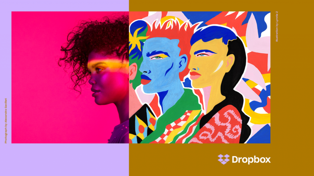
The 2017 Dropbox rebrand by Collins adopted this style, with imagery composed of half illustration and half photography. The company, which offers collaboration and file sharing, noted that the juxtaposition represents “what’s possible when we bring ideas together in unexpected ways.”[i]
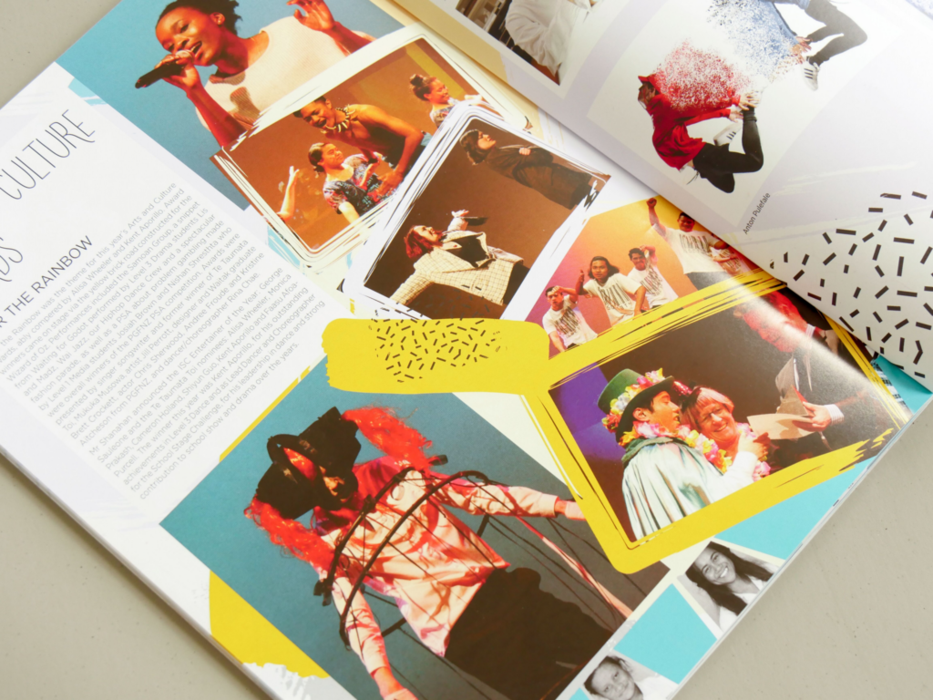
Try out this trend for a photo-heavy page. Combine fluid lines, textures and illustrations with school photos for an interesting and unexpected collage!
Open Composition
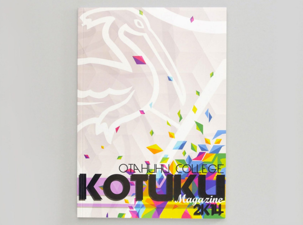
Open composition has been popular in photography for some time now. More recently, this style has also become commonplace in illustration. With open composition, the subject matter is not contained within the image parameters. Instead, the design feels infinite, as if there is movement beyond what the eye can see. This technique helps encourage imagination and a prolonged visual experience. Consider open composition for an artsy yearbook cover!
Duotones
The duotone effect reduces photos down to two contrasting colours, using one for light and one for dark. This style is currently popular in a lot of web design and can be achieved with Photoshop. Duotone photos are often used in conjunction with gradient colour themes. The two techniques work well together, creating a dreamy look with just two shades.

Spotify made use of duotone photography in their gradient themed branding. These photos blend seamlessly into the background, and although attractive, they aren’t distracting. While Spotify can be thanked in part for this trend, don’t underestimate the popularity of Instagram filters either!
Colour Trends
Warm & Bold
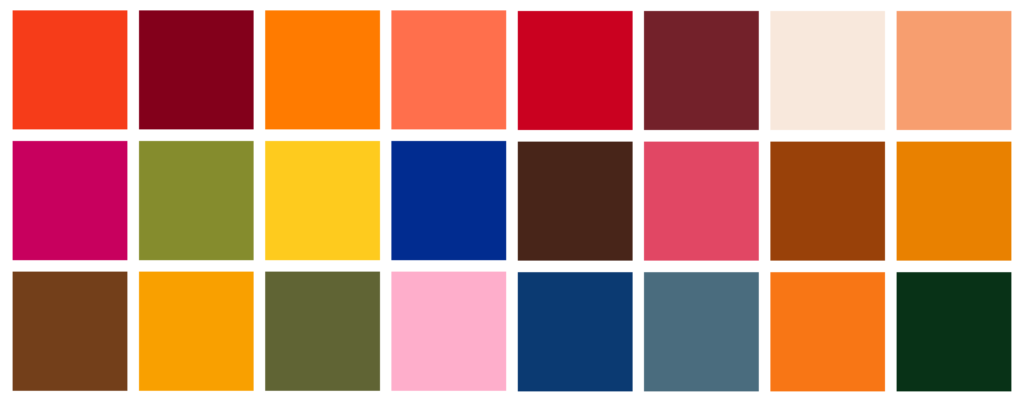
Bold, confident colours are in fashion, and designers are embracing the ‘loud’ look. The Pantone Colour Trends for 2019 are bright and confident yet remain warm and earthy in appearance. These shades lend themselves to retro 70s throwbacks and colour blocking designs. The Dropbox rebrand uses similar shades, exploring contrast and unusual combinations.
Neon
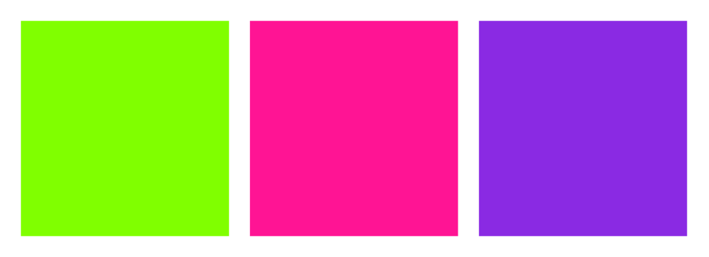
Shutterstock’s Colour Trends are far more electric offerings than those of Pantone. Neon green, pink and purple are the shades for 2019. Neons are largely popular due to their prevalence in gradient colour themes. They also pair nicely with black, as seen in the recent KPIT rebrand.
Monochrome
The continual advancement of photography and digital rendering allows for greater monochrome design. Black on black is a popular and alluring trend, often making use of texture and shade to differentiate the elements. Apple’s recent Mojave release embraces the black on black trend with its new Dark Mode.
Type Trends
Injecting Personality
The past few years have seen brands simplify and modernise their logos. As a result, once distinct brands have become harder to differentiate, all opting for simple black san-serif fonts. Some brands have swung the other way, adding personality and originality back into their products. Chobani’s once sterile and simple branding was updated in 2017 to match the brand’s ethos. The new deep green logo, which uses the heavy and friendly Chobani Serif, provides a welcoming and natural feel. Consider serifs, or try incorporating colour in your yearbook text for a fresh and updated look!

Along with quirky serif fonts, outlined, fragmented and deconstructed type are prevalent throughout branding. Incorporate text in your imagery and play around with the visuals of your publication!
Handwriting & Brushstrokes
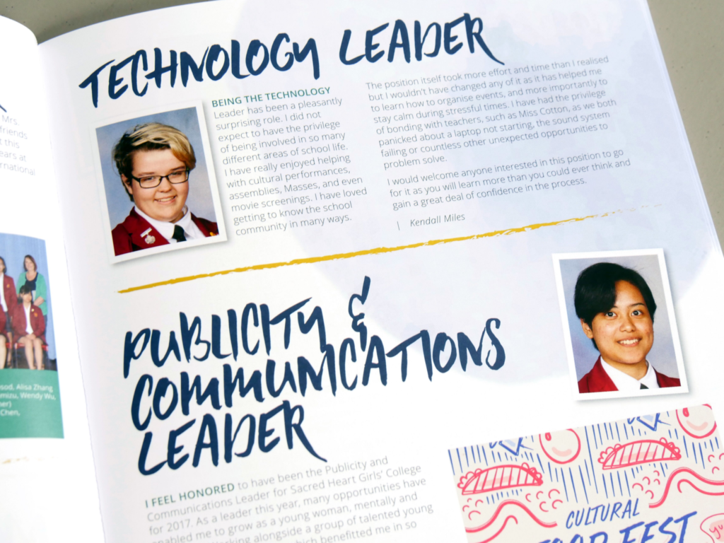
We are currently seeing a lot of handwritten style text, both in headings and artwork. From clumsy, childlike brushstrokes for your primary school yearbook to calligraphy for your leavers’ book, this trend can be used across many different projects. Hand-painted brushstrokes bring movement and texture to an otherwise sterile page. Pair with clean type to keep the look modern and fresh.
Objects & 3D Design
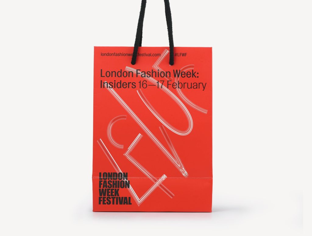
Get creative with text by adding dimension. Object-based type, including either photography or 3D rendering, provides an interesting depth to your work. This style has been popular for a few years now, but the constant evolvement of tech means that rendering has never been easier or better. Seen everywhere from London Fashion Week to artists like Alex Schlegel and Elmar van Zyl, this is a great style to use in your yearbook!
What do you think of these design trends? Let us know which ones you plan to include in your 2019 yearbook!
Sources:
[i] https://blog.dropbox.com/topics/company/-dropbox-unveils-colorful-new-look-and-global-brand-campaign-foc
