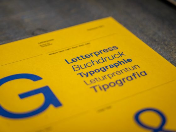
In the large world of design, new styles of illustration and typography are always popping up! For 2020, we have collected the trends in branding, publishing and websites to help elevate your yearbook. This includes both illustrative and type trends as they often intersect and work in parallel. Here are some popular styles to try for your next school publication!
Bold & Fragmented Type
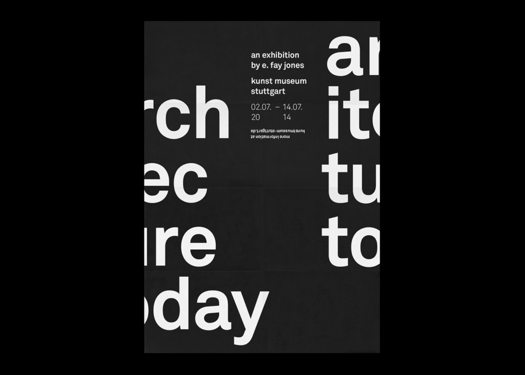
Our first 2020 design trend is the complete simplification of type, but with a sophisticated edge! Simplicity is often more effective than busy design, as it intrigues the viewer to learn more. We are seeing a lot of heavy, sans-serif monochrome type across a broad range of industries. A lot of health and beauty packaging uses this trend but its popular for books and posters too.
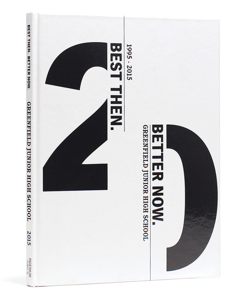
Add abstract elements to bring personality to this cold, computer-generated trend. Try deconstructed type or unique cropping for a sophisticated yearbook cover or page element – the simplicity of this trend is what makes it truly versatile!
Hand-Drawn Elements
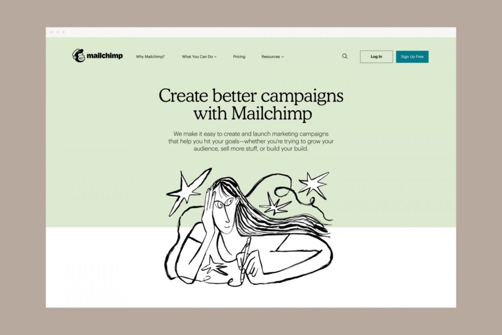
Our access to technology, good cameras and editing software makes it easier than ever to create sleek design. Yet due to the popularity of clean and sharp looks, a countertrend has emerged. Companies are opting for a lot more organic, hand-drawn shapes. This results in a more personal and less intimidating look.
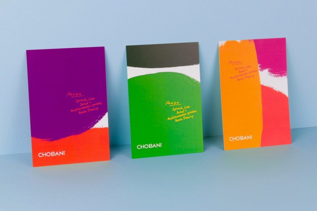
Unpolished doodles and childlike shapes offer an approachable and authentic feel. Collins’ recent Chobani rebrand adopted vivid, natural shapes, stating:
“Our approach is rooted in Chobani’s core principles – emphasising the hand-crafted nature of the yoghurt, and the company’s commitment to real ingredients.”
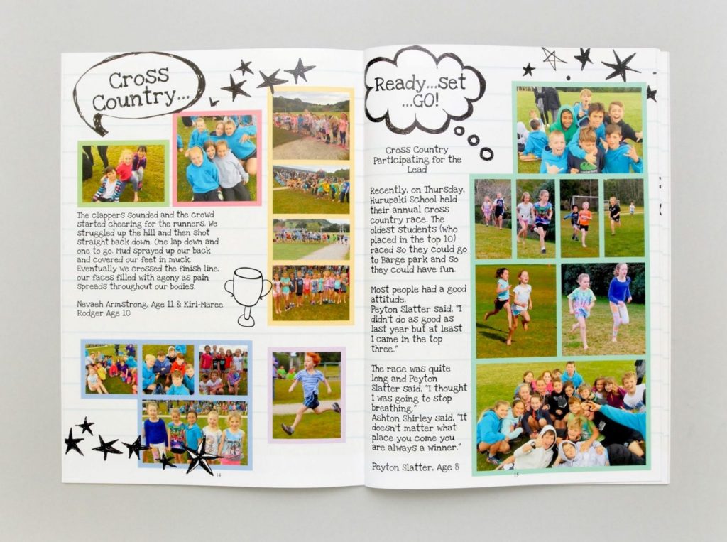
A school yearbook is the perfect vehicle for this trend, as it brings life and personality to the pages. Include drawings from students for a truly personalised yearbook!
Try pairing whimsical drawings with heavy clean fonts. The bold type offsets the fluid illustrations and brings structure and cohesion to the design.
High Touch Typography
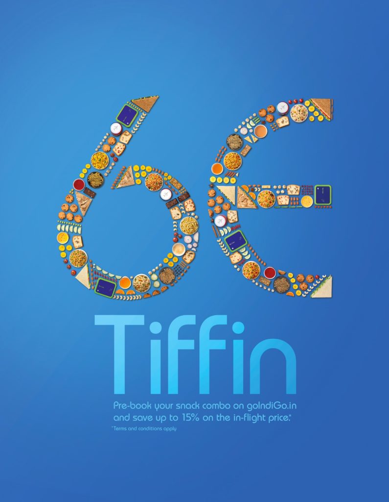
Our third trend for 2020 is high touch elements. Hyperrealistic, tactile imagery is being used for typography to give a 3D look. This design is often created with computer software, and our evolvements in tech are only making this trend easier to adopt.
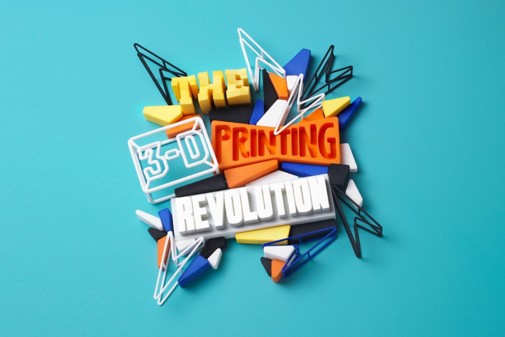
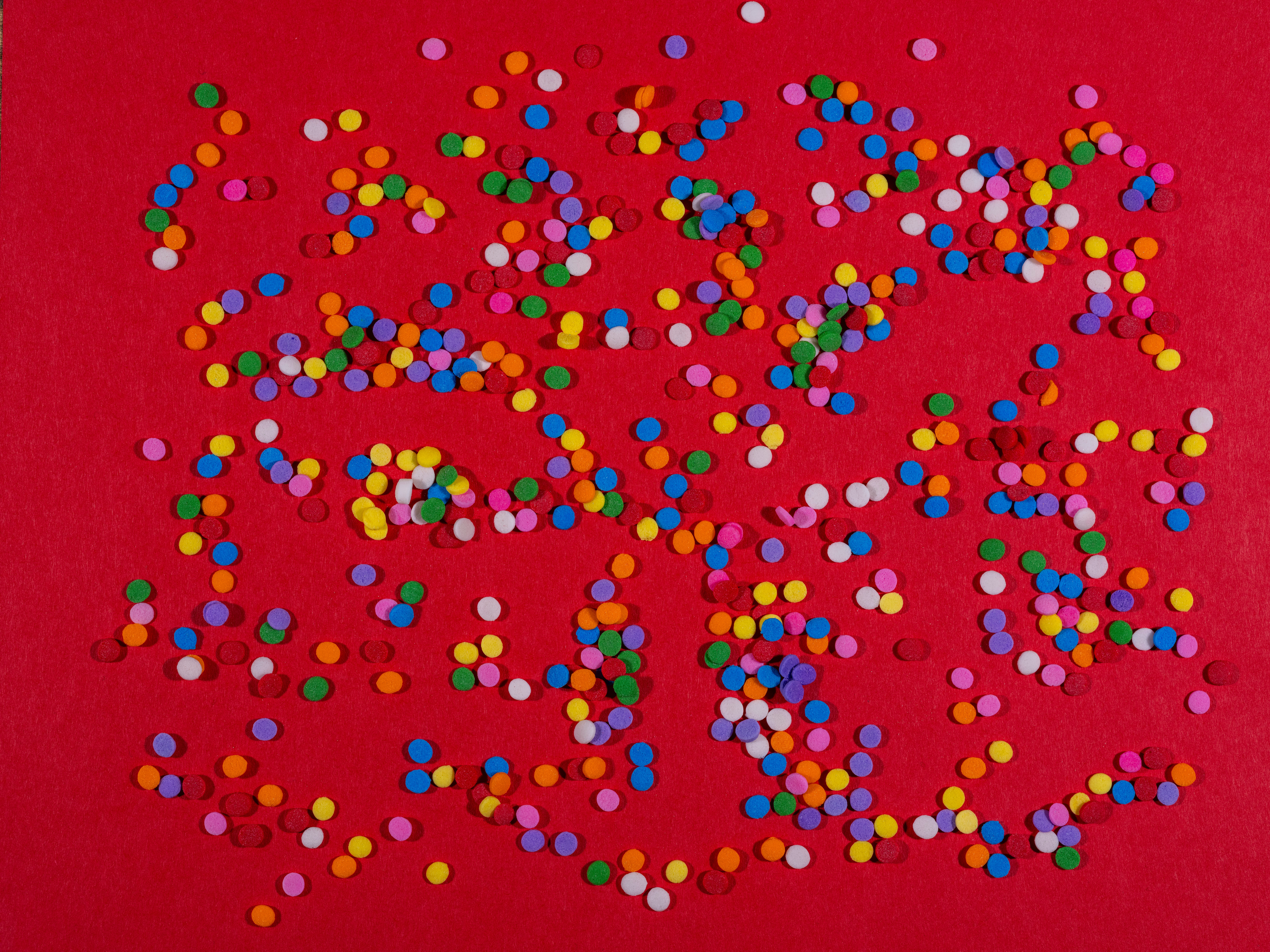
You don’t, however, need fancy software or design skills to embrace this trend. Create words out of objects, food or even people and snap a picture.
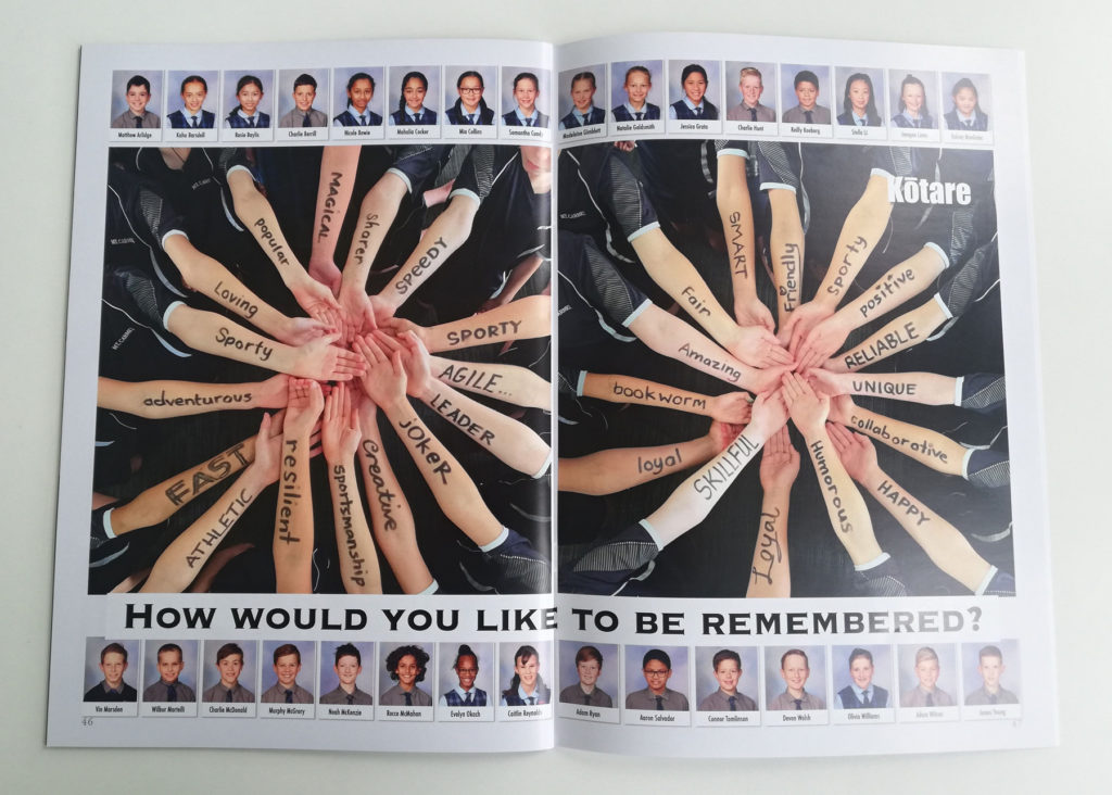
This is great for school cookbooks or classroom spreads where you have a bit of creative freedom – you can even get your students involved!
Flat & Geometric Design
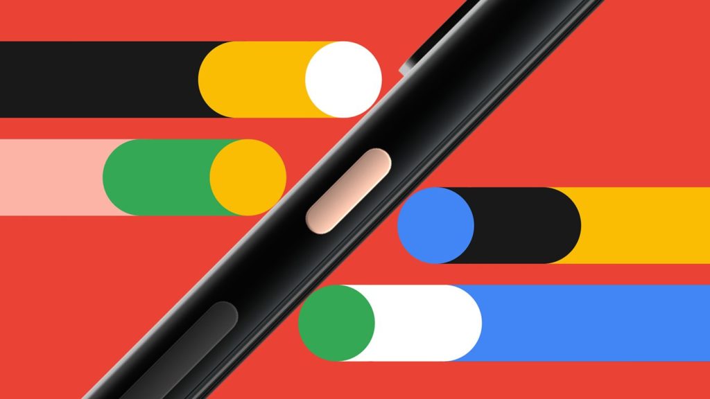
Simple geometric design has been popular for the past few years but this trend has simplified further for 2020. We are seeing a lot of flat, geometric illustrations that use limited colour palettes. Triangles, tubes and circles create abstract depictions and patterns, providing a fun and clean look.
Due to the simplicity of this trend, it is a versatile choice for yearbooks. Check out the work for Google Pixel 4 for more style inspiration.
Repeated Type
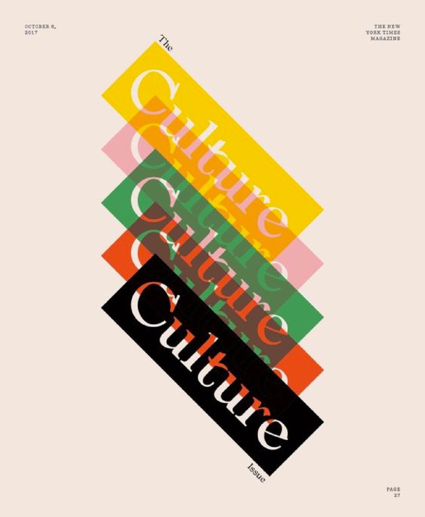
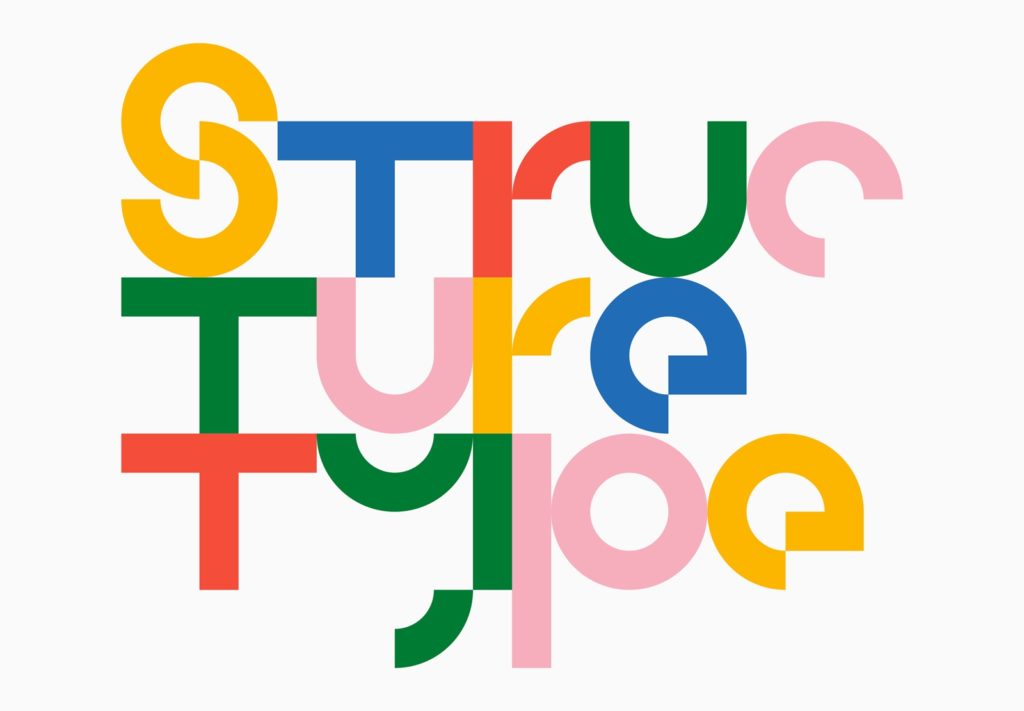
If a single bold heading is striking, just think about how striking five of them would be! For this 2020 design trend, we are seeing a lot of repeated type, either exact repetitions, cutouts or dragged effects.
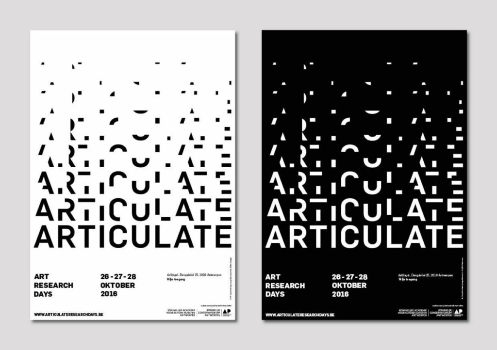
This 2020 trend uses type as a design feature, and is often combined with fragmented elements or lots of colour. Because of this, repeated type is a great choice for a bold yearbook cover.
Manipulated Lines
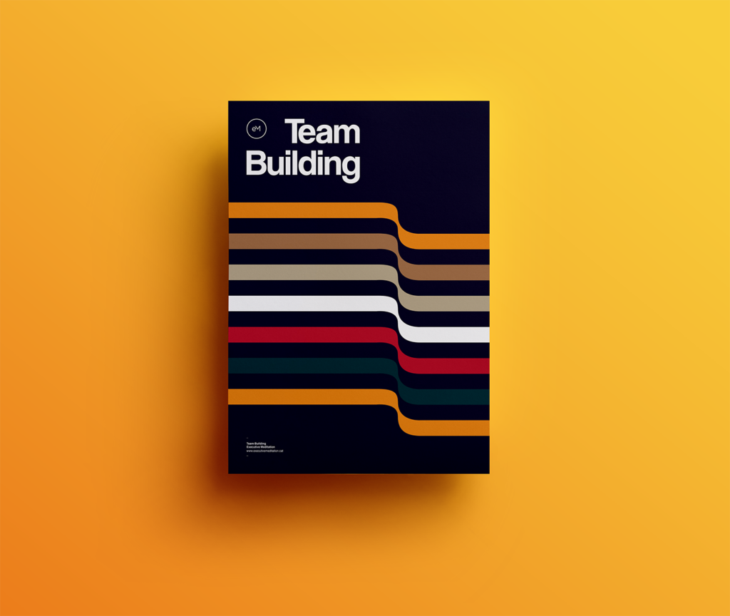
The simplicity of lines is what allows them to be manipulated in different ways. These lines add dimension and movement to the design, resulting in a fun 3D effect.
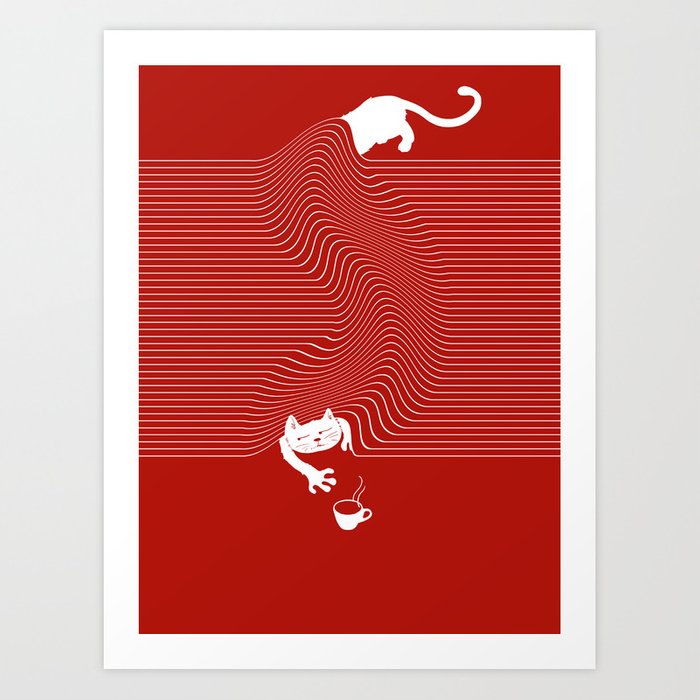
Due to the sheer variety of line options, from rainbow to monochrome styles, you can try this trend out in a lot of ways. For added depth, intersect illustrated lines with photography, or incorporate them into a page background!
Let us know what design trends you will be trying out for 2020!
